As was foretold, we've added advertisements to the forums! If you have questions, or if you encounter any bugs, please visit this thread: https://forums.penny-arcade.com/discussion/240191/forum-advertisement-faq-and-reports-thread/
Options
Mageormike's thread of illustration, concept art, and self-improvement
mageormike Registered User regular
Registered User regular
Hello everyone!
For the longest time I've been on the passive side of this forum, lurking and periodically posting a sketch or two in the doodle thread. This has given me pages upon pages of useful knowledge, advice, and inspiration for my own work. However, seeing as the new year is coming and observing the steady betterment of many others through similar means, I have decided to finally bear the full brunt of the Artist's Corner and create a thread of my own. Whoa man though, let me tell you that I'm pretty nervous even as I type this!
I'd like to say up front that my ultimate goal is to get into concept art and/or illustration. Since I'm working full time in a separate career at the moment that gives me far less to work on this than I'd like, but currently I have just enough to give a couple hours a night. I've been doing what I can from the Noah Bradley Art Camp, but the amount of assignments is kind of insane for my schedule.
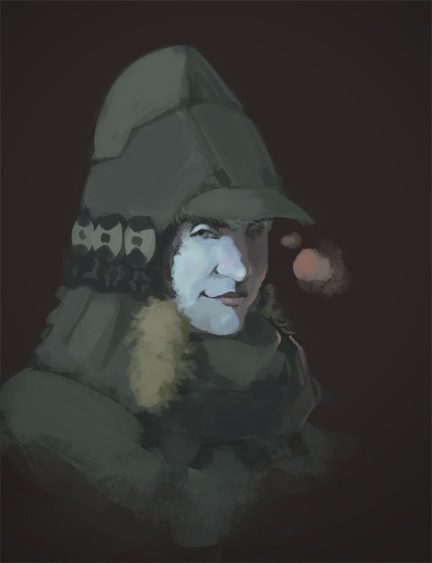
Below are a few of my more recent sketches:
For those that a willing to spare the time, any ideas on what I might need to be working on? At the moment my personal evaluation is that:
1) I need more experience in the planning stage.
2) My edge work is still a little sloppy and I have tendency to leave it a little underdeveloped.
3) My compositions are not all that interesting.
Thank you all! Give me your best shot")
For the longest time I've been on the passive side of this forum, lurking and periodically posting a sketch or two in the doodle thread. This has given me pages upon pages of useful knowledge, advice, and inspiration for my own work. However, seeing as the new year is coming and observing the steady betterment of many others through similar means, I have decided to finally bear the full brunt of the Artist's Corner and create a thread of my own. Whoa man though, let me tell you that I'm pretty nervous even as I type this!
I'd like to say up front that my ultimate goal is to get into concept art and/or illustration. Since I'm working full time in a separate career at the moment that gives me far less to work on this than I'd like, but currently I have just enough to give a couple hours a night. I've been doing what I can from the Noah Bradley Art Camp, but the amount of assignments is kind of insane for my schedule.
Below are a few of my more recent sketches:
For those that a willing to spare the time, any ideas on what I might need to be working on? At the moment my personal evaluation is that:
1) I need more experience in the planning stage.
2) My edge work is still a little sloppy and I have tendency to leave it a little underdeveloped.
3) My compositions are not all that interesting.
Thank you all! Give me your best shot
0
Posts
I would say for things like edges and rendering, don't be afraid to tackle much smaller subjects and do bite sized studies. Finishing illustrations is super important, but sometimes its easier to learn in smaller doses. I learned a ton doing these: http://iruka.iseenothing.com/balls4.jpg (You can actually go back in my thread and see me struggle with these studies, and the crits I got) They dont seem like much, but I had to solve a lot of problems at once. I needed to find reference for each, study them enough to reconfigure the lighting scheme to fit the scene, define textures that were in the same shape but were completely different, and so on. Noah's camp is/was great, but don't be afraid to make your own track and your own assignments now that you have that behind you.
I know I am going to try and do a few master studies and still life drawings this year, hopefully peppered around everything else on my plate. Hopefully we can work on our core skills together! Keep at it!
On your point about edges and materials, I definitely agree that working on smaller projects/scale would be a great way to improve without the pressure of completing a full illustration. To tell you the truth, I signed up late in the Art Camp and have been playing catch up the entire time. As such, I've had to kind of make my own schedule anyways ^_^;; I'm just now getting to the week on edges/materials in that course, so it seems like a perfect time to start some specific studies and paint some spheres!
Aside from completing more imaginative sketches and studies, my next big leap is to make a portfolio website (at least a starter one). I'm not sure if I should try to re-tackle some of my earlier works before uploading, or if I should just start fresh and make new pieces from scratch.
Does it make any sense to put some of my current work up as they are now, and replace them with better pieces as I go? I feel that if I wait until I have a large batch of finished projects I'll never get something off the ground.
Do you have any drawing work you could share? Base drawings or sketches of what you're showing here, or some life drawings maybe? Fully rendered greyscale work?
I ask because while you've got what looks like some good fundamentals, it can be difficult to tell with the loose chalk rendering when certain passages are acting as clever simplifications of objects, and where the rendering is just vague as a result of lack of time investment, or not being totally clear on what's happening with it yourself. Having some finished, solid drawings would be helpful in determining where you're at and what improvements you should be looking at tackling, because there would be less ambiguity on these issues.
Like you noted, the edge work could could stand to be tightened in places, the planning and composition could be worked on; these are all drawing problems, not painting problems. So if you want to improve your art as a whole in the quickest possible fashion at this point, I'd suggest spending a majority of your time just in black and white, working on these things. A great drawing with serviceable, or even no color will always be better and more impressive than a serviceable drawing with great, flashy color, so set your learning priorities with that in mind.
I'd also be interested in life drawings specifically because your 2 figure pieces are pretty nice, but having most of the figure covered up in ponchos and bulky winter clothing also makes determining what you do and don't know about anatomy, rhythm, etc. hard to pin down. Could be you've got it all down pat and the wardrobe is just coincidence, or it could be that you're trying to cover up some weaknesses with those things. If that's the case, it's much better to show those weaknesses so they can be improved; trying to hide them only leads to bad habits becoming ingrained. I know that's a tough thing to ask of you, especially as you've expressed nervousness about posting here (hell, I still get nervous about posting stuff myself), but it's true.
(semi-aside:)
I've seen people repeat the same things over and over for years and not be called on it, because having a certain level of competence and a consistent thing done over and over can make hiding weaknesses seem like a deliberate choice to the casual observer, rather than a crutch. You're clearly pretty competent, so I don't want you to find yourself falling into that kind of rut. The fact is that part of improving is making sure that the level of ambition on display in your work is always just a little bit ahead (or maybe a lot) of what you feel you're capable of, which means there's no avoiding having some degree of discomfort when showing work where you're trying to make progress.
As for a more specific note, I'd take another look at the legs on the last dude. The back leg seems kinda short, and the front one runs into a common leg drawing issue:
Twitter
First of all, unfortunately for the pieces above I've already flattened the layers. However, I've scanned a couple of recent life-drawing sketches and posted what is probably my most completed recent piece:
Regarding drawing, I've mostly studied from books such as Mike Mattesi's "Force": http://www.amazon.com/s/ref=nb_sb_noss_2?url=search-alias=aps&field-keywords=Force, as well as some Loomis, the "Dynamic" series: http://www.amazon.com/Dynamic-Anatomy-Revised-Expanded-Edition/dp/0823015521/ref=sr_1_1?ie=UTF8&qid=1388508651&sr=8-1&keywords=Dynamic+anatomy, and the art's atlas of anatomy.
Of course, I also try to participate in life-drawing sessions as much as possible. At least two of the images I've uploaded were from a week ago
I do not take slight to your question regarding my structure at all. Really, I appreciate you calling me out on it! I definitely could use some more improvement in some areas of drawing, especially with hands, feet, and legs. This is why I still try to go to a drawing session per week. Also, thank you for pointing out the knee/ankle problem with that last character. This is what happens when you draw in a vacuum(and don't use reference).
You hit the nail on the head with my renderings by the way. Since part way through the art camp I have been aiming toward mimicking a portion of John Singer Sargent's looser paintings (loose, painterly quality for most areas, sharp detail at the focal points). However, I don't think I've been successful in either aspect as of yet. I don't finish the focal areas enough, and tend to use the excuse of "it's supposed to be loose" to not work enough on areas that need it.
I'll give your advice a try and the next several pieces I work on will be in black and white. I always worry that if I don't do everything at once that my skills in other areas will end up suffering, but as long as I keep up the work that shouldn't be a problem I guess. Just another bit of irrational fear that gets in the way of my progress.
Thank you again, your posts are always amazing and a great help! (You really should write a book from all the work you've put into these, honestly)
First off, the three weaknesses you point out are not issues that would really occur to me from looking at the work, other than possibly the edge work. Even then I would say I've seen work with edges as rough/underdeveloped as yours if not moreso but which blew me away with composition, lighting, texture, color usage, forms, and so forth.
I wouldn't worry much about planning -- higher emphasis on planning may lead you down a route of stiffer, more unnatural work as you become reluctant to make significant changes to plans that you've put much work into. I would consider developing your improvisational skills to be far more valuable, especially if you are looking to pursue work in concept art, where improvisation is crucial. The ability to break down issues on an in-progress image becomes your target then, something at which Bacon is quite adept!
Your compositions could be more compelling, but they certainly aren't bad or actively damaging your work. I would not consider it a priority unless your primary interest is illustration or matte painting, rather than concept art.
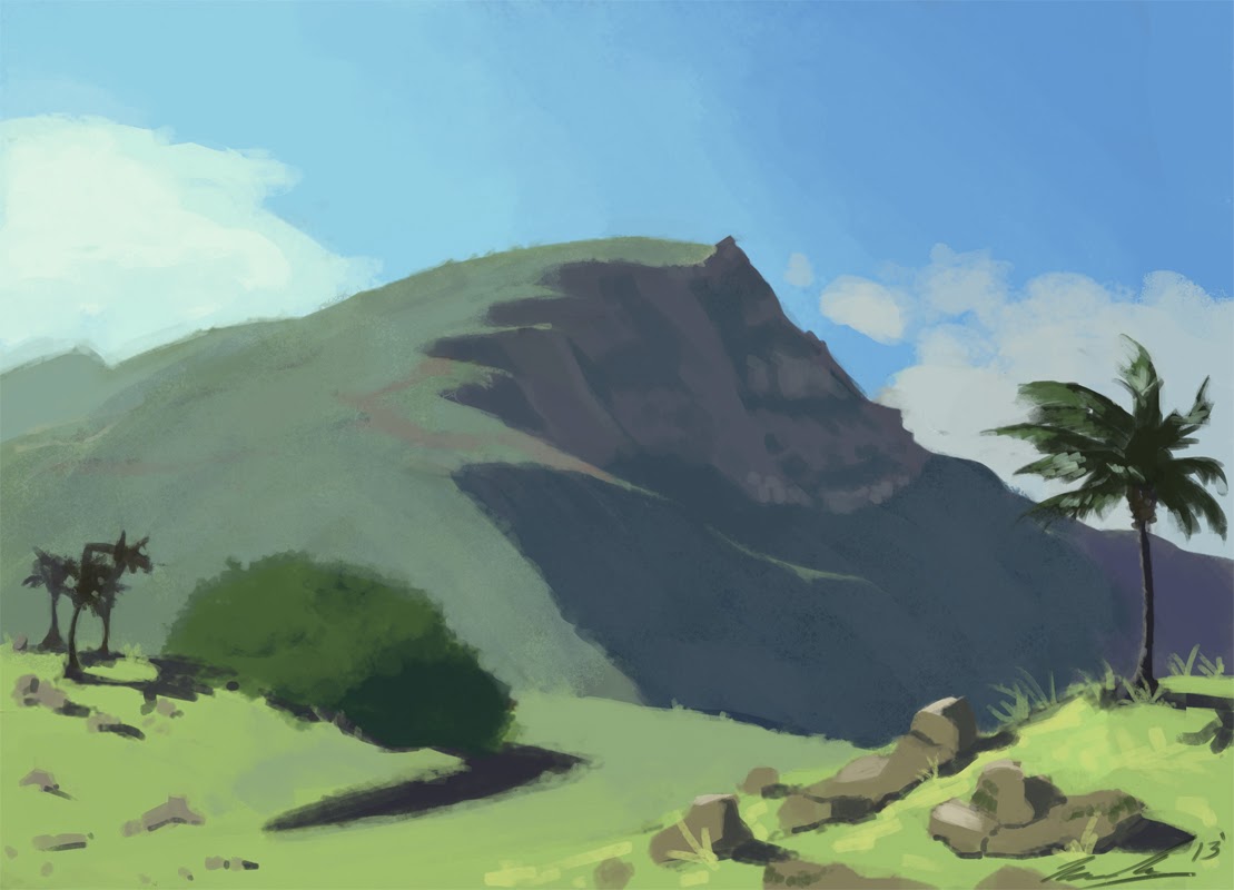
You are fond of cool colors, but tend to shade with grey tones (the palm tree mountain is your best exception). Your lighting is also very muted and low-contrast. If you are looking to have a sort of gloomy and dry effect, you would benefit greatly from a very well developed understanding of ambient lighting to give your forms more dimensionality. If you want a more "life fighting against the gloom" kind of effect, you could consider putting much stronger coloration in your shading. You went for a little colored shading in the top piece here, but blended it away to a solid swatch per surface to where it is no longer lively -- none of the blended color really peeks through, it's a bit smothered, and the net effect is just desaturating your cool tones rather than mixing it up with warm tones.
Here's a paintover exploring mostly the colors and a bit of lighting on that first piece:
I've added more red to the darker areas, and added a bit more saturation variety in the cooler areas. I mostly did this by manually setting color values I wanted (rather than picking off the canvas) for the brush over and over, and going overboard on the paintover layer before pulling it back with layer opacity and a gentle eraser pass. I also reinforced the dimensionality of the forms by brightening the surfaces facing toward the viewer and darkening surfaces facing away, which is a suitable effect for a portrait like this. Replacing the original image with a 50% grey layer provides an interesting way to look at the differences in the paintover:
Worth pointing out that the layer that I used to affect the lighting is on "overlay" blend mode, which is sort of like a combination dodge AND burn blending mode. It just looks like desaturated values here because the underlying image is grey.
Anyway, hope that gives you some good stuff to think about!
Thank you! You've given me a lot to ponder over
I do feel that my edge work at the very least could stand to be improved. However, you've brought up another area that I need to work on. I've shied away from too much contrast so much to the point of pushing hard in the other direction. My understanding of reflected light in shadow could use some work. Really, it comes down to just doing more life and master studies and appropriating what I learn into my imaginative work.
I think at some point soon I'll go back and finish up some of these pieces. If I don't have a portfolio up soon I feel I'll keep pushing it back indefinitely ^^;;
Below is an attempt at rendering metal (from life):
It's not perfect, but for a couple hour study I'm not as disappointed as I thought I would be. Gonna try at least one more round of this material in grey scale before attempting one in color as well.
I feel like I'm learning a lot even from this piece alone, but man, metal is harder than you'd think ^^;;
This is where the small details and edge work will betray you, If you let a few things be off, the whole thing falls apart. Something about this doesn't quite add up for me, but I dont know exactly what your hunk of metal looks like.
It's not perfect, but this is roughly about the angle and lighting conditions that I painted the dish washer/sink cap thing (not really sure what it's called to be honest, ^^;;):
Looking at it with fresh eyes, I think I can see what you mean about it not reading quite right. I have the primary values in place, but there are textures on the top of the metal that need to be further developed/added, as well as smudgy water stains on the sides/wood texture of the table reflection that could be touched up to better show the form. Picking something this reflective was a difficult first try I think; everything has to be super sharp and all the surrounding details added for it to read properly.
Something more in the general neighborhood of Brass or Aluminum is probably a better starting point for doing a material study on metal.
I'm not necessarily saying "give up and try something easier", by all means keep grinding at it if you feel like a challenge-- just mentioning that you shouldn't feel too bad if you can't nail it.
My next study is going to be a little more simple I think.
Also yeah, what Scos said. Even so there is a good lesson here in that you were actually doing a good job on a surface level, but you need to really push for accuracy. Rendering reflections is funny because it shows how much your mind is doing when you look at an object.
Ever look at something and just not understand it? Like the light is weird or you've never quite seen it reflected that way, and you just cant really get whats going on for a few seconds? You walk up to it a bit, or move so the light is different, and it all makes sense? I remember watching a documentary that had a bit where a guy, who had been pretty much blind his whole life, had his eyes restored. He cant really deal with depth perception because his brain never developed the part that tells him what all the shit he is seeing means, everything is just blobs of bullshit.
When you are doing something material wise, you are trying to trigger this part of the brain. When I look at that picture, I know its not a orange hunk of something with a black top because all of the context clues I've memorized over a life time tells me what I'm seeing is a reflection. The better you provide the context clues will actually be what enables my brain to consider it "realistic"
That's part of the mistake that people make when they try and trace photos. The camera can easily destroy context clues that your eye picks up. Great photographers will take photos that are at the optimal angle/contrast to work with your brain, or they will intentionally break that so that you see texture and abstraction. You are trying to take control of this, and wield it as you desire.
So, here:
Other than some light dark issues, one of the real things I added was the sharp, tiny scratches that tell me that "Man, that's some metal I'm looking at" and cleaned up those edges. But the other thing I added was that piece of rope. Because that's all my brain needs to tell me that that is a reflection. If you didn't want to render the rope, you'll have to make the executive choice to take it out completely, Otherwise it looks like a huge crack.
You could, actually, go to the other way and just render it SO ACCURATELY that my brain knows its a rope without it being there. You can see here, that if you take out the string, your mind is still like "Eh, I see whats going on here"
To the right though, if you eliminate all of the clues, you start to lose a solid sense of what the object is. Is that a wood tube with molten metal cap on it? If I take just a few details away, it would continue to fall apart.
I was so focused on the rendering of the object itself that I forgot to add in many of the important details that let us know what the object is.
Going forward, I will be certain to put everyone's advice to good use.
Today I worked on a different still life: stainless steel Starbucks thermos
(The photograph was taken after the fact for everyone's reference. Though it's blowing the highlights and shadows WAY out of proportion, it should get the idea across)
I feel much more happy with this one. Though an easier material than my previous attempt, I feel that the lessons I learned it helped immensely! I ended up spending way more time on it than I usually do for a study, and perhaps the best lesson I took from this was that I can't allow myself to become lazy when the hours start piling up. Take a step back, look at it with fresh eyes, and spend some time really analyzing what I've created before making lazy strokes or quitting early.
One more metal study, this time in color
I THINK I got most of the surrounding colors (no photo unfortunately this time).
I think I need to do more 30-second to 1 minute gestures, as they are obviously my weakest area. Anything greater and I feel that I have the time to observe at my leisure and tend to produce better work. Standing poses are still difficult for me, my observation skills could be improved ^_^;;
Thinking about calling this one finished, unless there's something glaring that really stands out that I missed. Thanks again everyone for all the wonderful advice and feedback! I feel so much more confident and inspired now that I'm participating in a community
I had a pretty difficult time figuring out the planes of the rock formation in this materials study. The number one thing that I learned from this was, be sure to FULLY understand and comprehend your subject matter before attempting to paint. Because I didn't observe the planes correctly at first, I was unable to properly determine the values, and the edges were largely unrecognizable. In the end I was able to persevere and go back to make the necessary adjustments
I feel that this was another informative and helpful study that will lead to further improvements in my painting!
First of all:
Structure. Take your time drawing out the face before going through to painting. Make sure that the proportions are right, and nail down the planes. I tend to use the Reilly Method for head construction.
Ron Lemen has a neat little video on it here:
Sometimes I'll load up Blender, plonk down an Asaro head model and throw some lights around it. In this case the primary light source is placed above and to the left of the head, with a weaker light to the left.
(This model isn't perfect, and the camera can skew its proportions, but it's good enough to give a general idea of how light is going to fall across the planes.)
Painting the planes:
I'll start off by using a soft brush to throw down some very basic values, then switch to, and stick with, a hard-edged, high opacity brush to carve out the planes. Hard-edge, high opacity brushes. They are a good friend. A very good friend. It doesn't have to look absolutely beautiful or clean at this point, you just want the forms to read well.
Blending and refining:
Once I think I've got the planes good and solid, I'll start blending with a low opacity, low flow brush, and some smudge tools. I spend a bunch of time switching between blending and refining bits with a hard-edge high opacity brush.
Constant noodling:
You still had a bit of room on the value scale to maneuver around. I darkened up the background a bit to help the figure pop out a bit more, and added a few highlights as well.
Thank you very much for the in-depth tutorial and insight into your process.
There definitely has been a lack of understanding of planar definition and structure in my faces. I'll be taking (several) good looks at that video, it doesn't seem too different from my current method of finding the structure.
Man, so much good advice and help coming from everyone! I don't know what to say, but this is super inspiring
The original is below:
Considering the weaknesses in the composition and value choices I had to work with, I think that I've fixed this about as much as my current ability will allow without starting over from scratch. I added foreground elements, a 3rd focal point, changed the colors up, and punched up/added contrast where I could. I think that really the values are just too blown out; it's too bright in the area where the character is standing, and I can't seem to make the scissors she's holding jump out enough.
Really, I probably should have started over from the thumbnail stage so I could figure this stuff all out before everything got all complicated.
Any thoughts?
First off, I took @ChicoBlue's advice to heart and spent a ton of time doing facial anatomy studies, particularly the planes of the face and the nose. I realize now that I had unconsciously avoided doing serious studies to understand many of the more complex features of the face (man, noses are hard). I still need to do many more portraits studies, self and otherwise, but for now I feel that I'm on the right track to improving
Below is my first attempt at a greyscale self portrait:
Mid-point stage
Other than that, I've posted a series of some of the studies I worked on, in addition to some of my favorites from last weekend's life drawing session!
The theme is "apprentice boat mechanic who lives on a river in a desert". The period is near-past with a slight fantastical angle.
I'm trying to decide between the below thumbnails at total of 4 that I would like to move to the next stage.
To be honest, I really struggled for awhile to come up with a good variety of thumbnails and silhouettes. I tend to refine an idea in my head or with word lists until it starts to become really solidified, so when the time comes to try to branch out and deplete my visual library, I tend to have a hard time moving away from that initial ideal image. Wherein I then get artist's block, a headache, then have difficulty moving forward
Any tips on how to stay looser and not getting to fixated on any one idea?
(there's a good bacon crit in there for thumbs)
I think your self portrait is looking good, the attention to facial structure shows. I would be careful to not get overly attached to that chalk brush. Its a fine brush but you may have a better effect/more control over something else, especially when you start to get in there to define edges.
My problem I guess, is trying to find a smooth process for letting my ideas flow and getting them on the page. I think that I understand the bacon critique; consciously make informed decisions based on prior designs while keeping in mind how the silhouette reads, all the while trying to make sure that it follows the original concept accordingly. With that in mind, I went back and tweaked the line up a bit, to make them stand out more and make them all read as "mechanic" or "worker". A good thing that I started to do is begin my thoughts with "what if....", and going from there.
To make the most out of this exercise, I think I'll take at least 3 of the line up to the next stage and see what further ideas I can come up with from there, before finally deciding on the final image I'll take to the rendering stage.
You're right that I probably spend too much time with the chalk brush. I loved the result when used effectively (such as the way that Noah Bradley paints), but I should try to spread out and see if there's anything that works better for me
I mean, it really comes down to my lack of experience. I have to do more life drawing, more anatomy studies, more studies of color and light, more of everything really before my process gets fast enough to complete a project under a viable amount of time.
This has really put back into perspective just how long I have to go before I can perform in a work setting. I doubt it would be acceptable to spend an entire week on a single character design!
Granted, this is much more out of my comfort zone than say, an environment or landscape. Again, just means that I have to do more of them ^_^;;
Sorry if this turned into some kind of rant.
I really have learned a lot over the course of the week, about painting, about design, about what kind of process and workflow works best for me. I guess I just kinda hoped that all my work over the last couple months had pushed me farther along that it actually did.
I DO like how this design is going and I'm going to finish it. Finally figured just about everything out that needed to be done, all that's left is fiddling with the sketch and bringing it to the rendering stage.
That is part of the reason its important to practice finishing stuff, though, because its a skill in itself. I have a lot of trouble picking up a piece after that first initial 40hours of non-stop work, but I am trying to grow past that where I can pick up a painting a week later and keep working on it. Keep mixing up your studies with applying your skills to something a little larger.
The support of this community has been a great motivator and super inspiring!
So it might be a good idea then to move on to doing some more studies before trying to finish this piece? Granted, it's taken so long now that I really should try moving on to other ideas and studies, I'm getting burned out.
I think I'll take your advice on it and do some more studies for a week or so. Perhaps then I can have a more fresh look at it and as you say, add what I learn as I go
On a similar tangent, I've been studying some blender tutorials that @ChicoBlue sent to me. Hopefully having a workable Asaro head for reference and study work will allow me to move out of my comfort zone in regards to lighting.
Mostly I've been doing anatomy and facial feature studies + sketches, though not enough time on doodling (though I have been doing 15 minute warm-up sketches/thumbnails). Gonna rectify that tomorrow!
For now, here are my two biggest studies and my most successful warm up thumbnail:
This study was during a live session! My first time doing a 3 hour pose, I made sure to bring the laptop so that I could get as much real painting practice as possible. It was a lot of fun, and forced me to really work on rendering things properly and getting the values down correctly.
This portrait study was done with my own reference photo, and made things complicated with a non-traditional lighting setup (Oops!!). It was a good way to get me out of my comfort zone however, and I was able to practice blending with a couple different brushes that I feel worked better for rendering skin then the chalk brush I normally use.
Finally, started doing some greyscale thumbnails as a warm up. These have been fun just to try different lighting schemes and compositions! I definitely need to do a ton more though, my lack of experience shows pretty strongly I think ^^;;
Anyways, that's what I've been up to! Any critiques would be greatly appreciated if you have the time and energy to spare
Does anyone have any last-minute critiques before I get started on the final version?
At the moment I'm just trying to figure out the best way to make the composition and values work well.
Thanks in advance
I had apparently thought that I had already done it and forgot, sorry!!
Yeah, I tried to shove a particular framing element into the piece when it didn't fit at all. Another great learning experience!!
This week I decided to focus heavily on figure drawing to try to better internalize the fundamentals (so that I can draw upon them without need of reference as often). Below are a few of the studies, along with some figures from imagination I've been trying my new learn'in out on:
(First 3 are from reference, the remainder are from imagination)
Been largely following the Proko video tutorials, and let me tell you, it's been difficult trying to merge my more expressive sketching style with the tighter techniques that Proko teaches. At the moment I feel that my figures are feeling more stiff than my previous work, and it takes twice as long to get to the "good stuff". All the more reason to be sure to tackle the gesture and force of the pose before everything else I guess.