As was foretold, we've added advertisements to the forums! If you have questions, or if you encounter any bugs, please visit this thread: https://forums.penny-arcade.com/discussion/240191/forum-advertisement-faq-and-reports-thread/
Options
Free handy-jays for everyone.
Higgz Registered User regular
Registered User regular
Hello, everybody. I drop in once every couple years or so to make a new thread. I'm not educated in art(or even unusually good at it), but I do get satisfaction from making things that people enjoy. A social hobby, I suppose.
I find myself with a major problem when it comes to digital painting: I'm stuck! Help! I need an adult!
I will try to time-travel-illustrate what I mean.
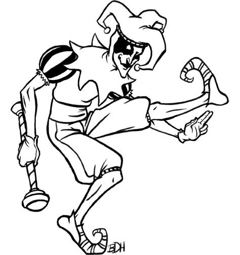
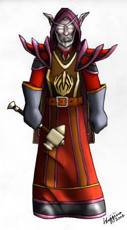 I made this around the first year of WoW. I think I was 16 years old or something like that. It's just micron pen lines with photoshop-painted colours and, god forgive me, burn and dodge tool shading and lighting.
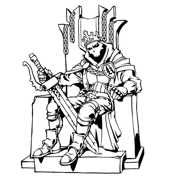
Years later, age 21, I made this when a certain web comic artist held some sort of contest that I vaguely remember. It's almost identical in style! The only differences are that I did the line work in Photoshop and avoided the burn and dodge tools. No major improvements, as far as I can tell.
As you can see, it's not a problem of medium, because my real paintings look almost exactly like my Photoshop work: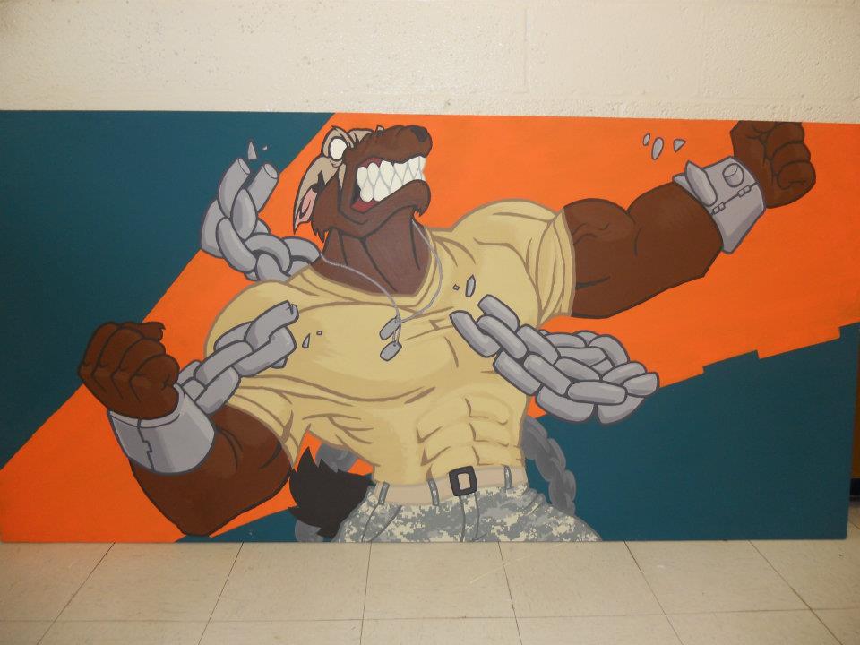 Painted for the Army around age 23. Acrylics on a man-sized wooden board. Design flaws noted(but are they -really-?)
These days, my line work is a bit more refined. Not the best, but good enough for my purposes. I usually end up with pieces like this: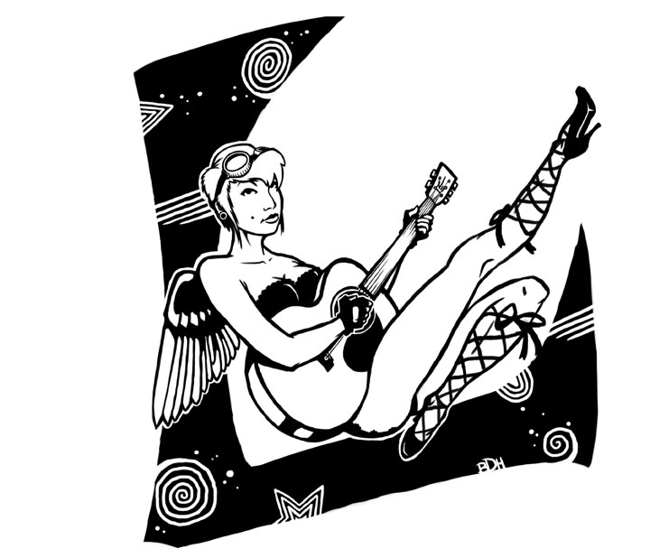
That's all well and good, but this whole ten years I have been trying to do achieve a complete digital painting. I've watched all sorts of nifty artists do their Photoshop painting work and tried to replicate their styles, only to make things like this: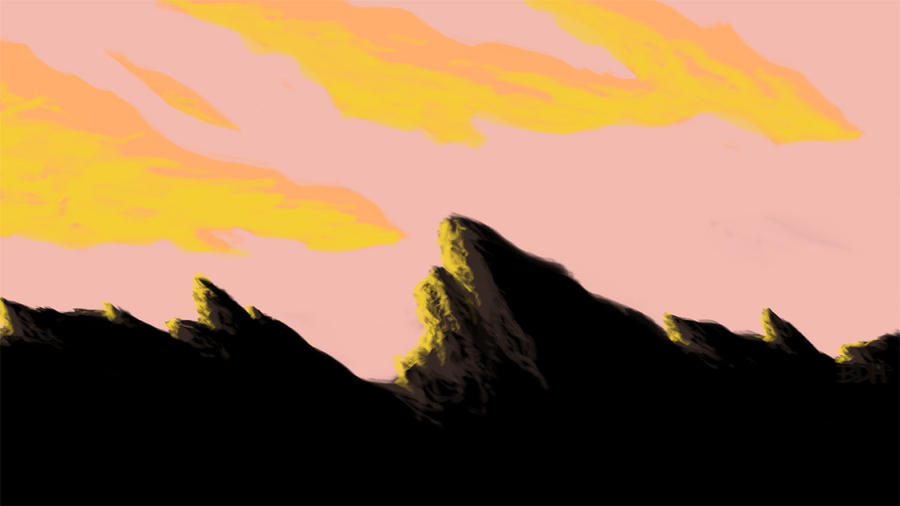 If there is a word to combine "shitty" and "boring," it is the title of this painting.
***NOW FOR MY CURRENT PROBLEM***
I'm 26 now. Probably 10 years since the WoW drawing at the top. A friend asked me if I could make his unit a cool paper-sized image to throw around on their records books and the like. I'm always down for things like that, and now I have the image below this paragraph. I want to take it to the next level in a way I've never been able to before. I'm looking to turn it into a line-less, full-form painting like I see all over the damn internet by everyone and their mother. I request advice.
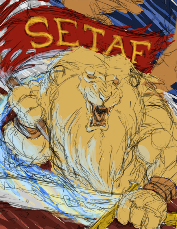 It's a winged lion with a flaming sword and the SETAF banner, before a red, white, and blue backdrop.
I find myself with a major problem when it comes to digital painting: I'm stuck! Help! I need an adult!
I will try to time-travel-illustrate what I mean.
Years later, age 21, I made this when a certain web comic artist held some sort of contest that I vaguely remember.
As you can see, it's not a problem of medium, because my real paintings look almost exactly like my Photoshop work:
These days, my line work is a bit more refined. Not the best, but good enough for my purposes. I usually end up with pieces like this:
That's all well and good, but this whole ten years I have been trying to do achieve a complete digital painting. I've watched all sorts of nifty artists do their Photoshop painting work and tried to replicate their styles, only to make things like this:
***NOW FOR MY CURRENT PROBLEM***
I'm 26 now. Probably 10 years since the WoW drawing at the top. A friend asked me if I could make his unit a cool paper-sized image to throw around on their records books and the like. I'm always down for things like that, and now I have the image below this paragraph. I want to take it to the next level in a way I've never been able to before. I'm looking to turn it into a line-less, full-form painting like I see all over the damn internet by everyone and their mother. I request advice.
Higgz on
0
Posts
With the 50% flow you can create a smoother rendered effect (on screen color mixing if you will).
I'm kind of a noob to digital painting, but it's an effective process I have been using.
That's sort of what I was doing, except I've never played with the Flow setting before. After trying it out just now, it seems like a faster way of blending than the multiple-strokes-on-low-opacity technique I used. Do you just use the round hard brush or is there a more natural shape for it?
I'd suggest raising the banner up a bit further, even if it means extending your canvas, giving his brain some room to live in and giving the mane on the top of his head some more attention (make it larger and wilder, rather than parted neatly and flatly down the middle like you currently have it).
Oh no! You're right! Fixing things is so hard, but at least it's Photoshop and not real paint.
EDIT: I added and forehead and changed that whole area just a bit. I think it does look quite a bit better.
2) On the 'I want this to look like a painting not a drawing' front, hope you don't mind a paintover:
Also, to further explain the idea of 'temperature shift': http://bacon.iseenothing.com/otherpeoplestuff/Severed_Colors2.jpg
Also check out step #3 for what I was on about having edge variety, and 5-8 on an example of what I mean by 'darkest lights not being as dark as dark as your lightest darks'. Didn't say it in those terms, but that's the principle at work:
http://bacon.iseenothing.com/otherpeoplestuff/maleba_pokemon.jpg
On brush settings, most of what I used here was default Photoshop brush with these settings:
Roundness 20%
Hardness 10%
Shape Dynamics On
Size set to Pen Pressure
Angle set to Pen Tilt
Transfer On
Opacity set to Pen Pressure
Flow set to Pen Pressure
Smoothing On
All the "Jitter" settings set to 0%, everything else off.
If you have an Intuous or Cintiq tablet, this gives you a brush that can be hard or soft, thick or thin, depending on the angle you hold the pen. If a tablet that doesn't support pen tilt, this may not work, and you'll have to work around the limitation by varying your brush hardness/size more through settings.
But I caution against looking at any one brush setting and feeling like, 'THIS IS THE SOLUTION, FINALLY!' The fact is, there is no one magic brush that's the right one in all situations. I always keep the brush window open because I constantly need to fiddle with settings or pick different brushes. Sometimes you need a brush that just lays down a straight line in a completely flat tone. Sometimes you need a really huge soft brush as 3% opacity. Sometimes you'll need a tiny 1 pixel brush. So my advice is to get real familiar with all the various settings in Photoshop's brush window (esp. the settings on Brush Tip Shape, Shape Dynamics, and Transfer), and spend a good amount of time playing around with them to see what they do, and take note of why you would want to use some of these things. Get used to changing things up on the regular when working.
Hope some of this helps ya out.
Twitter
But you just got an AoB crit, so you're set. As AoB says, play with all the settings and keep trying new things. I'm still learning too
Also, I never thought of starting in black and white, as with the pokemon example. That'll be fun to try.