As was foretold, we've added advertisements to the forums! If you have questions, or if you encounter any bugs, please visit this thread: https://forums.penny-arcade.com/discussion/240191/forum-advertisement-faq-and-reports-thread/

Stuff & Nonsense... mostly Nonsense [NSFW]

beckerskullsbeckerskulls Registered User regular
edited March 2014 in Artist's Corner
Hey folks. So I studied art with the idea of doing freelance illustration. After school, though, I kind of got side-tracked, then well-nigh derailed by fear and lack of motivation. Recently I've started to gain a little momentum, though, and it's felt really great. You AC forumers are totally inspiring me to improve my skills, so thanks for the helpful info., resources, critique and overall good vibes.

So... maybe you can help me out? These are two illos I did recently - the first for a children's magazine, the second for a collection of silly poems for kids. I haven't done anything in this style/to this degree of finish in years. (It took me like half an hour to pry the gunky caps from my all but fossilized oil paints). They're done mostly in acrylic with some oil on top and digital painting over that. I probably won't overhaul either of these but would really appreciate some ideas for minor fixes/finishing as well as more general critique I can use to make better work in the future. Thanks!

witnesse.jpg[img][/img]hoboartiste.jpg

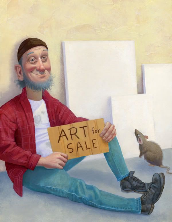
The silly poem that goes with this image:

Art

A polar bear in a snowstorm.
A massive razor-sharp fang.
Flying through a fluffy cloud.
Five minutes before the Big Bang.

Four different paintings,
Four different visions,
Four studies in shading and light –
Not half bad when you realize
The only color paint I have is
White.

IcyLiquid on
«134

Posts

  • SeraphSwordSeraphSword Sketch Fetishist Austin, TXRegistered User regular
    I don't see any images there. Where are you trying to post them from?

    Mastery is the result of ceaseless error, combined with ruthless self-appraisal.
  • m3nacem3nace Registered User regular
    Looks like they're in some kind of mail attachment format? You need to upload them to somewhere like photobucket, imageshack or tinypic.
    Also, if you want crits on the poems too you could post them in the writers block.

  • beckerskullsbeckerskulls Registered User regular
    Oh geez! Sorry about that :oops: Should be working now. Thanks for the tip, m3nace. The poems aren't mine, but the work of one John O'Marra. The project is called Chocolate Chips and Rocket Ships, if you're interested.

  • McMastaMcMasta ProvoRegistered User regular
    Quality work!

    Seems like a hot day for a bum to be wearing a beanie and a flannel shirt. ;)

  • squidbunnysquidbunny Registered User regular
    The polar bear in a snowstorm one is great.

    header_image_sm.jpg
  • EncEnc A Fool with Compassion Pronouns: He, Him, HisRegistered User regular
    I have seen books sell with far worse art, I think if you build a portfolio with these you could easily find a buyer, especially in the children books or the print pharmaceutical advertisement fields.

    This is quality stuff, is what I'm saying here. :^:

  • McMastaMcMasta ProvoRegistered User regular
    This:
    squidbunny wrote: »
    The polar bear in a snowstorm one is great.

    Also the attention to detail in the painting "Five minutes before the big bang" is impressive.

  • beckerskullsbeckerskulls Registered User regular
    Finding reference for that one was a real challenge ;-) Thanks for the feedback, guys!

    So I'm working on something way more casual - a lemur logo for the 5th grade classroom of a teacher friend of mine. Having a really hard time drawing those muzzles, though, and especially trying to describe their dimension from a straight-on viewpoint. Second, as designs, THESE ARE SO BORING! It's like I'm stuck in semi-realistic land. (Flat, graphic shapes have never really been my thing). Suggestions?

    lemur1.jpg
    lemur2.jpg
    lemur3.jpg
    lemur4.jpg
    lemur5.jpg
    lemur6.jpg

  • beckerskullsbeckerskulls Registered User regular
    So... this is what I came up with. Pretty generic, but I guess it gets the job done. lemurlogo.gif

  • HalenHalen Registered User regular
    I think it's perfect for the job in hand.

    Draw an egg.
  • beckerskullsbeckerskulls Registered User regular
    Here's an old lady I did for fun/digital painting practice. Crits welcome!

    gizine3010ni1.jpg?spref=tw

    Also, some creative friends and I have taken it into our heads to create a steampunk world. The problem is that this will obviously require drawing a lot of mechanical stuff, and while I appreciate that machines can be awesome, I HAVE NO IDEA HOW THEY WORK.

    So this piece (while it misses the steampunk mark) is me trying to get my toes wet drawing mechanical things. Right now I'm sort of stuck drawing highly-stylized, whimsical machinery that isn't meant to look functional. While I really enjoy whimsy, it seems like familiarizing myself with machines to the point where I could make stuff up that looks like it might do what it's designed for would really enrich my art. (Also, slapping a few gears on something and calling it steampunk would probably cause me to lie awake nights fretting over my eternal soul).

    Has anyone else been down this road that could offer any advice/resources for starting out designing machinery for art? (keeping in mind that I'm a total beginner and it would be really difficult to overstate my ignorance on the subject)?

  • beckerskullsbeckerskulls Registered User regular
    Did some doodles for a noir-themed card game prototype. The Informant, The Bruiser, The Trickster, The Rogue, The Bomber, The Decoy, and the Mastermind.

    informant-web.jpgbruiser-web.jpg
    trickster-web.jpg
    rogue-web.jpg
    bomber-web.jpgdecoy-web.jpgmastermind-web.jpg

  • lyriumlyrium Registered User regular
    Those illustrations are great! I like the texture and the colors on the old lady, but it seems like some of the drawing in it falls a little short of your other pieces. Love the style of the noir cards so far :)

  • beckerskullsbeckerskulls Registered User regular
    Thanks, lyrium! I agree about the drawing on the old lady - it wasn't the greatest to begin with. Generally though, I struggle with translating initial drawings into finished paintings. Some things get fuzzy and a lot of the life and energy are lost. Maybe I just need to learn to let go of the drawings and actually paint.

  • beckerskullsbeckerskulls Registered User regular
    It was a day late and a dollar short, but here is the comic I attempted for my sweetie-McSweetums this Valentine's.

    holdinghands.jpg

  • m3nacem3nace Registered User regular
    edited February 2014
    Nice, but I'd flip the hand holding panel since it inverts the line of action. Keep her on the left side and him on the right. It's a bit confusing when suddenly the swap places, especially when there's nothing to indicate we're seeing it from behind, after having watched it from the front the whole time.
    I'm not a big fan of panels going behind or in front of things either, it makes them appear like physical objects, say cardboards with text, and imho it pulls me out and makes me aware that I'm reading a comic, but maybe that's just me.

    m3nace on
  • beckerskullsbeckerskulls Registered User regular
    Thanks, m3nace, that is great feedback and you're so right about that panel. Sometimes it takes a fresh pair of eyes. Also, I like what you said about things going in front of or behind panels. I do feel lost when it comes to arranging a page like this, so I overcompensate sometimes by getting 'creative' with it, which can be detrimental.

  • m3nacem3nace Registered User regular
    Tell me about it, I constantly catch myself not incorporating speech bubbles when designing a page. Just gotta kick the habit.

  • beckerskullsbeckerskulls Registered User regular
    WARNING: inspired by NightDragon, the Jan. resolution challenge, and in the interest of artistic development, I'm gonna start posting a lot more regularly. I want to focus on developing characters and drawing the figure (later this year transitioning to environments and painting?) being more prolific (including letting things go so I can get to the next thing) and just working consistently, especially through slumps (and not letting slumps become deep dark holes). So every Monday or Tuesday I'm just going to dump on here whatever I've done the past week. Also, posting my worst stuff on the Internet and revealing my messy, messy process is a very scary thing, so I'm going to work on being more honest that way.

    Whew! Now that's off my chest - here's a character I've been working on.
    finch-sketches.jpg
    ibdw.jpg
    finch-figuresketches.jpg
    62372097fc0936a7be4b4ebc9cff8529.jpg5f5f3822-57db-4627-9c5f-7e43fa4cf3da.jpg
    His name is Finch and basically he's a gentle giant with a heart of gold. Never having been one to draw huge muscly guys, this is a big challenge, especially when it comes to drawing him from different angles and in a variety of poses. Trying to meet that head on by doing figure studies and building some clay models which I'll post next week!

  • beckerskullsbeckerskulls Registered User regular
    edited February 2014
    So, it's been ages since Sculpture 101, and these are kind of lumpy (which is partly my clumsiness with clay and partly my ignorance of anatomy), but this was a lot of fun and is already helping a lot with the structure and sense of depth in my sketches. I'll be working on those this week and will post next Tuesday.

    <img src="100_5786.jpg" alt="" />
    <img src="100_5794.jpg" alt="" />
    <img src="sculptcollage-finch1.jpg" alt="" />
    <img src="sculptcollage-finch2.jpg" alt="" />
    <img src="100_5804.jpg" alt="" />

    Sorry if these are enormous - been having trouble with Photobucket and I wanted to post before midnight...


    beckerskulls on
  • beckerskullsbeckerskulls Registered User regular
    Still trying to figure out how to draw big muscly dudes, so I've been copying some figure studies and photos.
    figurestudy-2.jpgfigurestudy-1.jpgfigurestudy-8.jpgfigurestudy-6.jpgfigurestudy-5.jpgfigurestudy-3.jpgfigurestudy-7.jpgfigurestudy-4.jpg

  • tapeslingertapeslinger Space Unicorn Slush Ranger Social Justice Rebel ScumRegistered User regular
    what clay is that? I think you're doing quite all right. :)

  • beckerskullsbeckerskulls Registered User regular
    Thanks! It's Jolly King plastelene. I guess sculpey is the thing to use, though I didn't know that starting out. This has worked fine, though; it doesn't dry out. The only disadvantage I'm aware of is that you can't bake it.

  • tapeslingertapeslinger Space Unicorn Slush Ranger Social Justice Rebel ScumRegistered User regular
    oh, you can use whatever you want. I was curious mostly because it informs the way the sculpture can be used and worked on, etc. (and also because I'm a technician for a sculpture supply company, so I'm generally incredibly nosy about that sort of thing. LOL.) Since Jolly King is super soft it makes a lot of sense that you can get a sketch together with it pretty quickly. Nice!

  • beckerskullsbeckerskulls Registered User regular
    edited March 2014
    Character drawing has not been going well... so here's some figure practice. In the absence of any local live session that includes gesture drawings, I've been using artists.pixelovely.com/ for reference. Pretty neat how in class mode it will time your gestures for you. These range from 30 seconds to 12 min.
    0f1tg6dpwncf.jpgo0z7fbqg3qrn.jpg
    skzdfgppwa1w.jpgbyvq13d0d9ta.jpg1xlwjpmwza2c.jpgzaakepdajz9y.jpgtnhgu7l49ak4.jpg
    gqy7w34cnoge.jpgyd8tnt80znpr.jpgm0veagjbi0t8.jpgboce4hvz9glk.jpg
    obay4x8rmr3k.jpgwwa154xyih9b.jpg
    rwx2mjmk12af.jpg2karphnb8fhh.jpg
    Gotta work on them feet.

    beckerskulls on
  • beckerskullsbeckerskulls Registered User regular
    Blerg. It was another tough drawing week, but I'll definitely post some character sketches next week if not sooner. Meanwhile, I'm attempting some steampunk caricatures of my team members to use as avatars on our game's website and this is what I've got so far. The pose was really challenging, dealing with foreshortening and trying to get a likeness at the same time. My digital painting skills are in a mushy stage right now, so normally I would just do a graphite drawing, scan and color it in Photoshop, but I wanted a cleaner look, I guess, so I tried ink which is not really my thing, then tried to be super careful with the lines but they just came out sad and shaky. It would probably be smart to learn to draw with a tablet at this point (though mine is pretty ancient and crappy). Lots of stuff to figure out. Anyway, I'm definitely starting over with this and suggestions are welcome.
    fn5t4ljdki6d.jpeg
    Here is what dude looks like. We decided on less facial hair for variety - the other guys have pretty iconic beards and mustaches.
    jakeface.jpg

  • ninjaininjai Registered User regular
    CATAN!!! also keep up the good work. Love your linez

  • beckerskullsbeckerskulls Registered User regular
    Thanks, ninjai!

    So I finally had to change out of my whiny pants and get these done to meet a deadline. It was hard, but I'm still alive.

    4q5ijd2sww5q.jpg

    0ku9d60oyp0t.jpg

    And closer-ups:

    ynjs2cf34tza.jpg1ycc187nrqzf.jpgq1kibmv8edne.jpgfinch-bumping-head.jpgo4y7a41oo7jw.jpgfinch-bird.jpgfinch-carrying.jpgyqhx5zb7ac42.jpgfinch-rock.jpg

  • IrukaIruka Registered User, Moderator mod
    You got good shapes, man. Really great.

    I think that the way you tackle eyes could be alittle stronger, it seems like when you start getting loose, you tend to let the shape of the eye fall apart and kinda do for two nearly horizontal lines for top and bottom lid. I think you can get more interesting shapes out of your eyes, or at least a little more structure out of them so they don't feel so flat.

  • beckerskullsbeckerskulls Registered User regular
    Thanks, Iruka!

    That is a good criticism. I will totally study some eye structure this week to help me make stuff up better. :)

  • beckerskullsbeckerskulls Registered User regular
    Should probably do like a million more, but I drew some eyes this week. From there I started noticing how weird eyebrow hair directions are, and pretty soon I was just drawing whole faces, so it was a little hard to focus on that one thing. It was also hard to find really reliable tutorials on the interwebs, so I might have to crack open some anatomy books (specifically, to figure out what the deal is with this iris foreshortening thing).
    ebv9yqbqsaa2.jpgjca6fxumy8bf.jpg
    z2hxm4s75w5e.jpg

    Another icon portrait in process. I'm leaning toward #4 hat. It's not the shape so much as steampunk whimsy combined with a serious expression that's working for me so far. I dunno. We'll see.
    cz93tnvld8h5.jpg

    Dude's face and awesome hat reference:
    7p7sdbxx61nb.jpg
    n5bsji1xovpn.jpg

  • beckerskullsbeckerskulls Registered User regular
    Yet another WIP, but this one's getting priority til it's finished. It's just a small commission for my uncle, but I'd like it to go portfolio (without spending forever on it 'cause there's so many other arts to dooooo!!) I don't really know any kids in my area who could model for me, so for now I'm using an awkward combination of selfies, Getty Images and my tiny Vietnamese roommate. Gonna hit it with acrylics and maybe some faux antique crackly texture if I can figure out how. Do they make glazes for that? Going for a Grant Wood folk art-type stylization, especially in the rendering (G.W. totally being one of my faves).

    tyo3rf1dzo4r.jpg

    By next week: finished drawing, value/color comps, and in-progress painting. Meanwhile, it's pretty rough, but any compositional suggestions? Is the perspective bothering anyone? The ground plane is supposed to curve upward somewhat and the handcart is supposed to be angled up, not perpendicular to the ground, but I'm not sure it's reading that way.

    The sketch he chose:
    sk96n0jb1lov.jpg

  • beckerskullsbeckerskulls Registered User regular
    Update: very messy final-ish drawing. May need to adjust so that kid on shoulders is actually looking at kid on rock and vice versa.
    5bkekdktdmz2.jpg

  • beckerskullsbeckerskulls Registered User regular
    Update: messy color study. Not sure how I'm going to handle those cast shadows :neutral_face:
    thygy699dij4.jpg

  • beckerskullsbeckerskulls Registered User regular
    Man, I forgot how tough acrylics can be. From here I'm gonna try out crackle medium on a test painting and see how that works and whether I can do oils on top of that. If not, I'll just go for the oils to try to bring some richness and warmth back into the colors. The photo makes them look even worse, but they are definitely not happy at the moment.
    hz9lb0d0125x.jpg

  • beckerskullsbeckerskulls Registered User regular
    So here it is basically finished. Decided to forego the crackles and just paint oil on top. Going to set it aside for a couple of days and see if there's anything I hate enough about it to actually change. Feedback welcome! Otherwise, I'll just scan it and be done.

    negy6a8hxzck.jpg

  • IrukaIruka Registered User, Moderator mod
    The kid standing on the rock somehow got his forehead warped way forward. Other wise I think it looks rather nice.

  • beckerskullsbeckerskulls Registered User regular
    Huh, yeah. Freakishly bizarre, bulbous forehead... totally missed that, thanks! After some tweaking, here is the final(?) painting. Feeling a little discouraged with this, especially considering the amount of time I spent on it. But it's not just this one painting, it's the whole painstaking process of using traditional media, plus this style of mine that just seems to happen by default that I don't necessarily like. Maybe I should put up the brushes for a while and really focus on digital stuff. But how to style better?? Any thoughts?

    rl1yjzyc6x1l.jpg


  • tapeslingertapeslinger Space Unicorn Slush Ranger Social Justice Rebel ScumRegistered User regular
    edited May 2014
    Style is sort of a matter of what leaks out of your drawing when you aren't focusing on it... the way to change your "defaults" is to generate other defaults. I would say that the "draw the same thing every day, even when you don't feel like it (ESPECIALLY when you don't feel like it)" will force you to sort of assess what you do as a natural progression with your drawings, and maybe highlight areas you aren't developing as much. When in doubt, dropping back to work on fundamentals has pretty much always helped me.

    edit to add: fwiw, I think you have a pretty good handle on the style you have, so it's mostly working out the kinks, maybe finding some new reference material, etc.

    tapeslinger on
  • beckerskullsbeckerskulls Registered User regular
    That is solid advice, tapeslinger. Gonna try more drawing from life and maybe doing master copies 'n stuff.

    The past couple of summers I took a crack at drawing caricatures for tips at the local farmer's market. Had a ton of fun, made pretty good $$. This summer I want to be more serious about showing up each week and also about delivering a better product. So I'm brushing up. Here's a few I've done recently:

    unma6j5r7j8c.jpgsawzdkkdy9s7.jpg
    fqydctmm1fti.jpg
    i9oo8zmkw8ad.jpgzeed7tr7267k.jpg
    cyp6s8gtslsv.jpg
    cr4buyg6hmre.jpg
    0j39ldlwe0xt.jpg
    cwmt9moq3pf3.jpg
    4wd2jbq3zu98.jpgr57m9xrmwomt.jpg
    vz5lo0dokgw9.jpghgnun16s6hh0.jpg
    q3c6aozy9pks.jpgwblki5efz1mp.jpg
    10orgt9ksvx6.jpg
    (Lost her reference). And, of course, gotta try and do them celebs.
    lnjqv89t3lfl.jpg

    All in all, I'm finding it really hard to crank out any kind of 'finished' drawing in 10 min., let alone a caricature. It feels like I'm not exaggerating enough, or not emphasizing the right things in the right way. I'll keep working on it, though. Watching how other people do it seems to help, too.

Sign In or Register to comment.