As was foretold, we've added advertisements to the forums! If you have questions, or if you encounter any bugs, please visit this thread: https://forums.penny-arcade.com/discussion/240191/forum-advertisement-faq-and-reports-thread/
Alex Smith: Intermediate Artist Debonair
AlexSmith Registered User regular
Registered User regular
Hey; my name's Alex Smith, I'm an illustrator from Australia and I'm going to post some of my stuff for critique. I only started learning how to use a tablet about a year ago, and I really want to meet other artists because I feel like otherwise I'm kind of throwing my art into the wind with no-one to see it. Anyways...

Here's some concepts for a personal project - kind of like a zelda-like game with elements of fantasy and post apocalyptic themes. We got a Fish Ranger (or Spook), a Mutant Road Warrior and a Warlord of some type.
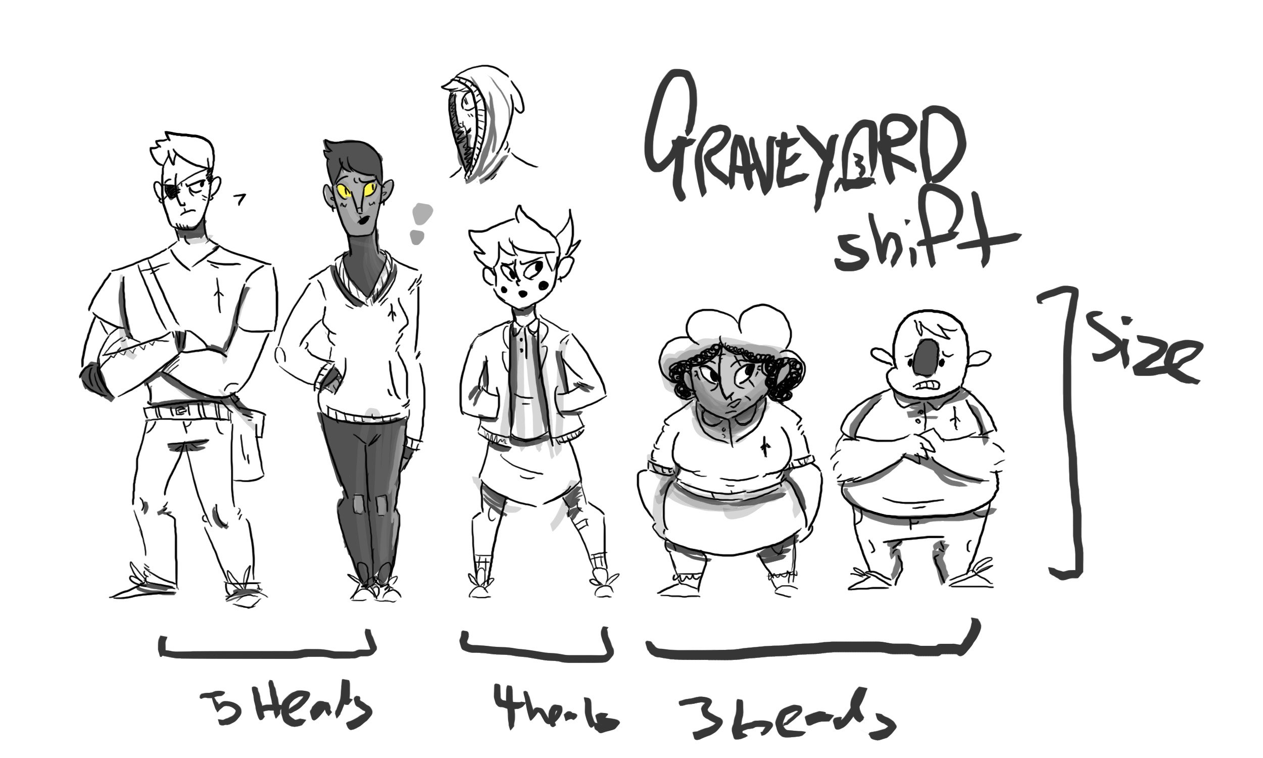
Some (very-rough) fully body portraits of the main characters for a webcomic I'm planning, with size comparisons. From left to right we have: Buck, Henri, Barbara, Agatha and Crange.

Here's a weird creature I dreamt up...
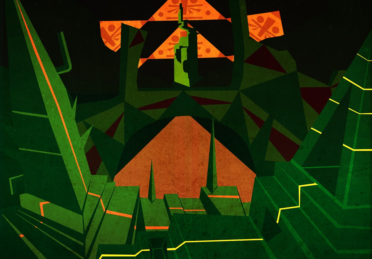
And lastly, my depiction of R'lyeh, done with a mouse. I tried for a vector style, which I usually don't do, and I quite like it.
Thanks for having a look, I will try to post more as I do more")
Here's some concepts for a personal project - kind of like a zelda-like game with elements of fantasy and post apocalyptic themes. We got a Fish Ranger (or Spook), a Mutant Road Warrior and a Warlord of some type.
Some (very-rough) fully body portraits of the main characters for a webcomic I'm planning, with size comparisons. From left to right we have: Buck, Henri, Barbara, Agatha and Crange.
Here's a weird creature I dreamt up...
And lastly, my depiction of R'lyeh, done with a mouse. I tried for a vector style, which I usually don't do, and I quite like it.
Thanks for having a look, I will try to post more as I do more
+1
Posts
(Sorry, I didn't have a chalk brush on hand)
Your characters and shapes are pretty nice/cute, I think refined coloring would give you some really charming work.
PORTFOLIO
PM FOR COMMISSIONS
EDIT Resized the image sorry, I uploaded in a rush.
PORTFOLIO
PM FOR COMMISSIONS
Working with harsh lighting just because. It's fairly rough and I didn't sink a lot of time into it but tell me what you think
PORTFOLIO
PM FOR COMMISSIONS
PORTFOLIO
PM FOR COMMISSIONS
less saturation more defined light source would go a long way
i think your stuff would make for great comics, lets see some comics!
INSTAGRAM
I tried to follow both critiques with this one, but I'm very mediocre at colour palettes. Anyway, this one's a Halfling Druid/Ranger, and rather than go just green for trees I thought I'd make him a bit more autumn themed. I'm loving Manga Studio, it just makes the whole process that much easier.
@earthwormadam I do do webcomics, here's a snippet from my Seinfeld parody comic. I did these almost two months ago so they're incredibly rough. I think this will be funnier without context, so here we go ( this is only one page because the website isn't up yet and I'm not posting the whole thing anywhere until then)
PORTFOLIO
PM FOR COMMISSIONS
The changes are subtle, but it's just enough to be able to see the details of the Ranger a bit more. But I am digging your style overall. There is something playful about it that delights me.
As for your comic, I can't really say much here. Since comics are gauged by style, panel design & overall storytelling it's hard to give you much of anything here without any sort of direction as to what to critique. I will say that it's odd how close up these shots are. It would be nice to have different shots, like a medium, far-away and so forth. Otherwise I feel as if I'm too close to all the action while getting not that much out of it. But it's all by taste honestly.
On your last one, I think it's better but still suffering from the same problems. First of your background is distractingly saturated. That is never good. Also, I think just breaking your figures down into simple shapes when you're coloring will help figure out a solid light source will help. SMY did a good job making some edits, but if you apply these theories from the get go, you'll be able to bump up the contrast even more and make your figures really pop.
I like the design on the ranger!
INSTAGRAM
I did a quick edit, but I don't think it's much better. This is a big hurdle for me and I gotta overcome it, so I guess I just gotta keep going with it.
Here's some panels from a comic I'm working on right now, a full two months after I did the previous one
PORTFOLIO
PM FOR COMMISSIONS
Hey! I'm not dead! Just been drowning under homework!
But because I'm terrible at homework, have a look at all the art I did instead!
(Working on my new style)
(A collection of 20-minute doodles with the aim of designing characters quickly and working on form/shape/movement)
Critique please?
PORTFOLIO
PM FOR COMMISSIONS
PORTFOLIO
PM FOR COMMISSIONS
PORTFOLIO
PM FOR COMMISSIONS
I feel like I am the complete opposite with EXTREME details and fine lines, like I can't find a pen small enough for my detail lust!
PORTFOLIO
PM FOR COMMISSIONS
I like what I do, and I'm refining it to be the best it can be (ergo I have my work mutilated on this site). I just wanted to comment that you do simplicity well, and that I've tried emulating that kind of work and it's like nails on chalkboard in my head screaming "WHERES THE INTENSE DETAIL!!!"
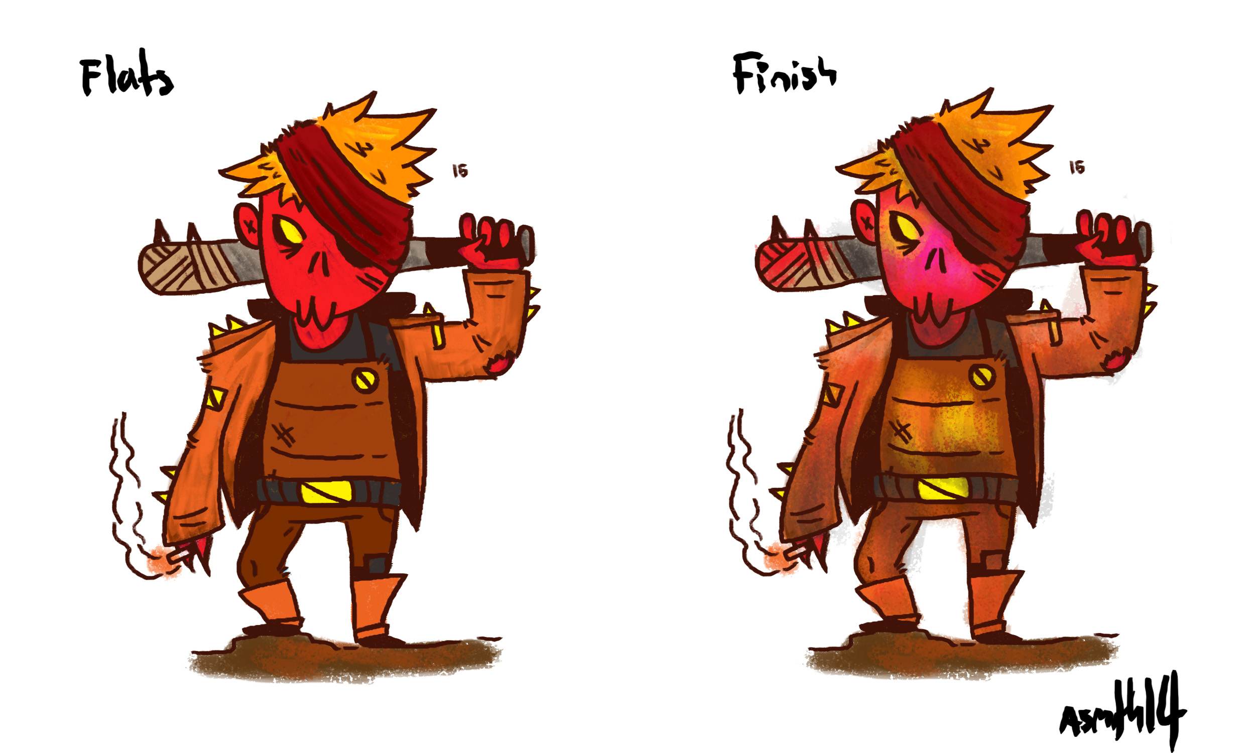
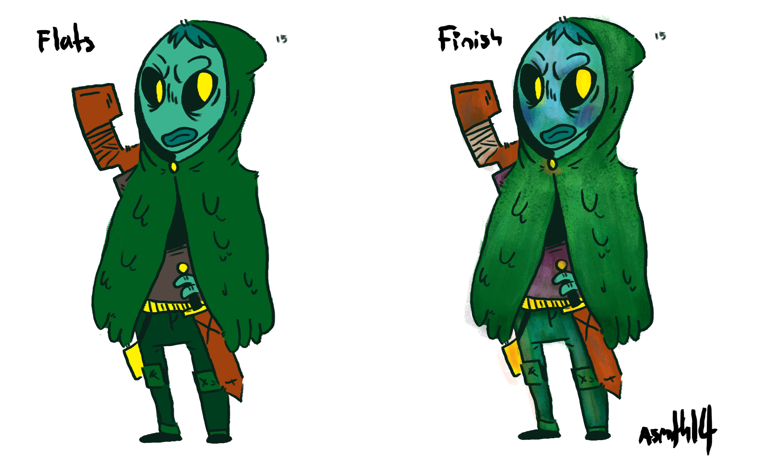
Developing characters for a web comic about the apocalypse and loneliness. My backgrounds aren't very good, but I guess the main focus of this piece is the character. Had an idea on the bus and came home and flesh it out
PORTFOLIO
PM FOR COMMISSIONS
PORTFOLIO
PM FOR COMMISSIONS