As was foretold, we've added advertisements to the forums! If you have questions, or if you encounter any bugs, please visit this thread: https://forums.penny-arcade.com/discussion/240191/forum-advertisement-faq-and-reports-thread/
Ruzkin's Precious Little Art Thread [NSFW]
ruzkin Registered User regular
Registered User regular
Hey AC, finally got the guts to start my own thread. I've been arting for a long time now, but never with any real sense of drive or will to learn. I thought I wanted to do concept art for a living back in the mid-2000s and even did a four year Industrial Design degree to further that goal, but I didn't put in the hard yards and basically went into a slump from '10 to '13 where I didn't output more than two or three doodles a year. But now, finally, I think I'm getting back on the wagon.
Some older stuff:
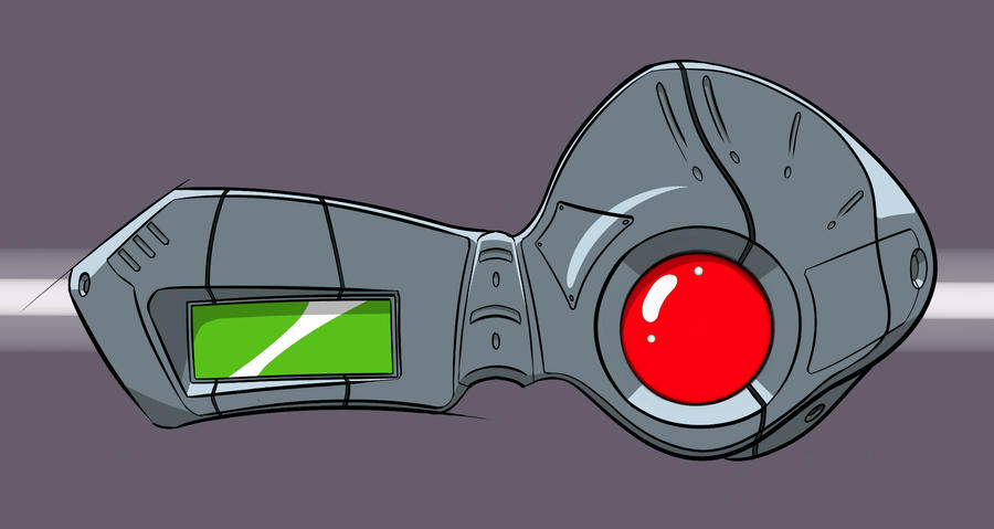


My current project:


Critiques are absolutely welcome!
Some older stuff:
My current project:
Critiques are absolutely welcome!

Iruka on
0
Posts
Blogs: Endless Space - galaxy seeds | Diablo 3 duels
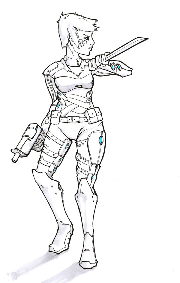
The rest of the pic (I'll adjust the other values to match those on the face if people think I'm headed in the right direction)
Also a doodle:
(I'll fix that.)
But yes, taking the tall boots from the photo I reffed from is my one concession to sexing up the character (as opposed to boob-windows in the armour, or something equally ridiculous).
They be called "condenser vents", its well known and documented that female assassins divert more heat to the chest and groin area than their male counterparts.
The stiletto heals just don't make any sense...
answer? because it looks cool.
imo your critique is selective.
There's a prevailing design thought process where things that look cool should also be a conscious choice. What are some reasons why a character would be dressed this way, or carry this equipment? If it looks cool but I can't visualize it as a working piece of equipment it breaks the immersion of the fantasy a bit.
I feel like the biggest hurdle here is just practice, practice, practice. Try not to fixate on a single piece, try to figure out different ways to approach a composition, whether it is through changing poses, color, and so on. The work looks really stylized which I think can work, but probably won't have the painterly quality I think you want.
Uncanny Magazine!
The Mad Writers Union
So does equipping a future assassin with a sword instead of a fucking sniper rifle.
I wasn't intending to critique his drawing with "it looks cool" , rather I was saying that design used to be more about how awesome we can make something, rather than is this a real thing that could actually exist. For example, let's think about cloaking in video games. It serves the purpose of getting you in close to someone and using your badass sword in close range. In real life that wouldn't be practical. Snipers would have a cloak instead of camouflage and would assassinate the person FROM RANGE, not up close where their target could gun them down with a shotgun. The proverbial knife in a gunfight.
My point was that the criticism that was given falls flat when taken as part of a whole. I don't think his idea was a realistic design but some badass future science FICTION lady. If you're going to critique functionality, critique the whole thing, not just whatever is popular to hate at the time to retaliate against the mainstream chauvinism.
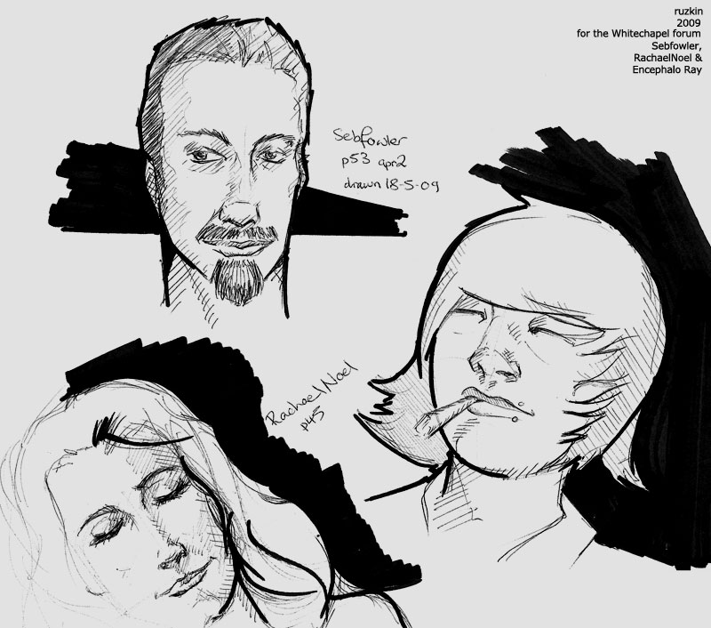
Today's 5 min sketches, all from photo ref.
They are complex forms, and simplifying them without a good knowledge of how the forms work is going to be difficult. That color speed paint looks like she has weirdly turned out eyelids, and the eyeball itself feels flat.
This week - more quick bodies, some perspective landscapes and some hand studies.
This kind of study can be really great for bootstrapping your rendering and observation chops, but to get the most benefit you have to try to really nail it. Even without seeing the ref I can tell that you're playing it a little looser than I'd like to see.
Quick paintover as promised, I'll try to address each step in the gif below:
Here are the biggest issues that grabbed my attention:
1. There's some very over-exaggerated proportions around the hips, at lot of the big shapes are a bit off in general.
2. The head is very simplified and the portraiture isn't a good likeness of our model.
3. The values feel a bit crushed in the lightest areas and there's some missed subtlety to the softer forms of the anatomy, which is making things look a bit flat. Particularly noticeable on the torso.
Addressing the proportions, something I do a lot when drawing from observation is to compare the negative shapes made by contours between my drawing and the reference. It's a way to simplify the drawing problem down into comparing relatively simple shapes, rather than considering entire complex structures. For our purposes here, it makes it pretty easy to see that the hips in the study have grown far more full and voluptuous than what we can actually see on our model.
The first step was just taking a fat brush and reshaping the contours, immediately solving or improving a lot of the drawing problems in one step. You'll notice that I crudely painted over the cloth in this step as well-- mostly I'm just trying to get rid of the linework. I'm not a master of drapery and I don't honestly have a lot to say about it, but I feel that the best approach is to think of it in terms of shapes and masses rather than as a linear problem. The shape of the hair and upper arm also got some tweaking to bring them more in line with our reference.
The next step is mostly softening or reshaping edges and blending values to make our light a little more convincing, or adding in missed details like the subtle abdominal furrow above the navel. This stuff is basic painting chops, paying attention to edge work and understanding how the light is hitting the subject.
At this point I felt that the working value range was a little too narrow, so I took a big soft brush set to multiply and slightly darkened up the entire figure. By pushing things a little darker, we free up some breathing room to create a greater sense of contrast in the lighter areas without necessarily having to resort to brighter values. It's not a strictly necessary step, but it makes things a bit easier on the next step where I'm going back into the lighter areas with an opaque brush and continuing to refine the edges and bring back some of the shapes that got darkened.
Next, I went in and just repainted the whole head as a point of demonstration. Portraiture is a complex matter in its own right and I don't want to dwell, but put briefly the face you drew is pretty clearly mostly invented and not much like the one in the reference. There aren't really any easy tricks here, you just have to observe closely and be a stickler for accuracy. I'm working pretty fast and loose here so even the head I put in is not quite perfect, but hopefully it's good enough to illustrate the difference between your head and the ref. Doing some longer portrait studies is a good way to get better at this and improve your observational skills in general.
The last step is a relatively minor one with some embellishment on the hair, and and developing the cloth a little more.
There are still some unaddressed drawing problems that more careful measuring and accuracy checking would catch, the head is a bit misplaced and the torso is a little bit too short to name a few, but hopefully I've hit the major points with some kind of clarity.
Serious thankyous for taking so much time to help me out. I don't have any progress on this piece to post yet, but I thought it'd be rude to leave you hanging. There are a whole raft of things for me to work on here - my observational skills first and foremost as well as my attention to detail. You're completely right, the face was mostly invented. What's more damning to me is that the woman's cloth skirt wasn't invented, but side by side with your work it becomes clear that I simply wasn't looking.
So. More training on that.
I also think I'm hurting myself by a) trying to separate values so harshly, and b) by using such basic hard, round brushes for this sort of work (I'm using Clip Studio Paint). They're pushing me towards a harder, more cel-shaded style, which I know has its uses but probably is only holding me back when trying this sort of study.
The only other suggestion would be to standardize as much of the text placement as you can. Your name could be in the same size in the same place on all of them without any ill effect, compositionally.
Are you generally working at a super small resolution? Seems like you have a lot of messy, choppy strokes, and I'm not sure if perhaps you have a super small tablet or some other limitations that may be working against you on that.