As was foretold, we've added advertisements to the forums! If you have questions, or if you encounter any bugs, please visit this thread: https://forums.penny-arcade.com/discussion/240191/forum-advertisement-faq-and-reports-thread/
Girl nextdoor (NSFW)
Windburn Registered User regular
Registered User regular
It's been a long time since I posted here. In fact, the last time was around the Shadow of the Colossus contest. I would have resurrected my original thread, but apparently they get purged after so long.
Anyway, every now and then I get the itch to draw something and it basically consumes my life until I scratch it. Now that it's finally (more or less) done, I'd like some feedback. On previous pieces, the majority of critiques posted said my pieces looked "plasticy" and lacked a sense of texture.
Thanks!

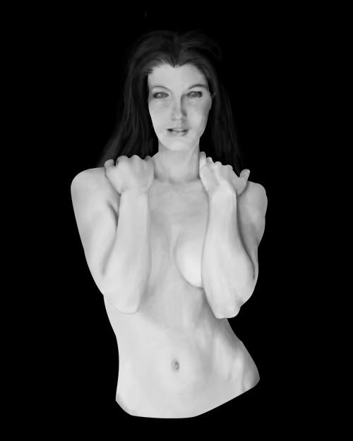


10/22/06

10/24/06

EDIT: Adjusted her eyes so that she no longer has a cataracts (plus a few other minor tweaks).
EDIT2: See post below.
EDIT3: See post below.[/img]
Anyway, every now and then I get the itch to draw something and it basically consumes my life until I scratch it. Now that it's finally (more or less) done, I'd like some feedback. On previous pieces, the majority of critiques posted said my pieces looked "plasticy" and lacked a sense of texture.
Thanks!
10/22/06
10/24/06
EDIT: Adjusted her eyes so that she no longer has a cataracts (plus a few other minor tweaks).
EDIT2: See post below.
EDIT3: See post below.[/img]
Windburn on
0
Posts
I updated the image with larger/closer together eyes.
Sam
I tried to symmetrize (I don't think that's a word) the cheeks. On the forehead, are you talking about the hairline or skull structure?
Sry for manipulating your pic, the rest of it looks so awesome :^:
See what I mean?
...and the eyes are still a bit too far apart
- great animation focused website http://www.catsuka.com
I updated the original post with a new version that hopefully addresses some of your suggestions.
Ape2001
I'm not entirely sure what you mean by "bruised." I tried to tone down some of the contrast so that the shadows looked less like bruises. Is it better now?
Sam
I trimmed down the (her) right jaw and deangulated the left cheek bone. Does she look a little more symmetrical now (realizing that we are picking up a little of the left side of the face that isn't visible on the right)?
I haven't reworked the forehead or hairline yet, but I plan to.
Thanks again for your help. Please keep the advice coming.
Anyway, I would say it's better now! Really good work
- great animation focused website http://www.catsuka.com
Otherwise this has great potential, nice rendering for sure. Just some skeletal issues.
Thanks!
DuckM4n
I think this may be more an issue of personal preferance, but I'll keep your critique in mind. If others agree, please speak up. She's supposed to be attractive (realizing, of course, that everyone's tastes are somewhat different).
M2tM
You took the words right off my to-do list. She really does have 4 fingers, but the way its drawn right now, that's not at all obvious. Other than the right hand, what other skeletal issues do you see?
Thanks for the compliments, as well.
P.S. For those interested, just so you don't think I've abandoned the piece, I won't be able to work on it for at least a week (exam time).
her right breast seems to lack the definition or "pop" that her left has in the image
her left hip has a strange defintion to it,... almost looks like a tan line left from a bikini or something weird with the bone there
Just so I'm clear, do you mean her left or our left? Her left has some odd muscle definition that I plan to correct, if that's what you're referring to.
The right breast is being shadowed by her right arm, but I could probably draw it out a little bit more.
What you're seeing in her left hip is the iliac crest, but it's probably overly defined. I'll tone it done some.
Thanks for the suggestions!
sounds good!
I finally manged to carve out some time to work on it this weekend and hopefully addressed some of the suggestions.
New version:
Shortened left eyebrow
Smoothed her right neck angle
Defined the upper lip
Fixed right hand (4 fingers!)
Smoothed the left deltoid
Drew out right breast
Toned down iliac crest
Deshadowed the nose
Gave the hair some love
Thanks again for the feedback. Keep it coming!
edit: oh i SEE. You changed the original ... hehe my bad.
edit 2. her forarms are different sizes and both look too airbrushy smooth. Also on her hip there is a weird mark that looks like someone has photoshopped out a thong, if you can see what i mean.
Looks really good apart from that though.
That's how I've updated this thread previously. Would people prefer updates to be new posts? I figured it would be kinder to not have to load scroll through more and more pictures everytime the thread is viewed, but... <shrug>
I'd say her right wrist could use more shading as could the right upper arm, these spots look still pretty flat for me.
What itches me still is her right upper corner of her face. This bump looks just out of place...better use a pic:
- great animation focused website http://www.catsuka.com
I see what you mean about the forearms.
However, could you be a little more specific or do a quick paintover on the hip to show me what mark you're referring to?
Thanks!
I like to see earlier versions so i can see the progress.
edit: damnit grif
Sure thang!
It's tough becaues you're going for photorealistic and hair is just a huge beast to conquer. Good luck and good work so far.
When I said skeletal issues, I meant that the whole thing was well rendered, the skin was appropriately treated, but that the anatomy was a little odd in some places, but just enough that it's hard to put your finger on it.
The hips may be too narrow or the shoulders too wide, I'm not 100% sure about that, the left and right forearms are indeed different sizes and the elbows are a little too cleft. The left hand (her right) is not nearly as strong as the right (structurally) in a few ways. The thumb and the two fingers next to it are a little awkward probably partially because of the entire wrist area on that hand being a little off and that hand's perspective isn't as good as the other. Also, I don't know if that neck/head is of proper proportion.
Get a female friend to pose as such, take a picture and overlay it. Don't use it to trace, just to get a sense of scale.
Holy crap, I wasn't able to pinpoint anything wrong with the picture until you pointed that out. The shoulder on our left, in particular, seems too long and angular.
edit: Also, am I crazy or is her belly button too small?
Concerning the comparative size of the forearms, I did some quick measurements and, roughly accounting for the perspective, they're similar. However, they still look off to me (damn I hate how when something wrong is pointed out, that's all you can see). Any specific suggestions here?
Thanks again for all the feedback.
As for the width in general, I have pretty broad shoulders, and I put my hands up like that, I've got no more than an inch between my little finger and the edge of my shoulder. Inch and a half, tops. The one on the right is just on the big side of believable. The one on the left is ridiculous.
When you have them right next to each other, you can see how much less "coat-hanger" her shoulders look like. I REALLY think it helps the pose too.
On my paintover, I think I overexxagerated the muscles over the shoulder, but oh well... Maybe she's a bodybuilder? I think this is what Tynic meant about the shoulders though. Don't believe my paintover though, just work on it yourself and I'm sure it'll turn out fine.