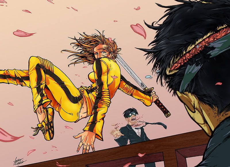
I like it. Only crit is that her breast looks like the tip of a torpedo. Also, I'm not too sure what's going on with the (cut?) mask of the guy in the foreground. Right now it sort of looks like it just spontaneously ripped apart to me.
my biggest concern is that the guy in the background has a totally different feel of color to him than the rest of the painting. no black outline. if the rest of it were done that way it would look even better imo. her hair should be a solid mass instead of individual strands. make the end of the sword visible behind her head, it seems short.
Anyway, yeah, this looks really good. Nice dynamics, and a solid coloring job. Very nice job on the fabric and how it folds. I wish I could do that!
Okay so on to the crits. I think the foot is way too small. Perspective wise, it is right next to the hand, and it looks small by comparison.
It could be that the hand is too big, and it's making the foot look small. Either way something doesn't seem right. The hand also suffers a bit from man-hand syndrome, but maybe you were just shooting for uber-Uma realism.
The cuts on the crazy 88 seem to be completely random, when looking at what the bride is doing at the moment. Example: The guy in the background is being sliced, but her sword isn't swinging in any way to be cutting him in that fashion. The guy in the foreground I don't really get, as mentioned above.
Also I think the picture could use a little more detail in the pink leaves, they look like they aren't from the same picture IMO.
Overall it is one of the best killbill fan arts I've seen.
I like it a lot. I don't think her foot is too small; it seems to be the length of her forearm, which is right. And I don't have a problem with the big hand either. It's something about the way she's colored that's bothering me. I don't know how to explain it, except to say maybe it's a little flat. It just seems like yellow and brown blah, not very dynamic. Not a legitimate critique, I know. Maybe someone else can put it into better words.
Factual Based Crits:
Did you use reference for the sword from the film? The "Hatori Hanzo emblem is on one side of the sword, I can't recall any writing on the blade. Check out some screenshots for authenticity just to be sure (if you care at all)
Uma thurman has big feet and hands visible when she is regaining the use of her feet after escaping from the hospital. So check that and then consider the foot size.
To me, it looks like the guy in the background is a different drawn style than the foreground two. He looks like a cartoon character, while she and from what I can tell, the dude without the scalp look a little more realistically drawn. Still a sweet drawing.
Crits have already been covered. I just want to say that I like the way you've drawn Kiddo's face more than in any other Kill Bill-inspired art I've seen yet.

Posts
my biggest concern is that the guy in the background has a totally different feel of color to him than the rest of the painting. no black outline. if the rest of it were done that way it would look even better imo. her hair should be a solid mass instead of individual strands. make the end of the sword visible behind her head, it seems short.
i like the composition and the colors.
Anyway, yeah, this looks really good. Nice dynamics, and a solid coloring job. Very nice job on the fabric and how it folds. I wish I could do that!
Okay so on to the crits. I think the foot is way too small. Perspective wise, it is right next to the hand, and it looks small by comparison.
It could be that the hand is too big, and it's making the foot look small. Either way something doesn't seem right. The hand also suffers a bit from man-hand syndrome, but maybe you were just shooting for uber-Uma realism.
The cuts on the crazy 88 seem to be completely random, when looking at what the bride is doing at the moment. Example: The guy in the background is being sliced, but her sword isn't swinging in any way to be cutting him in that fashion. The guy in the foreground I don't really get, as mentioned above.
Also I think the picture could use a little more detail in the pink leaves, they look like they aren't from the same picture IMO.
Overall it is one of the best killbill fan arts I've seen.
INSTAGRAM
Did you use reference for the sword from the film? The "Hatori Hanzo emblem is on one side of the sword, I can't recall any writing on the blade. Check out some screenshots for authenticity just to be sure (if you care at all)
Uma thurman has big feet and hands visible when she is regaining the use of her feet after escaping from the hospital. So check that and then consider the foot size.
Otherwise I like it, cool.
Also, why does the guy in the foreground with the cut showing brain matter not have any skull?
Just a minor snaggle to me, looks awesome though.