As was foretold, we've added advertisements to the forums! If you have questions, or if you encounter any bugs, please visit this thread: https://forums.penny-arcade.com/discussion/240191/forum-advertisement-faq-and-reports-thread/
Options
Scosdump, finished painting pg 2.
Scosglen Registered User regular
Registered User regular
!!!: If you're too lazy to look down and read, this is now a dump thread~
My latest attempt to grapple with my old arch nemesis. Looking ESPECIALLY for hard crits of what I'm doing wrong with the color (or If I managed to do anything right), but any commentary is welcome! I really wanted to try doing something with strong directional colored light, since one of the things that I have the hardest time with is how colored light changes the color of an object's base color. Anyways, here's the process so far.
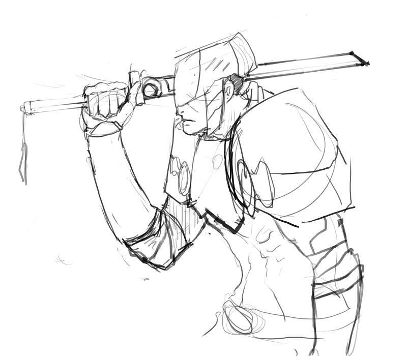
have at it.
NEW UPDATE Oct 17: I really appreciate Bacon giving my thread a proper kickoff and everyone who followed suit after him, I wanted to show you guys what I've changed. If it's a rough area I probalby just haven't gotten around to smoothing it out yet. Changed some anatomy around (moved torso up, rotated forward arm, made the sword arm less noodly near the elbow, tweaked levels a wee bit for more contrast and starting working in dark darks in the front, among other small changes.
My latest attempt to grapple with my old arch nemesis. Looking ESPECIALLY for hard crits of what I'm doing wrong with the color (or If I managed to do anything right), but any commentary is welcome! I really wanted to try doing something with strong directional colored light, since one of the things that I have the hardest time with is how colored light changes the color of an object's base color. Anyways, here's the process so far.
have at it.
NEW UPDATE Oct 17: I really appreciate Bacon giving my thread a proper kickoff and everyone who followed suit after him, I wanted to show you guys what I've changed. If it's a rough area I probalby just haven't gotten around to smoothing it out yet. Changed some anatomy around (moved torso up, rotated forward arm, made the sword arm less noodly near the elbow, tweaked levels a wee bit for more contrast and starting working in dark darks in the front, among other small changes.
Scosglen on
0
Posts
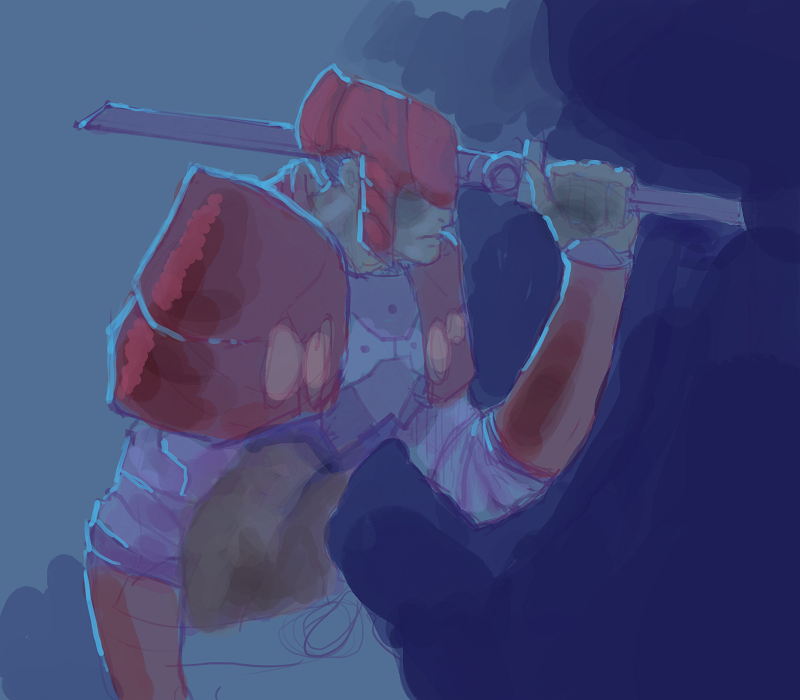
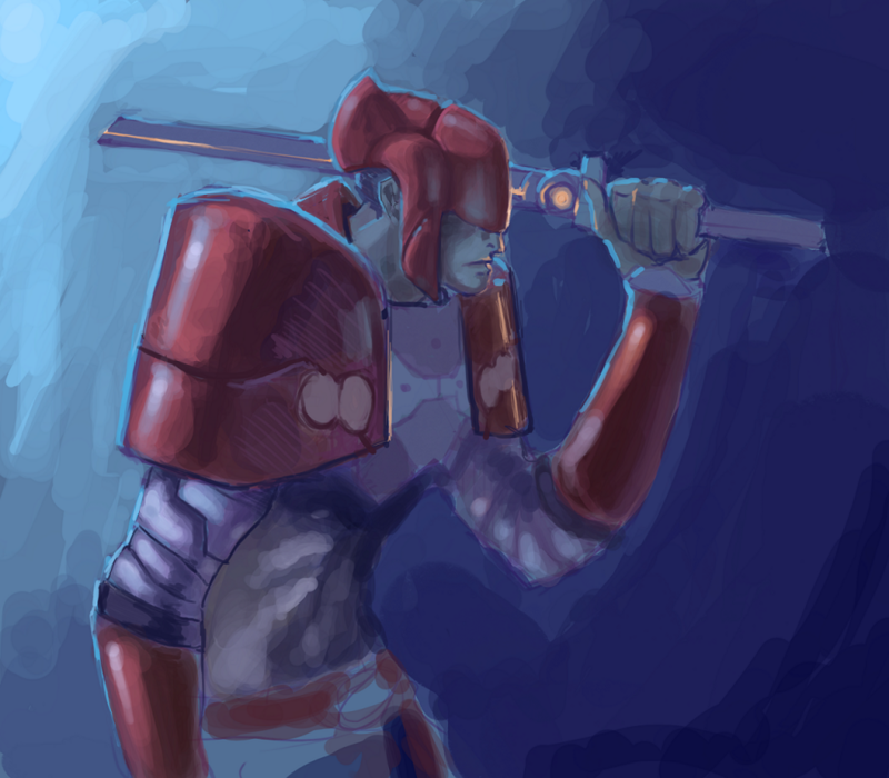
Somehow the the blue light on #3's helmet appears more like an outline to me than a reflection of the surface. This went better in #2. Maybe it's caused by the loss of line variation it had in #2, I think.
- great animation focused website http://www.catsuka.com
I see what you mean on the helmet, I think i accidently pushed the light forward a bit when I was going over it again, I'll probably pull the outline back a little bit in a few spots in the next updates.
The proportions are somehow off. The forearm, for example, is around a hands-length too long. If you want to maintain the horizontal blade (which I think you should do), you need to raise the elbow a bit.
Still, as I said, it's looking quite cool so far.
First off, I gotta say it's starting off pretty strong. I'm just going to bitch about lighting because that's what I do and the fact that I'm going to do it yet again probably comes to no surprise to anybody. In fact, I'm probably going to bitch too much about lighting in the hopes that at some point of actually saying something useful, so don't take too much of it too seriously because I'm not in the mood for a fight.
Proportional issues; yes, there are some. Whether or not the proportions were an intentional style thing is up for debate (or rather, maybe you should just tell me whether the were or not), so I won't touch it. I'm not a resident expert on that front in any case.
If you're shooting for a somewhat realistic sort of rendering, I'd reccomend not being afraid to mix in some black, or at least darker hued values in the shadow areas. Yes, With secondary or ambient light sources you can justify getting rid of almost all dark areas, but it's almost impossible to eliminate all shadows in a real-world situation. Even in a brightly-hued picture, little touches of darkness can add a lot in terms on contrast.
form on back of helmet has become much more ambiguous since the initial sketch, with the shadow indicating a dent going inwards near the middle, and then curving outwards in the back, which would make a dent in the guy's head.
"Outlined" light.
Obviously going for a rimlight effect, but the uniformity of it makes it seem artificial. For example, you apply the same effect from the shoulder armor and forearm armor to the white potion of the arm. I'm taking it from the application of specular highlights to the armored portions these are meant to be shiny and the more diffuse shade on the arms that they are not so shiny- therefore, while there still may be a rimlight effect happening on both portions, the arm would have this light's effect more integrated and less prominently focused looking as the shiny armor; the light being distributed among the surface instead of being reflected back.
Speaking of that arm the shading there seems to be based a bit too heavily on the internal lines there, rather than the overall form of the arm. Now, I realize that your intention was to create the effect of overlapping forms with the shade, but applying the shade evenly to both sides of the line make it seem less like pattern or overlapping form than it creates a sort of "Michelin Man" effect of a series of bulges.
Cast shadows- neck area- while not necessarily being as black as how I've rendered it- should be recieving some sort of shadow from the back neck collar. Ditto for the back (sword) arm- the body should be casting a cast shadow on most of the arm; doings so also helps to push the arm back in space a bit.
Some confusion if blue light is straight behind or somewhat to the front- outline rimlight vs speculars on shoulder armor.
Forms not defined- back collar, forward forearm. This is a drawing problem more than a painting one, but some spots (esp. the forward forearm armor), the linework doesn't convey the foreshortening as it should, making a flatness. Now, it could be that instead of a perfectly flat circular shape at the top lip of the forearm armor you meant it as the armor curving upwards at the back to cover the elbow, but the form here is not yet given enough definition to indicate that idea.
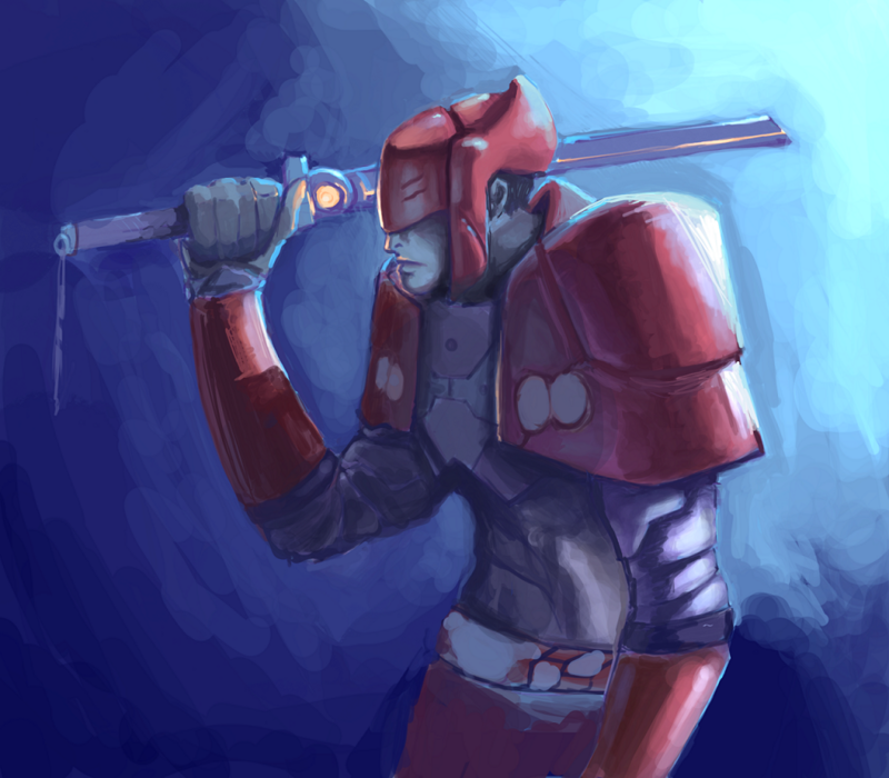
Aaaaaaaaaaaaaaaaaaaaaaaaaaand a paintover just to prove to myself that what I'm sayin' has some kind of actual basis in reality and I'm not just giving you a load of smart-sounding horseshit. Although yeah, my way is not necessarily what you were going for, the best way to go, or worth anything for any purpose other than to illustrate my ramblings about lighting- just want to make it clear it's not an attempt to steal anybody's thunder, as my paranoid brain sometimes suggests is what some people might think of it.
Now, I'm gonna go to bed.
Twitter
srsly, damn you
Thank you so much Bacon, best crit I've ever recieved! :O
Proportions: I did want it to be slightly exaggerated, although I may have gone a little overboard in my initial sketch, I did some resizing of the arms and torso placement in the newest update that makes him a bit less lanky.
Dark shadows: I suppose I can blame my painting teacher for this, as one of the things she always told me was that "real painters never use blacK" and it sort of stuck. I definitely see how you've used them in the paintover though and I'll try incorporating some deep shadow.
Agreed about the helmet, I'm redefining it in the current update because that one reads weird.
Outlined light: This is the first time I tried doing "rimlights", and I've been working on making it more logical in the newest update, but I see what you mean about the "matte" arm parts being less outliney.
I went a little nuts with the speculars and the rimlights so I can see how that might confuse it a bit, I'll make those more unified.
Definitely agreed on the michelin man arrms!
And you don't ever have to prove what you're saying for me to believe it Bacon, but thanks so much for the completely unexpected and completely awesome paintover.
Well, if you're going for a deliberatly stylized anatomy I'd reccommend taking it even further in exaggeration to make the stylization obviously deliberate. Stylized or realistic is fine, as long as the viewer knows from the get go which one their looking at.
And the 'real painters don't use black' thing is mostly myth and a little bit fact. The only actually famous painter I know of that made a point of not using black in any of his works was Monet (a some experiments by Sargent when he found out Monet was doing it, but personally my favorite paintings by him are very black heavy), and that's partly reasoned as a reaction against the overly heavy black and white based painting techniques that came before it.
The only bit of fact to reccomend the adbstience of black is something to do with actual physical paint pigment, where mixing colors can give you richer "blacks" (in reality, just really, really, really dark colors) than a premade black pigment out of the tube. When working digital this is less the case, but you can still benefit a bit from it by after you add black to your shadows, eyedroppering the resulting color, bumping up the saturation and painting back over it with that richer tone, to avoid sapping the hue from the shadow areas.
Twitter
My only question is where is the light coming from that is hitting the front of his face? The little decorative circle near the quillion of the sword? Personally, I would make it a little bit brighter, unless you plan on doing something else with that light.
I have a LOT more in my sketchbooks I could post, but I lack suitable scanner atm, so here's a few pages and little digital things.
Most of these are just little exercises or experiments, I'll see if I can't get some more pages scanned soon.
INSTAGRAM
Not that this matters a whole lot at all, but I think AOB was talking about MANET, not MONET. Manet was an earlier influence for Monet. I always remembered it because Manet comes alphabetically before Monet. On the off chance you're actually going out to look for reference for black used in paintings, search Manet.
Black is hard to use well because it's vague. It can't cover up mistakes the way color can. Unlike the Romantics (lots of blacks with strong contrast) Impressionists were all about showing the glorious effects of light, so they tried to abandon the use of black when they could. The eye rarely (if at all) see's black on a day to day basis in a natural setting. It's a STRONG commitment to a form if you use black, so it has to be drawn very well.
Also, black tends to create "black holes" in your painting if you jump to black too fast. This is more important for the process than the end result. Like AOB said, the best I can remember it being used was for suitcoats in older famous paintings. Be careful of going too black or using black on too much of the surface.
No, I didn't. Manet used black. Monet didn't.
And I can speak with authority on everything Monet because my Mom has bought Monet desk calanders and day-planners every year for the last 20 years. :P
Twitter
Reveal your secrets!
It's pretty neat, like drawball with a chatbar, layers, and decent drawing tools, and no blithering idiots who constantly scribble all over your stuff. The canvas isn't huge but there's usually space to add your own little piece, it resets every 12 hours, and since the CA.org community is just generally crazy, you occasionally find awesome little doodles left behind by some pro during a lunchbreak or something.
My digital art! http://forums.penny-arcade.com/showthread.php?t=8168
My pen and paper art! http://forums.penny-arcade.com/showthread.php?t=7462
Going for the "ripply muscle" look. It's difficult to make up convincing fake musculature :S
XD
Really interesting sketchbook, like your lively armordesign ^^
- great animation focused website http://www.catsuka.com
[edit] fuck, I love em all![/edit]
Thevo1ta: Thanks
New rough WIP
Originally he was going to be holding a sword, but I decided to give him a gigantic enchanted sentinel sword that he controls telepathically instead.
I have some graphite stuff I really want to post but again I'm having a hard time finding a scanner :S
Love your work, good buddy. Good to see that you do studies, unlike me... :oops:
The one thing I'm noticing in lots of your pics is the men have very short stubby legs. I think if you payed more attention to the proportions from the waist down they'ld be even better.
You pencilling skills are tiiiiiight- what hardness of lead do you use?
I also am really liking your approach to painting aswell- especially the little touches of highlights on the sword.
like everyone said- keep up the great work
Sublimus: Everyone should do studies! Go do one right now!
Raven: Thanks, I definitely agree about the legs and it's a bad habit from long long ago. Leg muscle structure is still something that I need to sit down and do a bunch of work with so currently I tend to downplay the lower half of my figures since I'm not as comfortable with that anatomy. Also I have a habit of working from top down in rendering and refining contours so if I don't finish a sketch all the way it's usually the legs that get skipped :S
CMT3k: Thanks for the kind words. I feel pencils are definitely where I'm in my element since It's what I used exclusively for such a long time. For general sketching I use a straight up 2B mechanical pencil. I have a set of fire art pencils running the whole gamut from H to 8B, but honestly I find that many pencils cumbersome to use and I'm satisfied with the versatility of value achievable with a single 2B.
It doesn't even seem like the same artist (the first post vs. the rest of the sketches). Your tablet work is quickly becoming to be on par with your pencils as well. I'm very impressed.
Today I started my new absurd exercise regimen, consisting of a minimum of one set of hand studies, one set of leg studies, one environment study, and as much sketching from mind and random observation as I can fit in the rest of the time, to be completed on a daily basis. Here's todays results (I made the environment a color study at the same time, bonus points ++)
My Portfolio Site