As was foretold, we've added advertisements to the forums! If you have questions, or if you encounter any bugs, please visit this thread: https://forums.penny-arcade.com/discussion/240191/forum-advertisement-faq-and-reports-thread/
Options
portfolio shizz
nat Registered User regular
Registered User regular
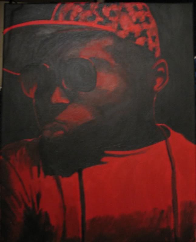
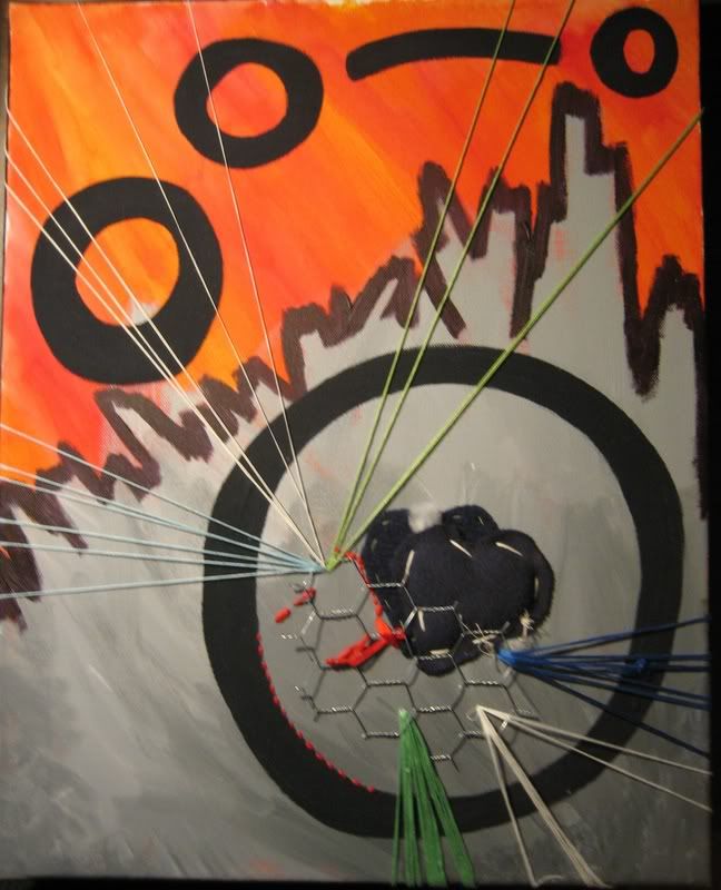
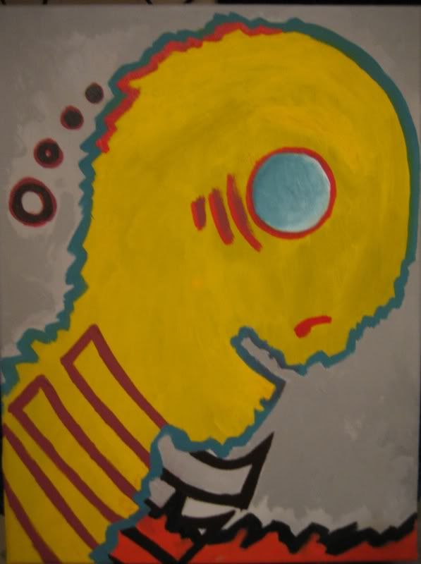
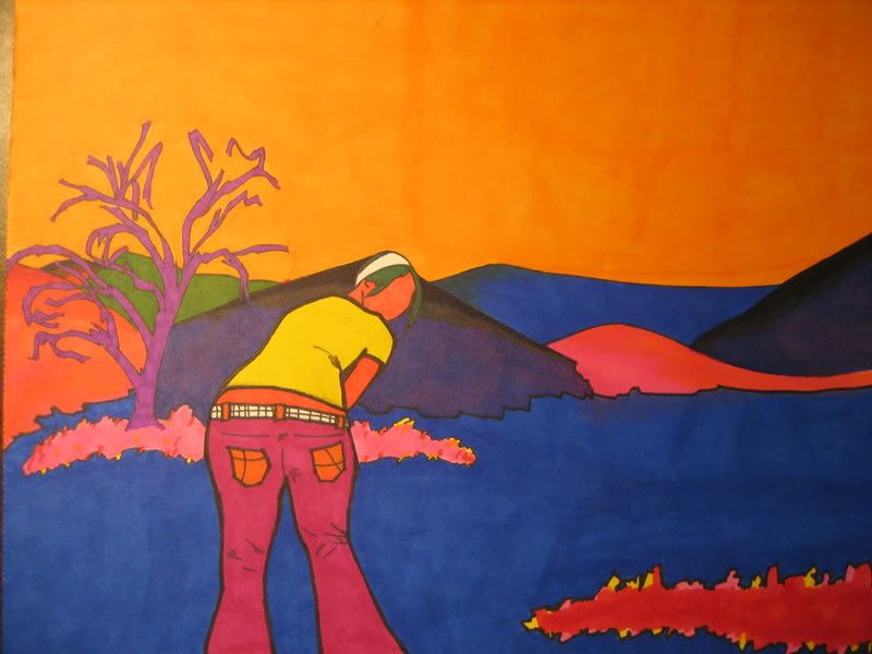
Hello everyone. I dont know how many of you remember me, but i used to be a regular around these parts back in the day. Well the time has come that I am a senior in high school and i have to get a portfolio together. These are some doodles i guess and then some of the stuff im planning on putting in my portfolio. Any feedback is welcomed and encouraged.
I'm also sending my portfolio in to the AP test, if anyone is familiar with that.
Anyways, thanks for looking.
I'm also sending my portfolio in to the AP test, if anyone is familiar with that.
Anyways, thanks for looking.
nat on
0
Posts
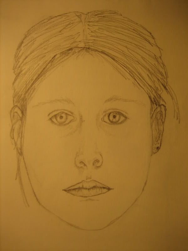
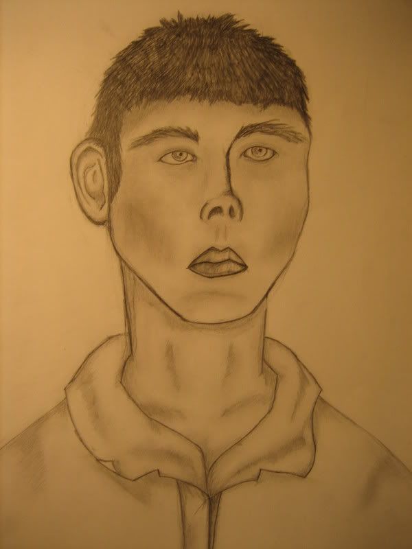
It seems like your abstract stuff is a lot better than your drawing from life. The two portraits you have shown are a little off in the features. Also, parts of them are shaded, but the shading and light is not consistent over the entire face - and the outlines are rather strong in both cases.
But overall, not bad.
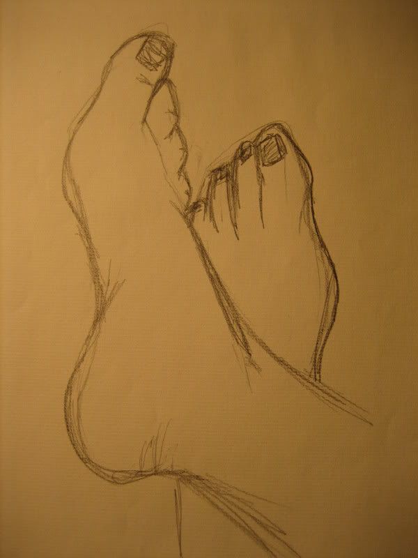
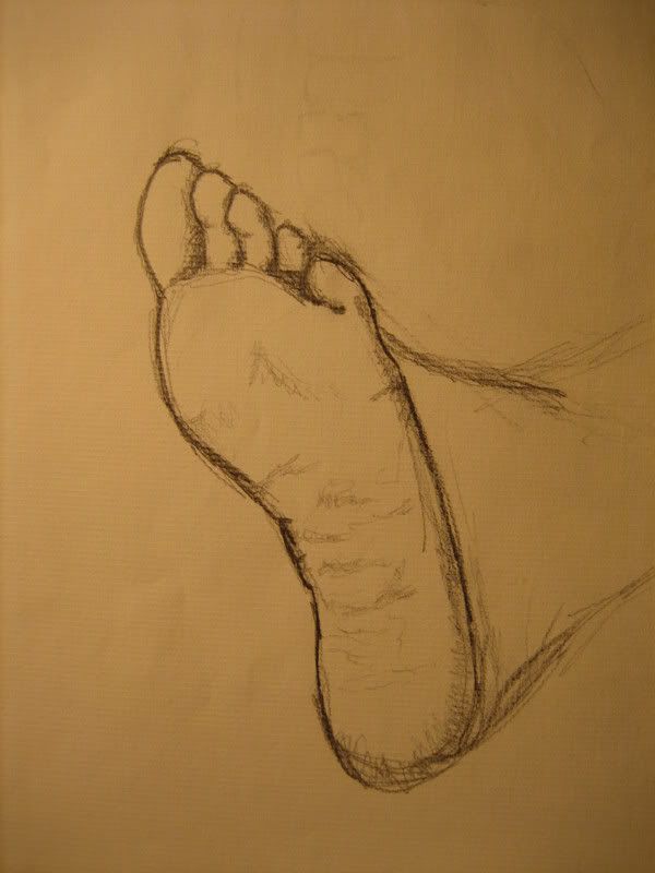
Its hard commenting on a art dump- but i will say that try and stay away from putting doodles in a portfolio- no matter who it is for. Your trying to show your best work- the pinnacles of your talents. Its (as a personal opinion here) better to have fewer awesome pieces than dozens of lackluster ones.
Agree'd
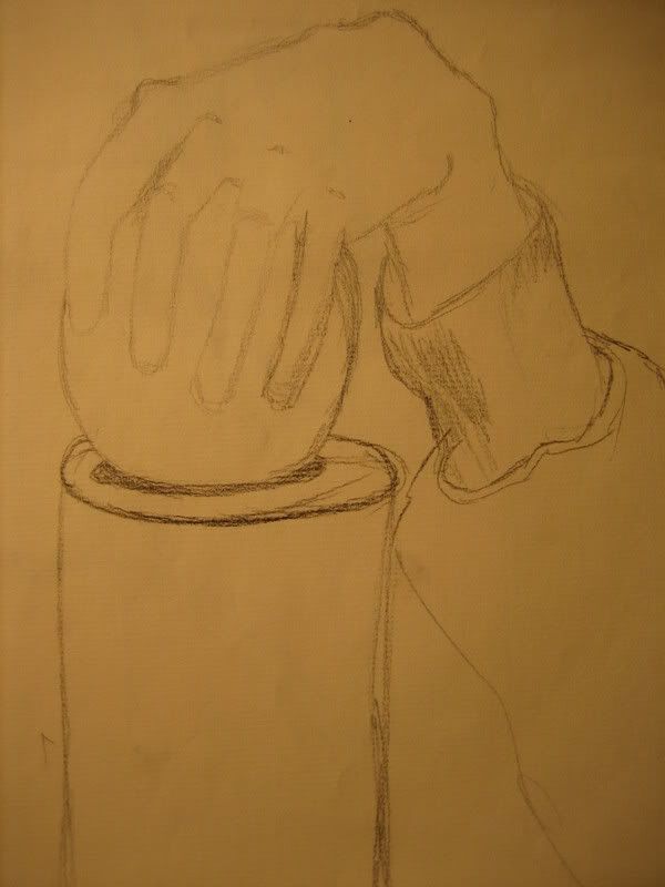
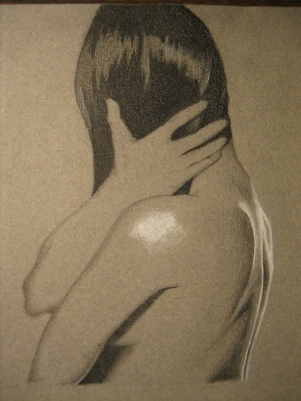
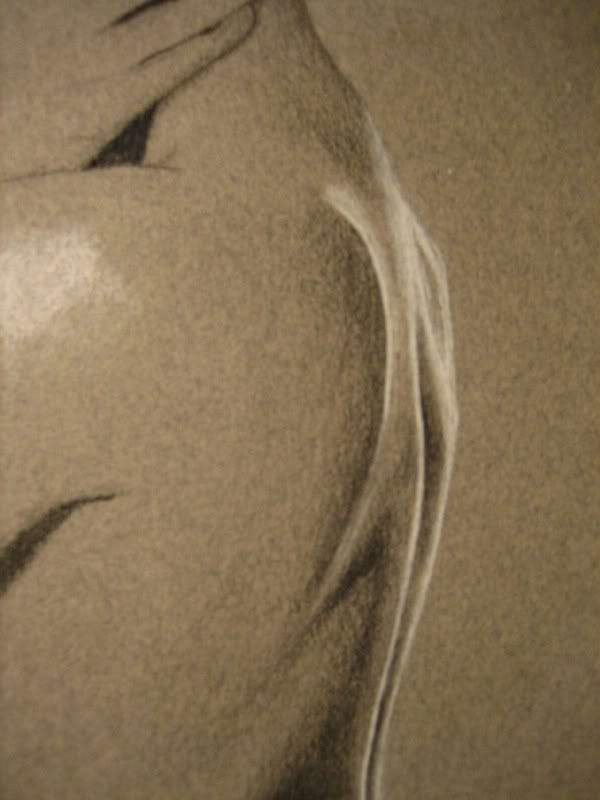
Her backside is well rendered, and even her hand is impressive. What is bugging the hell out of me is that big white island spot in the middle of her shoulder. Now i wasn't there to see the model, but I really doubt that that existed in the first place. A white so bright right there, but then nothing on the hand or the reast of the shoulder?
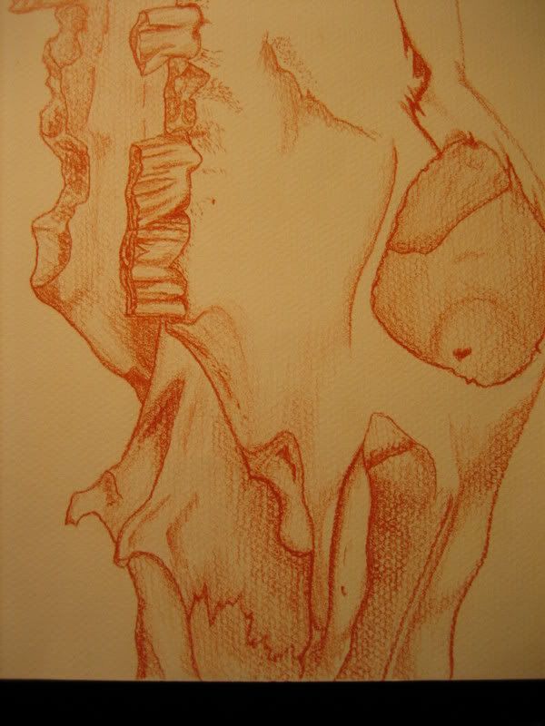
But if it was- this is a time when you make a decision as the artist to ommit somthing so awkward that doesnt have anything to do with the rest of the peice. It doesnt relate at all. I am diggin that skull though. I'd say the first 10 pics you posted need to be reworked to some level of completion or taken out and replaced.
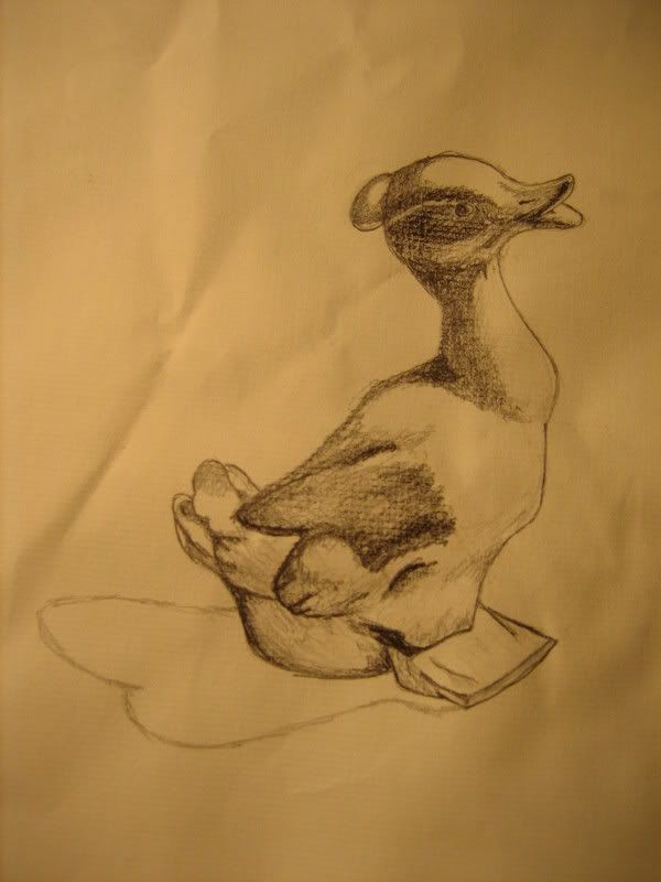
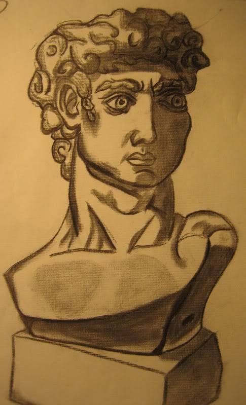
My best advice would be to count the skull and the girl as in the bag, maybe one, or two GOOD abstract pieces, and then start doing life studies like crazy. I see good potential with the duck, but the study of the sculpture way off (did you try to stylize it?).
More proverbial ducks and you'll be on your way.
I'm having trouble working on all 3 and figuring out what to do.
It's spiffy.
There are three parts of your portfolio.
Breadth- this is where you show your range. Studies usually go in here, examples of different techniques (perspective, lighting) also go here. These are also creative peices also, not just academic studies that show what you can do. Its about showing your range in interest and ability rather than "skill" based.
Concentration- this isn't only about creativity or whatever you want to do. Its a challenge to make a set of art (12 peices) that shows you expanding and exploring as you go through it. These should still hold the academic things you know, persepctive, compisition, lighting and all that jazz. Its like you pick one peice out of your breadth, and make 11 more going in the same direction- then you see where you end up. They even have you right a little paragraph describing your process and conclusion.
The last part, is the Quality Works section. This is where you send in 5 actual works, not slides, to show what you beleive is the best of your ability. This way they can get a look at what you really value as important in your art. And they check out craftsmen ship n'stuff too.
So yeah, the AP isn't all that simple, you will/should figure that out in time anyways- just heads up.
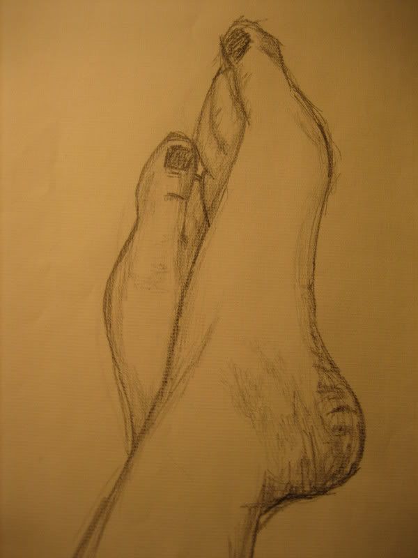
First off, your hands need work, all of em actually not just the wonkey ones in the second picture. The thumb is too long in the drawing of the woman's back, and they need some shading to, they seem really out of place with the incredible shading on her back!
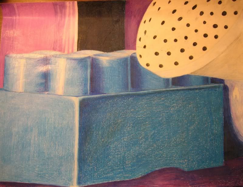
Some of you abstract stuff is spot on, and you should definetly expand on that as much as you can! Work on the life pictures though, definetly draw more faces and hands.
It's hard to crit a bid dump like that but i hope i got some of the main points.
Could you also be a little more clear as to what's going into your portfolio? If any of the first ten are included, I would seriously consider removing them or redoing them.
Please do not put the picture in images 7-8 in your portfolio. Its too simple and just feels like, didnt i see a street urchin selling that in the early 90's?
otherwise your good.
PS: the bust looks like a fairly poor rendition of Hercules from the disney movie, that stuff dont fly at portfolio reviews.
but i dont want to sound disheartening, you dont really need to worry about getting into art school, your good enough. (i got into the 4th best art school in the US and my portfolio was utter tripe)