As was foretold, we've added advertisements to the forums! If you have questions, or if you encounter any bugs, please visit this thread: https://forums.penny-arcade.com/discussion/240191/forum-advertisement-faq-and-reports-thread/
Options

Webcomic "Big Cookie" Feedback

kainakanokainakano Registered User regular
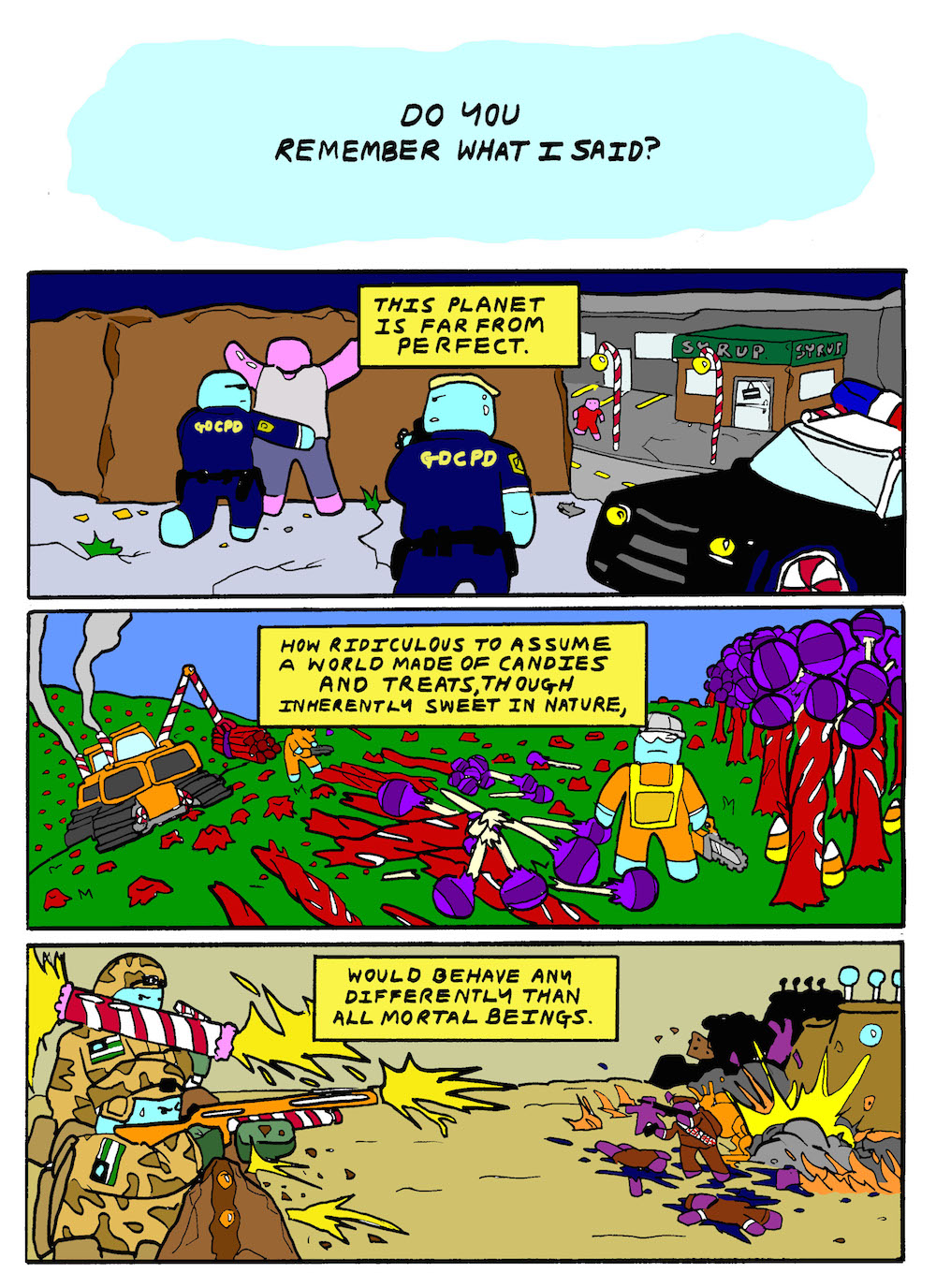
Hey guys! New to the forum. I recently started writing a webcomic called "Big Cookie". It's a comic about a candy planet that has real political issues.
Could I have some feedback on it?

Things I could use critique on:

- color
- perspective
- scanning technique

Thanks much erryone!

d6ah34ebkn86.jpg
ncta6mi9cs8b.jpg
mr240s472859.jpg

iKjm6MS.jpg?1
pa3.jpg 286.4K
pa2.jpg 362.2K
pa1.jpg 454.3K

Posts

  • Options
    IrukaIruka Registered User, Moderator mod
    The colors are over saturated, and your pallets are too literal (grass is green, sunsets are orange, but you don't actually want the most saturated versions of both right next to each other.) Look at color full landscapes and see how they unify the pallet. For instance sugar rush from wreck it ralph is predominantly pink, brown, and orange http://www.disneyme.com/wreck-it-ralph/images/games/sugar-rush.jpg just with splashed of color here and there to give you the candy landscape.

    To help you with scanning, it would probably be best if you talked about the tools you have and the methods you are already using to give people an Idea of what you are working with. Do you have a tablet? Photoshop? How big are your drawings?

  • Options
    kainakanokainakano Registered User regular
    Thanks much for the color feedback!!

    I work on 9 x 12 marker paper. I use measurements to make the frames, then draw and ink everything. Then it's scanned onto photoshop and I convert the files and whatnot, then color it.

    I'm guessing most people do their frames in a digital editor?

    iKjm6MS.jpg?1
  • Options
    CreaganCreagan Registered User regular
    Not really. It depends on the artist and how they work. If drawing the frames by hand feels more comfortable to you, it's fine to keep doing that.

    You're leaving white spaces in tight areas. That detracts from the overall look of the piece. (One thing you can do to fix this is set your brush to "darken" and manually correct all the little spots the fill tool missed.)

    Also, shading would really help the art look less flat. You can shade in Photoshop by making a new layer, setting it to 10%-15% opacity, and drawing over areas you want to shade in black, or any darker color.

  • Options
    kainakanokainakano Registered User regular
    Creagan wrote: »
    Also, shading would really help the art look less flat. You can shade in Photoshop by making a new layer, setting it to 10%-15% opacity, and drawing over areas you want to shade in black, or any darker color.

    HOLY CRAP LOL THAT'S AWESOME THANK YOU SO MUCH

    iKjm6MS.jpg?1
  • Options
    earthwormadamearthwormadam ancient crust Registered User regular
    I like the subject matter here, you've already separated yourself from the pack in terms of trying to do something original. So kudos on that. On the other hand, as mentioned, the color needs a lot of work. (I struggle with color as well) Also keep in mind texture. If you are going to sell the characters and setting as candy, their surfaces need to reflect that. I couldn't tell if they were gummy dudes or gingerbread men, because there was no indication of texture on anything.

    Another area for improvement would be line thickness variation. That first page is really flattened out by the fact that everything is the same thickness, no matter how far away the setting is to the eye. The small building is the same thickness as the big building in the background. The further away something is, the more thin the lines should become. This will help things fade back and pop out. Try using some pens/markers that are different sizes. Keep at it.

  • Options
    kainakanokainakano Registered User regular
    I like the subject matter here, you've already separated yourself from the pack in terms of trying to do something original. So kudos on that. On the other hand, as mentioned, the color needs a lot of work. (I struggle with color as well) Also keep in mind texture. If you are going to sell the characters and setting as candy, their surfaces need to reflect that. I couldn't tell if they were gummy dudes or gingerbread men, because there was no indication of texture on anything.

    Another area for improvement would be line thickness variation. That first page is really flattened out by the fact that everything is the same thickness, no matter how far away the setting is to the eye. The small building is the same thickness as the big building in the background. The further away something is, the more thin the lines should become. This will help things fade back and pop out. Try using some pens/markers that are different sizes. Keep at it.

    Thank you so much. It means a lot to me. :)

    Here's some updated color and line work:


    9z5y1bf.jpg


    iKjm6MS.jpg?1
  • Options
    NightDragonNightDragon 6th Grade Username Registered User regular
    Creagan wrote: »
    You're leaving white spaces in tight areas. That detracts from the overall look of the piece. (One thing you can do to fix this is set your brush to "darken" and manually correct all the little spots the fill tool missed.)

    @kainakano - I agree with Creagan that the white spaces are a problem, but I can also see the outlines of all your linework. Are you using the paint bucket tool on the same layer as your linework? That would cause this problem.

    Creagan's suggestion would work, but a cleaner option would be to create a new layer on top of your linework layer....and set the new layer's blending mode to "Multiply". Now all of the color you put on that layer will automatically fill in the white space on your paper, and won't cover up the black linework. It's a much, much faster and cleaner way to work...and it allows for easy color-tweaking later, without having to worry about preserving your lines.

  • Options
    kainakanokainakano Registered User regular
    Creagan wrote: »
    You're leaving white spaces in tight areas. That detracts from the overall look of the piece. (One thing you can do to fix this is set your brush to "darken" and manually correct all the little spots the fill tool missed.)

    @kainakano - I agree with Creagan that the white spaces are a problem, but I can also see the outlines of all your linework. Are you using the paint bucket tool on the same layer as your linework? That would cause this problem.

    Creagan's suggestion would work, but a cleaner option would be to create a new layer on top of your linework layer....and set the new layer's blending mode to "Multiply". Now all of the color you put on that layer will automatically fill in the white space on your paper, and won't cover up the black linework. It's a much, much faster and cleaner way to work...and it allows for easy color-tweaking later, without having to worry about preserving your lines.


    Wow, thanks so much. It seems like I taking an editing class would benefit me greatly; there are a lot of useful things I didn't know about Photoshop.

    iKjm6MS.jpg?1
  • Options
    kainakanokainakano Registered User regular
    OKAY! I've done a little bit of practice and I've brushed up my color and also re-sized my images so they're not ungodly large:
    Here's the latest:

    55rB3Fs.jpg?2

    This character is a gummy reverend for the planet's religion.

    iKjm6MS.jpg?1
Sign In or Register to comment.