As was foretold, we've added advertisements to the forums! If you have questions, or if you encounter any bugs, please visit this thread: https://forums.penny-arcade.com/discussion/240191/forum-advertisement-faq-and-reports-thread/
Options

Optical Throng

Faded_SneakersFaded_Sneakers City of AngelsRegistered User regular
edited June 2015 in Artist's Corner
Hello people. Trying to draw things more consistently and thought I'd try posting again. Hopefully this will last more then a single week this time.

Any criticism on colors and shading would be a huge help. Though any advice is appreciated.

Thanks!

Cats meow ... literally. They do:
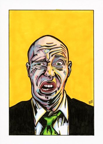
image.jpg

Self portrait:
image_1.jpg

Instagram: fadedsneakers
Faded_Sneakers on

Posts

  • Options
    Faded_SneakersFaded_Sneakers City of AngelsRegistered User regular
    edited May 2015

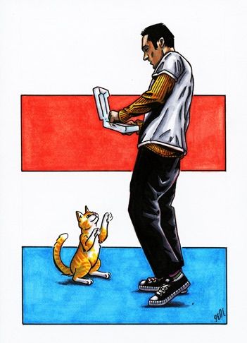
    Pouncing of your face 0_0:
    image_2.jpg


    I caught him but he got away:
    image_3.jpg

    Faded_Sneakers on
    Instagram: fadedsneakers
  • Options
    OllieOllie Registered User regular
    These are cool!

    My first thought for critique is that your way of drawing folds in clothing seems a little random. The white shirt on the guy in the first image is streaked with lines that don't really do anything.

  • Options
    NightDragonNightDragon 6th Grade Username Registered User regular
    edited May 2015
    Hello! Welcome to the AC :)

    You've got an interesting style here. If you have any idea on a style/look you're aiming for, that would be hugely helpful to us in figuring out how to better critique you and give you advice.

    Currently, it seems like some color theory might benefit you. In the leprechaun piece, the shading is looking a bit muddy. While this link talks about oil paint mixing, I think it still may be useful to you to read:

    http://emptyeasel.com/2006/12/22/how-to-make-better-oil-paintings-tips-and-techniques-for-correctly-mixing-color/

    It discusses things like "warm" yellows and "cool" yellows, and how to mix those with "warm" blues and "cool" blues to achieve different hues of green.

    The other problem with the leprechaun piece (and to an extent, the first piece you posted) is that your shading seems to be so dark it's interfering with the black lineart, and making the forms a little harder to read. Maybe try mixing colors on a separate piece of paper, or in a section outside of the art first, just to experiment to see what would work best...maybe try mixing with lighter colors in general - try to avoid going too dark too quickly.

    [edit] This piece, for instance, is shaded in a very clean manner, and generally all the lineart is still highly visible. They are using lighter colors much more often than you seem to be, so maybe that's something to consider:

    tumblr_nkft58syfO1qae9seo8_500.jpg

    NightDragon on
  • Options
    Faded_SneakersFaded_Sneakers City of AngelsRegistered User regular
    @NightDragon: Thank you for the advice, I agree completely. I look at the base colors I did on the Leprechaun piece and feel I should have stayed there instead of taking it where I did. I used to be afraid of going too dark so began forcing myself to go straight to the dark instead of building up and I fear I may have developed a reverse bad habit. What I'm posting here is probably not a great attempt at being more careful but I'll try to do something this week reflecting the softer touches you recommended.

    @Ollie: BAH! Folds. You're spot on. I'll try to work on that. I want to define folds sometimes without going to far or not far enough and end up using line work where shading would be more appropriate. Thanks for the comment.

    Here are a couple pieces that were partly done before I read the above comments. I'll do a couple color studies and cloth studies before I post next time.

    Scissors%20Vamp%20Adj%204.png

    Mercat%206p.png

    Instagram: fadedsneakers
  • Options
    acadiaacadia Registered User regular
    That vampire piece is nice and clean, and looks great! I like the drawing for the second one as well, but the colors are a little muddy, and it doesn't really look like there's a well defined light source, so the shadows don't read for me. I like the blue layered background to that piece though and the ambiguous transition from bg tree trunk to water is neat. I don't know your process so I'm only guessing here, but are you planning out where the light will fall before you begin coloring? Knowing where the shadows will be will definitely make it easier to prevent going over a particular spot multiple times with different colored markers, which should help your pieces feel a bit cleaner (as in that first one).

    I could be talking completely out of my ass here. Who knows?!

  • Options
    Faded_SneakersFaded_Sneakers City of AngelsRegistered User regular
    @acadia: You caught me. My original idea was that she and the mercat were inside the mouth of a cavern and that would mean the light source was coming from behind them. But when it came time to actually color the image I kind of realized I would end up darkening them too much and was worried I'd lose all detail so instead I kind of committed to some vague non-defined light source hoping it would come out ok. I have a really hard time with light sources, especially when dealing with reflective light and secondary sources.

    Here is an attempt to avoid muddying up the colors and avoid going too dark, more similar to the image @NightDragon posted above.

    Skatertoad%206p.png

    Instagram: fadedsneakers
  • Options
    Faded_SneakersFaded_Sneakers City of AngelsRegistered User regular
    edited June 2015
    image_5.jpg

    Faded_Sneakers on
    Instagram: fadedsneakers
  • Options
    Faded_SneakersFaded_Sneakers City of AngelsRegistered User regular
    image_4.jpg

    Instagram: fadedsneakers
  • Options
    nakirushnakirush Registered User regular
  • Options
    Faded_SneakersFaded_Sneakers City of AngelsRegistered User regular
    @nakirush: Thank you for that video. It makes me realize how very limited my understanding and use of the color wheel has been. Usually I only look at it to find complimentary colors for shading purposes instead of using values. But even that is something I don't commit to.

    I like the idea of using double complimentary colors for adding depth to background and foreground. I'm looking forward to playing with some of those ideas.

    Instagram: fadedsneakers
  • Options
    Faded_SneakersFaded_Sneakers City of AngelsRegistered User regular
    So here's something for today:

    image_6.jpg

    Not shading the cat and mouse was easy to resist but oh my god I was literally fighting myself to stop myself from shading or overlapping colors on the hummingbird.

    Instagram: fadedsneakers
  • Options
    Faded_SneakersFaded_Sneakers City of AngelsRegistered User regular
    Working on colors, cloth folds and shading here, this is my progress so far:

    IMG_4924.jpg

    IMG_4926.jpg

    IMG_4951.jpg

    Instagram: fadedsneakers
  • Options
    Faded_SneakersFaded_Sneakers City of AngelsRegistered User regular
    So yeah, as careful as I was trying to be with the cloth I clearly got lazy with his face. FOOOOOOOOOOOOOOOOOK

    0012.png

    Um, I do have a thing for cats. O_O

    0013.png

    A friend asked me to redesign the Thrasher Goatmouse/Mousegoat logo for him and this is what I have so far. I think Im going to take one last run at it because these both have certain ideas I like but don't feel right yet.

    Goat%20Mouse%205point5p.png

    GM2%205p.png

    Instagram: fadedsneakers
  • Options
    Faded_SneakersFaded_Sneakers City of AngelsRegistered User regular
    This is where I ended up on this thing:
    Mouse%20Goat%204point5.png

    Couple of ladies:
    SpaceGal%206p.png

    SewerSkate%206p.png

    So my room mate is a fan of all these detailed/ornate? (not sure what they'd be called) kind of things on Instagram and said I should give it try. Challenge accepted. Not sure if successfully but meh.
    Lion%20and%20Skulls%206p.png

    Instagram: fadedsneakers
Sign In or Register to comment.