As was foretold, we've added advertisements to the forums! If you have questions, or if you encounter any bugs, please visit this thread: https://forums.penny-arcade.com/discussion/240191/forum-advertisement-faq-and-reports-thread/
Options
Kel's Sketchbook
kelred Registered User regular
Registered User regular
Hi everyone. I've lurked on the AC for a while but now I've worked up the courage to start my own thread. Anyways, I plan on becoming an animator one day but I also would like to create my own sci-fi/fantasy webcomic in the near future. I want to improve my drawing abilities but I'm not entirely sure what needs improving or how I should go about it. Any critiques or advice on how to improve would be greatly appreciated.
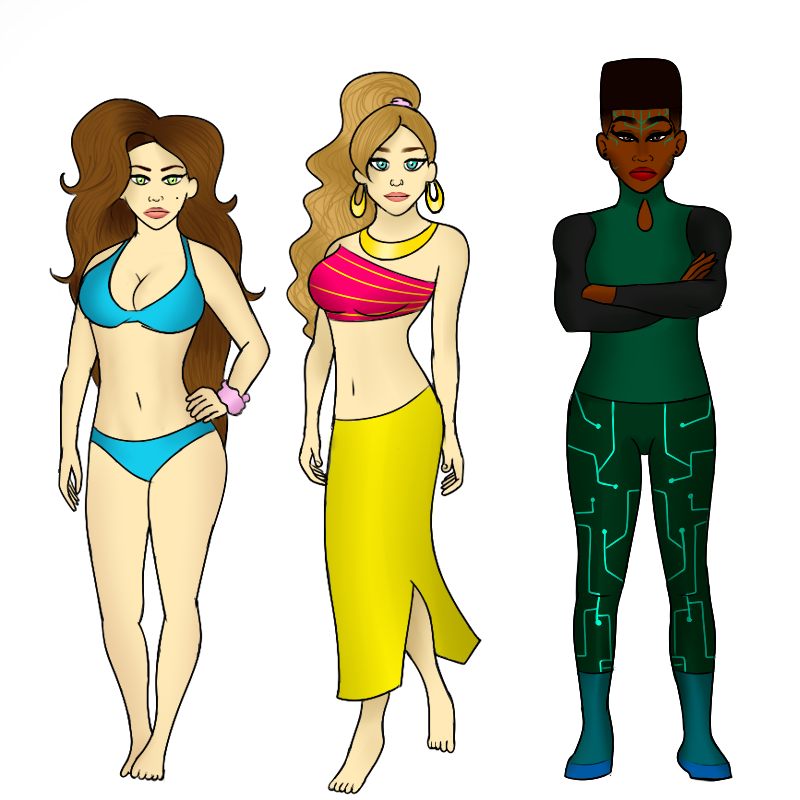
Here's some character designs I made:

And here's a page I made from a scene that I wanted to put in my comic:

Here's some character designs I made:
And here's a page I made from a scene that I wanted to put in my comic:
kelred on
0
Posts
The first shot of the green energy woman has her with her back to the ocean and the water quite far away which would mean that her target is even further away from the water.
The second shot is at a really strange angle and very tightly cropped in on her. Is the shot angled or is it level and she's standing on a slope?
Then we have yellow skirt woman standing next to the water and putting up an energy shield to block a shot which appears to be coming from the ocean with blue bikini woman standing behind her.
Then a close-up shot of blue bikini woman where the water can't be seen at all, just endless beach.
Then a close-up of yellow skirt woman looking back except the water has jumped from being on her right to being on her left.
If you haven't read them, Scott McCloud's "Understanding Comics" and "Making Comics" talk about some of the fundamental aspects of comics as a storytelling medium. Things like word balloon placement, establishing characters' relative positions, that sort of thing.
When you're just starting out, it's easy to forget that your reader doesn't know everything you know about the characters and the location they're in. They only know what you show/tell them.
Most of our forum resources are dumped here right now: http://forums.penny-arcade.com/categories/art-assignments-and-resources
notably, lots of books are listed here: http://forums.penny-arcade.com/discussion/196619/comic-resources-masterpost#latest
I think the end of highschool is a good time to start getting into some more technical study. If you can learn to like it and get a regular schedule for trying to improve your technical skills, it will go a long way. The enrichment threads are a good place to start: http://forums.penny-arcade.com/discussion/196641/enrichment-directory#latest
I'd be interested in seeing your traditional work!
One thing that I'm noticing is that, for what looks like is supposed to be an action scene, the characters and composition are pretty static in their posing.
If I draw a line through the hips and the shoulders, they are all flat horizontal. The spines are generally sticking straight up and down. The horizon line is straight in the center of the composition, flat across. The end result is that you have an action scene where nobody seems to be particularly involved in what is happening- put your hand over the energy beam/water shield for a second and try to figure out what's going on, or read the emotions of the characters and you'll think...'a girl waving at someone out on a boat somewhere?' Not, presumably, what you're hoping for.
So let's try to see how to punch these panels up a bit- not necessarily the 'right' solution you should go for, but this is more to demonstrate a few ideas you may find useful.
As a general rule, characters will appear more dynamic if you make an effort to angle the spine, angle the hips, angle the shoulders. When the character is in repose, all these angles are balanced against one another to create a contropasto pose. When moved in a specific direction, it implies movement. So let's try to apply the idea here:
In the first panel here, I've tried to push everything a but more to give more of a sensation of weight and force, as well as thinking about about the acting.
-Ponytail girl- she's reacting to this huge force barreling at her- so what does someone do in that situation? Well, generally you're going to widen your stance to create a stabler base, making you harder to push over. You're going to lean in to absorb the force- if you stood spine upright, if you started to get pushed back you'd topple backwards, rather than being able to get your feet under you. (Side note: if this character is going to be participating in action scenes on the reg, a tight, long skirt is going to become an issue in trying achieve any significant motion.)
-Bikini girl- she's reacting to this unexpected event- she'll be trying to get out of the way and throw her arms up to protect herself out of instinct, protect herself out of instinct. The whole of her body, from the toes to the head, is tilted at an angle to make her feel off-balanced in this moment.
-The beam is now larger and coming in at a downward angle- making it feel more like it's crashing down on our characters with a lot of force. I assumed that the shield is a water-type thing so I went with a more waterbendery conception of it, emphasizing the two forces crashing, pushing against each other with a lot of force (again, maybe not the right solution, but I can justify a logic behind the decision). The beam pushing the defense back to an angle, again emphasizes the force of the beam.
Panel 2- Again, bikini girl should be reacting to the event, still off-balance. She's looking over her shoulder rather than facing the event straight on. Just having the torso and head facing different directions make the pose seem more lively- angling her spine away results in a much more dynamic looking composition. I'm also taking advantage of the long hair you've given these characters to create some secondary action. When you do animation, you'll hear a lot about how hair, floppy ears, tails, clothing, etc.- ie: items that don't motivate the main action of the body like the arms and legs might, but trailing behind it- in a drawing, these elements provide a lot of opportunity to reinforce and explain the motion of a character, in addition to the main body posture.
Panel 3- Ponytail is again down, legs braced. Head is tucked in, shoulders and arms are up for protection. Eyes are on the action that's happening, which not just makes sense from a fighting standpoint, but it also lets the audience know that what's going on is important, that it keeps her attention rather than looking away from it.
Now, the example sketches I've made? Not particularly well drawn, not on style, super rushed, not finished. Not the point- the point here is that now, without dialogue, I can understand what's going on, I can understand the attitudes of the characters based on gesture alone. Even if I break the scene down to the point where the characters are completely abstract shapes, you can tell one is more dynamic and exciting to look at than the other, just by getting rid of all those straight vertical and horizontal angles.
I admit- maybe I got the intent of this scene totally wrong- maybe the point is that this attacking thing happens every day to these 2, and they are totally bored with it by now- hence the lack of reactions. In which case, you still need to push to make that intent clear- if they're totally bored, you can convey that by, for example, ponytail continuing to apply sunscreen while fending off this attack with one hand. Bikini cracking open a book under an umbrella when she asks what it's all about. Every pose can be pushed in some way to be more effective- even if you want a totally upright, symmetrical pose, such a Beefeater standing guard, that rigidity can still be pushed for a clearer read. Pushing poses is essential for readability.
Now, whole wall of text of this may seem like a lot to keep in mind, but really it's just scratching the surface of the subject of gesture. For some more on the subject, I'd suggest checking out the books "Force: Dynamic Life Drawing From Animators" by Mike Mattesi and the "Drawn to Life" volumes by Walt Stanchfield (1 + 2)- both of which talk at length about how to develop and work on gesture, capturing and exaggerating poses for readability.
You might also notice that both of those titles have a running theme: life drawing. Drawing from real live humans is unbeatable for developing a sense of observation for gesture, for building a mental library and innate understanding of how to move characters in believable and interesting ways. If you can't go to a life drawing class, you can take a sketchbook and draw people hanging out at a beach or a bus stop or a coffeeshop or a mall. Failing that, friends, family, pets- failing that, photo ref, stills from movies, etc. Anything you can do to further your understanding of the movement of real people in the real world.
Now, even all this, is all just a starting point. You'll start working on gesture and realize, hey, you may need to brush up on construction to get them to work. And in studying construction, you'll realize a need to study perspective. And anatomy, and composition, and so forth. Then having studied all those, you'll need to go back and deepen your understanding of gesture again. And construction, again- the studying and practice never stops, even for the most experienced artist. It may be easy to look at all this stuff and get overwhelmed, but the important thing isn't to try to tackle everything at once, as it is to develop a consistent habit of practice and study, getting to each topic in time, revisiting and expanding on each topic over time.
If you want a big chunk of stuff that you want to try to start chipping away at, I might suggest Glen Vilppu's articles on life drawing and the Disney Feature Animation's Reading List's books on drawing (it's slightly out of date, such as omitting Animator's Survival Guide and listing the Bridgman books separately when they can be bought in one big complete volume these days, but it's still a solid place to start forming a drawing foundation.)
Twitter
You can do both!
I'm excited to see you tackle some enrichments. Pick up those books as you can and keep pushing yourself forward. If you can combine your good attitude with some solid time studying, you will see measurable progress in no time. Just keep us updated so we can try to help.
Quick google search pulled this up. See how much depth is just conveyed with three colors? Play with all of your values, from your darkest to your lightest! That's half the fun.
@Enc Thanks for the tip. I'll definitely try to use bolder shading next time.
Especially focus on the cone (and maybe do a cylinder or a bent rectangular prisim) as those are going to be the most translatable shapes for your limbs.
Also, are you drawing these freehand? and how are you creating and placing the shadows?
@Enc Thanks for the suggestion! I just downloaded the pdf so I'll start reading it shortly.
Check these out and see what you can learn from them:
http://img12.deviantart.net/e420/i/2015/087/e/3/cast_shadow_sphere_by_vladimirdrak-d8nfa4u.jpg
https://courses.byui.edu/art110_new/art110/week06/images/sphere.jpg
http://3.bp.blogspot.com/-3dxf1mRlQ24/VCAcVqBPX-I/AAAAAAAAC6I/J-e4TE9DqZU/s1600/Lesson+3+Ball,+Cube+and+Cylinder.jpg
You'll find, if you look at the references, that the airbrush will hold you back a lot when creating shadows because it doesn't allow you to create a hard edge. Shadows are not always a fuzzy petering out away from the light-source. I would suggest either moving off digital altogether and going to basic pencil and paper, or at the very least, use a hard-edged brush and get used to the idea of creating soft edges by manipulating opacity and flow. That way you have more versatility.
The benefit of getting physical objects is you can move them around, and move yourself around, to get a full understanding of how light works. Approach it like a science project. Let me try and illustrate.
here's two objects, the best I could find off hand. What you want to do is analyze these objects, looking for the following elements:
Not really sure why this video wasn't in the enrichment, but proko explains some of these concepts very well.
What you want to do is take your objects and configure them and observe them. At first you don't even have to draw them, keep your light source the same and move the blocks so you can see how the different faces interact when being rotated under the light. keep your light simple (this is one, flexible neck desklamp) and focus in on trying to recreate what you see extremely accurately. Ask yourself whats going on as you go. So with arrangements like these:
Why does the chapstick on the top middle have a white line on the shadow side? On the bottom right, why does the shadow from the eraser appear to wrap around the cylinder? I suggest using bigger objects, if you can get your hands on some plain wooden blocks, that's ideal.
With that in mind, I would encourage you to do some more studies of these blocks and other simple objects, but this time try to not rely on lines for marking edges and contours. Using lines to lay out the shapes and set up the preliminary sketch is normal, but as you start working in the values and rendering, the lines should "disappear".
Getting cylinders will really help you with bridging this simple shape study into your understanding of anatomy, cubes will help too, of course, but it will make it when you go back to trying to break down anatomy into basic shapes, you can do so with a more informed viewpoint. Notice how much more slow and careful you were when trying to really nail these shapes. Think about how you can apply the same mental process when you are observing a reference for anatomy. You're shape breakdowns were quick with erratic strokes, how much more information will you get out of it if you slow down and really try and think out whats happening?
To get into scos's point, It can be hard to find good examples of what hes talking about (Googling "shape still life" gets you alot of people who are still learning, not a great reference point) but lets take a look at some good ol' M.C. Escher:
http://www.wikiart.org/en/m-c-escher/three-spheres-ii#supersized-artistPaintings-204893
Er, its supposed to say "he allows the edge to disappear" I guess I got distracted.
Interestingly, there's not much in terms of reflected light going on on the right-most ball, its possible that the table he was drawing on was very dark and thus it did not bounce much light. He also could have left it out for his own reasons, hard to say. This sort of smooth as fuck graphite application is probably a combination of really nice paper, a good set of pencils, and time. You don't necessarily have to spend the effort trying to get to thus level of rendering traditionally, but it can be a fun exercise in that it will teach you alot about control, and give you a physical work at the end to look at and show to people. I always enjoyed that, personally.
When you look at examples, realize that some artists maybe overemphasizing edges for clarity:
Being aware of that will help you when you are starting to make value choices. After enough looking and observing the forms around you, when you are painting something you maybe able to say "How can I still make this believable, but give a little more punch to this edge? Would it be reasonable for the area around it to be darker?"
In your comics, if you stick to a simple, flat style it may not come up as often, but knowing how to control these circumstances will do a lot for you when shading in general.
It looks like you're making some improvement, though. The ellipses on the cylinder and the top of the cube look a little off, at a glance. Keeping those forms solid will help you when you are trying to break down more complex forms with the same shapes.
You may want to try some simple perspective activities, I'll try and find some examples
And another rough attempt at perspective:
Keep doing this stuff, keep hounding on your fundamentals. The portrait looks better than your previous attempts, so your observational skills are obviously improving. You'll only get better and better if you keep at it!
These last two studies of the cylinder and cube have some issues-- the construction of both objects is a little wobbly and the light doesn't make sense.
You've got deep black cast shadows right up next to much lighter areas of the block which are also in shadow. The solid darkness of the cast shadow is too strong relative to the shadowed face of the block, but the other thing throwing it off is that the edge where the block meets the surface it sits on is too bright. If we look back at the photos you took yourself, we can see pretty plainly that this is actually the darkest part of the shadow. The cylinder drawing has the exact same problem. I can't tell if this is just a simple oversight or if you're misunderstanding how reflected light works here. Getting this stuff right is crucial for tying together the light in a scene and really making it seem like the object is solid and believable.
The shapes of the cast shadows themselves also aren't quite plausible. They don't make sense for the size and shape of the blocks that are casting them, and the direction they're cast in doesn't really match the way the light is hitting the blocks (almost all of your 'invented' drawings on this page have this problem).
This is all stuff that can be learned by studying from observation, and you'll pick it up intuitively in time, but it's going to take a lot more than a few drawings to master. For that reason I would advise you to stick with mostly doing these studies from direct observation. Certainly do a few from your imagination here and there to test your knowledge and put what you're learning into practice, but the majority of it should be based on observation. I would also generally advise you to avoid making studies with digital tools at this stage. I don't think you're learning anything by doing them the way you have been, and digital tools generally just complicate learning.