As was foretold, we've added advertisements to the forums! If you have questions, or if you encounter any bugs, please visit this thread: https://forums.penny-arcade.com/discussion/240191/forum-advertisement-faq-and-reports-thread/
Options
A little bit of Horror! (NSFW, 56K)
God_is_my_goldfish Registered User regular
Some concept art I did a while ago for a film script I've put aside for now, was trying for the whole Silent Hill vibe with them. They are more than just creepy looking, they actually played out as part of the story, with meaning behind each design.
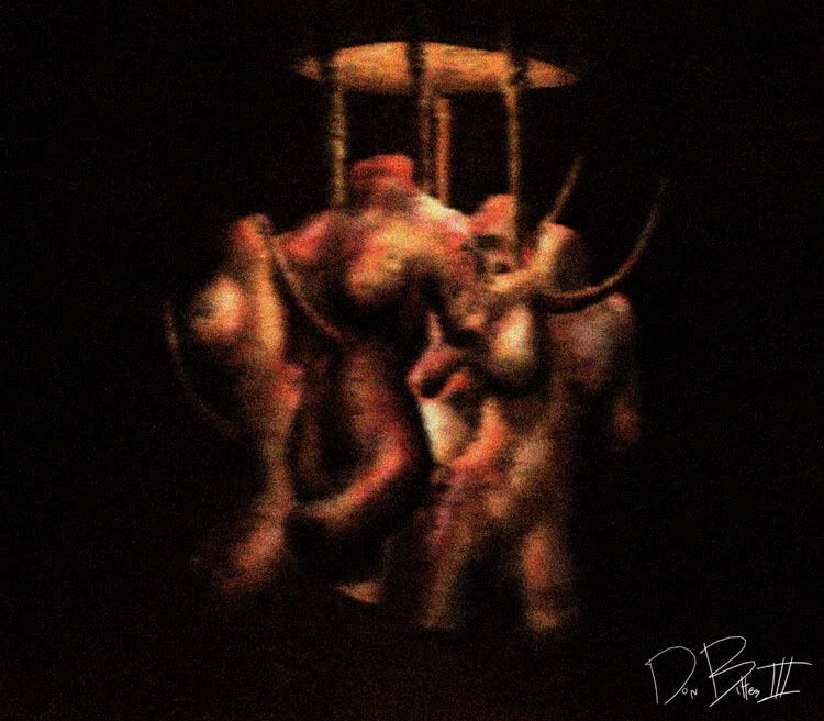
Here's the same, sans the blur
http://img.photobucket.com/albums/v140/god_is_my_goldfish/Dark%20Corner/abbatoirofsin_01.jpg
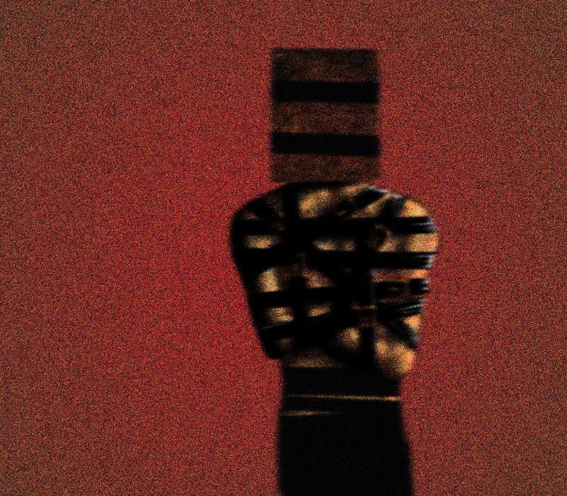
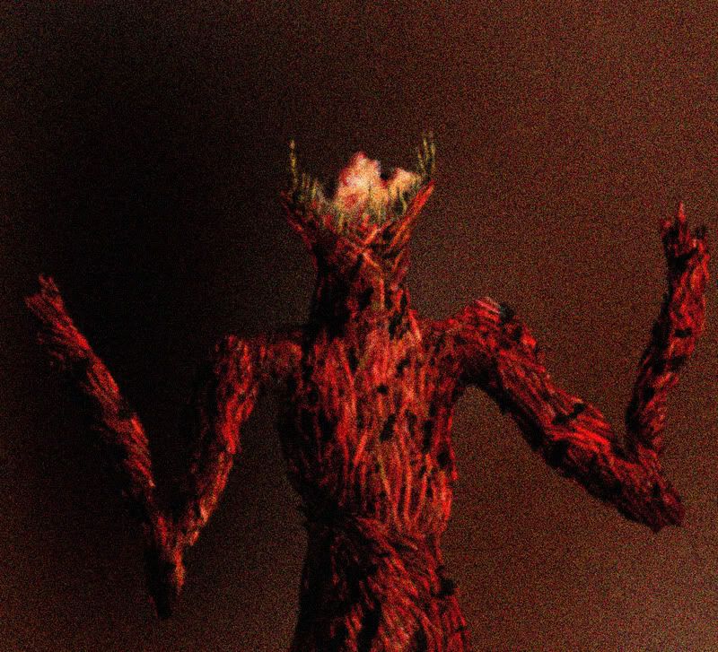
The BoxHead
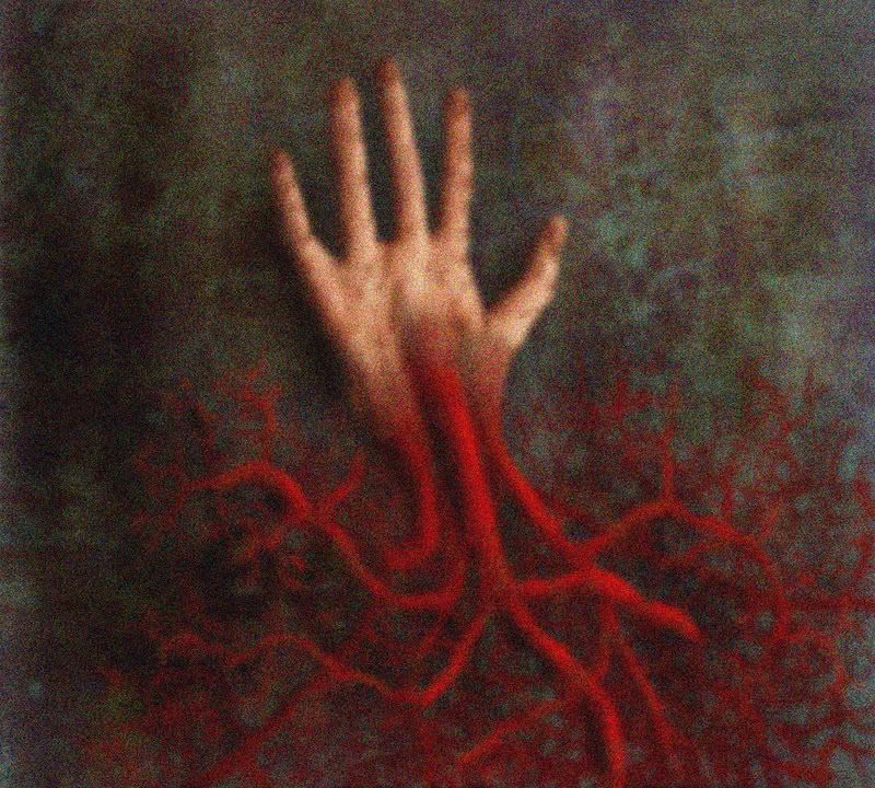
A Bloodpalm
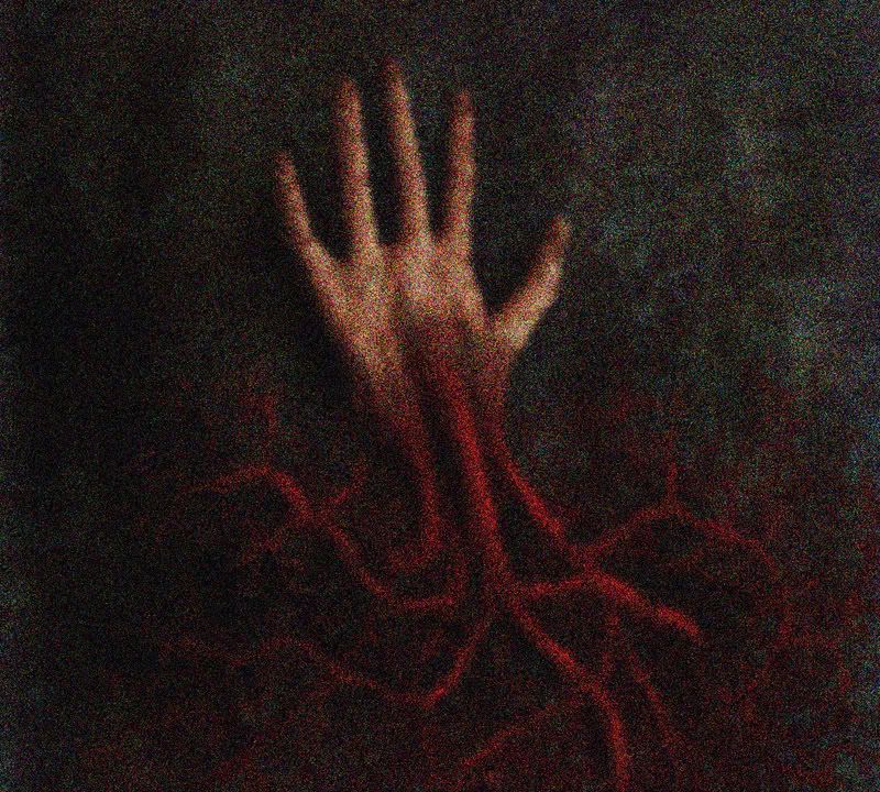
The same, but a little brighter
http://img.photobucket.com/albums/v140/god_is_my_goldfish/Dark%20Corner/bloodpalm.jpg
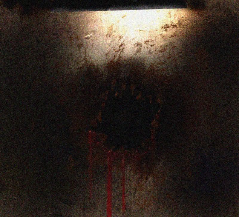
A hole in the wall, was actually scrapped in a later revision due to similarities with SH4
Self-Consumption
Crits/Feedbacks welcome, Have a Happy Halloween!
:twisted:
Here's the same, sans the blur
http://img.photobucket.com/albums/v140/god_is_my_goldfish/Dark%20Corner/abbatoirofsin_01.jpg
The BoxHead
A Bloodpalm
The same, but a little brighter
http://img.photobucket.com/albums/v140/god_is_my_goldfish/Dark%20Corner/bloodpalm.jpg
A hole in the wall, was actually scrapped in a later revision due to similarities with SH4
Self-Consumption
Crits/Feedbacks welcome, Have a Happy Halloween!
:twisted:
God_is_my_goldfish on
0
Posts
Being inspired by something and ripping it off are completely different things. You should do more than change the shape of the helmet, and even if he isn't wielding a huge fucking knife....
just no. Originality man!
The art is kinda cool but too much noise and blur effects.
edit: wait.... now I see it...
Dear satan I wish for this or maybe some of this....oh and I'm a medium or a large.
Basically. I also wish the last one had muscles instead of spaghetti. The first one is probably the most solid, but for the subject matter and genre, it's pretty generic :?
in the movies during the flash back was noise.. thats about it, but in addition to noise they had film scratches and actual brush work done on top of the frame.. not just a shitload of noise put on top
the boxhead is also sorta dumb me thinks.. however everything is very silent hillish and i think is done quite well
Noise filter makes things horror. Didn't you know?
If I were Konami I'd sue if this ever hit a screen.
"No no guys, it's not pyramid head, it's BOX head"
edit: the noise thing is also ripped from silent hill >:|
You are correct!