As was foretold, we've added advertisements to the forums! If you have questions, or if you encounter any bugs, please visit this thread: https://forums.penny-arcade.com/discussion/240191/forum-advertisement-faq-and-reports-thread/
Beavo Poops (novel cover finished)
beavotron Registered User regular
alright I'm just gonna go ahead and make my own thread cause I want some crits, see?
so rip into it, cause I'm open to change it:
here's some old stuff too (also open to crits cause these aren't finished):
so rip into it, cause I'm open to change it:
here's some old stuff too (also open to crits cause these aren't finished):
beavotron on
0
Posts
P.S.: I like it.
http://fantasy.premierleague.com/my-leagues/
The join code for the CLASSIC league: 214755-65927
The join code for the HEAD-TO-HEAD league: 5294-3346
When did you become a 1930's mobster? I swear I read that like those old Alcapone films. "Mugsy, Jo-jo; go make sure he's sleepin' with the fishes, see."
In any case, I really like how the guy on the first piece is comming out of the frame, please don't change that!
Cool stuff. =D
if not, speak up and i'll try to work on it. if it's not editable this round, then i'll definately keep it in mind for next time
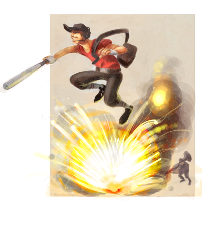
on the scout or on one of the other two? and can you elaborate a little?
My Portfolio Site
The updated explosion helps a lot in that it gives a sense of momentum for the scout. However, I still don't feel him in reference to his surroundings. He could be standing on the ground in that pose and I wouldn't know the difference (it would just feel like he was in the process of ducking). This could be solvable by working on a subtle planar surface for the ground, it could bridge the gap between elements and give me some sense of depth. Also some slight motion blurring of the scout's left leg (and a little on the right foot) could give a much more palpable sense of motion.
It's looking good though.
Our first game is now available for free on Google Play: Frontier: Isle of the Seven Gods
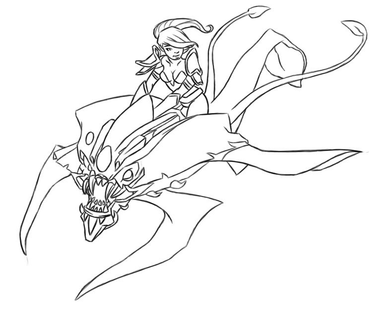
Yarp. Kay, I was talking about the girl riding the monster. I think you want more line variation where the monster's lines cross or are near the girl's. Or, you could make the lines of whichever you want to pop out thicker than the lines of whichever you want to be more in the background.
Basically, more line variation.
EDIT: Also, the lines are wobbly and broken at places, but I expect that's because the piece is in preliminary stages.
great crit, i can see what you mean, he could definately be seen as just sorta standing there
i'll try adding in some indication of motion
tam: yeah that makes sense since i used the same size brush for the whole thing hahaha (you can slap the back of my hand now if you want)
typically most of the lines are gonna be gone when i go to color it, i sort of intended on coloring her the way i colored the scout
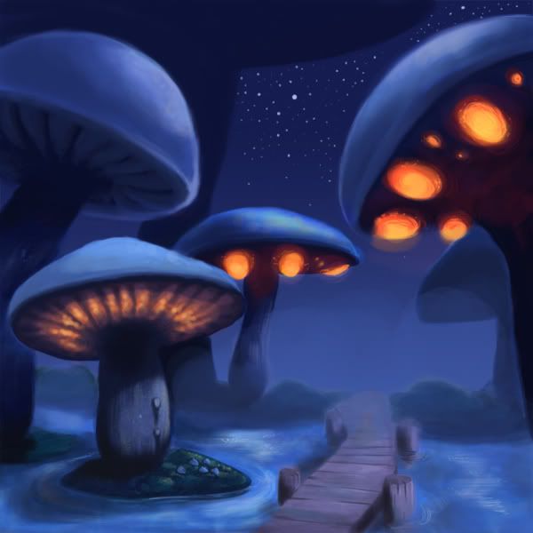
Lovin the glowing mushrooms too
The explosion does look much better but it just didn't tie in with the scout; like 2 different random things put together, rather than the scout actually evading the explosion. No big deal really as it works nicely IMO now that you've touched it up, but some kind of double jump trail might help if you do want to tie it to the explosion. That or move him much further left, but that would prolly kill the composition.
On the last one I think the fog is a little too muddy and blurry, it make things looks smudged as opposed to obscured. I think if you varied the density of the fog in places that would help. As of now the fog line is close to the bottom of the mushroom line so visually you lose some dynamic possiblity by having them converge around the same height (let me know if that doesn't make sense).
The mushroom island on the left looks a lot more defined that the bridge at the same distance from the viewer.
The image also draws the eye to the end of the bridge which is probably the weakest part of the illustration at the moment. I know you said it's not finished but the way they bridge kinda get obscured makes it look like you just couldn't figure out what to do there. Maybe having it interact a little more with the bushes or something would help.
The perspective there looks off to me as well (looks like the bridge/walkway is about 15 feet off the ground at the shore).
I love the contrast of the orange with the purple, perhaps a little more secondary lighting from them would be good.
I get the impression from your illustrations you could could benefit from working at a higher resolution, I'm not sure how to explain it exactly but it seems like things would pop more with some sharper lines that at the moment seem limited by resolution. I could be wrong though!
for the cover of some teen girl novel a local guy is writing.
the ground is going to extend around the spine to the back where there'll be a well. the ground/sky are clearly not done, trying to tweak the tree/candle. suggestions and crits are as always, much appreciated.
they sent me an .eps file of some other book cover done for the same publisher, i'm also doing an image for the back, basically i was thinking i'd do the images, then incorporate them into the proper size/format for the final version that i send off to them... but i'm not sure how to properly go about doing that?
this whole book jacket design thing is new to me, and completely foreign... and weird
help!
edit: i also have this saved at double the size, as a psd with all layers still separate, so it is very editable at this stage in the game, and should be relatively easy to get onto a book cover lol.
The whole of the leaf area reads pretty flatly. Try to look at that whole space as a cylindrical or spherical shape rather than a mass of details. I might suggest exaggerating the candle light so you can put in some red/orange areas to define the underside plane of the mass as a whole. Also, the purplish light that makes up most of it, while not bad, seems to come from nowhere- if you are conceiving that light an ambient sky light, it should at least have some indication of direction of that light coming from above, rather than what it looks like right now, which looks as though it is coming from the viewer. The moon rimlight there works, although depending on the ultimate style you may want to consider indicating it a bit in the whole of form, rather than confining it strictly to the outside contour as you have.
Having the darkest area of that area be that flat dark purple, rather than the black you've used on the trunk, is also kind of odd, and I think the presence of such a dark black in the piece makes it more likely that that purple will just read as a flat form rather than an intentional stylistic choice; Either one can be fine, but I think it would help if they were consistent.
</lighting rant>
Twitter
kk i'll tone it down.
the leaf area is really pissing me the eff off, for basically all the reasons you just said. so maybe if i add some blacks like in the trunk it'll make it better? and yeah the purple is really coming from ass nowhere. but it's supposed to appeal to teen girls, and it's supposed to be all magic and shit, so what's more magic and teen gurl squad than purply pink?
how do you think i can make that tie in better? Adding the same black that i have in the trunk to the leaves seems like a pretty solid bet...
<sigh>
Fiiiiiiiiiiiiiiiiiiiiiiiiiiiiiiiine.
But to prevent everyone from thinking they can rope me into free paintovers just by asking, I'm going to have to insist on saying the only reason I'm doing this is because you're hot. :P
So, I tried to solve the whole disparity between the trunk and leaf area by pulling that pinkish candle light into the trees, and darkening some select areas in the leaf area to boost the contrast. I also tried to retain that whole purple value of the leaves while creating a lighting scheme that at least seems somewhat legitimate; instead of being lit from nowhere, it's being lit from reflected blue-ish sky light, and between the moonlight and the candle light you get a wider range of color values that, when viewed as a whole, still reads in that kinda sugary-sweet Lisa Frank purple if you get me. :P
EDIT: Also: having those 'light beams' coming through holes in the leaves do not currently make any sense without having similarly lit areas outside of the tree, since those sort of things are created by light illuminating particles in the air, not light passing through a small space.
Twitter
INSTAGRAM
I need to use my female charms around here more often.
thank you so much!
it looks awesome, i will keep working at it.
Copy space is just fancy talk for an empty space to put your text, it would suck to have the title cover your awesome tree. I'd suggest leaving room on top of the tree to write the title, I say the top of the tree and not the bottom because if the book was placed on a magazine rack the top of the book would still peek out making the title visible.
As for making a book jacket, it's not that hard. You basically do what you said in your post; work the image to fit the size/format. What you have to keep in mind is the pre-press settings, which is also not difficult. What you do is, you make your illustration a tinsy-bit bigger than the actualy size of the jacket's dimention. This is for the bleed, your illustration should peek out of the canvas... though you can't do this in Photoshop, it's best to do it in Illustrator... I mean... you can do it Photoshop, but it will be sooooo much easier in Illustrator.
After you've placed all the text and images set your Raster Settings to 300dpi: Effect>Document Raster Effects Setting. Check the Over Print preview for any disapearing graphics or text: View>Over Print Preview. If there's no disapearing graphics, you're good to save! But first, turn all the text into outline, so you don't get Arial instead of Helvetica at the press.
When you're saving the PDF copy you're giving to the press, set the Adobe PDF Preset option to Press Quality. In the Marks and Bleed option click on All Printer's Mark. Just below that you'll find the Bleed option, the average bleed is .125". Click on Sumary to see if you get any warnings, and that's it!
There are extra steps I like to take to be 100% sure that there will be no problems with my work at the press. I always-always hand the final PDF version on a CD along with a JPG reference, the fonts I used and any images that the original Illustrator document used. Also, a little notepad text that lists:
Project Name
Dimentions:
Colors: (yours is full color)
Bleed:
Fonts:
Native Program:
Designer:
Tel: 1-800-hot-toast
This way I make sure that even if the guy running the press is a complete idiot, he'll know what he's supposed to do... and if he still has problems, he can call my hotline.
As far as preparing a document for the press, that's as far as it goes. How ever, if I can give you some advice: Have the guy sign the copy he sends to the press and keep it as a personal record. If anything goes down, you have your document as insurance.
Jesus, I'm sorry I went on this crazy pre-press rant! I didn't mean to make it so long. I don't think I left anything out, but if someone spots something, please chime in!
Edit: I just realized I wrote this entire thing assuming you'll make the image in Photoshop and then work the text in illustrator. So, yeah... all of these directions are for setting a document up in Illustrator.
EDIT!!!: You're working in CMYK, right?
that was so ridiculously helpful, you have no idea.
and yes, i'm not a complete retard, i am indeed working in CMYK
seriously dude, thank you so much.
and bacon
you guys are all rad,
thanks again bacon and toasty for helping me out! The writers love it, so I'm not going to change it at all, but I do still want crits for the whole learning thing.
All the text seems very close to the page edge - have you accounted for the bleed? Where you've layered two fonts you could do with filling the gaps in. Also, why isn't the spine done in that manner? The title could do with having the letter spacing tweaked, and the linespacing on the back is very tight. Also, if you tweaked the letterspacing on the body text you could reduce the length of each paragraph by one line. All four paragraphs have really short lines at the end, it's unsightly, it makes the paragraph look unbalanced.
You could also do with removing the large bright star in the middle of the title and under "candle" on the back page. The first line on the back also doesn't really need or want a period.
type is seriously my biggest weakness in all this stuff i think
i just plain don't understand the ins and outs of making type look nice and effective
this has already been sent to print, but i don't want to make the same mistakes on any following projects
are there like, recommended books or anything i could pick up on type?
I've never been good with that effect, so I couldn't tell you how to fix it, but I think it would've looked better without if you're not fully sure how to achieve it.
Jeak is right about the title, it should be done consistently on the cover and the spine if space allows, and I think it did here.
The cover is really nice, I can definitely picture it in a bookstore.
This may have already been said, but I'm a little confused about the scale that's going on. The tree looks really big, but the candle looks small. I think maybe what is throwing me off is the details on the tree? It just makes it look really big.
Looks pretty sweet, hope you got paid well. ;-)
The balance on that box is just... wow!
You got a tough spot with all that text. The way i would have handled it was by adding an extra flap to the jacket that folds inside and I would have written the author's text there. Then I would have used some fancy advertising talk to convince him to go with that idea.
Good going with that book!
the candle being really huge: yeah it's a little whacked, but any smaller and it didn't really give the desired effect i guess? i suggested multiple candles just kinda hanging around at the base, but single giant candle was the way to go
i hate throwing the "artistic license" hack around, but I'm going to go ahead and use it here. It's just a really huge, magic candle.
toasty: that box makes me want cookies in the worst way. and it's 4am here...so no stores are open, dammit! I'll spend a few days buying candy in the grocery store... for... for research and all.
...yeah... research.
i only had half a day to throw all the text in, they really rushed me at the end by sneak attack chopping a full day off my deadline. not an excuse for shitty work, i know, but hopefully next time i'll have more time to post stuff here and get all your guy'ses crits on them.
so far this has all been an excellent learning experience and i've copy and saved this whole thread for my next gig, so again, i can't thank you all enough.
PLUS YOU DON'T GET FAT.
There's nothing particularly wrong with the amount of text you have on the cover, just the way you've presented it. Like I say, you could cut four lines just from sorting out the last line of each paragraph. You could also Use indents rather than a full line break for the first two and last two paragraphs, eg.
Pellentesque vel dui sed orci faucibus iaculis.
Suspendisse dictum magna id purus tincidunt rutrum.
Nulla congue. Vivamus sit amet lorem posuere dui
vulputate ornare. Phasellus mattis sollicitudin ligula.
_____Duis dignissim felis et urna. Integer adipiscing
congue metus. Nam pede. Etiam non wisi. Sed
accumsan dolor ac augue. Pellentesque eget lectus.
Aliquam nec dolor nec tellus ornare venenatis.
Nullam blandit placerat sem. Curabitur quis ipsum.
That would let you knock up the line spacing by 1/3, which is the major issue with your text - there isn't too much, it's just too close together to be comfortable to read.
just sorta chill out, i'll give you some snacks
maybe put a movie on for you or something
you can help me with layouts and text
some... some mood lighting maybe?
i will seriously pick up this layout book. i've been meaning to get some layout info anyways cause i want to make my website look like... not crap. that's my next project.
and jeak it is impossible for me to get fat
i have weighed the same since the 9th grade and i eat like a horse
a really really hungry horse that likes fast food.