As was foretold, we've added advertisements to the forums! If you have questions, or if you encounter any bugs, please visit this thread: https://forums.penny-arcade.com/discussion/240191/forum-advertisement-faq-and-reports-thread/
Options
New to Graphic Design and looking for loose opinions and harsh critiques
Don_Lockwood Registered User regular
Registered User regular
I started doing graphic design as a hobby and for my podcast about a year or so ago, and I'm beginning to get requests from indie filmmakers (my day job is in the industry) to do some poster work for them. They've really liked what I've done so far and I'm playing around with the idea of starting a website and doing it on the side regularly. I really want some feedback first before I jump into it from some more experienced designers so that I can figure out where I'm at on a professional scale. Let me know what you think and don't hold back. This is a decent mix of old and recent projects.


Don_Lockwood on
0
Posts
Try posting your images smaller so we can take them in without scrolling vertically.
Anyway, looking forward to any critiques or opinions.
If you'd like to know where you stand on the professional spectrum, it's very low, you need to branch out of "Indie Poster Design". I'm not even suggesting moving away from the movie industry... just do other things. For example, this would have been a very interesting portfolio if each movie had its own marketing showcase, like the title used as a single element, or a series of posters that go from teaser, to actual promo, to a breakdown of the characters in the film. Show the same poster as an iTunes/Netflix banner or anything where you show your ability to port the same design to different formats and aspect ratios.
Your weakness is typography. There are kerning issues and bad font choices. Take a look at pages such as myfonts.com and take cues from how people use typefaces. Also, consider making an investment in purchasing fonts, you'll have a leg up on your peers when you can make a look they can't replicate.
All of this feels like it's being done in Photoshop, is it?
Individual poster critiques
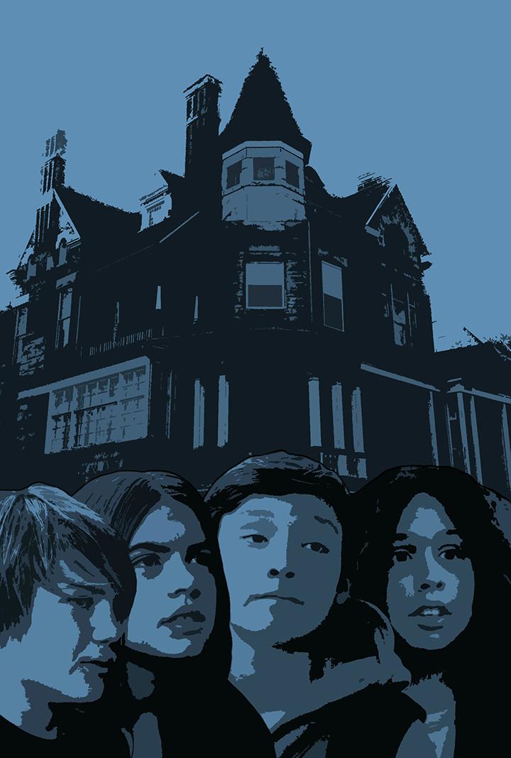
What's to see here? It's a logo you didn't make with textures thrown over it. What design skill are you showing here? Also, why is this horizontal? There is very little to say about this one. This is your weakest piece, but you're leading with it. Don't get me wrong, it looks cool, but you didn't do anything beyond textures and shadows.
Blue Kids
Again, what's going on here? It's a photomontage with a posterize filter. I have no idea what this is for, and you're not really showing any skill. This is your second weakest piece, but it's the second one in your line up. What does this one have that made you put it here?
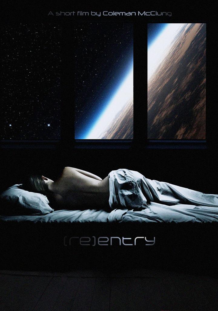
[Re]Entry
Designwise this is a very interesting one. I like your type choice and I like that you've given yourself a lot of space for text. I don't like the shadows over the text. If this prints poorly or is in bad lighting conditions, you might read it as "Entry", which would be unfortunate because it's placed right under her rear.
Where is this on a professional level
If this was meant for production and I was your art director, I'd ask you if you have the right to these images and if the font is licensed for production use. If the answer is no, I'd ask you to change it. Using unlicensed images will get your client in hot legal water.
Why doesn't this one have a tag line or credits? Not even a website.
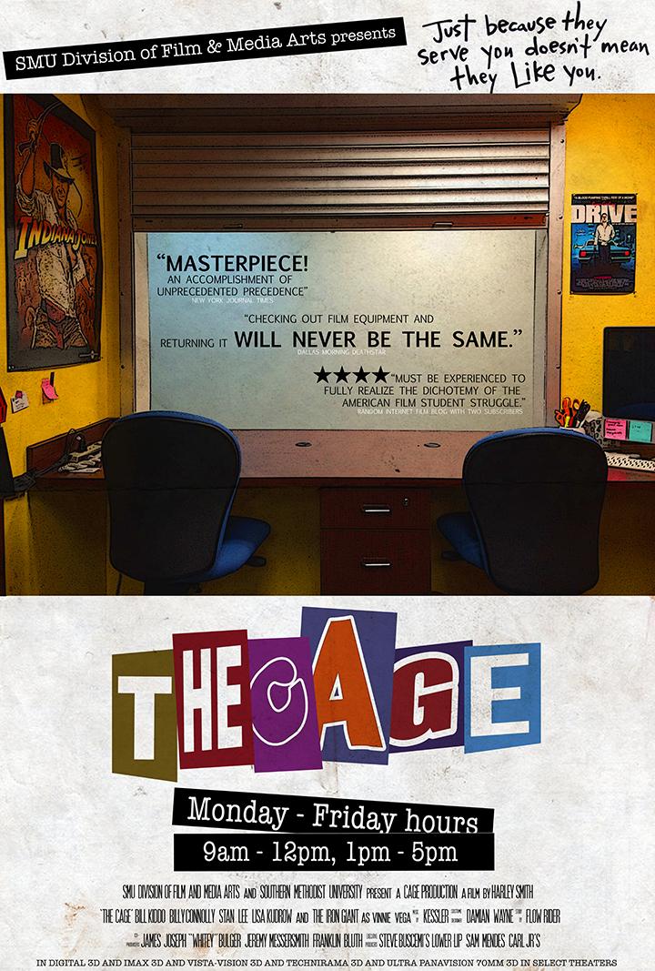
The Cage
So. Many. Fonts.
Still, this might be my favorite of the bunch. There are things that I'd ask you to change.
Where is this on a professional level
Again, I'd ask you the standard licensing questions.But I'd ask you to watch your type treatment. Why is there so much space between "will never be the same"
The title kinda reads like "The Age". I bet you could fix this if you mad the C as heavy as the A and the A as light as the C.
The text at the bottom is too close to the edge. It might get chopped off when you trim the poster... but it will definitely get hidden by a frame.
Departure
Why is this one horizontal? What are those thumbnails? Why is the title written twice?
Where is this on a professional level
I would have turned this back for a complete redesign. Everything is hard to read. The text is way too close to the edge.
Solaris
What's going on here? I have no idea what this is about, this poster tells no story. What is that smoke?
Where is this on a professional level
Again, I would have turned this back for a redesign. That smoke bothers me so much though, almost as much as that red graphic in her eye.
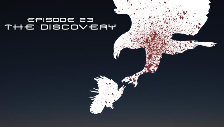
Episode 23
Why is this horizontal? What is this for?
Where is this on a professional level
At this point, I would wonder why you're using the spiderman typeface. This is just begging for legal action.
After re reading my post, it sounds so angry. I wrote it while taking care of kids.
All really good critiques, I really appreciate it.
-Tynic is right, the Departure design is a DVD cover.
-Most of this is in photoshop with some digital painting.
-The last one isn't the Spider-man font, it's the font from the book series this is based on.
This is really just a mash up of some things I've made in the last two years, and I'm glad that you're heavier critiques were on the older projects/half-finished mock up. That said, I know I am very low on the professional scale and actually plan on using that in marketing myself. Since this isn't a full time job for me yet, I might be able to come in at a lower price for clients who can't afford an ad agency or similar.
Thanks again, I actually am going to put a lot of your notes into effect immediately.
The consistent problems that I can see in your work are business and a lack of clarity. A complicated design can work, but it needs to be counterbalanced with a lot of restraint. Clarity means not only making sure that the visual hierarchy is clear, but also that the message (if any) that you want to convey is clear. Why is that red thing sticking out of her eye in the Solaris poster? Does the red thing have something to do with her eyes, or being watched?
Also this might seem dumb, but make sure you consume good design work. Surrounding yourself with good design will help to improve your design sensibility (just be careful not to become too derivative). Sites like Behance or FFFFound are good places for quick inspiration.
Good luck, keep posting your stuff!
EDIT: Find this book and read the shit out of it, it's great.
You know your way around Photoshop on a professional level, but it seems your design sensibilities are still developing. This is exactly the quality of work I would expect from someone with 1-2 years of experience. I was lucky enough to have a digital graphic design program in my highschool, but I remember most if not all freshman/sophomore projects resembling your body of work.
Anywho, regarding your work- The first thing that stands out is the over-use of filters. Photoshop filters scream "amateur" to anyone reviewing a portfolio. It's an understandable crutch that a lot of inexperienced designers use when they want to add visual fidelity to a piece and don't really know how. Instead, focus on the basics of design, and they will strengthen your work immeasurably. You clearly know your way around layer styles, and that's great when they're used tastefully. Your use of texture isn't a bad thing either, it's just a matter of using them in a way that doesn't compete with the composition or the context of what you're designing.
Your understanding of composition is decent, but needs some work. Knowing the focal point of a piece is essential. Try zooming way out, or standing across the room and looking at your work- What jumps out at you first? Should that be what catches your eye first thing? Is nothing catching your eye, but rather feels like noise? That should give you a good idea of where to start.
To avoid this in your future work, try doing mock-ups or thumbnail sketches first. You could do this in photoshop, but I strongly recommend just doodling with a pen and scrap paper first. Rough in where the features are going to go, and decide from that small preview whether or not it will work at a larger scale and with graphics.
Your use of type is on its way, as well. Seriously reconsider centering any kid of body text- it tends to create an amorphous blob that throws off your composition. Better to have a rag (unevenly justified lines of text) on one side rather than both. If needed, tighten the text field until the rag looks better. Avoid using the justification setting though, this was intended mainly for columns of text appearing in magazines and newspapers, and generally isn't suitable for packaging or poster design.
Otherwise, I like your use of novelty fonts for the titles, and you have a good sense of what kind of body fonts to pair them with.
One last thing to round out this small novel of feedback- Remember to take regular breaks while you're working to check and re-check that it's working. Print it out and tape it on the wall way across the room and look at it from a distance. Add a desaturation layer in photoshop to see that the amount of contrast you use is appropriate and that background and foreground elements are not competing for your eye (as they are in the Departure piece particularly). Flip it upside down or backwards to make sure your composition is balanced.
Some resources I like to use/follow: These are slightly out of date, as I'm mainly digital these days.
http://www.thedieline.com/ - Excellent blog for package design and branding
http://thedesigninspiration.com/ - I looove checking back here to see what the new trends are in logos, but they also post stellar examples of web design, packaging, illustration, etc.
http://paletton.com/ - Interactive color wheel to keep your pallet in check!
https://www.behance.net/ - Lots of free and cheap fonts, textures, and other resources.
https://creativemarket.com - More of the above.
And of course keep asking for critique! You're doing great, so keep it up.
EDIT: Sorry, I didn't realize I'd necro'd a thread. In the future I'll check the dates and make sure not to resurrect any more shambling horrors
meaghanglynn.com