As was foretold, we've added advertisements to the forums! If you have questions, or if you encounter any bugs, please visit this thread: https://forums.penny-arcade.com/discussion/240191/forum-advertisement-faq-and-reports-thread/
Options
Empire of the Ghouls
DMAC Come at me, bro!Moderator mod
Come at me, bro!Moderator mod
I got permission to post my work from another RPG project. These are from a book called Empire of the Ghouls by Wolfgang Baur. It was done on a patron/sponsor system with people buying the book in advance and then having input on the process. Kind of interesting. I'm currently working on some pieces for another book that's going to have an Arabian Nights vibe to it.
More info can be found here: http://wolfgangbaur.com/opendesign/
Anyway, on to the monsters...
Vulture Sphinx:

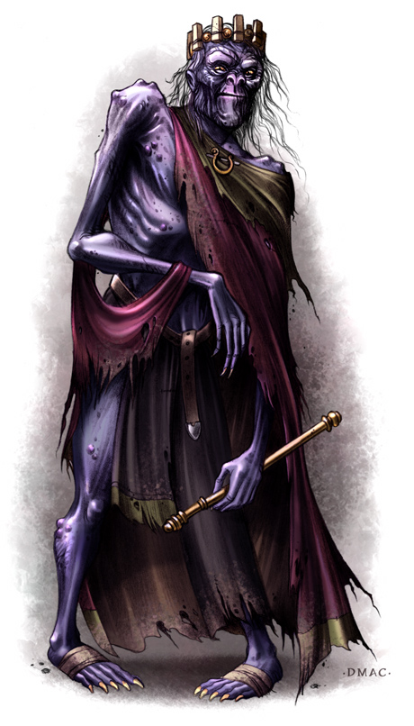
The Last King:
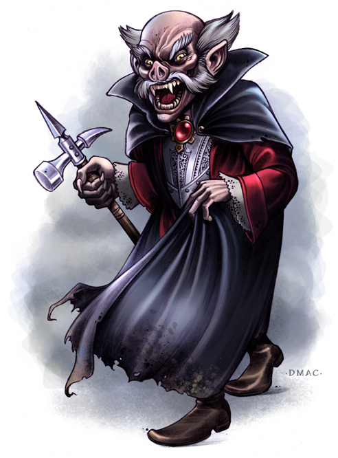
Gnomish Vampire:
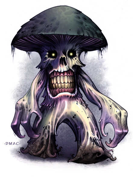
Deathcap Myconid:
I'll try to post some of my initial sketches and pencil drawings later.
More info can be found here: http://wolfgangbaur.com/opendesign/
Anyway, on to the monsters...
Vulture Sphinx:
The Last King:
Gnomish Vampire:
Deathcap Myconid:
I'll try to post some of my initial sketches and pencil drawings later.

DMAC on
0
Posts
Also, the art style, color saturation, etc are consistent and I think that's really important for doing a rpg book. You want everything to feel like it exists in the same world.
Just because I haven't experimented much outside the defaults, I don't know as much about other possibilities for brushes.
Do you have a custom set of brushes you normally use?
The Myconid is better, but still looks a little silly since the size of the mouth makes it look like a face with hands and feet attached. If it's not such a serious threat then I guess that's appropriate, but if he's supposed to be as intimidating as possible then a little less exaggeration on the face/mouth area might help.
But that's just stylistic stuff. Technically, all of this is first-rate stuff, DMAC.
My scary stuff isn't really all that scary. It's more "Jim Henson's Creature Shop" scary.
Edit: Which, as we know, is a lie. Please fix this, DMAC.
Way to go, kiddo! ;-)
Here's a process shot of the Myconid piece showing the pencils, flats, and final colors:
Fuck you, H-scroll!
is
awesome.
Our first game is now available for free on Google Play: Frontier: Isle of the Seven Gods
I demand answers!
not that there's anything wrong with the finals. they are just more processed and plasticy than i normally dig.
INSTAGRAM
This was the cover of Wolfgang Baur's Kobold Quarterly #1.
Here are my rough pencils:
And here's the final piece:
INSTAGRAM