As was foretold, we've added advertisements to the forums! If you have questions, or if you encounter any bugs, please visit this thread: https://forums.penny-arcade.com/discussion/240191/forum-advertisement-faq-and-reports-thread/
Options
Middle Aged Sketchbook
jimmyblevins SirPenny ArcadeRegistered User regular
SirPenny ArcadeRegistered User regular
EDIT: I changed my title from "New Sketchbook" to "Middle Aged Sketchbook" b/c after 2 yrs it is now Middle Aged.
Hello everyone. I didn't know what to put for the title and thinking of something clever would give me a headache, so I just put that.
I'm trying to get closer to how I want my art to look and I thought perhaps some outside perspective would be helpful. If you don't want to criticize that is fine
with me, sometimes I find it is just as helpful if people can simply describe what it is they are seeing.
I don't have any professional goals right now, I'm just trying to get better. The kind of art I like and that gives off the feel I am going for tends to be realistic but also expressive. I recently like Piotr Jablonski, Jeff Jones, Alek Maleev, among others. I like the art in East of West, and some of the value arrangements in V for Vendetta and From Hell (as well as the architecture and carriages). I like anime art, though I don't actually watch anime that often, but like Blade of the Immortal and those kinds of strange character designs. I like Art Nouveau too and the Baroque/chiarascuro style of painting. I do also like stuff
like Dada, but I'm not choosing to focus on those techniques here.
Right now I'm trying to work on values, as well as composition and perspective. I also want to draw things of greater variety such as environments and such. Enough variety so that I can create a world that looks like it can be inhabited and give a context to my thoughts.
Here's a couple recent things that can show you about where I'm at right now -- I feel kinda of embarassed honestly having just listed my goals, but anyways
They're all the same character (Alvin, an evil pilgrim)


Some more. Different characters though.

Hello everyone. I didn't know what to put for the title and thinking of something clever would give me a headache, so I just put that.
I'm trying to get closer to how I want my art to look and I thought perhaps some outside perspective would be helpful. If you don't want to criticize that is fine
with me, sometimes I find it is just as helpful if people can simply describe what it is they are seeing.
I don't have any professional goals right now, I'm just trying to get better. The kind of art I like and that gives off the feel I am going for tends to be realistic but also expressive. I recently like Piotr Jablonski, Jeff Jones, Alek Maleev, among others. I like the art in East of West, and some of the value arrangements in V for Vendetta and From Hell (as well as the architecture and carriages). I like anime art, though I don't actually watch anime that often, but like Blade of the Immortal and those kinds of strange character designs. I like Art Nouveau too and the Baroque/chiarascuro style of painting. I do also like stuff
like Dada, but I'm not choosing to focus on those techniques here.
Right now I'm trying to work on values, as well as composition and perspective. I also want to draw things of greater variety such as environments and such. Enough variety so that I can create a world that looks like it can be inhabited and give a context to my thoughts.
Here's a couple recent things that can show you about where I'm at right now -- I feel kinda of embarassed honestly having just listed my goals, but anyways
They're all the same character (Alvin, an evil pilgrim)
Some more. Different characters though.
jimmyblevins on
+3
Posts
These all seem to have a really cool mood, but perhaps lack some of the fundamental structure they need to hold them together. With stuff this abstract, its going to be hard to get the critiques you are truly craving. I suggest doing some studies, they will be hard, but in the end you'll feel accomplished, and the feed back you'll get on them will get to the very core of your short comings.
But here are some studies I've done, I didn't post them before because I felt that they would be boring to people.
A decorative egg from grandmother's house:
A corner of our house:
Our garage:
Figure drawing:
Everything has a bit of a rushed quality to it, it may be a good idea to push yourself to refine something. The first piece in the thread is the only one that strikes me as looking done, with the edges looking refined an nothing looking haphazard. The decorative egg strikes me as something that could be really strong with just a little more pushing. Going for that second or third lap on a painting can make a huge difference sometimes.
Yeah you're right. It's rare that I'll stick with something for more than several hours. I like to do it all in one or two sittings.
The egg I just started it in the afternoon then stopped when I had to go home, so that was the end of that one.
I had some new ideas for stuff last night in bed. I think that if I can get the value and color relationships right it'll go a long towards to making my stuff look more complete. The first one I actually didn't spend that much more time on than some of the other ones, but it did use the ruler and ellipitical tools a lot more than in the other imagination ones, so that may be partly why it looks cleaner. The thing I don't like about that one is that it's too symmetrical in terms of perspective and value arrangement.
There's also the concept that I based this off, which character I drew last year. Now I actually have a Haswell processor in my computer.
Also, I just threw in something that I did for my art assignment on Coursera (I'm taking Live!), just because it's a bit different from what I normally do and it's more craftsy and not as digital.
Did a study of my room. ~4 hours or so, till my tail bone got bruised from sitting in the corner on a hard wood floor.
Something moody.
Made a new brush. Made a guy with cow horns and no face.
Gang fight comic
I was staring at my bed sheets one morning and thought they looked like a rock formation so I drew them and turned them into rocks.
Janitor
A god named Bangdurak and the little disc faces who accompany him.
Pen sketches
Some solid improvements in some areas. I love the studies and the imagined rock formations. I feel like You have a really odd relationship with hard and soft edges, some of your images are all soft, and some of them are all hard. I suggest in images like the disc faces and the rocks, you start practicing material definition and edge control. How do you get those rocks to really look different from the sky and grass? Some of this is going to take longer than you may be used to working, and maybe seem like a tedious task, but in the long run you want your work to be able to look clean when that's what it call for.
I can see a bit of that East of West influence in the comic, and I caution you from rushing panels. It really sticks out in that drawing of the knife.
The last page of the comic is bad imo. The knife doesn't bother me much actually, though the linework on the grip isn't very subtle. The worst thing to me is that the environment is uninspired. That's why I'd never submit the comic and stopped working on it actually. I just couldn't place the characters anywhere and kept adding clouds to make interesting shape patterns.
And it bothers me that I can't do a scene with iconic poses, and sweeping panoramic vistas.
I think by the end of the course I was more comfortable just "going for it" with my ideas and not worrying about whether or not I had the knowledge/skill to actually pull them off. Also it was fun to make little stories for the characters you come up with. I bought $5.00 worth of Switches, so I'm probably going to Andrew Hou's Introduction to Digital Painting course next. That seems like a good idea, so I can learn about blending and coloring value comps and such.
Here are some of the Exercises we did for the course. There were 7 assignments, covering Line of Action, Shape, Silhouette, Space, Exaggeration, Extrapolation, and Story. Alex was really big on "Cafe Drawing", but I hate going to public places and sitting around for hours, so I cheated and just used gesture drawing tools for a couple hours a day.
As you can see I really mucked up some of the exercises and missed the point of them because I'm not used to thinking in terms of L o A and Shape.
Line of Action (30 sec drawings from ref. I made these too much like stick figures):
Shapes (30 sec - 1 min, no ref. I made these too much like silhouettes):
Silhouettes (1 min, ref.):
Space (1 min, ref. Left handed (dominant hand)):
Space (1 min, ref. Right handed (subordinate hand), I like aspects of these better than my left handed drawings):
Exaggeration (1 min, ref.):
Extrapolation (2 min, ref., for this exercise we were supposed to study an animal, and then look at poses from human models and transfer the ideas in the pose onto a realistic animal pose. I could not do this very well. I had a lot of difficulty in particular figuring out how to get a giraffe to hold a long rifle.):
Story (5 min per pose, ref. We were supposed to take a series of poses from a model and turn them into a story. I really liked this exercise, though it was pretty hard to come up with stories on the fly. It was like storyboarding. I picked for my main character a Super Hero who is basically like my version of Superman and all of his travails):
(This one is about him getting abducted by Aliens and stuck in a glass cage where is electrocuted for sport, but then he breaks free and the Aliens are sad):
(This one is called "The Fraternity of the Star" and is about my Super Hero abandoning his old chest symbol to join the Star symbol Super Heroes)
(This one is about how he goes into the sewers one day and finds a bunch of smelly dead sewer rats. He tells the investigators about them b/c he doesn't know what to do, then he barfs, then he gets his little sidekick to give him deodorant to spray the rats with):
Finally, I did these Gestures too one night for practice just drawing random shit:
I'm excited to see what comes out of the digital painting course for you, I think it will really be a good step forward.
Hopefully Monday my request gets completed. It'd really be nice if it were all automatic.
I checked their Kickstarter and found out that Schoolism is actually based in Canada btw, which makes sense since that's where their house is located. I just guessed California b/c that's where Hollywood is and they're having a workshop in San Francisco.
I was going through some of the Hogarth's Heads book, so I tried to learn something there
Did some quick drawings/studies of Barber's Hands too, b/c I needed to figure out how Barbers hold scissors and such to cut hair:
Lesson 1, just random sketching, but we were supposed to use a normal grey layer and then a multiply layer on top. I think? It doesn't really seem to matter to him what we do though. And actually I've watched him change his sketch method in this course, b/c sometimes he does his technique where he just silhouettes the character in blocks, but then later on in the cell shading assignment he drew it with lines. Nothing wrong with that...I was just torn b/c I wasn't using his silhouette technique when I was sketching earlier and felt somewhat guilty, but then he went and changed it anyways so I needn't have felt guilty at all.
Lesson 2: Practicing Rendering. We were supposed to take the outlines of random shapes he drew and then fill the same shapes with values in different ways to make them look different. Also, we had to sketch a character and then light it from different angles. I drew Samara from the Ring.
Sketch
and the lighting schemes
Lesson 3: We were supposed to do the sketch, then the rendering with multiply. Then color it with Color, Saturation, Multiply, Overlay, and a Normal layer. I can't remember the order...I don't think it's really that important.
Lesson 4: Cell Shading. This relied very heavily on lasso selections and fills. I did a football player for something different.
Overall I think these are good assignments. They seem to be forcing you out of your comfortzone and making you think about photoshop as the rather large tool that it is. Thats a really good thing, as getting too settled into a workflow can make it hard to achieve new things. Theres a lot of different ways to tackle digital painting. Trying out new things helps you be flexible and use techniques that best facilitate the results you want, rather than using the same five tools because they are what you always use.
The ring girl and the football player are looking pretty fun. The buffalo thing seems to lack any commitment to the forms, so everything looks overly rounded. The cell shading really benefits from the commitment to hard edges, but try to find them in your painterly work as well.
I like the shape studies, but notice that theres a bit of messiness there as well. Try to nail the blending/hard edges on those. Pushing yourself for cleanliness in those small studies is what helps make it come more naturally when working on larger pieces. You are breaking your problems down into small parts. Next time I'm at my computer I'll see if I can do a little paint over of what I mean.
I'm still working on this method of colouring b/c I'm not really satisfied with what I've done with it. My poor buffalo has unrealized potential. I think I know what you mean about hard/soft edges, because normally I do the sketch, which is all hard edges, then I do the rendering, which is all soft edges, then there's the step where you have to mix the hard/soft together so the character reads and isn't messy looking. I didn't actually do that part.
I think it'd be pretty exciting to have a paint over. It's always nice to see what decisions other people would have made instead and how they interpret things.
I'm still going to keep circling back on this coloring method for awhile probably even as I keep doing other assignments. I like the cell shading look too b/c of how clean it is, but you really have to have great linework to make it work.
It'd be nice if Schoolism had an anatomy class. I'm surprised they don't, except for Animals. Which is interesting though too, since I don't know much about animal anatomy. I imagine it'd be similar to human anatomy in some respects.
Anatomy is one of those things where I think learning tips and shortcuts from already heavily stylized illustrators can be misleading. Human anatomy is a large subject and proko does a good job of teaching it through structure. When you learn the muscle groups, how they interact, and how fat deposits cover them, you can apply that knowledge to a larger range of things. In the end though, you will probably have to cobble together many anatomy resources and refer to them often. Good list of books in this thread: http://forums.penny-arcade.com/discussion/196617/anatomy-resource-masterpost/p1?new=1
I'll really try anything though because having different instructors tell you basically the same thing in different ways helps me remember.
I did this one today, it's for Assignment 5 of Andrew Hou's course. This time we just coloured our character on a normal layer and used the eyedropper tool a bunch.
I picked U.S. chess GM Hikaru Nakamura for the character, but I redrew him as a Union Cavalry officer
Lesson 6 was the custom brush lesson. It gave me an excuse to finally organize my brushes, which were getting quite messy between the ones I had made and the ones I'd downloaded, most of which I never used anymore. We were supposed to do a drawing with the custom brushes, which included brushes based off photos and other sorts of special effect texture brushes, besides the normal type of brushes.
Lesson 7 was all about painting environments. It was pretty much a huge lesson packed into a couple lectures and it was impossible for me to learn everything. For the assignment we were supposed to do 6 thumbnail sketches of a character of our choosing in a variety of settings and lighting arrangements. I followed what he did in the lesson, where you draw a couple characters, and then just place them in different environments. I liked the idea of having little premade stock characters for myself anyways that I could just manipulate around. I drew Ryu & Ken for my characters.
Then I put them in these little technical environments where I just tried to focuss on one detail at a time:
And then the last assignment was just to draw a character in an environment of a similar complexity to the one he drew in his acccompanying video lecture, so I drew this spaceman running from a horde of angry monsters:
And then tonight I went back and worked on Lesson 3, to try that Coloring from greyscale method again that I can never get to look natural. I drew GM Magnus Carlsen this time, as a Viking b/c he's from Norway.
All my colours look washed out as fuck on this computer.
Really like the space alien painting. There's a nice leap in skill from the first paintings in the OP, and that's awesome. It seems like you are taking to the classes really well. I would look into proko's anatomy teachings, I think you would benefit a ton.
I've been doing some anatomy studies sparingly here and there. I feel a bit guilty about not doing more of it honestly. I try to fit it in with the Schoolism classes and my other drawing, but I usually end up coming a bit short. If Proko had assignments and told me what to do that would be great. I know I'm supposed to set my own pace, but sometimes it's nice to have a professional tell you that you have to do X for Y amount of time, the way that Alexander Woo did in his course. I'll definitely look at them at some point, but not yet. Or maybe I will...I have no idea. I"ll probably change my mind. Studying anatomy books on your own can get a bit dry.
After I finished Andrew Hou's course, I decided to take a quick detour and do Thomas Fluharty's Drawing Fundamentals. I wasn't really sure if it would be worth it or not, but it was only 4 assignments and 5 lessons, so I just did it this week. (Btw, I figured out why my course switches were so damn slow. When I went into my account profile, the lines that were supposed to have my e-mail address and password were both blank. So I filled in my e-mail address again, and I updated my password. Now everything seems to be working. Not sure how that happened....)
Lesson 1 was about Seeing. Specifically seeing shapes in objects. We were supposed to draw a giraffe, from ref provided, in a simple made up scene:
Turns out Thomas Fluharty does not like lines in drawings..so I stopped doing that after this assignment
Lesson 2 was about value. We were supposed to draw a lion statue from the ref provided (I don't know if I'm allowed to show these refs or not, since they are part of the course material on Schoolism). Then we were supposed to pick either another lion to draw, or an angel statue. I picked the angel because I did not feel like rendering another lion's mane:
I spent forever and a day on this Angel..
Lesson 3 was on Perspective. 1pt, 2pt, 3pt. We got a picture of the White House and had to draw from that:
Lesson 4 was Composition. Basically, use the Rule Thirds. That's the most concrete thing I got out of it. We were supposed to take the 5 photos provided to us and turn them into a novel composition. The pictures were 1) a park scene with trees and a bench, 2) a statue of Charles Dickens, 3) 4) 5) were all dogs running around and/or catching frisbees.
Besides that Schoolism stuff, I did some anatomy drawings from Vanderpoel:
I also started making some characters:
I think these studies came out nice though, and I do understand the motivation of being in class and having someone give you assignments.
I think that the angel is pretty strong, but it seems like in places your rendering is a bit haphazard. Are you working at low resolutions?
For the angel, I was actually working at 3000 x 2000, but I zoomed in to like 200% when I was drawing. Here I'll show you what I was actually working with before I cropped it:
Don't ask me why I zoomed in so much to do the drawing. I think it's a bad habit from when I was in the Gesture Drawing course. I would just take a huge canvas size, and then zoom in to 200% -300% so that I could fit in a lot of drawings while still getting full range of motion with my pen.
I'm taking Sam Nielsen's course right now. It's kind of kicking my butt. I've been going pretty slow through the lectures b/c it's been quite a bit more scientific than I'm used to from an art course. I really don't know a lot about many of the things he's talking about w/r/t the properties of light.
I did the first two assignments so far. One thing I really do like about these assignments though is that the video feedback is actually quite useful, b/c since everyone is doing the exact same drawing with practically the same lighting set up, the critiques he gives are more generally applicable. That's how I know I messed up a lot.
Here's the first one, we were just supposed to shade this object he drew for us using only values, with the light source coming from top and front (I realized too after I saved the .jpg that I took my texture off, whoops...):
The second one was like the first, but then we have to put some colors on the values and remember about how all the lights will interact. It's a lot to think about. Then we have to put a texture on one of the objects, and integrate that into the lighting scheme.
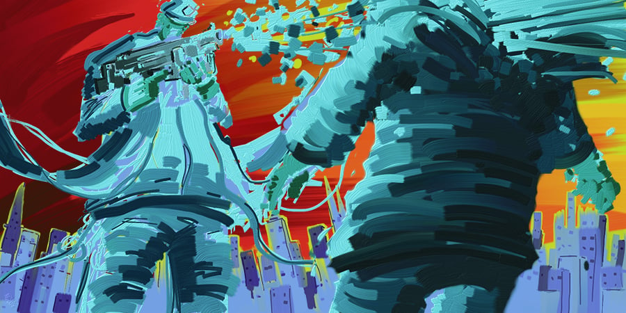
I also drew some levels for my imaginary game. First I did the day time scene, then I painted over it w/ some blend layers to make an evening and night scene. It's supposed to be a battlefield:
I drew a detail shot of a weapon too. I gave it claws and shells for the stats b/c swords and shields seemed weird since it makes it seem too 1:1
Then I did a version of the Balanced Soldier where he is powered up:
EDIT: I tried to fix the leg a little on this this morning b/c it looked pretty weird in hindsight
The 3rd one was mainly about Specular reflections and the range of surface types between Pure Reflective materials like Chrome, and Lambertian surfaces that scatter the light a lot more. We got 2 pictures painted by Sam Neilson: 1 was a background picture and the other was an external picture that we were supposed to imagine reflecting off the specular surfaces. I just blurred the background picture so that it wouldn't be distracting. Obviously you can't see the other picture except in the reflection, because it would be behind the viewer. The point of the exercise was to make sure that the objects had variable levels of specularity and looked like they were a part of a scene.
The 4th lesson was on Translucence and Refraction, meaning like skin and glass and that type of stuff. In the assignment, basically we were supposed to make it all look realistic. The glass with the liquid and reflections, the grapes with their sub surface scattering, and the air filled rubber ball.
The 5th lesson was on fur and hair. We were provided w/ a drawing of this monster that looks like it's from Where the Wild Things Are and had to give it all sorts of different hair types/lengths. It was also supposed to have a key light, rim light, and fill light.
I did a weapon made out of fur b/c I thought I needed some more practice at it and I liked the idea of a fur weapon
Then I did another weapon w/ an iridescent handle to practice that weird phenomenon
Then I did some more power ups (I didn't actually do any of these things in the order in which I'm listing them)
And I set aside some time and I went through Riven Phoenix's Blender tutorial for sculpting a person. It was pretty formulaic, so it didn't require much guesswork on my part until we started getting into the fine details, at which point it's pretty much artistic license to model as I see fit. I was pretty pleased w/ how this went along, considering that when I initially tried to model something I couldn't make the outline of a head.
I really like the fuzzy fox sword, and in general feel like you've been taking steps forward in your lighting. I feel like maybe @ChicoBlue or @Angel_of_Bacon are better suited to actually say something substantial about the lighting, if they have the time.
I think you're right about the grounding too. Part of it is probably b/c the objects are so much more rendered than the table cloth they are on, and the other thing is, I had some trouble with the shadows. Particularly the one for the glass. I just didn't know what to do with it at first, so I had to find a reference on bing and try to infer from that what the shadow would look like.
I started doing the Proko videos this week and last week. I drew some of the cubes, and tried to use Blender to try and help me w/ the perspective. I also started the figure drawing part. I wasn't sure if I should do that, or the anatomy first. Anatomy is more interesting to me, but my figure drawing isn't exactly great either. I can do both too I guess. But anyways I started the figure drawing and watched the 'Bean' video, then I did this drawing to try and practice the bean and twisting of forms:
Then I did a couple more Sam Nielson assignments. I always feel pretty intimidated when I try to start these b/c I feel like there's so much to remember and I'll never remember it all.
The first ones are for the Skin lesson. Sam provided two line drawings. 1 is of a guy, and the other is of a girl. We were supposed to color them in and give them value. The emphasis was on the skin, eyes, lips, ears, and trying to get them looking realistic. I ended up doing both b/c I did the guy, and I watched the video feedback, and wanted to do better, so I did the girl then.
This next assignment was about atmospheric perspective. Again, I'm painting a line drawing provided by Sam. We could pick whatever lighting direction we wanted, but the mountains were supposed to show a clear shadow and light side.
I also did another 3d render on Blender. This time I did the whole thing on my own. I'm probably gonna try to add some hair and maybe texture at some point. I have no idea how to either of those things right now.
The cloud/mountain one seems a bit flat, I think the brush texture is a bit too raw. The foreground cloud has some blue around it on the edge where it overlaps with the mountain, which is weird,
Overall, though, its really nice to see your steady pace.
My rocks always stink. I worked them over a couple times and eventually I just decided to move on. I think I didn't go dark enough on the clouds either.
Here are a couple more things I did recently:
This was Assignment 8 for Sam Nielson's Schoolism class. It was painting water. The only thing I painted in this picture was the water. Everything
else is a matte painting that Sam did as background. The water is supposed to be realistic looking, as usual, and that is what I was going for. So there should be caustic effects, color change depending on depth, reflections, waves, a flow to the water, etc.
I did some more drawings to practice the Bean too. I didn't really feel like just drawing a bunch of beans so I drew a bean to establish the pose and then
drew a full character.
I took the design for the soldier from the soldiers in Hunchback of Notre Dame. I thinned the lines out on them a bit too.
With the colors on your dude in the sky, you may want to take the blue into account when creating shadows. all of the colors in a scene tend to relate to each other, so try not to just plop a pallet into a setting with out thinking about the color of the light, and how the surroundings may reflect onto the object.
For that bg, I really did just copy and paste it from another bg that I did for a level. Originally I just had it like all the others with the flat color bg and the silhouette fill transform shadow. Then I threw the other bg on b/c I thought it looked cool.
I was doing some thumbnails for Nathan Fawkes course too. I just combined them all together. Some were color, and then the others were 3 value. I did an hour for the colors, and then 30min for the values, though I guess we were supposed to just do 20 min., so mine got a little more detailed.