As was foretold, we've added advertisements to the forums! If you have questions, or if you encounter any bugs, please visit this thread: https://forums.penny-arcade.com/discussion/240191/forum-advertisement-faq-and-reports-thread/
Options
Yet ANOTHER girly painting in need of critique
Asbestonia Registered User new member
Registered User new member
Hey guys, new to this forum and really impressed by your art and attitude toward giving thorough critiques. A really nice change from the stale cotton candy dished out by the majority of deviantart users.
Wondering if I can get some suggestions or critique for this half finished painting that had been annoying for a while now. No matter what I do to it, it still doesn't look right and can't pinpoint why. Any comments or suggestions about color choice, form or potential background would be really welcome. Thanks in advance.
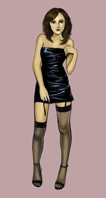
Wondering if I can get some suggestions or critique for this half finished painting that had been annoying for a while now. No matter what I do to it, it still doesn't look right and can't pinpoint why. Any comments or suggestions about color choice, form or potential background would be really welcome. Thanks in advance.
Asbestonia on
0
Posts
I'd suggest finding a good ref for the hands, and I would just scrap the head completely and start over, focusing more on construction this time.
But, yeah. This has the potential to be a really great piece, and it would look ten times better if you'd fix those two, relatively simple problems.
Ah, I just noticed the feet are pointing down too far. It makes her look like she's floating.
It needs to be blended a bit better.
Her right arm (viewrs left) also seems a but chunky.
Beautifully done though.
Other then what's been said, that's about it. Looks good though. Just those little errors that sorta make it out of Porportion (sp?)
If she isn't supporting the weight on her left leg then that will lead to a two additional paragraph rant of Hip angle + Body leaning to support the center of gravity.
Anyways as for the rest, her left arm is done very 2-demensionally, The reason why it ends there is because its aiming out more forward, which means that in general, the arm itself will not shrink as it draws closer even though the wrist is indeed smaller, so it looks as if she has a shrunken left arm.
Also, of course she looks like she is a blond... Who just escaped her special edd class because of that arm. The shoulder bones are offly angled.
One of the last things is her eyes are far to wide open, you should never be able to see her entire iris like that when casually looking, some people do have abormally big and open shiny eyeballs, (Like me) but in her current position and how shes looking, her eyes would be more closed. It would just look more natural.
Also, why is her right ear missing?
Edit: Oh right forgot, her right shoulder looks like she is trying to shake off a cramp. Far to high up makes it look stiff.
Oh.. forgot to mention, its not that her right arm is to big, its just that her left is a shrivelled up raisin
Also try and mimic her pose, because the way she's positioned, like the way the hand on her left is bent, are really uncomforable.