As was foretold, we've added advertisements to the forums! If you have questions, or if you encounter any bugs, please visit this thread: https://forums.penny-arcade.com/discussion/240191/forum-advertisement-faq-and-reports-thread/
Wherein I give in and ask seemingly silly questions
Red Raevyn because I only take Bubble BathsRegistered User regular
because I only take Bubble BathsRegistered User regular
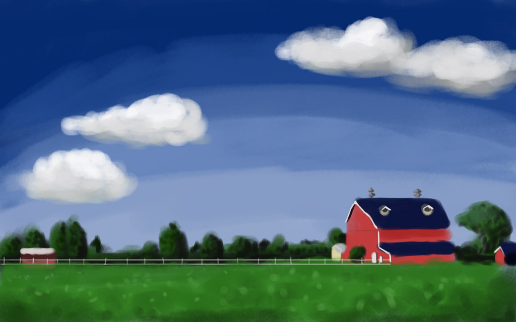
Been around here for a few years, but every time I thought about making a post I thought "well you should just research it and find the answer yourself instead of bothering someone". I'm going to suck it up and just ask for some help from time to time, even if the questions probably won't be novel. I've been doodling and playing around with painting (digitally) for a long time now, but usually in spurts with long breaks in between. Here's some of my stuff (spoilered for stupid sizes):
My question:
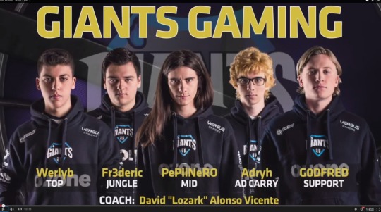
The other day I was watching a League of Legends video and thought the team roster picture looked like a great set of faces to paint, so I grabbed a screencap:
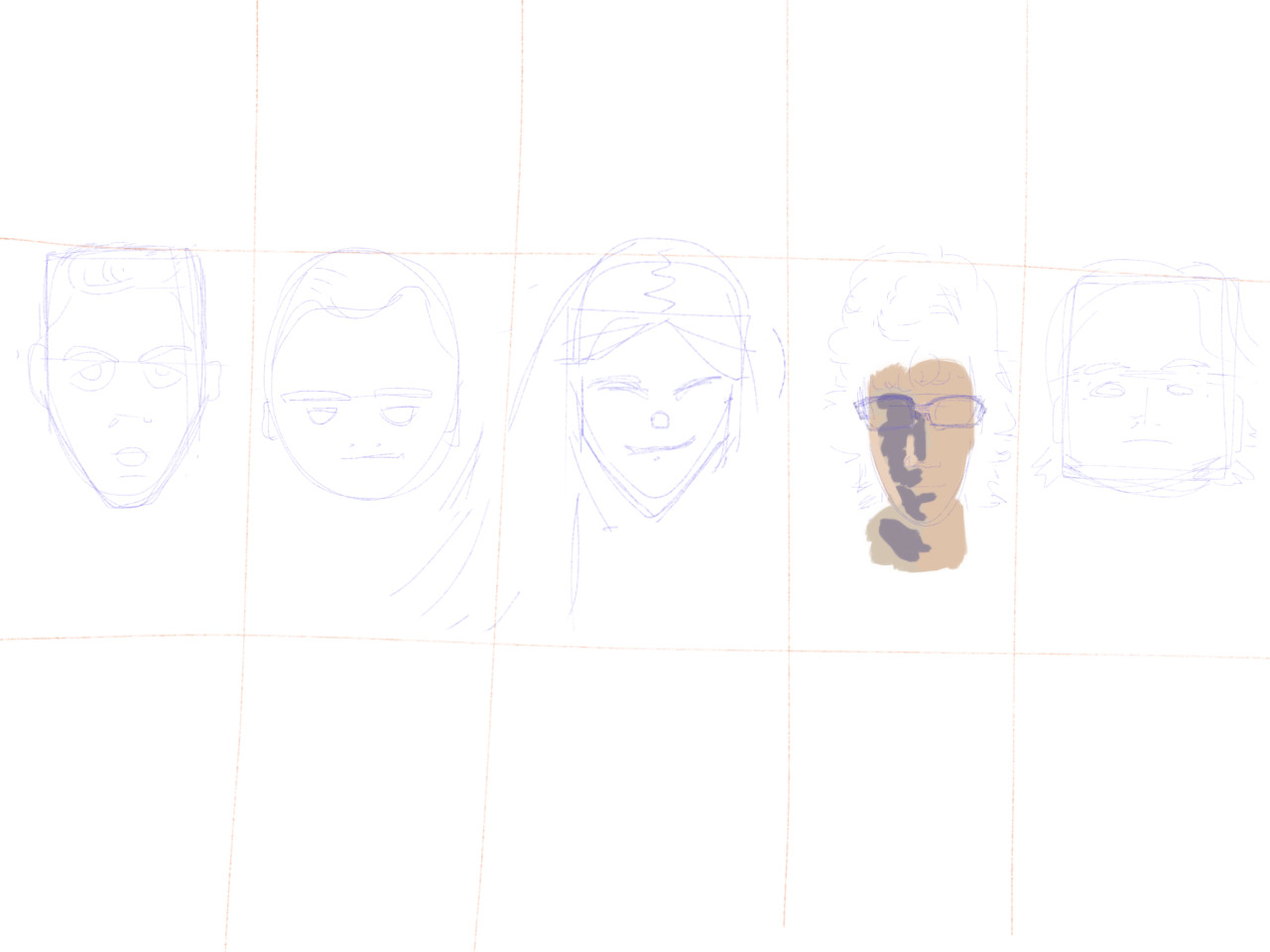
I'm pretty happy with my initial sketch, as is usually the case for me (sorry so faint here, contrast was better on the ipad).
When I wanted to start painting in some color though, the color picker makes me feel completely lost. From reading a lot around here over the years I know the gist of what I want to do, pay attention to the light, draw what your eye sees not what your brain thinks, etc, and I've succeeded in the past. But more often than not when I try to start painting color, I'm really stymied. And I really want to be able to render things, I get excited by paintings of not just clouds but shiny napkin holders or doorknobs. I love it when painters capture light.
I guess I'm somehow at the "where do I start?!" feeling with the infernal color choice even though I've gone through this a few times in the past. I feel dumb as heck asking something so elementary but I've been in a got-frustrated rut for a few weeks and I'm looking for some help getting out of it and back to practicing more frequently. In addition to advice I'm especially interested in things I can do in 10-20 minute spurts, which come up a lot at work (where I have my iPad and Procreate handy).
Recent:
Last year and older
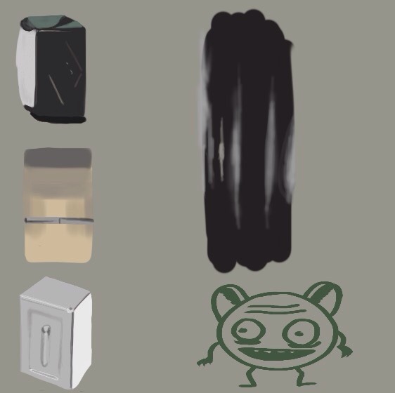
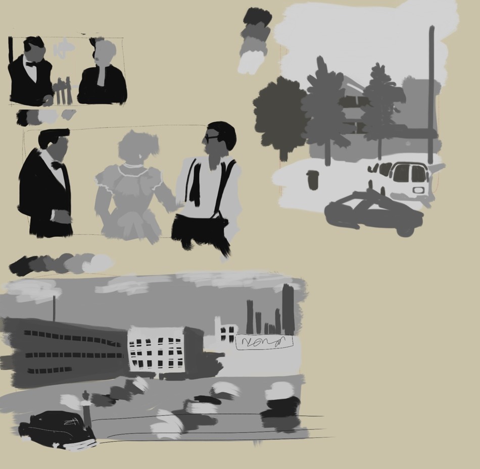
Wolves from ref to study fur:
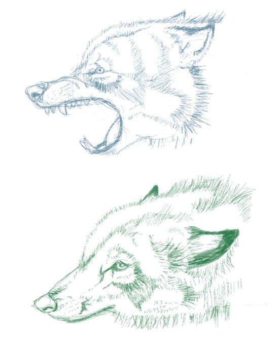
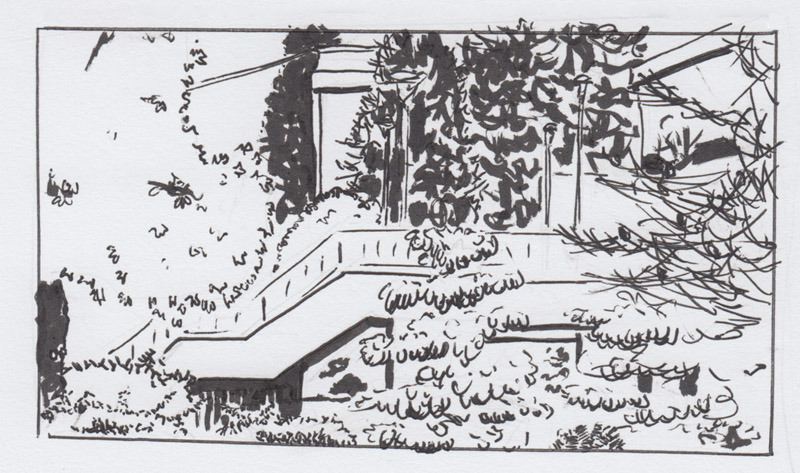
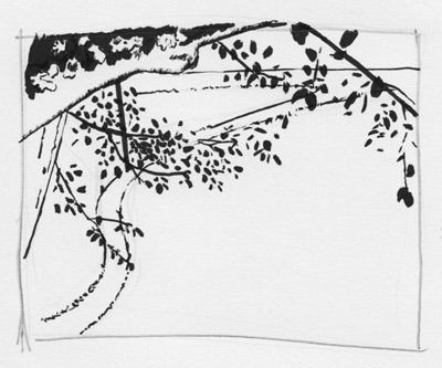
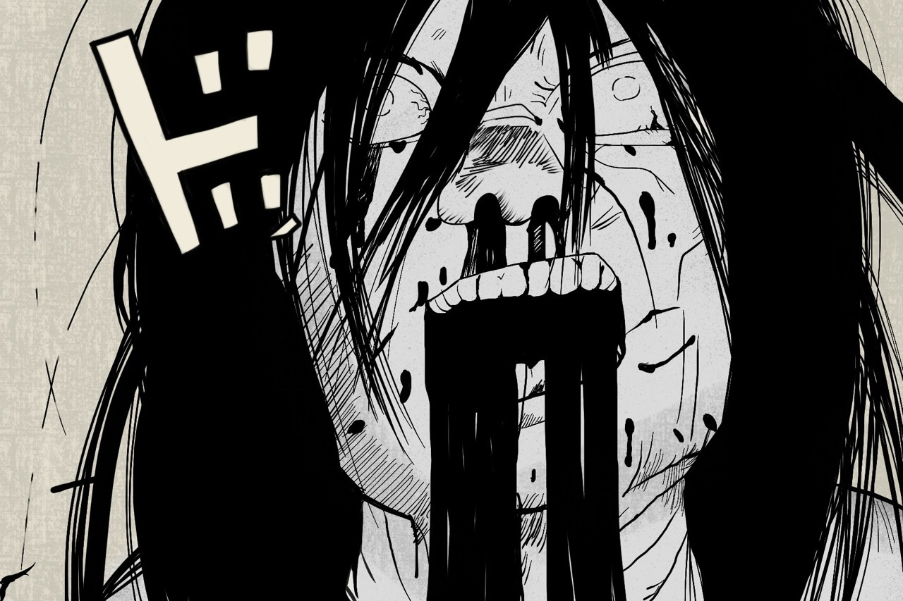
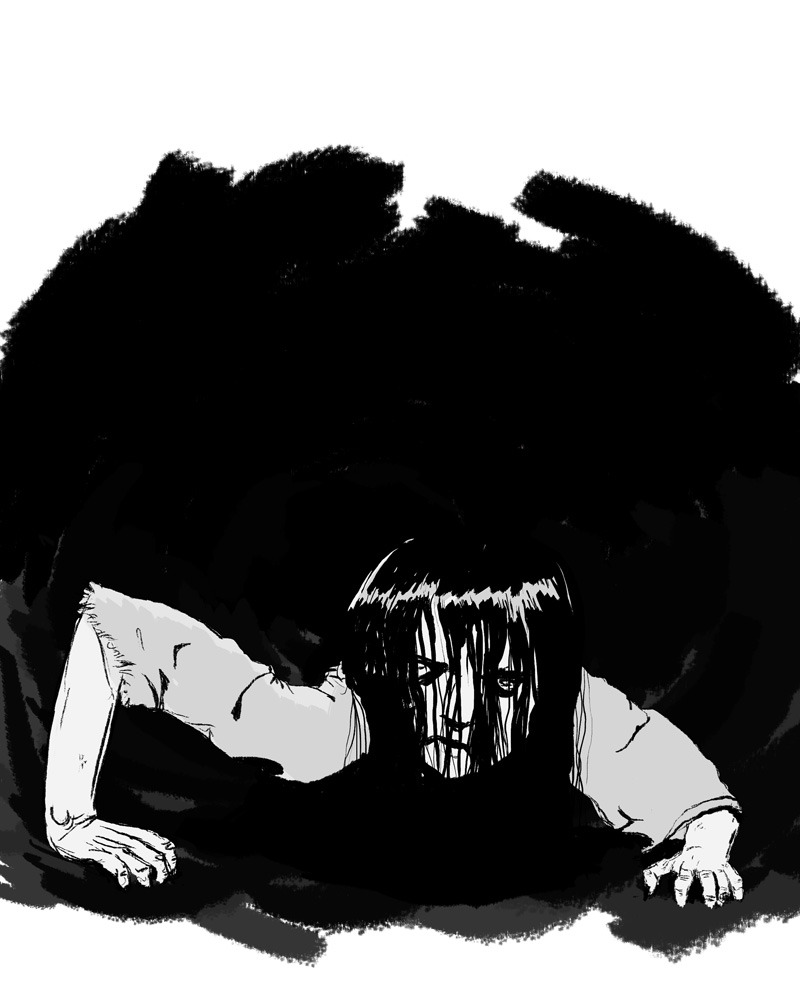
Face from ref for fun (a panel in AKIRA):
Last year and older
Wolves from ref to study fur:
Face from ref for fun (a panel in AKIRA):
My question:
The other day I was watching a League of Legends video and thought the team roster picture looked like a great set of faces to paint, so I grabbed a screencap:
I'm pretty happy with my initial sketch, as is usually the case for me (sorry so faint here, contrast was better on the ipad).
When I wanted to start painting in some color though, the color picker makes me feel completely lost. From reading a lot around here over the years I know the gist of what I want to do, pay attention to the light, draw what your eye sees not what your brain thinks, etc, and I've succeeded in the past. But more often than not when I try to start painting color, I'm really stymied. And I really want to be able to render things, I get excited by paintings of not just clouds but shiny napkin holders or doorknobs. I love it when painters capture light.
I guess I'm somehow at the "where do I start?!" feeling with the infernal color choice even though I've gone through this a few times in the past. I feel dumb as heck asking something so elementary but I've been in a got-frustrated rut for a few weeks and I'm looking for some help getting out of it and back to practicing more frequently. In addition to advice I'm especially interested in things I can do in 10-20 minute spurts, which come up a lot at work (where I have my iPad and Procreate handy).
0
Posts
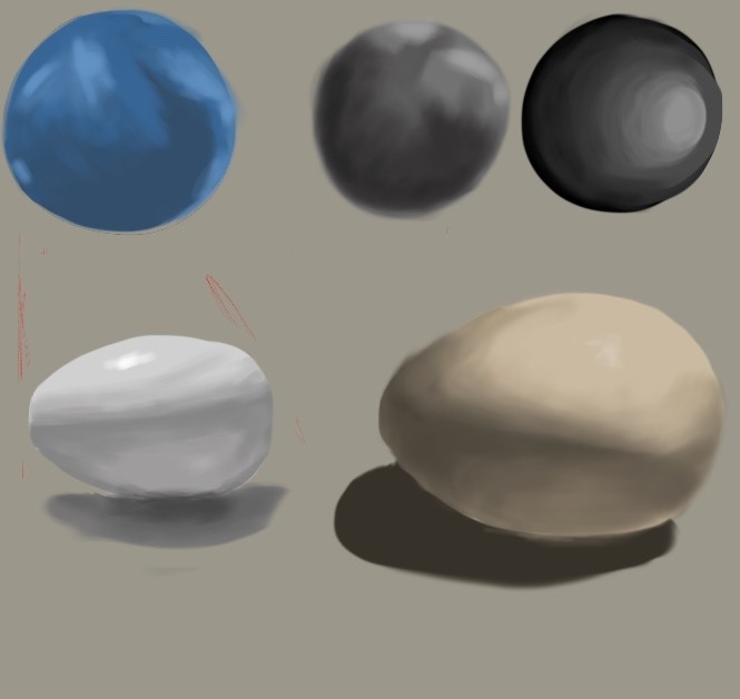
I came inside and decided to play with some brushes while trying some basic spheres from imagination (bottom left). I didn't think they were too hot, and decided to try agian using a picture of the scene as reference. I got to the bottom middle picture and said uh where from here. Then I tried using the blend tool, alternating between it and going back in to fix values, and got to the bottom right. So all in all, after an hour I managed to draw a sphere that needs work but doesn't make me cringe, hurray! The blend tool kinda feels like cheating, though.
Moving from the highlight outward, I observe:
-Highlight: pure white
-The area immediately surrounding the highlight: Cyan. Not a blue, but a specific, very saturated blue that is moved up the color wheel, almost into green territory.
-The midtone area: A light/mid value blue, a bit less saturated than the cyan.
-The core shadow: A purplish, saturated dark blue. If I were mixing this with real paint, there'd be a good amount of ultramarine in that mixture.
-In the shadows: A desaturated, greenish-blue. This is the result of the light bouncing off the yellowish gray of the ground, into the shadow area, as well as the ball directly reflecting that area. That reflection creates a warm-looking shape on the right side; if you observe it, it actually may appear a warm, reddish color- but this is an optical illusion brought on by the areas surrounding it being so blue. I haven't color picked it to check, but I suspect if I did I'd find it to in fact be pretty desaturated, with little actual 'color' to it. A gray surrounded by a cool color will appear warm, a gray surrounded by a warm color will appear cool. (additional reading, demonstrating how much you can get out of a single color if you know how to control your saturation: http://muddycolors.blogspot.com/2012/08/duotone-illustrations.html)
Now, in the paintings, I feel like you spent a lot of time trying to get "the color of the ball" right- what's referred to as 'local color'. A blue ball is blue, right? So finding the 'right' blue will get the 'right' result?
Then having chosen a color, you make some parts lighter, and some parts darker.
Now, if the objective was to say, match a color so you can go to a Sherwin-Williams so you could paint your room the color of that ball, focusing on the local color makes sense.
However, the thing to keep in mind is that when painting- trying to create a 2-dimensional representation of a 3-dimensional reality on a surface- there is no one single 'color of the ball'. In my rough breakdown, I've listed at least 5 specific, discrete colors that all equally can claim to be 'the color of the ball'. The 'actual' color of the 'actual' ball does not matter, because you may or may not actually be able to observe that color in the reality of the situation.
Only the specific colors you can observe matter. That same blue ball could appear pretty much any color depending on the circumstances of light, of its surroundings, of the atmosphere, of the exposure settings on your camera- and trying to focus on the local color will give you wildly incorrect results much of the time.
Probably the most common example would be how beginners tend to paint bodies of water- they think, 'water is blue!' and leave it at that. So you wind up with a lot of paintings of this super-blue water on overcast days, or during brilliant red sunsets, or in the pitch black of night; whereas in observable reality, water only appears blue as a result of the colors it reflects. If it's not a blue sky, it's not a blue ocean. This is a very broad example, of course- but it serves to illustrate that to get anywhere, you have to make sure your observations trump any assumptions.
In your paintings, you have tripped upon some of the observable colors- your first painting is closer to capturing the more ultramarine color of the core shadow. The other paintings get closer to the midtone color. But in trying to generalize that single color observation across the whole object, you wind up missing a lot of essential information- and as a result, the viewer won't buy it as a real object.
Now, I know you are looking for things to do in 10-20 min bursts and well- tough. 20 minutes is short for a drawing, let alone a painting. It's going to take time to observe well, it's going to take time to get a handle on turning those observations into accurate color notes, it's going to take time to apply those observations and still get the shapes, edges, and values right at the same time. But spending that time, taking the time to be accurate and observe well is going to get you a lot further a lot faster than doing a bunch of quick, rushed paintings. Don't do 7 'ok' paintings, moving on when you get frustrated. Stick on one until you get it right.
Twitter
If I go from a reference I can take it with me from place to place so I can come back to the same work when I have another opportunity. I'm going to try that.
I spent 2-3 hours on this through 3-4 sessions. Because the color picker can be overwhelming, to start off I was using the pallette to narrow the spectrum from infinity to 128ish options. I went a little extreme (it's way green/blue/red), but then using a white brush to paint over brought them closer to something reasonable. I tried not to spend too much time on the shape (in initial sketch), thinking I'd just focus on color, but my onion's shape being off kind of bit me when I was deciding where to put the color. Derp.
The biggest error though is that my onion is too white, it doesn't have that tint overall it should - is that reddish? I want to call it brown. I want to do better on this onion - am I better off trying to paint a color over/into it at this point, or starting over?
Meanwhile, this picture caught my eye so I decided to spend more time on the initial sketch, about an hour:
Now I've got about 30 minutes into the painting. Obviously lots more time to go but I decided to post before I get too deep to ask about method.
In trying to find some one to watch (because to get better at League of Legends I watch pros and streamers play while doing dishes and such), I found one source saying paint the highlights, then shadows, then do midtones, then go from there. That's what I'd tried with the ball. When I'd read about doing comics and stuff in the past, they always did flats, then shadows overtop then highlights... but that's a different goal.
Is highlights > shadows > mid tones > refine the general method? Does it change drastically depending on which medium you're using (simulating)? [I'm using the oil paint tool in MS5].
I feel like I need to read a "painting 101" book, but every thing I've seen so far seems focused on how to use the physical or digital tools, not what you're trying to do with them.
Over the years here I've had massive respect for y'all who are dedicated to art, but the more I try to paint the more my respect grows.
facebook.com/LauraCatherwoodArt
Block in your values with a big, hard edge brush. Once your block-in is complete, use that same hard-edge brush but kick the opacity down to about 40-50 percent and just work on the EDGES where two values meet, and slowly work over them to blend them. ONLY work on the edges where two values meet, otherwise you'll be blending away your values altogether. That's no good because values are the things that are going to describe plane changes, and that's what makes your object look 3-dimensional: Different value, different plane. See the second-to-last step below? That's just color picking with the eye dropper and blending the edges of the planes I've already established in previous steps.
Once you're done blending between planes with a medium-opacity brush, you can go in with a small brush and add small details to finish your study.
As for color picking, my main suggestion would be to pay a lot more attention to color temperature and a lot less attention to hue. The body of the onion is basically desaturated pinks, reds and yellows. You're seeing desaturated areas, which look cooler, and thinking "blue." It's really a trick of perception because there are no blues on the main body of that onion (there is a hint of blue in the shadow near the top of the onion.) Again, try to think in terms of warm and cool tones, and when you want to go cool, try desaturating your color and shifting the hue slightly toward the cooler end of the spectrum -- don't just jump to blue.
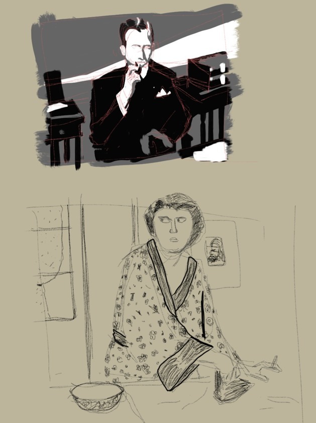
I made steady progress on the woman for a while. The first shot below is right after I painted in a background per m3nace's advice and went "whoa!" at how off the color was. I worked on fixing the face's colors first, then its position and the neck.
At that point I could see basically all of the colors were off, so I moved on to the dress next since it surrounded the arms anyway.
Then I got busy for a few weeks and didn't paint. Now that I've got time to paint again I'll probably start another piece even though I can still see lots of errors here, because I'm a little sick of looking at this one. I put about a dozen hours into it and got a lot from what you guys have been saying in here, looking forward to applying it to the next thing.
The length of that lady's arm is the most obvious bit of a measuring mix-up.
There's a pretty neat little drawing video/packet by Dorian Itens that goes over some basic methods and things to think about when you are trying to accurately draw something. It's available on Gumroad, and is a pay what you like sort of thing.
Here's a link to James Gurney's overview of it. The link to the actual video is at the bottom of his post.
gurneyjourney.blogspot.ca/2015/07/dorian-itens-accuracy-guide.html
The colors were frustrating but in a kind of fun way. When I realized how late it was and had to stop, I had that "step back and look at it" moment and saw my proportions were way off. Remembering the advice I had previously, I said next time I sit down I'll focus more on the drawing, and also just go grayscale to not worry about color yet.
But I moved from drawing to painting shamefully quick. I'm a lot happier with the values (though I think my range doesn't go light enough), and I got the vertical spacing of eye/nose/mouth pretty well, but goodness gracious it's a completely different person. I totally neglected to pay careful attention to jawline, chin shape, eye size, ear shape - I erased that ear and redrew it once, but obviously auto-piloted it as a generic ear.
So my self-appointed next task is to draw-only a bunch of faces, because dang does it need work and as fun as painting is I hate looking at something I spent 2 hours on and feeling like I polished a turd.
Proko videos are helpful, though I can't take it all in right now.