As was foretold, we've added advertisements to the forums! If you have questions, or if you encounter any bugs, please visit this thread: https://forums.penny-arcade.com/discussion/240191/forum-advertisement-faq-and-reports-thread/
Options
blinds art thread
BlindPsychic Registered User regular
Registered User regular
Hey guys, I posted once here a long time ago, but I wanted to start a sketchbook thread in addition to my current plans of trying to really up my drawing game. Some backstory: I completed art school a long time ago and finished up an illustration program. I've kind of fallen out of rigorous drawing since then. I'm currently mostly doing design and layout things, and as part of my plan I do want to start knocking out some portfolio stuff for that. I really want to get a strong portfolio together so I can get out of my current gig, although that one would most likely be design focused rather than illustration focused.
But anyways, I really want to improve my art, I feel like I've stalled pretty hard and haven't been improving. My battle plan right now looks like this (and ideal after work plan):
-Knocking out a lot of gesture drawings/life drawings (60-120 second poses)
-Anatomical study
-Try and draw something mechanical (something which I'm terrible at)
-Start working my way through the exercises in a few books I have lined up (Loomis, Robertson's Perspective book, and a few others)
I've also been experimenting some more with doing just contour line drawing just to break myself out of my symbol drawing, I'm kind of sick of the way I draw things and I'm trying to add some fresh ideas into my brain.
I'm also hitting a life drawing session once a week, possibly 2 if I have the cash.
I just really want to improve my draftsmanship and then move on to some other stuff like getting better at digital painting. So I turn to you guys for some crits and advice. Here's some stuff from my comeback:
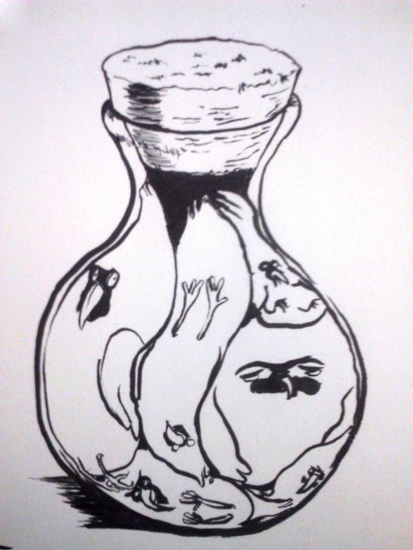

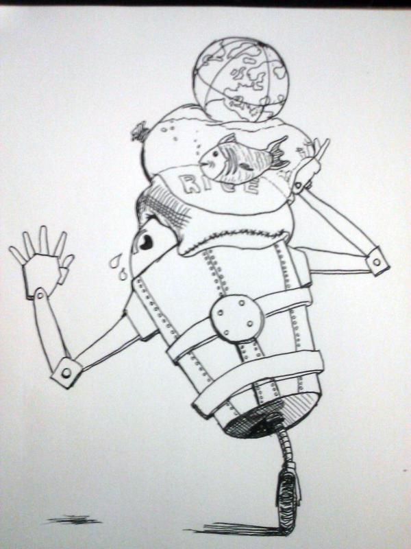


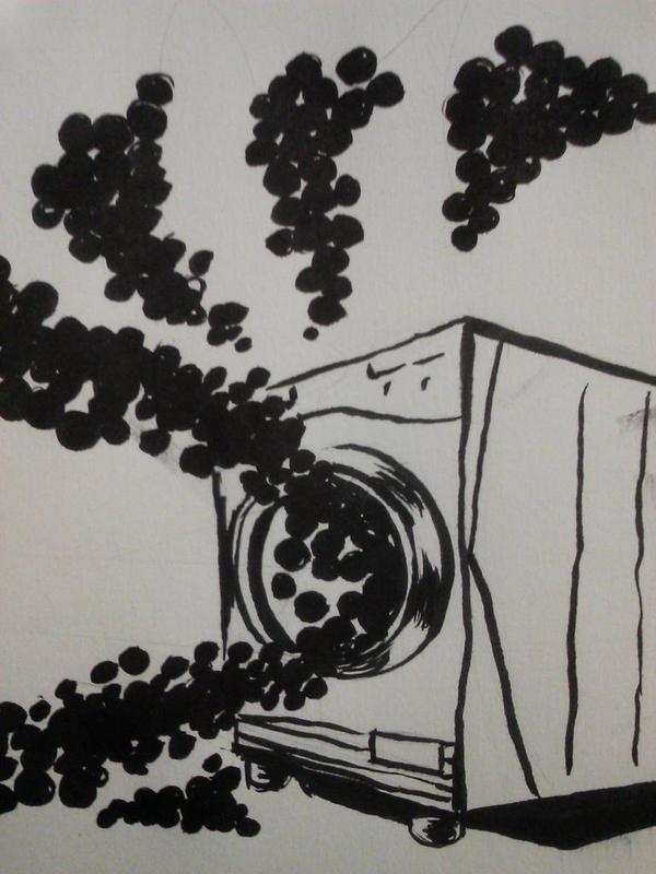
Some inktober doodles, these have been mostly for me to just draw out of my comfort zone subject matter wise.
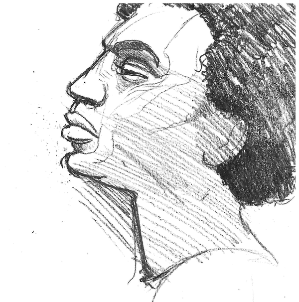
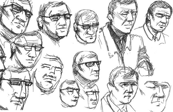
Some sketches from life
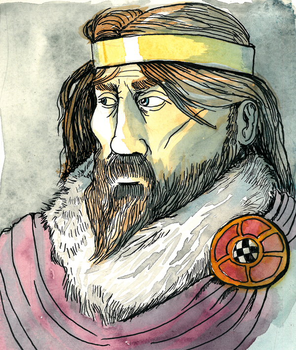


And some paintings.
But anyways, I really want to improve my art, I feel like I've stalled pretty hard and haven't been improving. My battle plan right now looks like this (and ideal after work plan):
-Knocking out a lot of gesture drawings/life drawings (60-120 second poses)
-Anatomical study
-Try and draw something mechanical (something which I'm terrible at)
-Start working my way through the exercises in a few books I have lined up (Loomis, Robertson's Perspective book, and a few others)
I've also been experimenting some more with doing just contour line drawing just to break myself out of my symbol drawing, I'm kind of sick of the way I draw things and I'm trying to add some fresh ideas into my brain.
I'm also hitting a life drawing session once a week, possibly 2 if I have the cash.
I just really want to improve my draftsmanship and then move on to some other stuff like getting better at digital painting. So I turn to you guys for some crits and advice. Here's some stuff from my comeback:
Some inktober doodles, these have been mostly for me to just draw out of my comfort zone subject matter wise.
Some sketches from life
And some paintings.
BlindPsychic on
0
Posts
And some from life drawing
I think you are doing the right stuff. If you have the cash, I suggest picking up Scott Robertsons "how to draw" books, as they will get down to the roots of draftsmanship (And frustrate the hell out of you as doing the beginning exercises and sucking at them makes you wonder if you EVER knew how to draw).
You may want to think about watching some proko videos about anatomy, as they can help add some structure to what you are looking for in life drawing. There was a great review of his premium options over in our online class master post: https://forums.penny-arcade.com/discussion/196620/online-art-class-masterpost#latest
If you think you'll probably end up pursuing design work, I'd encourage you to mix that in with your studies too, trying to push into design work that interests you over your current job. We have some assignments and enrichments that may give you some guidance and inspiration, too.
I like the three paintings the most. Your eyes are a bit flat, which generally comes from a lack of understanding the structure before attempting to simplify. I would dig in a bit in that area.
Some more inktober
Some more drawings
facebook.com/LauraCatherwoodArt
I'll try and dig out some examples in a bit
https://www.pinterest.com/pin/268245721527926494/
The right face on this little page is more inline with what I mean though:
https://www.pinterest.com/pin/153755774755597335/
If you want to think about it in a stylized realm, I've been looking to caricature for inspiration:
https://www.pinterest.com/pin/564638872004563875/
The more understanding you have about anatomy, the structure of eyes, and the face in general, the stronger your stylizations are going to be. You'll be less afraid to define a form because you know you'll be doing it in a way that means something. I suggest going at it from an anatomical angle first, it may not be the look you'll want in the long run, but breaking down the problem will really benefit you.
This drawing from Loomis helped a lot. I'll knock out a few more and post them here
I don't have too many digital sketches right now, but I have stuff I've finished including some commission things
In January I set myself of doing a painting every day from an old master, there's one missing here from a PS crash, and I ended up a couple days short, but I learned a lot. These ended up being mostly sketches, probably 2-3 hours each, it varied.
There's still a lot more I want to work on. My big two things I want to lock down on now is accuracy and line confidence. They both kind of go hand in hand, but I feel like they're my two biggest weaknesses. Other stuff is mostly getting on perspective stuff more and getting more confident with hard surface stuff. More life drawing too.
Glad you are done with whatever surgery you needed, I hope recovery is going as planned.
I feel like theres alot of overall improvement going on here, which is great to see. I love the light you have on the first drawing of your bird-dude, and the master studies are shaping up pretty well! Doing one regularly is a great plan, I hope you can keep up with it!
You might want to mix in some landscapes, if you want that to be part of your skillset.
With inking I feel like i just end up weakening my sketch in the ink phase instead of helping it. Mostly because the wavering line weight I think.
And on the painterly front it's mostly in brush control. I've been practicing with just a solid color brush first and then softening edges where they should be. It ends up getting over worked and not helping.
So basically I'm just wondering how much it is is just mileage. But I'm wondering if there's a logical way to practice things in studies so I don't get rattled. Trying to do my own pieces just frustrates me more than anything because of those process things. So any help would be appreciated. I wanna post some sketch pages soon too just to get some feed back on that and so this isn't just a text dump. Thanks y'all
For painting, often studies of maters sort of have that effect of looking way better than what you can currently paint. The source material is better than what our imagination produces. You can combat it with gathering reference like hell, with lighting schemes that are about what you are going for, and studying those before you embark on your painting. Its a pain in the ass, but it does work.
I think process itself is more personal, unless you are on a production timeline (or want to be in a studio environment) you can have a bit of a messy process if it still nets you results. You'll benefit from watching other artists tackle things, so If you have a schoolism sub, or favorite artists who stream, spend time just casually watching them and trying to dissect how they tick. Despite the way it can feel sometimes, there are multiple approaches to getting the same results, and few of those approaches are "wrong" though some are inefficient.
I feel like some of your paintings would benefit if you eliminated the lines and went fully into painting. Sort of a personal preference, but thick, black lines flatten things out, and you are clearly going for light and volume. It maybe challenging at first, but it'll afford you some new avenues for learning how to finish things.
Anyway, be sure to post some images inline if you want people to look.
First here's the new paintings since phone posting prevented it:
And some sketches. sorry for the cam shots
Here's some older stuff from ~6 mo ago
And here's a Rembrandt study I was working on this week
Those plant sketches have a lot of life to them, and the study is alright too.
Here's some
art from this week
This one was a very long painting for a change. I probably could've kept working on it but I want to move on from it now. Back story on tumblr
I like your sketches though! Nice to see the exploration.
This was another 'fast'ish one in that it wasn't meant to be a full illustration, just an idea of a pose I had. something isn't clicking with it and I'm not sure what. But I feel like I'm improving with each one of these I work out. I think working through resolving all the parts of a picture is worth it for my development and not doing things flippantly which I've done too long.
Twitter
Hows this?
The top 2 sketches are possible solutions to the problem: either orient the foot so it is inline with the leg, or rotate the whole leg at the hip to match that orientation of the foot. Trying to maintain the current orientation of both makes the ankle look broken, because the ankle does not have the ability to rotate that much in that direction by itself.
EDIT: On second examination, you might be attempting the second version, but it's not coming across because of a lack of definition and structure to the anatomy- bending the shinbone and misplacing the calf muscle has warped the initial read of the anatomy.
Twitter
Oh I am reading it backwards, this leg look better now?
My initial confusion was about where the placement of the knee was- it's not very well defined, and given the silhouette I thought it was in a different location altogether.
The new one is a bit better, yes, but I feel like leaving the knee and shinbone not having any shading to indicate them makes the leg still feel a little unstructured. Also, it's worth noting that in my drawings and paintover I'm making a point to have the front contour of the shin be a straighter line (to indicated the hard, straight shinbone) versus a more curved contour on the back (to indicate the fleshy gastrocnemius muscle). Opposing curves versus straights in this manner is a pretty standard way to add strength and structure to a drawing- having symmetrical curves on a limb can make the drawing seem flat or like the limbs are being puffed up like a balloon, rather than being a structure of bones and muscles and tendons all interacting with each other.
Twitter