As was foretold, we've added advertisements to the forums! If you have questions, or if you encounter any bugs, please visit this thread: https://forums.penny-arcade.com/discussion/240191/forum-advertisement-faq-and-reports-thread/
Options
Webcomics/Illustrations or ican'tthinkofasnappytitlejustgowithit by Alex Smith
AlexSmith Registered User regular
Registered User regular
Hey Y'all! My names Alex, and I literally haven't posted here since 2014 (yikes), but I thought I'd pop in and put up some of my art if anyone is interested to see! Also, I seriously can't find any other online communities with an active, good art scene and you all seem really nice!


Some The Adventure Zone art I did at the beginning of this year of Tres Horny Bois

Some stand-alone illustrations

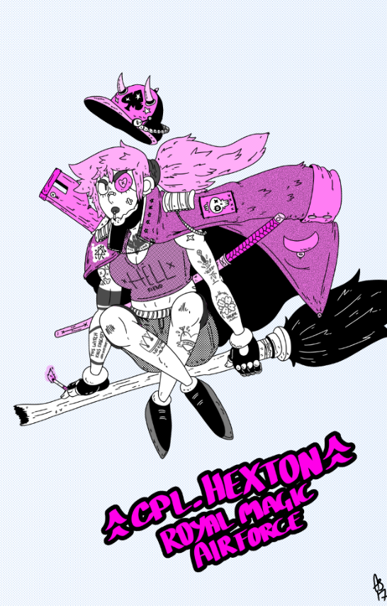
A re-draw of an old page from my webcomic, NO_SUN [link in the signature]. This is part of my patreon/going towards me releasing a published edition later this year. [link to the original page for those interested]
That's all!
C&C welcome!
Some The Adventure Zone art I did at the beginning of this year of Tres Horny Bois
Some stand-alone illustrations
A re-draw of an old page from my webcomic, NO_SUN [link in the signature]. This is part of my patreon/going towards me releasing a published edition later this year. [link to the original page for those interested]
That's all!
C&C welcome!
+5
Posts
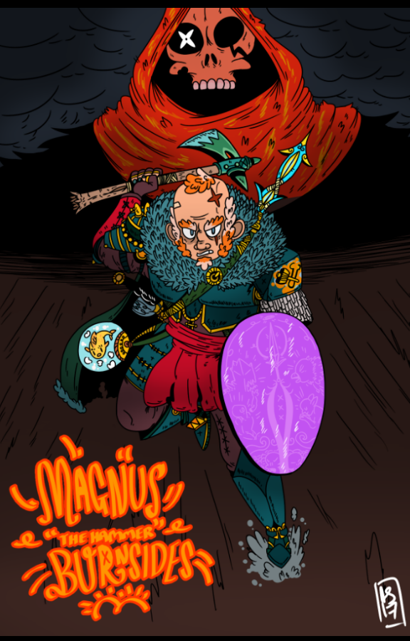
I like the pallet on your first one, and really enjoy your flat colors. I think the sort of soft black gradient on the magnius one are a bit weird, its placed more like you just wanted to make an object here or there pop out than actually lighting it. Its hard to skate the line between "Im not shading this" and "I'm going to light this consistently", so thats something to watch out for.
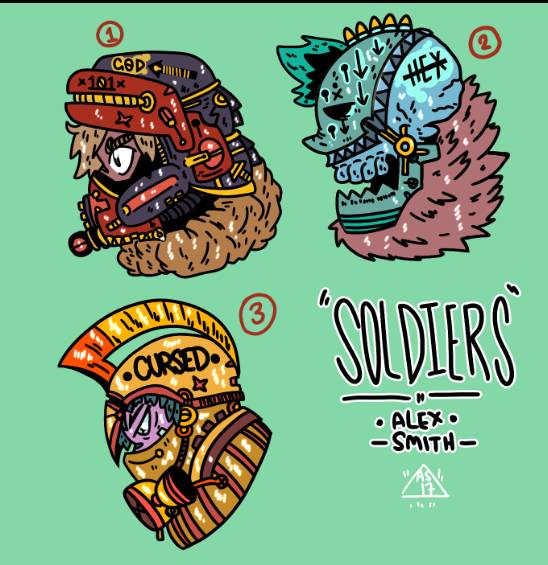
Overall you have some fun shapes, the yellow jacket guys are by far my favorites.
The typography is a little rough, the hand drawn look of it's fine but the style and color don't seem to fit doesn't fit with the rest of the piece.
It kinda got side-lined due to lack of interest! Im popular in my local scene but it's fairly small haha
Anyway, sorry for the radio silence, here's a dump of some recent work:
PORTFOLIO
PM FOR COMMISSIONS
The orange text on the first couple is hard on my eyes. Hard to read. Something about the orange fill with orange stroke. The last things ya posted are gigantiiiic and hard to see as a whole image because I have to scroll so much to see the whole thing.
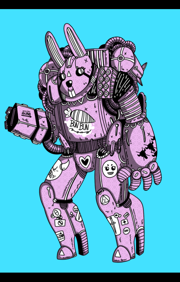
Bunbun bunny bot is so cool. IMO some of the strongest images here have some sort of limited color palette.
INSTAGRAM