As was foretold, we've added advertisements to the forums! If you have questions, or if you encounter any bugs, please visit this thread: https://forums.penny-arcade.com/discussion/240191/forum-advertisement-faq-and-reports-thread/
Options
Locust: McGibs Remakes an Old Comic!
McGibs TorontoRegistered User regular
TorontoRegistered User regular
Hey friends (I'm back for my sporradic dip into the AC!)!
A long long time ago, I was making a comic called Locust and the art community here was a great sounding board for me. Locust was full of dumb highschool-isms and anime tropes (I started it when I was 16), and I really didn't have any coherent plan for the greater storyline or structure. I kept it going for a while into college, but eventually outgrew it and decided to move on to other things (like making video games).
Now, almost 10 years later, my partner and I have decided to try and take another crack at Locust. She thought there was some interesting things with a few of the characters and world-building elements and somehow convinced me into rebooting it as a whole new project. Together we've been script writing, tinkering with concept art and are ready to start showing off some of the early designs and ideas.
So here we go!
Locust is a sci-fi story about a couple people trying to rebuild themselves from their troubled pasts, while trying to survive an equally troubling future. It's got music, rebellion, romance, political intrigue, and lasers!
The story takes place in the city of Akara, an ancient city from a long-lost empire. In the time before the comic, Akara was revitalized by entrepreneuring Syndicates who became rich and powerful from the ruin's advanced technologies. Recently, the Syndicates have been dethroned by the fanatical Catharians, outsiders who claim to be the rightful descendants of Akara's creators, and inheritors of it's treasures. Currently Akara is in a precarious state, as the newly "liberated" population has no interest in trading one dictatorship for another.
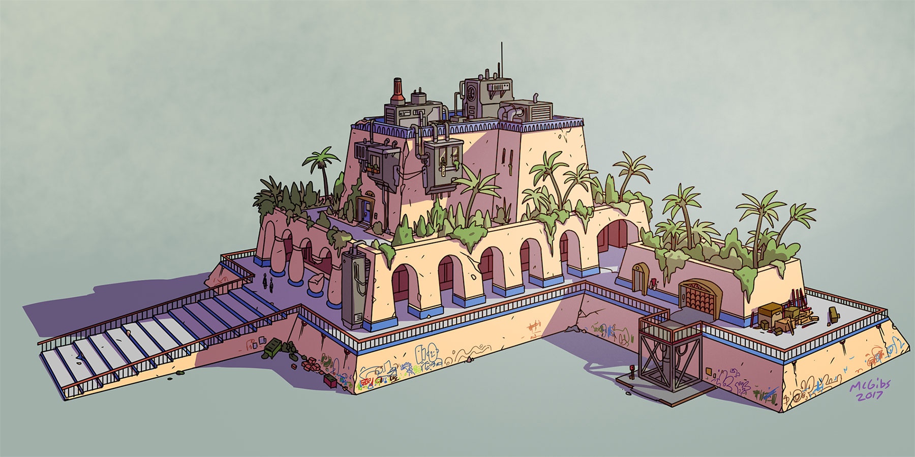
Aesthetically, we wanted to model Akara on a sort of "cyberpunk Babylon". It's a desert oasis city, lush with green gardens, and towering with ancient architecture from an advanced civilization. It's also a reclaimed city, blasted apart and rebuilt by countless people; crumbling statues defaced with corporate signage and ziggurates bristling with parasitic favelas.
This was a test building I did to try out some styles and technical processes. I made a quick 3d mockup in sketchup and used that as a base for the drawing. The majority of the environments in the comic will be constructed this way to save my sanity.
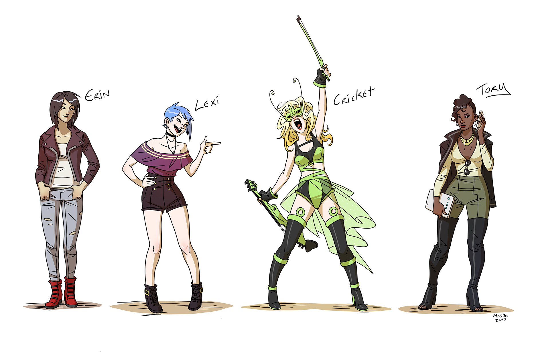
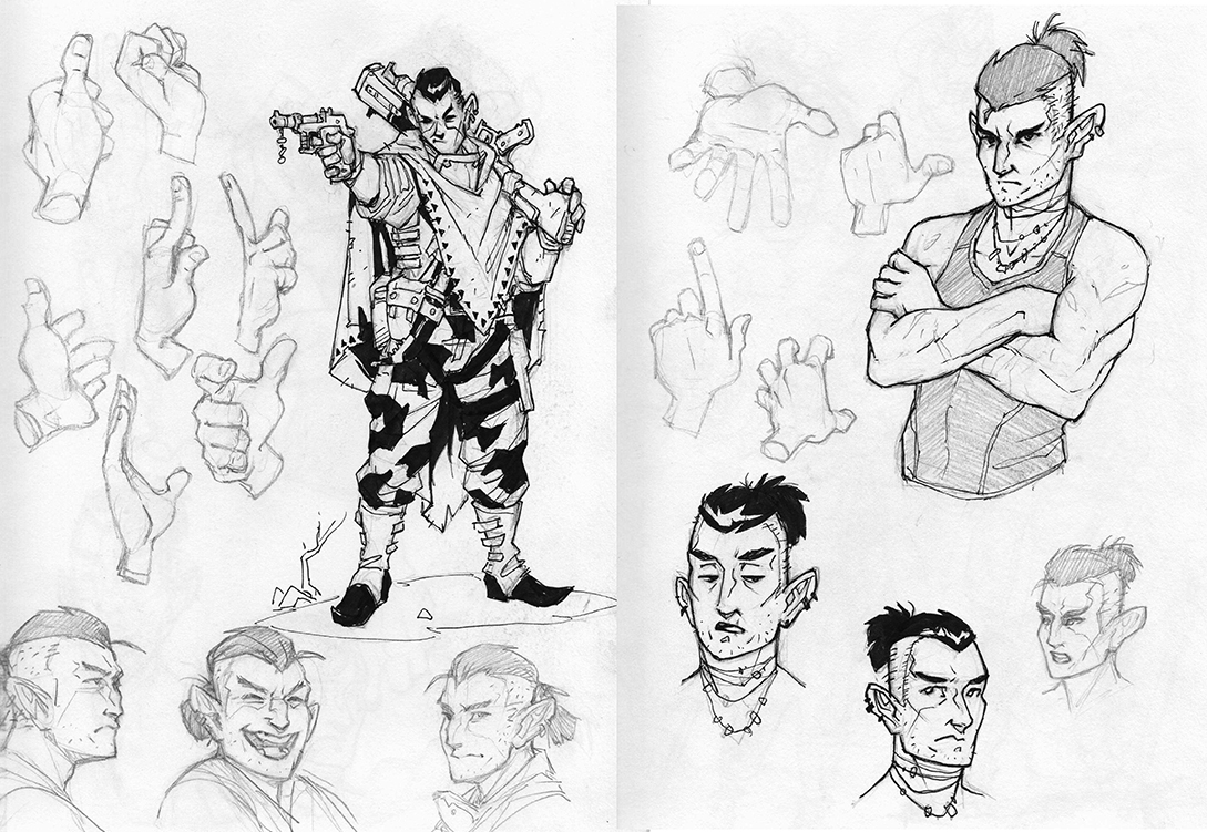
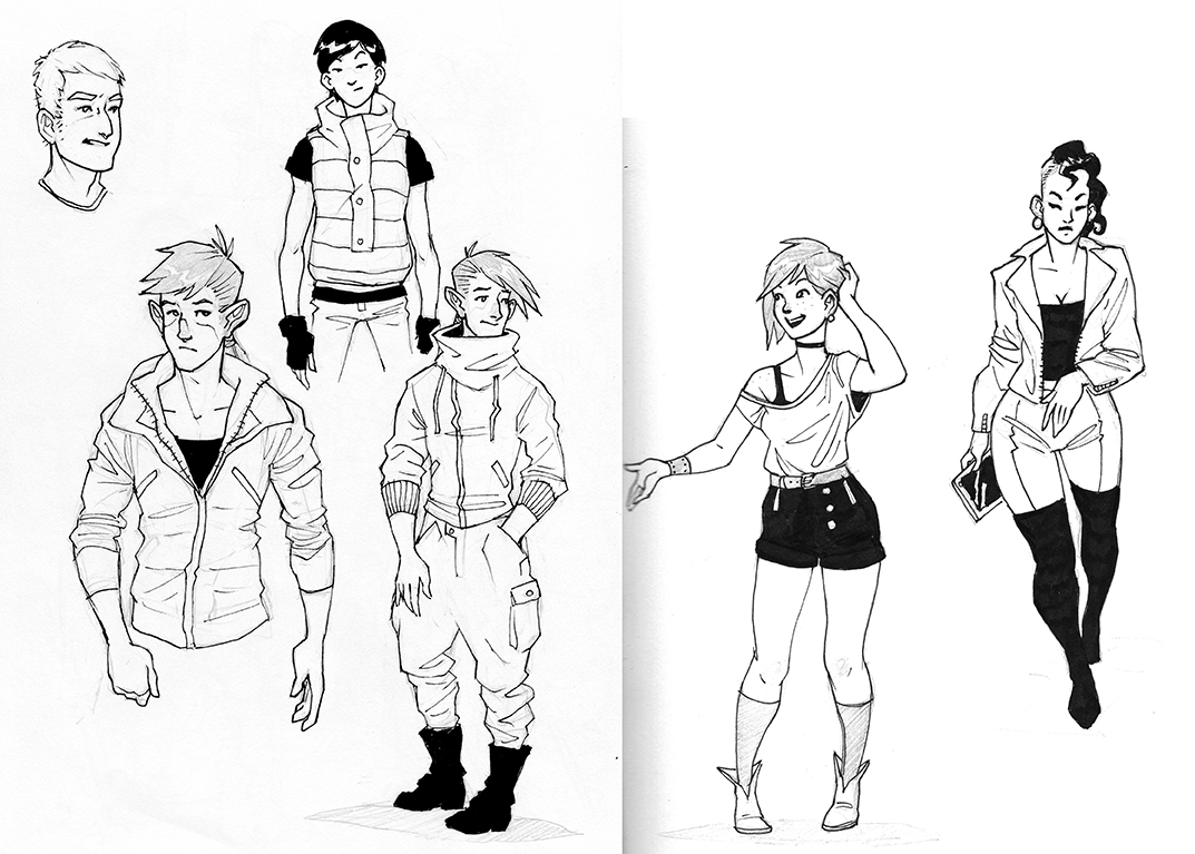
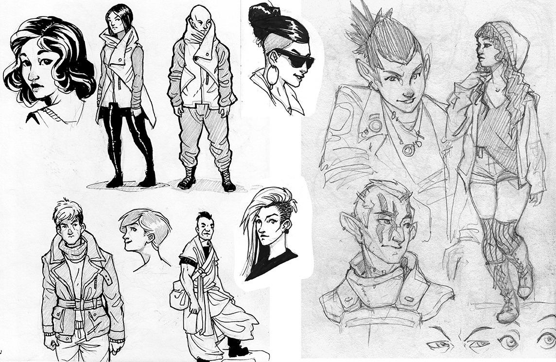
And I've got character pinups for most of the cast, minus a few of the lesser antagonists.
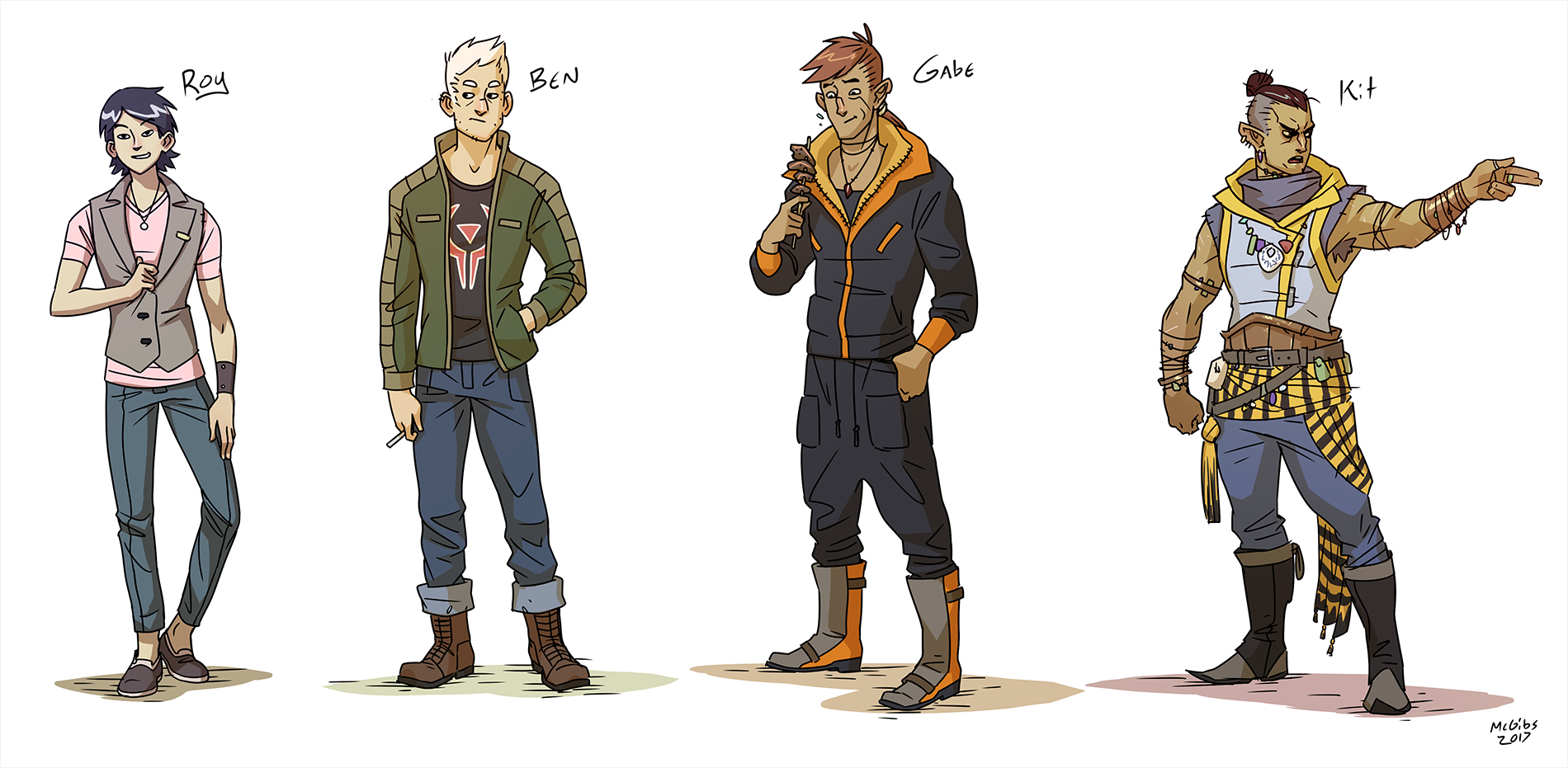
Gabe: A lonely wanderer with a mysterious past. Gabe is a Ferox , a race of nomadic desert warriors, but all he wants to do is make some new friends and eat some tasty food. He picked a bad time to visit Akara.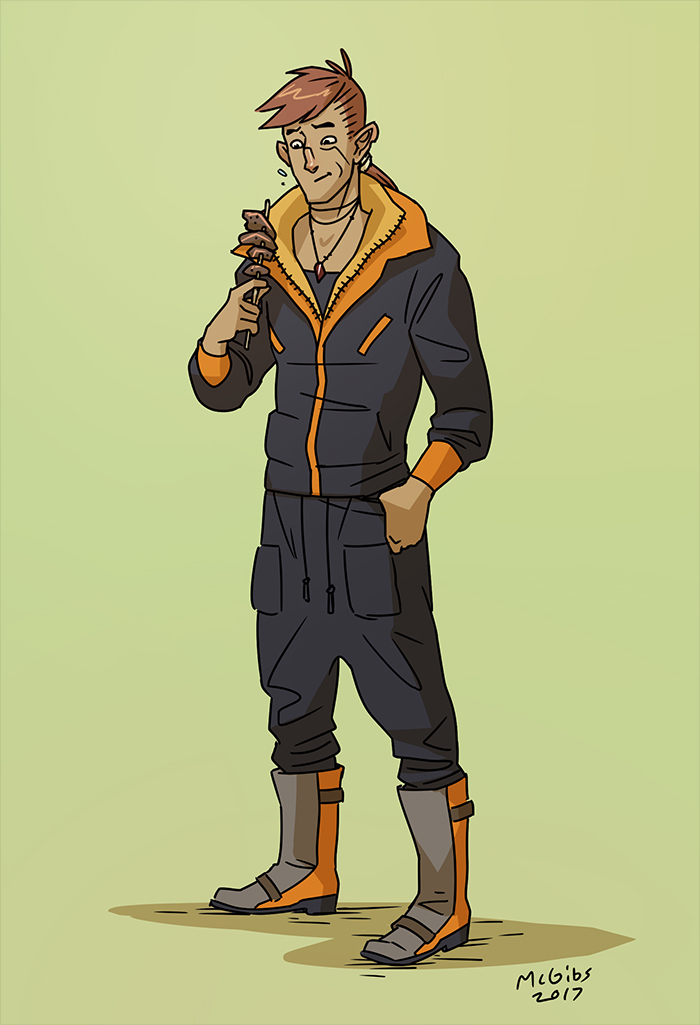
Lexi: A synthetically engineered person, Lexi was tailor made to be a musician and performer for the Syndicates. Although she freed from her previous life by her master's downfall, new problems arise with the rising conflict with the Catharians. All she wants is to get out of Akara and finally see the world, but she's got responsibilities to uphold.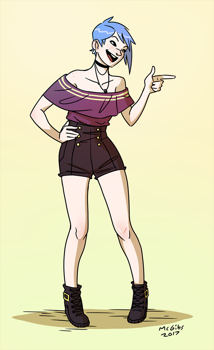
Cricket: Lexi's secret stage persona, Cricket is an energetic icon for the rebellion against the Catharians. She's the rallying symbol of the Locust.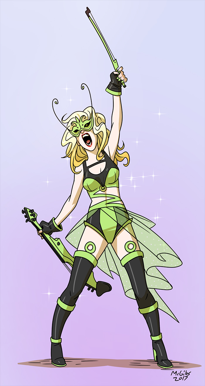
Tory: The cunning leader of the Locust rebellion and proprietor of their underground base at the Red Moon theater. Tory has plans for a reborn Akara, free from the tyranny of the Syndicates and the Catharians, and she'll go to any lengths to get it.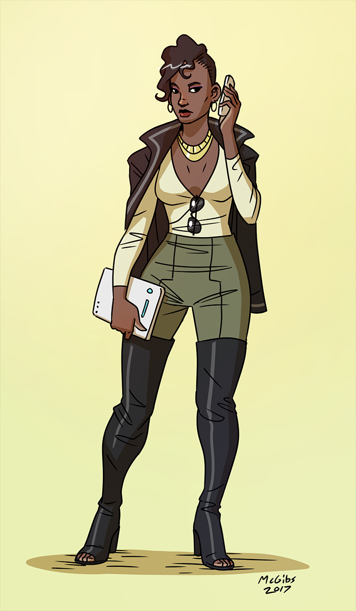
Kit: Tory's partner in crime, Kit is the chieftain of a Ferox mercenary company bringing the fight to the Catharians. With Akara freed, maybe his people can finally stop wandering the deserts.
Ben: A Catharian native to Akara (not those new wackjobs who took over the city!), Ben works as a blue collar stagehand at the Red Moon theater. Nothing's ever gone right for poor Ben, and the constant upheaval of Akara only makes him more cynical. Maybe the Catharians have the right idea after all?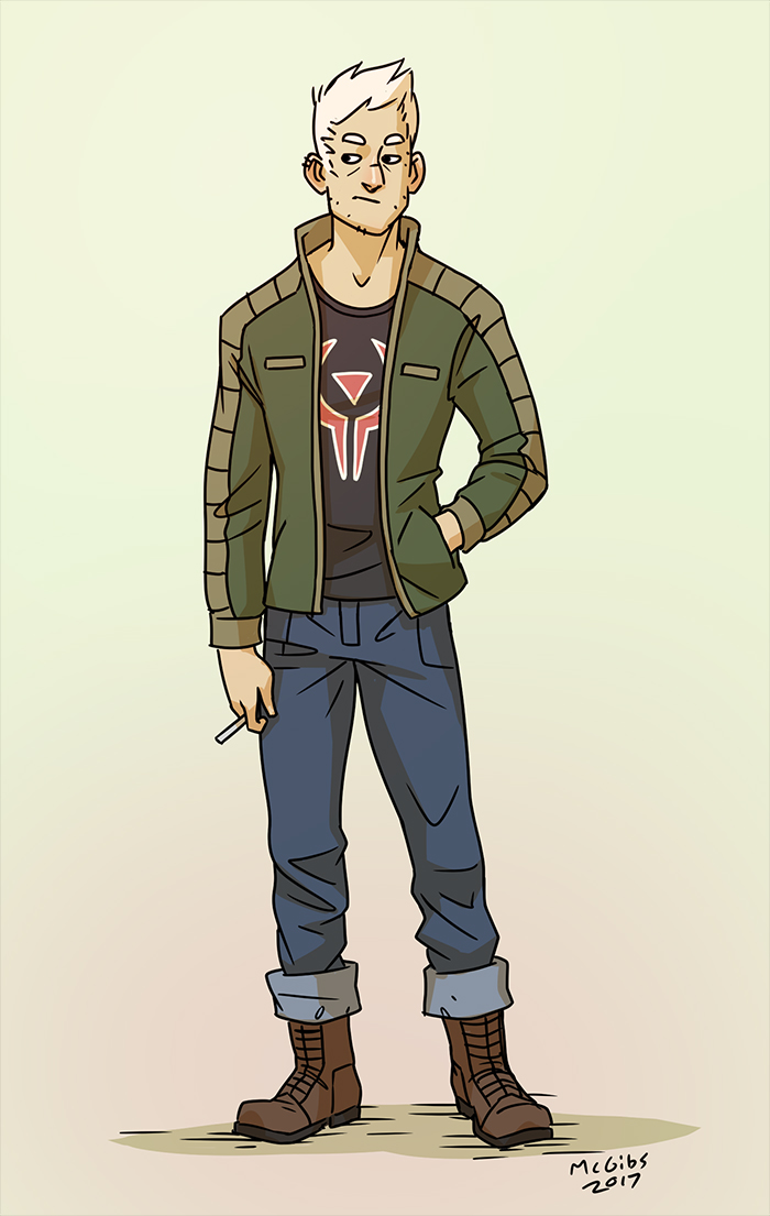
Erin: The last in line of her merchant family's shop, the new governance of the Catharians have been hell on business. Erin's a huge fan of Cricket's music, Lexi's childhood friend, and thinks that maybe the Locust actually can make for a better Akara after all.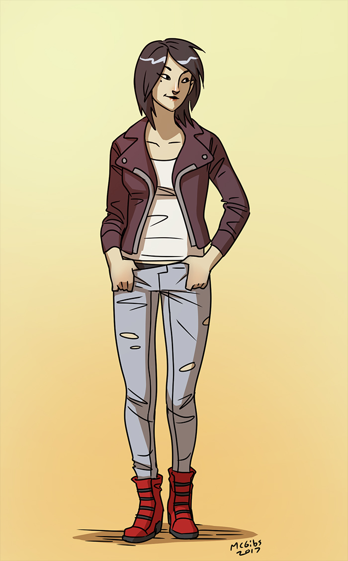
Roy: Erin's brother who works as a bartender at the Red Moon theater, Roy's in way over his head with all this crazy rebellion stuff. His friend Ben is getting more dower than usual, and maybe it's time to hightail it outta town before things get real bad.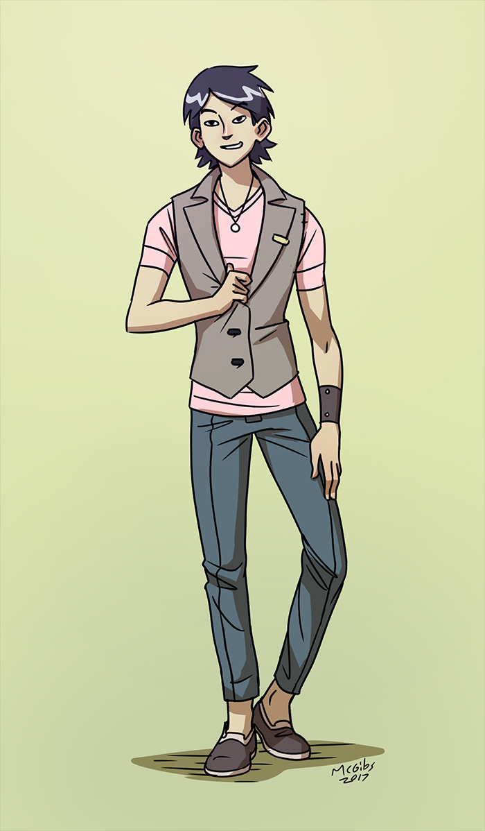
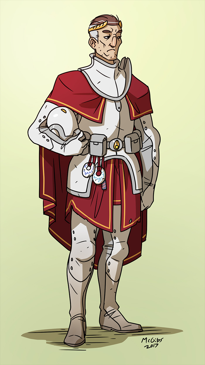
Peregrine Auric: A veteran Catharian knight, Auric's only goal is to hunt his people's arch-nemesis, the Ferox. He's arrives in Akara to track down Kit and his clan, but his single minded tactics only make things worse for everybody.
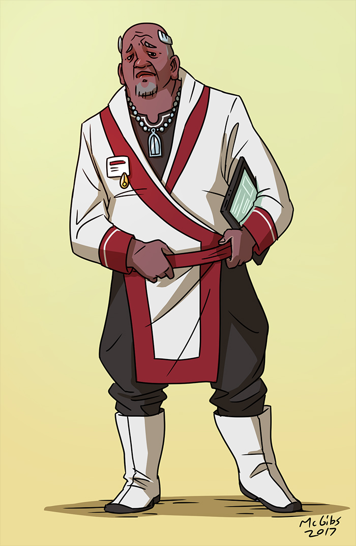
Director Pollus: The beleaguered bureaucrat tasked with overseeing the Catharian occupation of Akara, Pollus is underfunded, undermanned, and underappreciated. He desperately tries to maintain control as the fires of rebellion ignite and even his own allies turn against him.
Blast from the Past! Here' the original character lineup from way back in the day. With my partner's help, the fashion got way better...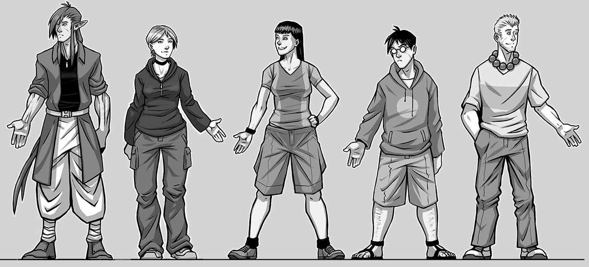 Left to right: Gabe, Lexi, Erin, Roy, Ben
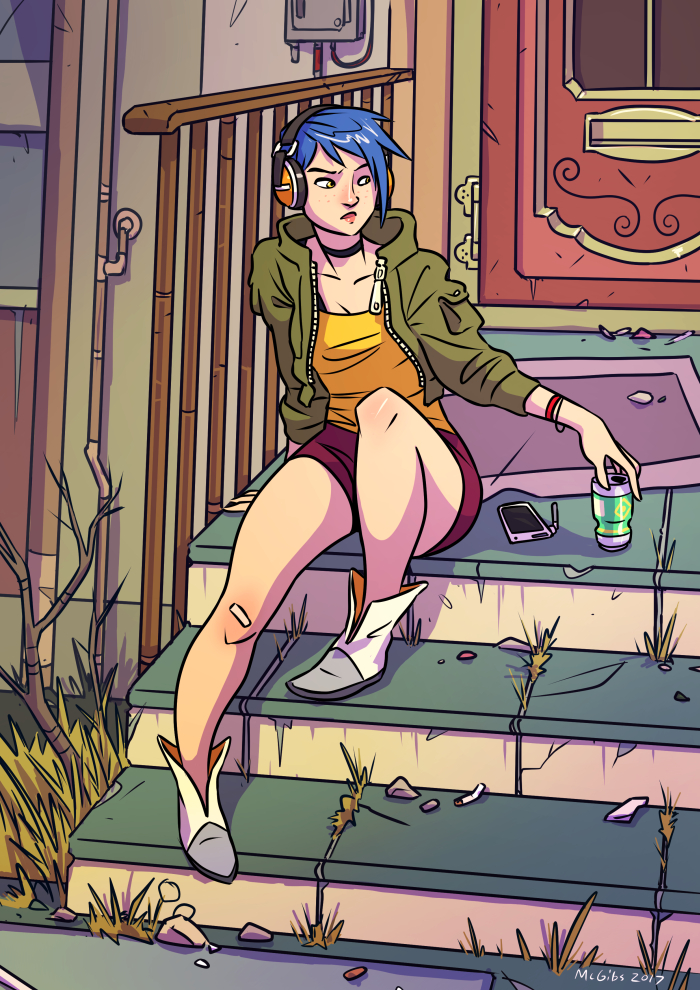
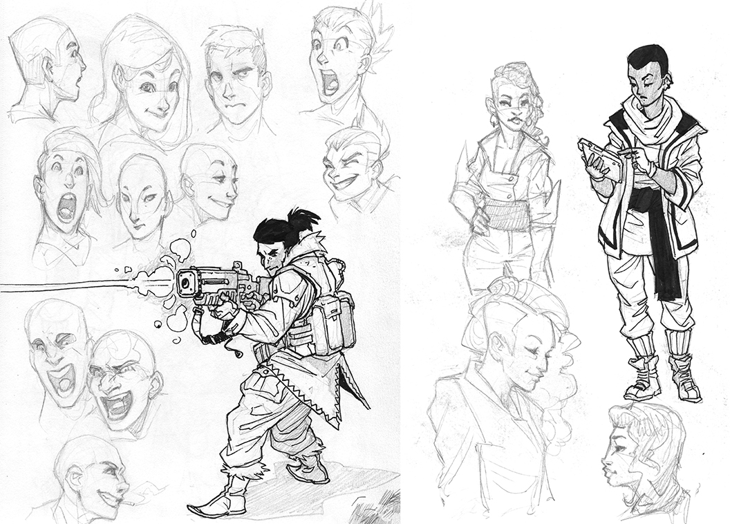
Finally, here's a few more pieces and sketches while trying out some designs and inking/colouring styles.
Thanks for checking it out! I'd love to hear any feedback or suggestions, as well as answer any questions I can.
I'll try to keep this thread alive with regular updates, hopefully something every day or two.
A long long time ago, I was making a comic called Locust and the art community here was a great sounding board for me. Locust was full of dumb highschool-isms and anime tropes (I started it when I was 16), and I really didn't have any coherent plan for the greater storyline or structure. I kept it going for a while into college, but eventually outgrew it and decided to move on to other things (like making video games).
Now, almost 10 years later, my partner and I have decided to try and take another crack at Locust. She thought there was some interesting things with a few of the characters and world-building elements and somehow convinced me into rebooting it as a whole new project. Together we've been script writing, tinkering with concept art and are ready to start showing off some of the early designs and ideas.
So here we go!
Locust is a sci-fi story about a couple people trying to rebuild themselves from their troubled pasts, while trying to survive an equally troubling future. It's got music, rebellion, romance, political intrigue, and lasers!
The story takes place in the city of Akara, an ancient city from a long-lost empire. In the time before the comic, Akara was revitalized by entrepreneuring Syndicates who became rich and powerful from the ruin's advanced technologies. Recently, the Syndicates have been dethroned by the fanatical Catharians, outsiders who claim to be the rightful descendants of Akara's creators, and inheritors of it's treasures. Currently Akara is in a precarious state, as the newly "liberated" population has no interest in trading one dictatorship for another.
Aesthetically, we wanted to model Akara on a sort of "cyberpunk Babylon". It's a desert oasis city, lush with green gardens, and towering with ancient architecture from an advanced civilization. It's also a reclaimed city, blasted apart and rebuilt by countless people; crumbling statues defaced with corporate signage and ziggurates bristling with parasitic favelas.
This was a test building I did to try out some styles and technical processes. I made a quick 3d mockup in sketchup and used that as a base for the drawing. The majority of the environments in the comic will be constructed this way to save my sanity.
And I've got character pinups for most of the cast, minus a few of the lesser antagonists.
Gabe: A lonely wanderer with a mysterious past. Gabe is a Ferox , a race of nomadic desert warriors, but all he wants to do is make some new friends and eat some tasty food. He picked a bad time to visit Akara.
Lexi: A synthetically engineered person, Lexi was tailor made to be a musician and performer for the Syndicates. Although she freed from her previous life by her master's downfall, new problems arise with the rising conflict with the Catharians. All she wants is to get out of Akara and finally see the world, but she's got responsibilities to uphold.
Cricket: Lexi's secret stage persona, Cricket is an energetic icon for the rebellion against the Catharians. She's the rallying symbol of the Locust.
Tory: The cunning leader of the Locust rebellion and proprietor of their underground base at the Red Moon theater. Tory has plans for a reborn Akara, free from the tyranny of the Syndicates and the Catharians, and she'll go to any lengths to get it.
Kit: Tory's partner in crime, Kit is the chieftain of a Ferox mercenary company bringing the fight to the Catharians. With Akara freed, maybe his people can finally stop wandering the deserts.
Ben: A Catharian native to Akara (not those new wackjobs who took over the city!), Ben works as a blue collar stagehand at the Red Moon theater. Nothing's ever gone right for poor Ben, and the constant upheaval of Akara only makes him more cynical. Maybe the Catharians have the right idea after all?
Erin: The last in line of her merchant family's shop, the new governance of the Catharians have been hell on business. Erin's a huge fan of Cricket's music, Lexi's childhood friend, and thinks that maybe the Locust actually can make for a better Akara after all.
Roy: Erin's brother who works as a bartender at the Red Moon theater, Roy's in way over his head with all this crazy rebellion stuff. His friend Ben is getting more dower than usual, and maybe it's time to hightail it outta town before things get real bad.
Peregrine Auric: A veteran Catharian knight, Auric's only goal is to hunt his people's arch-nemesis, the Ferox. He's arrives in Akara to track down Kit and his clan, but his single minded tactics only make things worse for everybody.
Director Pollus: The beleaguered bureaucrat tasked with overseeing the Catharian occupation of Akara, Pollus is underfunded, undermanned, and underappreciated. He desperately tries to maintain control as the fires of rebellion ignite and even his own allies turn against him.
Blast from the Past! Here' the original character lineup from way back in the day. With my partner's help, the fashion got way better...
Finally, here's a few more pieces and sketches while trying out some designs and inking/colouring styles.
Thanks for checking it out! I'd love to hear any feedback or suggestions, as well as answer any questions I can.
I'll try to keep this thread alive with regular updates, hopefully something every day or two.

McGibs on
+18
Posts
Perhaps its just your style preference, but it feels to me like you went heavy with designing the people who were more unique to the world, but stopped short on the people that seemed "normal". If its not an intentional choice, I'd encourage you to keep world building in that area.
Otherwise, the drawings themselves look fuckin solid dude. I'm excited to have you posting again, and also to see these characters again. Its a real nostalgia trip for me, I'm glad Gabe is going to get the chance to really be somebody.
A: that's more the Ferox's thang,
B: It's a pain in the ass to draw,
C: The Akarans are sort of intended to clash with the design of Akara itself (the ancient Babylonian part), as they're the more contemporary folk that moved in after it was abandoned.
We do want to try out some more unusual styles of clothing (Korean's have some cool stuff, that's what Gabe's based on) with more out-there cuffs and cuts. And also more unified use of accessories: jewelry, scarves, sashes, bangles, etc, that will hopefully tie them together a bit more and away from modern looking people.
I also added in Director Pollus to the OP ^
For the clothes, I wouldnt say go diving into robes and such, but there's plenty of fashion that skates along those lines with different form factors.
https://www.pinterest.com/pin/51861833189087262/
https://www.pinterest.com/pin/406872147575555458/
If you can manage to say a substantial amount with the clothing and really invent a language for it, It'll lend a visual interest to the characters. I would dive into cultures that deal with the climate you imagine, and then stylize from there. Even just looking at different regions of the country. When I moved from the northeast to the west, we traded nice, classy coats with heavy collars for shorts, leather boots, and light layers. Just something to think about.
Also for some reason I am not at all a fan of pink-shirt biege vest, it just seems really trying way too hard to make him look... I dunno. It seems like a drawing of someone 'stylish' rather than what a stylish person would actually wear?? Esp if you're going for more interesting korean mens fashion
love it tho!! cyberpunk Babylon is a cool thing!
I'll tweak up Roy and Tory a bit later.
@Sadgasm more lively sketches I find are always going to be a thing (with almost any art, really), but like Iruka said, its not something that lends itself that well to the sort of comic production I'm aiming for. It's not something I'll be able to keep consistent. This graphic inked/celshaded style might not be the flashiest of arts, it could always be more energetic or detailed or stylized, but I think it will work for me as a production style for however many hundred pages so I can stay sane.
I try to think of it like, would I draw fanart of this character? And that scarf+vest combo + his face being cool seem cool
Glad to have you back man, I'm jealous of how quickly you work. Looking forward to seeing more of the comic
For now though, this stuff looks real dope! Especially the sketches, I'd have to agree with sadgasm in that I prefer the life of the sketches. For sure there's no way to keep that sketchy quality intact without getting a bit chaotic at times on the real page, but I'd still like to encourage you to ink it by hand, since those lines have so much more life in them (to me at least.) Clarity is only so much, if you can tackle clarity while doing it by hand that's a whole 'nother level.
Either way, looks cool and I'm eagerly awaiting more.
@M3nace: We're just rounding off the final revision passes of the full script which is about 125 pages (just raw script dialogue/descriptions, not page layout), so... maybe 300-400 pages or so of actual comic? We might break that down into 2 or 3 books depending on what we end up doing for publishing. Right now our goal is to make enough of the comic, put it online, get a community going, and then try to get some publishing/distribution once the project is nearing completion. It'll be a 4 or 5 year project for sure, and we've already got a zillion spinoff/sequal/shortstory ideas that may or may not turn into anything.
I know for a fact, I'll not be inking this thing by hand, I feel like not having access to digital tools in the drawing phase would destroy me, dispite how it may look. I've yet to do any full test pages yet, but I think the character plates are probobly a little cleaner than the final product will end up looking. Hopefully I'll loosen up when I have to put a 50 person crowd into a panel.
Speaking of character plates, here's another baddie (though they're not nearly as evil as they look?): Minister Delance, who works alongside Pollus in his administration.
Really sifting through minor named characters now.
The new designs are really cool, but I wonder if the bright colors/very clean style/mildly cartoonish aspects of them may clash tonally with the sort of grim, ultra-violent action scenes you had in there originally.
Granted, right now you're presenting all these characters just hanging out in sunny weather for the sake of working on the character designs- but as long as you are doing exploratory groundwork, it might be worth doing some exploratory work on how you're going to play with light/color toning/cinematography/etc. to hit all the tonal beats you need to hit.
If you've seen some of the "Art Of" books of Pixar movies, you're probably familiar with the idea of a 'color script'- while I don't think you need to go that far (since you don't have to keep 100 artists on the same page, just yourself), 3-4 demonstration panels plucked out from different points of your script that have different moods (tender scene, violent action scene, I've-just-come-to-the-new-city-and-it's-a-world-of-possibilities scene, etc.) may be helpful in making sure you've got a solid idea of how to handle the whole of the emotional range your story is going to hit, in terms of color/composition/design.
Twitter
Tonally, the comic's outgrown some of it's teenaged angst and violence for the sake of violence where I was just trying to be edgy. They'rl still be gunfights and angry mobs and probably some sexytimes, but on a whole I wouldn't put it in the "grim ultraviolent" category anymore. There should be some levity to contrast with it.
I did a super choppy doodle tonight, playing around with some rough pen brushes and just trying to be loose. Bout an hour.
My Portfolio Site
Like Bacon, I noticed the change in tone. I'm excited to see where how the shifts in tone will impact the story. Part of the original's appeal was definitely the dystopian world you'd created, but handled well, those tones are gonna hit harder if there is some levity.
I did one of those "25 essential expression challenge" sheets for Gabe. Some of these expressions seem redunant or not "essential", so I'll probobly tweak it some more for future characters.
Finding the economical balance of mark making that fits with your style maybe difficult, but I've never looked at something that it suffered from the expressions being well described.
For disgust, I was thinking more "contempt", but good call on the nose/mouth pulls.
I think I tried to do that a bit more with Lexi. She's got a squishier face.