As was foretold, we've added advertisements to the forums! If you have questions, or if you encounter any bugs, please visit this thread: https://forums.penny-arcade.com/discussion/240191/forum-advertisement-faq-and-reports-thread/
Options

Critique on Cover colors for Dangers Dozen book

Jessie GarrettJessie Garrett Registered User regular
edited January 2008 in Artist's Corner
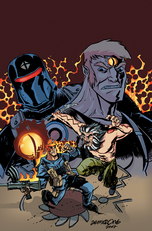
Hi everyone, I want to get some critiques on my coloring. Its been awhile since I sat down and colored anything so I'm more than a bit rusty. This is a Alternate cover for the Comic The Dangers Dozen which will be out in January. Any comments are appreciated.

Also if Im doing any thing wrong with posting the images please let me know. I believe I did it correctly but...

Thanks

dangerdozencover2.png

Jessie Garrett on

Posts

  • Options
    TheBogTheBog Registered User regular
    edited December 2007
    Did you only color it or did you draw it too?

    TheBog on
  • Options
    GrifterGrifter BermudaModerator mod
    edited December 2007
    He just did the colouring.

    Grifter on
  • Options
    NightDragonNightDragon 6th Grade Username Registered User regular
    edited December 2007
    I thought I should let you know that you misspelled "coming" in your sig.

    I think you need to work on separating the foreground from the background...and your lightsource is incredibly confusing. You've also only used a maximum of two tones for every color, which is giving harsh, confusing shadows.

    I'd suggest you also find something better to color next time. This piece really has quite a few issues in it already that would make it a bit more difficult to color properly.

    NightDragon on
  • Options
    Jessie GarrettJessie Garrett Registered User regular
    edited December 2007
    I thought I should let you know that you misspelled "coming" in your sig.

    Silly me.
    Fixed Thanks.

    Jessie Garrett on
  • Options
    GreatnationGreatnation Registered User regular
    edited December 2007
    I know your not responsible for it, but I would really re-design the whole cover. The composition doesn't make any sense. That ball behind the guy with the gun is an eyesore and throws off the whole image.

    Greatnation on
  • Options
    Jessie GarrettJessie Garrett Registered User regular
    edited December 2007
    I think you need to work on separating the foreground from the background...and your lightsource is incredibly confusing. You've also only used a maximum of two tones for every color, which is giving harsh, confusing shadows.

    I'd suggest you also find something better to color next time. This piece really has quite a few issues in it already that would make it a bit more difficult to color properly.


    I have to agree about the lightsource. I was trying to follow the artists shadow indications etc.

    I am trying to stick to more 2 tone coloring style, similar to Invincible or Cell style coloring for a variety of reasons. Also I think it lends itself to Jason Armstrongs (Lobster Johnson) work.

    LOL. unfortunately I don't have a choice of what to color as this is going to be used as a cover soon. Im trying to get back into the swing of things after quite a long absence.
    Thanks I'm gonna give it another look over and see what changes I can make. Any other comments out there?

    Jessie Garrett on
  • Options
    CyberMonkeytron3000CyberMonkeytron3000 Registered User regular
    edited December 2007
    I agree about the separation thing. I think if you would have changed the colour of the lines for the background elements it would have worked better. Something like a dark purple or something. Also you could maybe try and add some texture to the background because that flat colour really doesn't add anything.

    CyberMonkeytron3000 on
  • Options
    GrifterGrifter BermudaModerator mod
    edited December 2007
    While I do appreciate that you want to stick to the two color tone for various reasons, I think that it may work better inside the book than it would on a cover. Generally, Invincible's covers are a bit more ornate with the colouring than the inside of the books. For instance, http://comicsmedia.ign.com/comics/image/article/634/634015/MARVTU014_colcov_1121448980-000.jpg.

    While I can see what you mean about trying to follow the pencils/inks for your light sources, I'm having trouble seeing what he was trying to accomplish so I would probably find colouring this piece pretty difficult, too. I think adding in a couple of more highlight/shadow colours would greatly benefit this piece.

    I'd disagree about the background not doing much since I think most of the open spaces that you left behind will be filled with text.

    Grifter on
  • Options
    Jessie GarrettJessie Garrett Registered User regular
    edited December 2007
    Yep I goy what you guys are saying. I think I willgo back and do some highlights etc on this piece. BUT here is take 2 anyway so you can see if it has improved at all.

    dd02cvrarmstrongflats2.png

    Also yes the Logo is BIG on Dangers Dozen and alot of that top space will be taken up with Text.
    Here is the First issues cover if you want to see what I mean

    http://firstsalvo.com/forum/viewtopic.php?t=138

    Jessie Garrett on
  • Options
    beavotronbeavotron Registered User regular
    edited December 2007
    ugh someone's gotta sit down with the line artist and have a good long talk about avoiding tangents.

    beavotron on
  • Options
    Jessie GarrettJessie Garrett Registered User regular
    edited December 2007
    I think I will also drop out the background a bit more with a color hold on the background figures

    Jessie Garrett on
  • Options
    GreatnationGreatnation Registered User regular
    edited December 2007
    beavotron wrote: »
    ugh someone's gotta sit down with the line artist and have a good long talk about avoiding tangents.

    Word yo, word.

    Greatnation on
  • Options
    Jessie GarrettJessie Garrett Registered User regular
    edited December 2007
    beavotron wrote: »
    ugh someone's gotta sit down with the line artist and have a good long talk about avoiding tangents.

    Word yo, word.

    Well You'll have to take that up with Jason Armstrong, I'm just here for the color critiques please LOL
    Thanks guys. I should have another version with the background figures colorheld shortly.

    Jessie Garrett on
  • Options
    GrifterGrifter BermudaModerator mod
    edited December 2007
    Read the first book today. Pretty interesting stuff. that eye thing is just weird.

    In any case, the second color job is a good improvement. Looking forward to your next version.

    Grifter on
  • Options
    Jessie GarrettJessie Garrett Registered User regular
    edited December 2007
    Ok here is the third version with the background dropped back .

    comments?

    dd02cvrarmstrongflats3.png

    Jessie Garrett on
  • Options
    mattharvestmattharvest Registered User regular
    edited December 2007
    Better. The main problem right now is that the eye, in lacking a black outline, seems to be part of the background and not the foreground.

    Also, in the right, where foreground meets background: because the glyph in the ground is the sharp edge of the foreground's ground-plane, it appears to ambiguously be vertical instead of part of the ground. I'd fix this by having some foreground ground-plane coloring to make it clear that it's a flat glyph.

    mattharvest on
  • Options
    Jessie GarrettJessie Garrett Registered User regular
    edited December 2007
    Better. The main problem right now is that the eye, in lacking a black outline, seems to be part of the background and not the foreground.

    Also, in the right, where foreground meets background: because the glyph in the ground is the sharp edge of the foreground's ground-plane, it appears to ambiguously be vertical instead of part of the ground. I'd fix this by having some foreground ground-plane coloring to make it clear that it's a flat glyph.

    I agree with both points and was looking to address them.
    The eye's "flame" actually does fade to a DARK red or black so I've added that in and that glyphy thing on the right always bothered me, so I just cut it off where it goes up like that. I had to move Armstrongs signature anyway as when the logo is dropped in the page will be shifted down a bit and his sig it might get to close to the trim line.

    dd02cvrarmstrongflats4.png

    Jessie Garrett on
  • Options
    MykonosMykonos Registered User regular
    edited December 2007
    It's getting better but there's something keeping me from feeling the intensity. I don't think it's on your part being that you just did the coloring, the fault may lie in just the original cover design. Strictly personal opinion and perhaps future reference, I'm kinda turned off by the background guy staring down at himself in the fight below, while the villain[?] seems far less of an imposing force by being both smaller and having his head sorta "pop out" in the way that it is. Having said that you did a good job nailing that comic look and coloring seems solid overall. I'd be willing to offer more of my subjective opinions on making a stand out cover if your interested.

    edit: I clicked your link and I loved the cover you posted. See, now on that one I did feel that intensity I was looking for.

    Mykonos on
    [SIGPIC][/SIGPIC]
    "I was born; six gun in my hand; behind the gun; I make my final stand"~Bad Company
  • Options
    Jessie GarrettJessie Garrett Registered User regular
    edited December 2007
    Thanks for the comments.
    The fellah "peeking " around the main character is not actually a villain. He's actually a friend of his and a supporting character in the book.

    Jessie Garrett on
  • Options
    Jessie GarrettJessie Garrett Registered User regular
    edited January 2008
    Thanks for the comments. The book will be going to print within the next day or two and ON SHELVES within the next couple weeks. (We want to make sure we are on time!)
    This is the special cover and retailers will only get it if they order 5 or more copies of the regular cover so please keep a look out for it and tell me what you think when you see it in print.
    Thanks much guys! I look forward to posting more work soon!

    Jessie Garrett on
Sign In or Register to comment.