As was foretold, we've added advertisements to the forums! If you have questions, or if you encounter any bugs, please visit this thread: https://forums.penny-arcade.com/discussion/240191/forum-advertisement-faq-and-reports-thread/
Options
First attempt at a logo
Nogs Crap, crap, mega crap.Crap, crap, mega crap.Registered User regular
Crap, crap, mega crap.Crap, crap, mega crap.Registered User regular
hey guys,
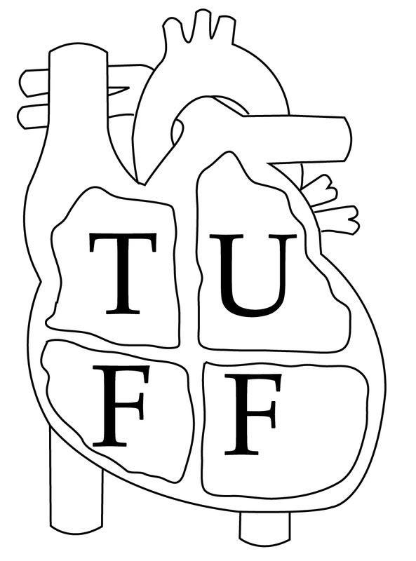
This is my first attempt at creating a logo for a company. It's for my sister's PR company called Tuff Love PR.
Here are two first drafts I got.
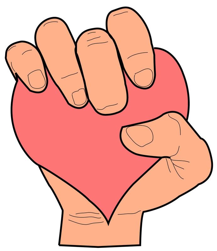
For the first one, I'm kind of worried that might be too much detail for a logo, and maybe I should simplify it a bit more and make the main lines a bit thicker.
I'm not sure if I like the font or not on the second one, that is something I could easily change. I really like the idea of the 4 chambers of the heart and spelling out "T-U-F-F" but the execution might need to be revised.
As always, any and all feedback is welcome.
This is my first attempt at creating a logo for a company. It's for my sister's PR company called Tuff Love PR.
Here are two first drafts I got.
For the first one, I'm kind of worried that might be too much detail for a logo, and maybe I should simplify it a bit more and make the main lines a bit thicker.
I'm not sure if I like the font or not on the second one, that is something I could easily change. I really like the idea of the 4 chambers of the heart and spelling out "T-U-F-F" but the execution might need to be revised.
As always, any and all feedback is welcome.
Nogs on
0
Posts
The second one, the theory is nice but in practice the heart is too complex and it's a bit too smart for the general population. If it were a medical firm, it would work but for a PR company it's a bit to clinical.
Our first game is now available for free on Google Play: Frontier: Isle of the Seven Gods
As of right now neither of them really stand out at me (I think adding that much detail to the fingers for a logo could be detrimental, since usually logos need to be able to look good when small and things like that get lost), but Mustang's got a good suggestion for improving it.:^:
yeah I figured the fingers had too much detail on them. If it's on a cap or a shrunk down on a webpage it might just look yucky.
When you say "do the heart in more of a squeeze to accentuate it's shape" what exactly do you mean? Make the hand squeeze more so the heart looks like it is bulging out? Or squeeze the heart down wider or narrower to make it look more like a heart?
PARKER, YOU'RE FIRED! <-- My comic book podcast! Satan look here!
I'd write a list of concepts I associate with "Tough love" and see what kind of ideas are born from that. Draw those ideas, see what happens!
EDIT:
I'd discard both concepts.
Yup.....but that may look sh*t now that I'm thinking about it.
Do this first, narrow down your 30 to your top 5 ideas, then ask for opinions. Ps use a pen, not your computer.