As was foretold, we've added advertisements to the forums! If you have questions, or if you encounter any bugs, please visit this thread: https://forums.penny-arcade.com/discussion/240191/forum-advertisement-faq-and-reports-thread/
FR's art corner
Fantasyrogue Registered User regular
 Registered User regular
Because I've not made a thread since I first came to this forum many moons ago and have instead been clogging up the doodle thread with things that I never show the finished versions of it's probably high time for a thread to dump stuff in.
I've more or less finished that bar scene in space. I'm sorry Mustang, no bales of hay ;-)

slightly bigger version
I'm tired of it right now, there's probably a boat load of issues with it still. I can see a few myself, but I've worked on this thing so much that right now I've kinda had it (I say this now but I've been moaning about this all week about every thing I need to fix and I keep going back to it).
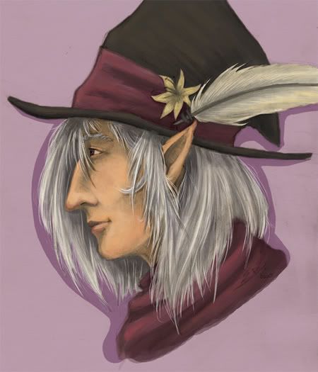
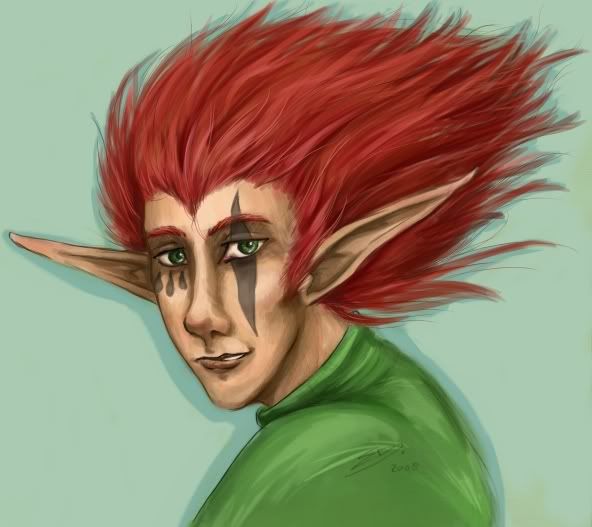
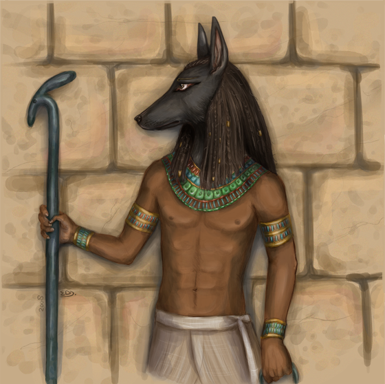
Also, things I posted in the doodle thread but never showed coloured/"final" versions of. I didn't put as much effort in the colours on the first two of these, as is probably noticable. Especially the first one feels really flat to me.
I'd post some stuff from my model drawing course but I'm not sure what the general etiquette is towards posting other people's bodies and faces on the internet?
I've more or less finished that bar scene in space. I'm sorry Mustang, no bales of hay ;-)

slightly bigger version
I'm tired of it right now, there's probably a boat load of issues with it still. I can see a few myself, but I've worked on this thing so much that right now I've kinda had it (I say this now but I've been moaning about this all week about every thing I need to fix and I keep going back to it).
Also, things I posted in the doodle thread but never showed coloured/"final" versions of. I didn't put as much effort in the colours on the first two of these, as is probably noticable. Especially the first one feels really flat to me.


I'd post some stuff from my model drawing course but I'm not sure what the general etiquette is towards posting other people's bodies and faces on the internet?
Fantasyrogue on
0
Posts
Anyway, the first piece has a lot going for it, but it also has a lot of problems. Two that i see, and are really just blanket statements, are that as a whole it is very flat. There are no real rich shadows and highlights are almost noexistant. You could have great lightsources coming from the stars and neon lights and reflections off the glass...none of which seem to have been exploited It seems like they're all just kinda sitting in the dark.
If you convert it to grayscale you'll notice that everything looks like it's the same value. You need to push your values a lot more to actually make us believe that this room is receding into space (space as in atmospheric space...)
The other thing i wanna address is the shaky perspective. For instance, the central figure is drawn as if we were looking at him straight on from the side, but the bar and the girl next to him are drawn as if we were looking down at them. What would help is if you started with a horizon line and drew straight lines coming from a vanishing point where the viewer's eye would be.
As it is this piece has nice elements, but it is still lacking in some of the major foundational elements and principles of design.
And you're right about the flatness, it's a common problem for me. I might try and fix this one if I can do it without mucking up the whole piece. Although I'm not sure stars in the distance reflect all that much light, but the lighting could be stronger overall, agreed.
And thanks.
In most decent bars or restaurants, the lighting is intentionally designed to have individual spot lighting per table with a fall off towards darkness; the intended effect is to make each table feel like a private individual space, rather than a communal get-together with the entire population of diners. Thus usually the look of a bar is usually defined by pools of light rather than the sort of overarching ambient one you've gone for.
Also I'd take issue with the composition because it seems that you the two figures in the direct center of the picture are the focus of the piece, but the only evidence of that is that they are in the direct center. All the secondary figures and scenery are given almost the same amount of visual weight as those figures- same lighting, same color contrast, almost the same size in some cases, all spaced out so no one figure is overlapping another too much; it leads to what I'd call the "Where's Waldo" style of composition. By having a ton of elements with no immediately clear visual hierarchy established, the viewer is forced to search around trying to figure out what is actually important.
Here's a sort of quick paintover to show what I'm getting at. (not the best painting in the world obviously but I hope it gets the point across)
Brought the two main figures forward, lit them more heavily and with greater contrast than the rest of the scene. Brought the bartender even further forward, but made him lose visual prominence by darkening him down, making him less defined. Move the background figures around so they overlap in space, creating a greater sense of depth and establishing that they as individuals are less important than the main figures. Also, even though there are the exact same number of figures in the space space as there was before, the bar gives the appearance of being more populated because the large areas of space between the figures have been eliminated.
The other thing about thinking about the hierarchy from the get-go is that you can save yourself a hell of a lot of time on drawing out meaningless stuff. I don't need to see the shoelaces of the girl way in the back because the visual description of that item does not in any way directly contribute to the overall idea of the picture. I don't need to see every detail of every figure because not everything is actually important; I just need to see the details that get the idea across; what tells the story.
Twitter
Here's a question, the spot lighting in your case is a yellow which gives the piece a somewhat warmer feel. I'd been wanting the piece to be a bit blueish in tone (which I kinda halfassedly did in the original) to make it a bit colder, bit more spacey. I'm not sure how to go about using colours for depth if I make the spot lighting blue? Since the risk is, as has already happened, the entire piece turns blue and then falls flat on it's face.
Nevertheless, it's not a bad idea. I might look into getting some coloured light bulbs, might be a good study subject actually.
Well, the problem with what you're asking is that there is a lot of possible solutions so it's hard to just tell you to do this or that.
You could design the lights like those halogen car headlamps, which appear intensely white in the center but fall off to more a blue. You could desaturate and darken the lights further back. You could design the color contrast in the front to be greater than that in the back.You could make the closer lights a different shade of blue versus further back- cyan to ultramarine or prussian blue or something. You could keep the lighting the same color and just add additional intense rimlighting to the forward characters to make them stand off the background more. Or, you can do the opposite, make the background figures much darker have them largely defined almost entirely by the rim lights. You could use a haze effect to push the further people back, or you could use haze in the front to make an intense volumetric effect for the light illuminating the front figures.There are are probably hundreds of other ways to go about it that would work, but I think you get the idea.
The thing is trying to figure out which of these things will get the primary idea across the most effectively, which is something you need to figure out. It all comes down to which elements you think are the most important. Like, you have made a decision to have all the figures have wildly different and sometime elaborate skin coloration/patterining. How important is getting that idea across versus having blue lights, which will force the idea of skin coloration to become less prominent? Or for that matter, in the example I gave I pretty much killed off the definition of the architecture by darking most of it out entirely, but maybe you feel that's important enough element of the piece that that's not desired; you could brighten it back up with some blue ambient, or you could leave it dark and add some small Christmas light-style lights along the lines of the architecture to reinforce it, or you could do any of a million things. That's something you have to decide on, and be able to give some kind of reasoning behind those decisions.
This is sort of the reason I jumped on you for those finicky details; the more detail and specific you get with junk like shoelaces or eyelashes or keychains or whatever, the less you are paying attention to the big picture; the important bit that is actually going to make people want to look at it. If you stay looser at the beginning and spend more time grappling with the big issues at play- trying out several ideas quickly rather than defaulting to one-, the stronger the overall piece will be.
A good tip for keeping this in mind is when you are working in Photoshop, hit Window>Documents>New Window and zoom that window out to a tiny, little size and keep it open at that size when you are working on your big window. Or if you're working with physical media, get up out of your chair and view it from all the way across the room. If it reads clearly and is interesting when viewed from afar, you're golden. If you have tons of details and shit that just turn into a gray mush when viewed from afar, you've probably just wasted a lot of time. Keep your eye on the prize and do the important stuff- idea, mood, etc. first. Saves a lot of time and frustration in the long run, keeps things a lot more flexible.
Twitter
one of things you could try is creating a new layer set to soft light or overlay, or use a combo of both, and experiment laying down the color of ur choosing with an airbrush. Perhaps playing around levels and colorbalance will help as well
"I was born; six gun in my hand; behind the gun; I make my final stand"~Bad Company
Sure, but I'm lazy and I don't know what exactly I would do for it. I figure if I actually did one it would either be completely redundant with this, or would be the length of a decent sized book if I were going to try to be comprehensive about it, which I am probably neither qualified or interested enough in to make it worth the effort. <shrug>
Twitter
Plus there's that problem that I have always had issues letting go of some of the detail in favor of a better looking piece overall. I'm one of those people that spend a lot of time bent over their art focusing on tiny little details, which tends to make one lose the big picture (as you've said).
Then again, that's why I post here no? So you guys can tell me where I'm going wrong so I can get it through my thick skull. I'm letting this thing rest for a bit since I've already spent entirely too much time on it the past week and then I'm gonna look into fixing up the lighting/composition in some way that works better. Thanks again AoB and thanks for some ideas Myk regards the lighting
"I was born; six gun in my hand; behind the gun; I make my final stand"~Bad Company
AUGH, that's how you do that! I've been trying to find that out for the last month.
Note, they're all photographs and they're generally somewhat overexposed (dark room in here and I'm not putting this stuff out on the balcony) and some are a tad fuzzy. Sorry.
From, I think, the second class. In charcoal.
Portrait from one of the middle classes, charcoal pencil.
For these we had to focus on parts of the body, instead of the whole. In eh.. I think you call them Conté crayons in english?
This one's from tonight, just lines. Also in crayon.
I've learned that I don't like working with charcoal. It's just not for me. I like the crayons better, although I still haven't managed to teach myself to not rest my hand on my own work. It leaves smudges and also gives your hands a nice layer of colour. Also, I suck at finishing something when given only an hour (or less) to work with. I guess this relates back to that "spend too much time fiddling on the details" problem. We had a class where we had to use ink to loosen us up, which was fun although new materials have the downside of wasting time figuring out how to best approach the material itself (charcoal and crayons are also things I hadn't really experimented with prior to these classes).
I need to spend more time doing quick gestures, we didn't really get a chance to do any at the classes except for that one ink drawing lesson (though we're expected to do more quick gestures next week, when we work with paints for a lesson).
Just tell everyone she's on the chinese swimming team and you'll be safe.
And I did say that last one was a bad photo. Just for you, I pulled all the stored art out again and retook it (I wish I had a better place to store my art though).