As was foretold, we've added advertisements to the forums! If you have questions, or if you encounter any bugs, please visit this thread: https://forums.penny-arcade.com/discussion/240191/forum-advertisement-faq-and-reports-thread/
Options
Choplogic learns to digitally paint.
Chop Logic Registered User regular
Hey. I'm still getting used to using my tablet and I suck with color, so I'm doing these as studies in value and how to digitally paint.
I did these yesterday and the day before, using photo references. I'm still having some problems with blending, in some places you can see the strokes still. I spent a little over an hour on both of these. Any criticism or comments are welcome, I'm really trying to get better at this. I'll probably do another one of these today.
Thanks.
Chop Logic on
0
Posts
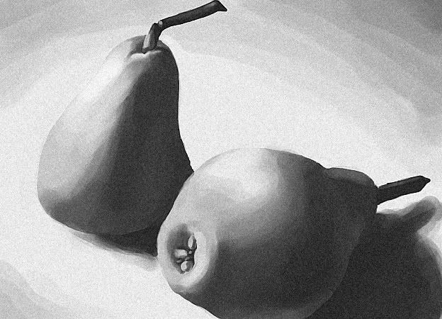
Pears:
http://farm1.static.flickr.com/41/112912151_b43ee59fea.jpg?v=0
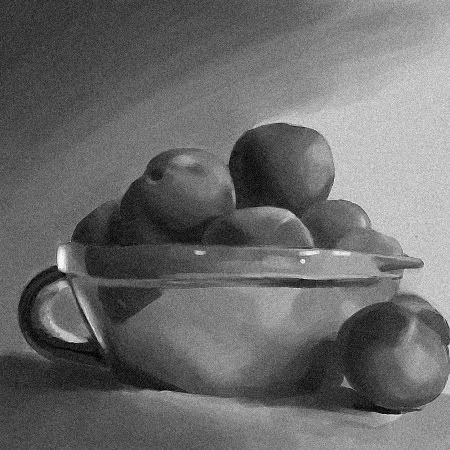
Peaches:
http://bluekitchen.files.wordpress.com/2007/07/peaches.jpg
Obviously in some places I made things a little more interesting (exaggerating darks), but for the most part I stuck to the references. With the peach picture, near the end I kind of realized that there wasn't a big enough difference between my darkest dark and my lightest light, so I really pushed the white highlights on the bowl (especially on the left). I think it might look a little weird, but I also think it helped the picture a lot. Maybe not?
Just did this, just over a relaxed 2.5 hours:
ref: http://farm3.static.flickr.com/2035/2260818829_c4db23337b_o.jpg
Comments / criticism? Thanks.
These are all great studies. Some of the forms and value transitions on these could have been handled a bit more gracefully, but overall it seems like you're catching a lot of the important bits that the light is doing.
You certainly didn't make the last study easy on yourself by picking wet apples covered in water droplets. A little more attention could have been paid to the detail on the droplets themselves, especially on the right apple.
Watch the contour of the apple on the right. Yours is a bit too round, almost more like a peach or a lemon. In your reference the top flattens out a bit as you would expect an apple to do. Also note the difference between where the tip of the stem ends in your painting versus where it ends on the reference--points like this can be invaluable as "anchors" for checking the accuracy of your work and making corrections when they don't line up properly.
In terms of values, you need to hit the highlights a bit more on the wet apples to really make them pop. Look at your ref again in grayscale mode and compare it to your painting. The lit areas need to be a bit brighter in general, but the biggest mistake is not hitting those white hot highlights. The apple's surface is already smooth and waxy, and now it's glistening with water, so the highlights are going to be a major component of establishing the texture and form of this object. You sort of hinted at the highlights in your painting but you don't go anywhere near the brighest whites that you see on the actual apple. I would also say the cast shadow on the right is picking up a bit more reflected light from the environment than you've indicated.
Keep it up.
I don't know how the professionals do it, and I don't know what program you are using, but in photoshop the smudge and blur tool help out with blending for me. A softer brush with less variation between colors, or even less opacity. If you're not using photoshop, or already know about those tools and functions I'm sorry for being overly simple.