As was foretold, we've added advertisements to the forums! If you have questions, or if you encounter any bugs, please visit this thread: https://forums.penny-arcade.com/discussion/240191/forum-advertisement-faq-and-reports-thread/
Options
grand central orikae - Astro Zombies finished, p 8
Orikaeshigitae Registered User, ClubPA regular
Registered User, ClubPA regular
I now use this thread to post about my current projects, paintings, drawings, and otherwise. Please refer to the latest page in the thread, or the page mentioned in the thread title, to see my latest project. My previous OP is below.
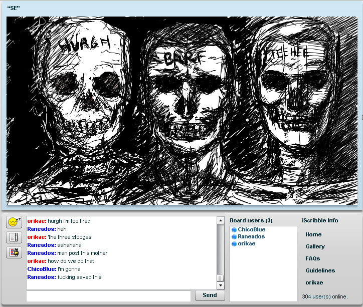
so after doing a couple of iScribbles with mully and chicoblue, as well as watching Rankenphile's progress, i have resolved to draw/paint every day until i'm satisfied with my abilities. that will likely be never, so i'll be doing this for a while.
first: some recent stuff and old stuff. then: loomis studies.
RECENT NON-LOOMIS STUFF
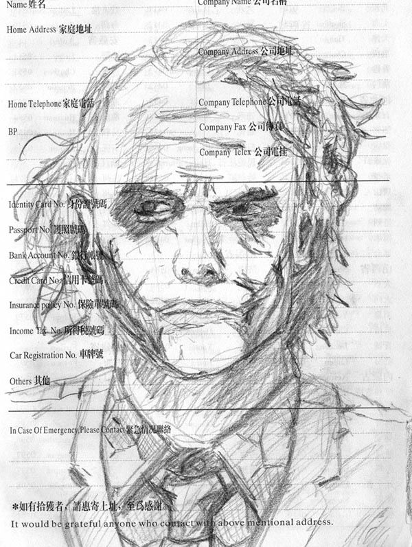
here's a picture of the joker that i did, i'm quite proud of it
me, chicoblue and rane (i'm on the left)
OLD STUFF
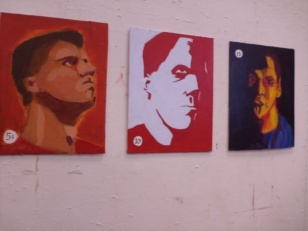
some selfportraits that i did a few months ago.
my entry into the recent SE++ forum battle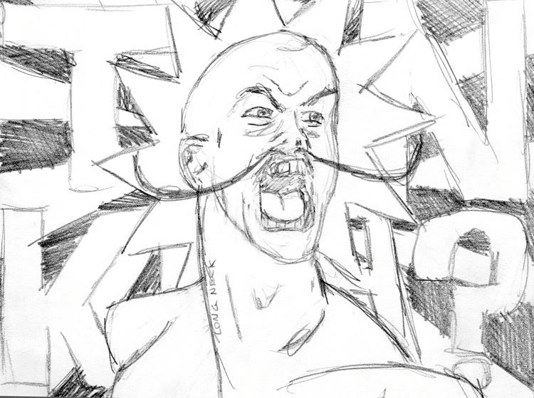
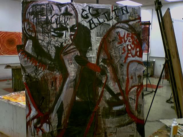
and a large portrait of GG Allin that i did. i'd just watched some math specials, so it's done as if it were a continuous space - cut it in half and put the left and right ends together, and it'll form a contiguous portrait.
LOOMIS STUFF
i'm working through Figure Drawing for All It's Worth - right now I'm focusing on proportion, mass, weight, action, etc since those are my major major weaknesses in figure drawing. eventually i'll graduate to musculature, rendering, perspective, etc.
basically i'm going along with the book.
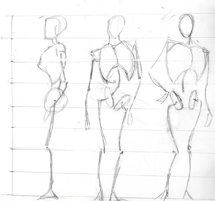
so today's drawings: proportion studies, mannequins, and gestural weight.
August 12, 2008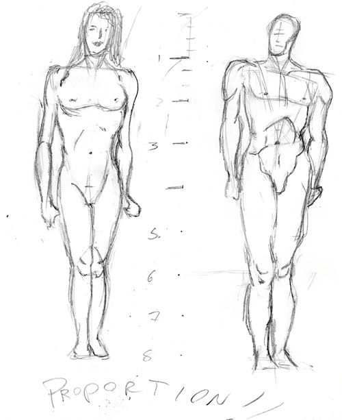
i couldn't figure out what was up with the woman, until I realized that i drew her with a male rib cage/shoulders. i'll do some more female proportion later today and tomorrow.
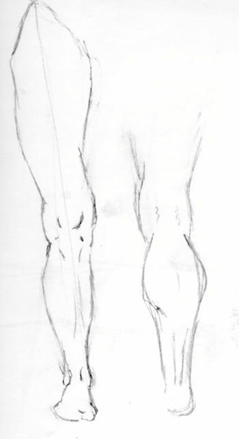
This is loomis' 'stuff to make your leg look convincing' page.
i have a lot of trouble figuring out which way to do the disc/hip arrangement - i'm assuming this'll come with practice, but can anyone point out a consistent thing i'm doing wrong?
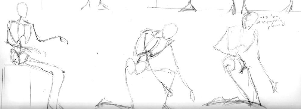
i'm quite proud of these. i've only been reading and practicing loomis for a few days (those sketches aren't pictured, because they suck) and already i'm seeing improvement.
so yeah. watch this space, because i should be posting many more sketches.
first: some recent stuff and old stuff. then: loomis studies.
RECENT NON-LOOMIS STUFF
here's a picture of the joker that i did, i'm quite proud of it
me, chicoblue and rane (i'm on the left)
OLD STUFF
some selfportraits that i did a few months ago.
my entry into the recent SE++ forum battle
and a large portrait of GG Allin that i did. i'd just watched some math specials, so it's done as if it were a continuous space - cut it in half and put the left and right ends together, and it'll form a contiguous portrait.
LOOMIS STUFF
i'm working through Figure Drawing for All It's Worth - right now I'm focusing on proportion, mass, weight, action, etc since those are my major major weaknesses in figure drawing. eventually i'll graduate to musculature, rendering, perspective, etc.
basically i'm going along with the book.
so today's drawings: proportion studies, mannequins, and gestural weight.
August 12, 2008
i couldn't figure out what was up with the woman, until I realized that i drew her with a male rib cage/shoulders. i'll do some more female proportion later today and tomorrow.
This is loomis' 'stuff to make your leg look convincing' page.
i have a lot of trouble figuring out which way to do the disc/hip arrangement - i'm assuming this'll come with practice, but can anyone point out a consistent thing i'm doing wrong?
i'm quite proud of these. i've only been reading and practicing loomis for a few days (those sketches aren't pictured, because they suck) and already i'm seeing improvement.
so yeah. watch this space, because i should be posting many more sketches.
Orikaeshigitae on
0
Posts
dick
well you did invite me
rank: you've seen it like eleven times, don't be a hater
you showed me the pencil sketch you did but never that big one up there
dick
i realized i never answered this question
i bought a chinese diary at a dollar store because i thought it looked cool, and then i couldn't find my sketchbook
i'm teaching myself to paint digitally, currently i'm inking
it's a paladin fighting skeleton mages from d2
but here are the pencils:
and, just for laughs, here's the inks so far
t-shirt designs. only the LOOM one is getting printed, but hey, it's good practice with paths and Illustrator's brush shit.
the loom one's not even original, but the button design is pretty generic to being with, so whatever. path practice.
Also, I really like the GG Allen one. I'm a fan of art that looks like graffiti that is done without annoying the neighbors if you catch my drift lol.
t MKR: thanks, that tip really helped.
t Nap: Thanks - yeah, that's a consistent tip that I really need to apply. Tomorrow I'll do a sketch or something and try and get it done. Thanks re: GG Allin.
t bombsy: IT TOTALLY WAS
if you want one, post to let me know, because runs of 6 or 8 are a little cheaper for me to print than one at a time. i'll be doing another design for this shirt - this one isn't original because i was just using it for my own stuff, but that'll change.
plus i want to do another one anyway
Ohhh... here I was all excited, thinking you were into Chinese... *sigh*
'balance last rear forward'
Yay, I said something useful.
and the same as the above, with a man ejaculating. NSFW.
i'm happiest with the superman, mainly because it actually was fun and i can see the improvement brought about by Loomis.
i feel like i'm really not getting anywhere, but i've only been doing this for around a week, so i'll just keep at it
on the back, below the neck
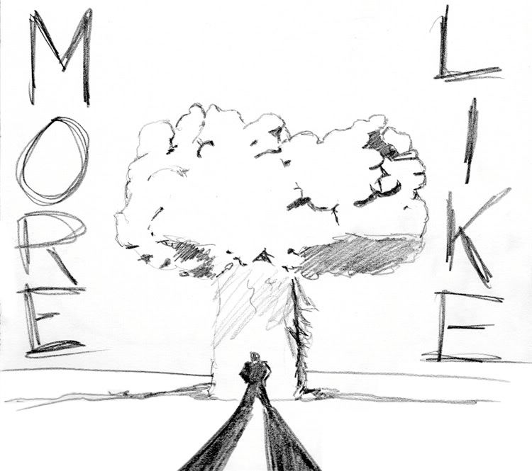
The world needs more Grim Fandango merchandise.
i think no arms is the way to go, if only because it makes the visual a lot easier to grasp - as you said, tripwire.
thoughts?
cthulhu stuff:
logo stuff:
opencanvas stuff: (i'm on the left)
and the current thing, a black and white self-portrait:
i'm really trying to work on my painting/illustration skills here. i'm still working on the portrait.
nothing here is really finished. i should work on that.
scanning really brings out the lines, doesn't it
also, looking at it, i need to focus more on other areas - i was trying to do the eyes especially, but the side of the face is relatively unconsidered
Specific things in the latest one, the contour of your nose, you don't actually have a line like that on the edge of your nose. You have the contrast between values of your nose and cheek, but there is nothing on your cheek at all, just white. That could be ok, but your nose is also white on the tip aside from the contour. How were you able to see that contour there anyways? There is a difference of values obviously, but you're not showing that here.
I've lost track how many times I'm recommended this to people and nobody has yet to actually do one, but I still think It would help you a lot.
However, I don't know what the hell that is.
1. Get a photo.
2. Draw a grid on it; not too small, but not huge either. (You can also draw a grid on a window/sheet of plastic, or make one out of wires and use this method with live subjects, you just have to be able to keep your head really still for long periods of time.)
3. Get a piece of paper. Draw the a grid on it, with the same number of squares per side as the photo grid. (The photo and drawing don't have to be the same scale for this to work- in fact, this is also a good method for upscaling study drawings to larger final paintings and such.)
4. By paying close attention to where the contours on the photo intersect the grid lines and the negative space, you can map out the contours with much more precision than just eyeballing the whole subject at once.
5. With the contours done, you can move on to shading. By looking at each individual grid square on the photo one at a time, you can hammer down on the actual tones that appear rather than the ones you think would be there (ie: shadow=black! light = white!).
Here's another attempt to explain it, which is half-assed but at least it has pictures.
http://drawsketch.about.com/od/drawinglessonsandtips/ss/griddrawing.htm
Twitter
Follow these steps
-Find a high quality reference portrait with a full range of values and good balance between light and dark. Portraiture works good for this exercise since inaccuracies are very easy to spot on the human face, and you will be working on a subject where habitual "symbolizing" is pretty common but in a situation where you will be forced to observe. Convert reference to grayscale if it isn't already
-If working in
Pencil: Print out the reference as big as you can, and get some decent quality working paper for the actual drawing that is the same aspect ratio, or find paper that is close enough and draw a frame so that the working area within the frame will be the same aspect ratio as the printed reference.
Digitally: Open a new document with the same aspect ratio as your reference image. The easiest way to do this is to open the reference and right click the frame and duplicate it, raising the resolution as necessary since you will probably want to work at higher resolution than the reference. I find working at twice the pixel size of the ref to work best, unless the ref is super high rez.
-Assemble a grid of squares covering the entire surface of your reference. The finer the grid, the more accurate the drawing will be. How fine is up to you. If you print the reference on a standard 8.5x11 sheet of paper 1" squares would be a reasonable size. Feel free to go smaller if you're up to it. In photoshop, you can build a grid on your reference easily by turning the ruler on and adding horizontal and verical guides to form squares. Duplicate this grid, keeping the sizes relative of course, on your new working surface/document.
-You're ready to begin. Start with the contour. Go slowly. Your every fiber of being should be focused on getting the shapes down as accurately as possible. The idea of the grid is that you break the drawing down into tiny bits and you only need to worry about one square at a time. If you get all the squares right the whole image ends up accurate. Stand back/zoom out frequently to make sure things match your reference. Spending extra time in this first step to get it right will save you lots of time in wasted rendering later if you made a mistake and something needs to be redone.
-Render render render. Working in photoshop is basically a battle of attrition. Regardless of medium your goal is to judge values as best you can and replicate them. Your goal is to produce an accurate form that DOES NOT DEPEND ON LINE, and instead reads entirely based on a contrast of values.
Pencils are a bit tricky here. Your darkest possible value you can get out of your graphite should correspond to the blacks on your reference. I do not recommend 'smudging' techniques, or using mechanical pencils except in areas that require very delicate work (if you feel the need to use them). Be mindful of where your hand is and what it's resting on. It's a good idea to have a sheet of paper or some kind of buffer between your hand and the working surface to prevent your palm from smudging around work you've already done. Smudging will probably still occur regardless, so clean diligently with your eraser of choice where necessary.
-Your final outcome should ideally be a photorealistic (or as best as you can muster) copy of your reference. It's gonna take a while.
edit: beat'd by Bacon, but yeah, between our two posts you should have more than enough to get started.
You know.. I own this game and yet have never played it...