As was foretold, we've added advertisements to the forums! If you have questions, or if you encounter any bugs, please visit this thread: https://forums.penny-arcade.com/discussion/240191/forum-advertisement-faq-and-reports-thread/
Options
The Sundays/Corktown/Misc. other stuff
ScottEwen Registered User regular
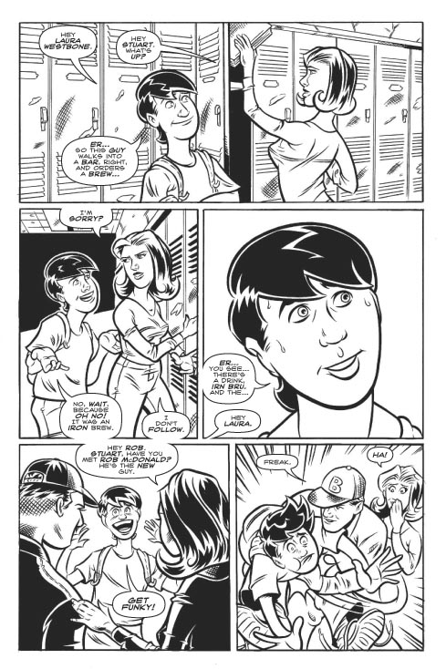
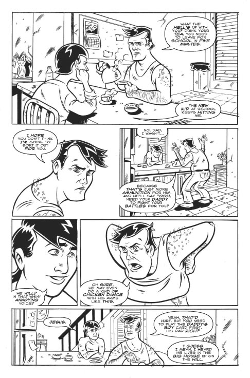
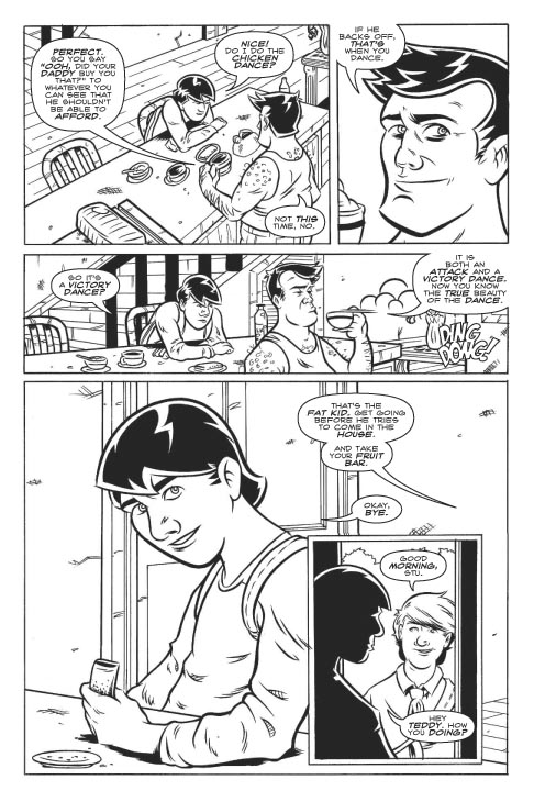
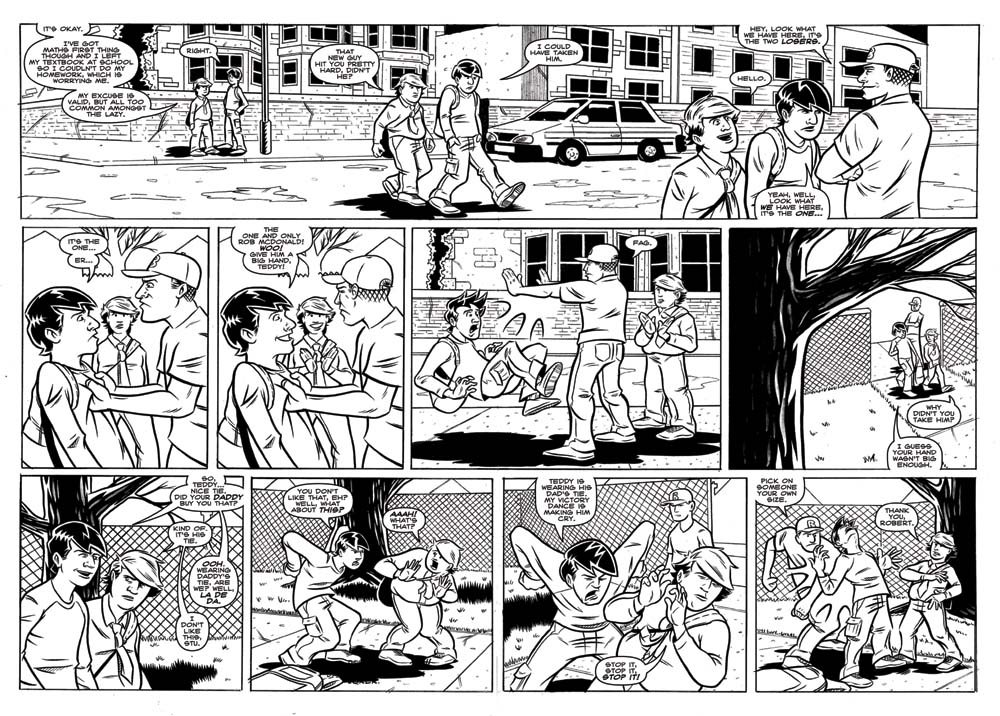
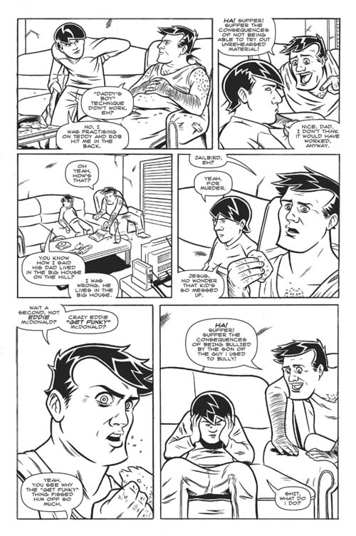
These are pages from a comic book series I'm working on. Written by Kevin L. Sheath, pencils/inks/letters by me.

I draw this comic: http://www.thesundayscomic.com
And then I have a deviantART here: http://scottewen.deviantart.com
And I tweet: http://www.twitter.com/scottewenartist
And then I have a deviantART here: http://scottewen.deviantart.com
And I tweet: http://www.twitter.com/scottewenartist
ScottEwen on
0
Posts
I like!
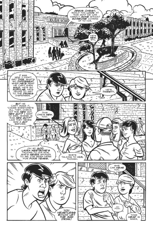
In the last word bubble on the last panel on page six (not including the cover), it's not pointing to the Stu.
Check out my art! Buy some prints!
Crap! You're right, thanks. I'll fix that.
Nah, I don't think so. I think modern comics don't bold enough words. I think it helps the aesthetic quality of the balloons.
And then I have a deviantART here: http://scottewen.deviantart.com
And I tweet: http://www.twitter.com/scottewenartist
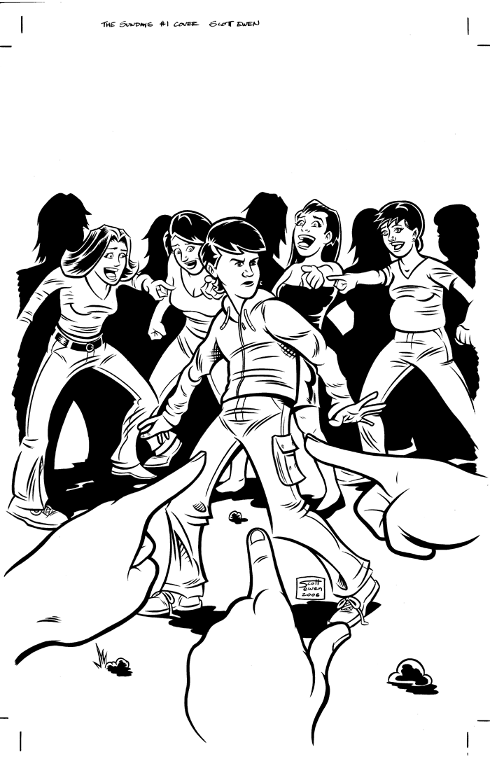
Also, this is kind of minor, but why the stomach of the girl (on the far right) on the cover bulge out the way it does?
Kev sometimes underlines words in the script that should be emphasized, but when I'm lettering I decide which words to make bold based on which words I think deserve more emphasis when I read the dialogue to myself.
Preggers. We meet that character later on in the story.
And then I have a deviantART here: http://scottewen.deviantart.com
And I tweet: http://www.twitter.com/scottewenartist
And I'm not bothered by the more bolding. What's bothering me is that there's sometime a mannequin-look to the people and a bit too big heads.
But that probably doesn't count if the comic is entertaining ^^
- great animation focused website http://www.catsuka.com
It honestly makes it very difficult to read.
Facial expressions are really good, but Stu starts to get a little stale as you move through, mix it up al little more.
Every now and then the women get a bit of a dude feel, but ithey seem more down to earth, a sans slut sorta deal. With the pointy boobs and slight bob hair-do she gets a bit of a 50's housewife feel at time. They aren't so manly as they are over-developed. I don't know how old everyone is in here, but she's built like a 30 year old woman, not a young lady. I haven't seen a girl wear pants that high in a long time also.
I really enjoyed this, good luck in the future. What's your ink process? It really looks great.
otherwise great art and writing nice to some some professional stuff around here
I read it all, very appealing.
I really like the art, it looks quite professional and the writing flows very nicely.
I want to read more damnit.
And then I have a deviantART here: http://scottewen.deviantart.com
And I tweet: http://www.twitter.com/scottewenartist
:^:
I agree with a lot that's been already said, so I won't repeat it.
I think that the pregnant girl, though, needs some "tummy work". Her stomach bump should extend down farther - it doesn't make sense that it just cuts off at her pants, at the hip. At first, I honestly thought you were just drawing a girl with fat on her stomach to throw in some character diversity.
Also, the place where her leg connects to her hip (right side of page) seems way too low.
Pretty good art, aside from that! Great inks.
The... the Chick tract guy? I'm going to go cry now.
And then I have a deviantART here: http://scottewen.deviantart.com
And I tweet: http://www.twitter.com/scottewenartist
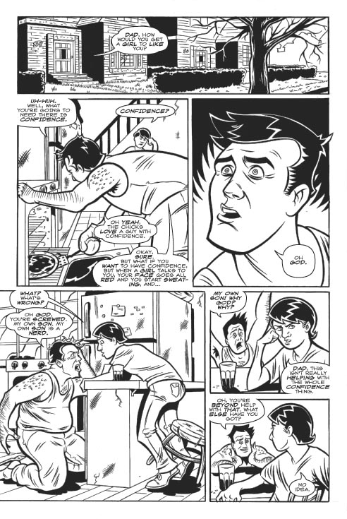
Heh, the dad reminds me of Bruce Campbell...he is so awesome.
tumblrrr
deviantart
In fact, the characterization is quite good. I have nothing to add on the writing front.
The art does almost everything it needs to - it's expressive, consistent, and detailed.
It could, however, do with more depth. The line thickness is a good start, but it could really use some greys to round everything out and give a better sense of depth.
Edit: In fact, the shading on "Flight of the Living Dead" is exactly what I'm talking about. Take these clean lines and add a bit of the sense of depth from your other one.
Thank you, Rubacava!
Thanks dude. Traditional, a Kolinsky #1 sable brush with Dr. Martin Black Star ink for the characters, Micron pens for the backgrounds.
I've tried digital inking, and I just can't get the hang of it.
And then I have a deviantART here: http://scottewen.deviantart.com
And I tweet: http://www.twitter.com/scottewenartist
Either way, the inking is already great, so whatever. Really funny (surprisingly) and the art is very well done (even more surprisingly). Also, I really like the Flight of the Living Dead as well.
The thing is, I was having a lot of trouble getting any kind of control with my lines. It seemed like I had to draw a line about three or four times before I got one I was happy with. Plus, I just really love inking on paper. There's something about making thick-to-thin lines with a brush that I look forward to every time I make a new page.
Thanks! But... why is it surprising?
And then I have a deviantART here: http://scottewen.deviantart.com
And I tweet: http://www.twitter.com/scottewenartist
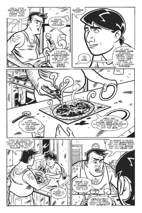
My favorite line was "Get funky!" at the very end before he got beat up. Classic.
I can't get the hang of it either. That zooming in makes me into a perfectionist.
And then I have a deviantART here: http://scottewen.deviantart.com
And I tweet: http://www.twitter.com/scottewenartist
And then I have a deviantART here: http://scottewen.deviantart.com
And I tweet: http://www.twitter.com/scottewenartist
Nice work though, the expression is the 2nd to last panel is great.
INSTAGRAM
Thanks for the critique, though.
And then I have a deviantART here: http://scottewen.deviantart.com
And I tweet: http://www.twitter.com/scottewenartist
And then I have a deviantART here: http://scottewen.deviantart.com
And I tweet: http://www.twitter.com/scottewenartist
And then I have a deviantART here: http://scottewen.deviantart.com
And I tweet: http://www.twitter.com/scottewenartist
And then I have a deviantART here: http://scottewen.deviantart.com
And I tweet: http://www.twitter.com/scottewenartist
Reveal your secret!
(or did you just bump up the brightness and hide the lighter lines?)
Flickr ... Myspace
And then I have a deviantART here: http://scottewen.deviantart.com
And I tweet: http://www.twitter.com/scottewenartist
This page took me too long to ink because of Flight of the Living Dead, but now the comic is on hiatus until I get this issue done. This double-page spread is one of the hardest things I've ever had to do, and I worked my ass off on making it good, so I'm probably prouder of this page than anything I've ever done. That being said, please critique the shit out of it.
Also, if you click on this image, you'll get a super huge, uncompressed version of it. For anyone that wants to zoom way in and point out the mistakes I've made.
And then I have a deviantART here: http://scottewen.deviantart.com
And I tweet: http://www.twitter.com/scottewenartist
Oh, no, I was saying it's surprising because the comics we normally get are rubbish. Yours are some of best I've read, and I actually plan to purchase them if I get the chance.
Very rare occurence with my cheap ass!