As was foretold, we've added advertisements to the forums! If you have questions, or if you encounter any bugs, please visit this thread: https://forums.penny-arcade.com/discussion/240191/forum-advertisement-faq-and-reports-thread/
Options
First full digital painting, advice? Critique?
Kochikens Registered User regular
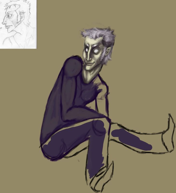
I just figured out how to digital paint in CS3. And i'm doing this inbetween animation. And I really wanna make something nice, so if you guys could help? Point out mistakes etc before I continue, get too far into it? I don't mind going over it, it's all on ONE LAYER cos I figured thats how you paint irl and jazz. Shirt'll be white, pants black.
Not sure about the lighting? Paintovers would be awesome.
Thanks. c:
 tumblr
Kochikens on
0
Posts
edit: there's some great digital painting resources in the tutorials thread. check it out.
also for trying out CS3 you should test and experiment with the brush settings. right now I would say take more time choosing the right colors and learning the color pallette.
artistjeffc.tumblr.com http://www.etsy.com/shop/artistjeffc
Mm. :c I have a sketch, but. I'm so used to painting on canvas, where it's just lightly sketched out with watery paint and built up from there. Yeah. Shoulda prolly drawn up a background first. Will do that next before I get ahead of myself. Anything you could point out that I should fix with the drawing of the dude, if that's what yer insinuating?
The further leg looks like it's bent the wrong direction. The closer forearm needs reworking... shape is off, it's too curvy. Also, where's the hand, wrist? -- it just kind of drops off. The upper arm seems a bit long as well, but it might be fine cause he seems tall and skinny anyways. Where is the rest of the arm in the back? And be careful with the shoulder area there, something's looking a bit off. Maybe when you finish shading in the rest of it it will come together.
The shading on the face looks pretty nice so far.
Are you using a reference image or are you doing this from your imagination? If you are using a reference, I can give much better suggestions.
Thanks! This is why I wanted to get feedback before I carried on, keepin it loose till I know what I gotta move around. I'll try to fix it up. Yeah, was gonna have the forearm leaning on the thigh, then the hand hanging down, and how I had it I figured it'd be hidden by the calf. Maybe i'll move it onto the knee or something, tilt it up to make the upperarm shorter. Not sure about the backarm, maybe the hand on the ground supporting himself a bit.
Hmm. This'll be fun.
Bettteerrr? Arms still a bit round, but i'm just thinking muscles right now.
Also, how long are you spending on this painting? Speed painting is a definite no-no unless you're so familiar with lights/darks and have a pretty good understanding of color theory that laying down values and tones becomes almost second nature. In short, slow > fast when starting out. Try spending at least six hours working on something basic, and make sure to not do it all in one shot; divvy it up between two or three sessions so as to get a fresh eye on things.
I strongly emphasize starting on the above mentioned because what you are trying to tackle here not only involves tonal understanding, color theory/application or light sources, but setting the piece up properly via tiny thumbnail sketches, a basic ground sketch to make sure all of your proportions are in check, and THEN successfully laying it down on canvas with outlines and proportions in check before you even start painting the damn thing.
I'm sure that's not what you wanted to hear, but i'm currently going through the process I just mentioned and it's proven to be more difficult than I expected.