As was foretold, we've added advertisements to the forums! If you have questions, or if you encounter any bugs, please visit this thread: https://forums.penny-arcade.com/discussion/240191/forum-advertisement-faq-and-reports-thread/
Options

Contributions to 700 Mole-Men

mattharvestmattharvest Registered User regular
edited November 2008 in Artist's Corner
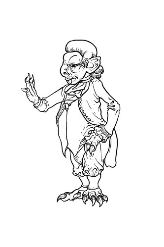
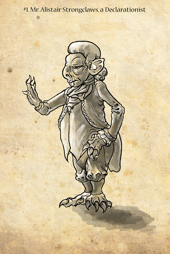
Well, ladies and gents, John Hodgeman's latest volume, "More Information Than You Require" has been released, including a list of 700 Mole-Men.

I, like many on Flickr, am making contributions to a collection of illustrations of those illustrious Mole-Men.

Here's the first. I'll be putting them here, not in the Doodle thread. The goal is to produce one a day, or so.

2962153257_5e586f7abb.jpg

2962998858_c173baea82.jpg

mattharvest on

Posts

  • Options
    PumazPumaz Registered User regular
    edited October 2008
    That's some layered humor

    Pumaz on
  • Options
    mattharvestmattharvest Registered User regular
    edited October 2008
    Next entry.

    2964276057_61707db904.jpg

    mattharvest on
  • Options
    mattharvestmattharvest Registered User regular
    edited October 2008
    Number 3:

    2965361731_55d66de40b.jpg

    mattharvest on
  • Options
    D-RobeD-Robe Registered User regular
    edited October 2008
    These are pure awesome. I definitely need to pick up More Information Than You Require.

    D-Robe on
    Cheese.
  • Options
    ManonvonSuperockManonvonSuperock Registered User regular
    edited October 2008
    the ears turn me off. they scream more gollum or gremlin/goblin than they do molemen.

    ManonvonSuperock on
  • Options
    mattharvestmattharvest Registered User regular
    edited October 2008
    They will not all have the same ears. Of course, Hodgman's excellent discussion of the origins of Mole-men makes it clear that they are not, in fact, related to moles or men.

    mattharvest on
  • Options
    mattharvestmattharvest Registered User regular
    edited October 2008
    4&5:
    2969743639_a4e3e4d726.jpg

    6:
    2970902366_c59e62b5bb.jpg

    mattharvest on
  • Options
    mattharvestmattharvest Registered User regular
    edited October 2008
    2973208922_b5f40e8f0f.jpg

    mattharvest on
  • Options
    vrempirevrempire Registered User regular
    edited October 2008
    Wowww mattharvest, that's look freakingly awesome dude!!
    Way to go my friend :)

    vrempire on
    vrembanner.gif
  • Options
    SpongeCakeSpongeCake Registered User regular
    edited October 2008
    6:
    2970902366_c59e62b5bb.jpg

    Goddamnit, the one thing I did not want to see today is a mole-man pimping out maggots.

    SpongeCake on
  • Options
    mattharvestmattharvest Registered User regular
    edited October 2008
    I'm a bit behind...damn real-world life slowing me down.

    mattharvest on
  • Options
    earthwormadamearthwormadam ancient crust Registered User regular
    edited October 2008
    Sir stinson is the fucking man. Moley man.

    I'm really liking these.

    earthwormadam on
  • Options
    ProspicienceProspicience The Raven King DenvemoloradoRegistered User regular
    edited October 2008
    SpongeCake wrote: »
    6:
    img]

    Goddamnit, the one thing I did want to see today is a mole-man pimping out maggots.

    Prospicience on
  • Options
    mattharvestmattharvest Registered User regular
    edited October 2008
    Trying a slightly different style on this one:

    2984918807_ee76cc65bf.jpg

    mattharvest on
  • Options
    mattharvestmattharvest Registered User regular
    edited November 2008
    Here's 10 through 12. It'd be nice if people let me know what they think, here.

    2997858987_6744249bb4.jpg

    2998699466_de4ee4d816.jpg

    2997858781_3fa6a5257d.jpg

    mattharvest on
  • Options
    lyriumlyrium Registered User regular
    edited November 2008
    I like the coloring of 1-7 best. 8 and 9 are hard to make out and the last three have weird contrast.
    How many were you planning on doing?

    lyrium on
  • Options
    mattharvestmattharvest Registered User regular
    edited November 2008
    I don't know; there are 700 on the list, so we'll see how far I get

    The last three are me shooting for a bit of Mignola's style, i.e. noirish. I'm bouncing back and forth between styles. Thanks for the comments.

    mattharvest on
  • Options
    earthwormadamearthwormadam ancient crust Registered User regular
    edited November 2008
    I really like 10-12 but the black levels are whats throwing it off for me. Keep em coming though.

    earthwormadam on
  • Options
    mattharvestmattharvest Registered User regular
    edited November 2008
    I have a few more to upload. Hopefully tonight.

    mattharvest on
  • Options
    GrennGrenn Registered User regular
    edited November 2008
    These are great - 8 and 9 are fantastic and I like the 12th best out of the Mignola-esque ones; not quite at MM's level yet (I'm sure you're not offended by this!) but he is deceptively good at his style of work, and it's a good stab at it.

    Great project overall, I would never have the patience for it, so good luck and keep it up. 8-)

    Grenn on
  • Options
    ProspicienceProspicience The Raven King DenvemoloradoRegistered User regular
    edited November 2008
    Really liking 1-7. On 10-12 I like 12 the best, think you got the best use of contrast down on that one, the others. I think EA is right about the black levels being a little high, maybe that's what's buggin' me. Still awesome though man.

    Prospicience on
  • Options
    mattharvestmattharvest Registered User regular
    edited November 2008
    So, no updates for a fews - found out I passed the bar exam (my second, and hopefully last jurisdiction to join) and was in a bit of celebration mode over the weekend. Updates to come. Thanks for all the comments.

    mattharvest on
  • Options
    mattharvestmattharvest Registered User regular
    edited November 2008
    Been busy, here's an update finally.

    3042687024_7fb5c674e8.jpg

    3042687118_a8a1cd786e.jpg

    3042687192_73c53e1a44.jpg

    3042687282_1aa36c71e4.jpg

    3041844315_373da625b5.jpg

    mattharvest on
  • Options
    earthwormadamearthwormadam ancient crust Registered User regular
    edited November 2008
    They look like they could use a bump up in contrast, but the designs and linework is superb!

    I like the second one, even though its a bit looser than the other ones.

    earthwormadam on
Sign In or Register to comment.