As was foretold, we've added advertisements to the forums! If you have questions, or if you encounter any bugs, please visit this thread: https://forums.penny-arcade.com/discussion/240191/forum-advertisement-faq-and-reports-thread/
Options

more stuff... ink washes... 3/29

RavenshadowRavenshadow Registered User regular
edited March 2007 in Artist's Corner
I always feel shabby compared to some of the regular threads, but I didn't want to spam the doodle thread. Went back to some pencil stuff to practice shading.

Anyways, some cartoon work...real light 'cause I'm just sketchin'
lessa.jpg

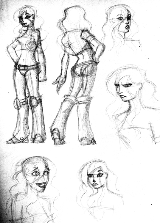
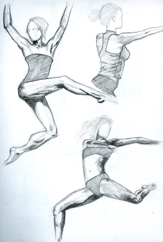
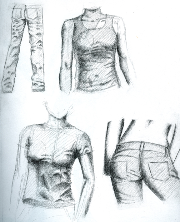
Scosglen's stuff made me want to do some studies too.
Dancers and shirts...
dancers1.jpg
dancers2.jpg
shirts.jpg

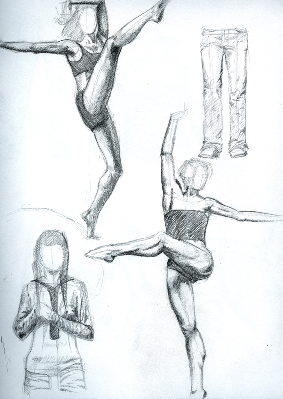
Figured I'ld try and carry a drawing a little further than I usually do
goth_girl1.jpg

Anyways, lemme know what ya think.

Ravenshadow on

Posts

  • Options
    earthwormadamearthwormadam ancient crust Registered User regular
    edited November 2006
    That's more like it. Nice pencil studies so far. Anatomy seems to be in check as well. The finished one looks really nice too, the shading looks well done.

    Now get back to work so that you can post some more.

    earthwormadam on
  • Options
    GrifterGrifter BermudaModerator mod
    edited November 2006
    dead images

    Grifter on
  • Options
    KurnDerakKurnDerak Registered User regular
    edited November 2006
    They are fine for me.

    KurnDerak on
  • Options
    RavenshadowRavenshadow Registered User regular
    edited November 2006
    yeah, boned the url. sorry guys.

    Ravenshadow on
  • Options
    lyriumlyrium Registered User regular
    edited November 2006
    These are really nice, but just something I noticed onthat last one- her arm holding the gun is too long, her fingertips would reach down to her knees instead of mid thigh where they should reach.

    lyrium on
  • Options
    DeeLockDeeLock Registered User regular
    edited November 2006
    lyrium wrote:
    These are really nice, but just something I noticed onthat last one- her arm holding the gun is too long, her fingertips would reach down to her knees instead of mid thigh where they should reach.

    No it's not.


    Looking good Raven.

    DeeLock on
  • Options
    Toji SuzuharaToji Suzuhara Southern CaliforniaRegistered User regular
    edited November 2006
    Raven, you know what you neglected on those studies.[/nag]

    The core shadow on the last image looks really spiffy.

    Toji Suzuhara on
    AlphaFlag_200x40.jpg
  • Options
    RavenshadowRavenshadow Registered User regular
    edited November 2006
    Raven, you know what you neglected on those studies.[/nag]

    :lol: I was waiting for that. yeah, I skipped the hands... I was focused on shading and balance.

    I'll do a couple pages of hands just for you though.

    Thanks guys

    Ravenshadow on
  • Options
    King_CobraKing_Cobra Registered User regular
    edited November 2006
    That last one is really good.
    lets see some more!

    *my last asspat*

    King_Cobra on
  • Options
    MagicToasterMagicToaster JapanRegistered User regular
    edited November 2006
    The first one kind of reminds me of the Kim Possible character style. I really like how you draw these wimmins.

    MagicToaster on
  • Options
    RavenshadowRavenshadow Registered User regular
    edited November 2006
    thanks guys.

    Toast: I like the KP style a lot. I've taken a bit from it, but I'm trying to be more detailed with it. More detailed faces... anatomy, etc...

    anyways, more...

    goth_girl2.jpg

    Ravenshadow on
  • Options
    Tweaked_Bat_Tweaked_Bat_ Registered User regular
    edited November 2006
    Her right (our left) forearm seems a bit short, and something seems off about her waist/legs (particularly her right leg).

    Once again, nice job with the shading though :)

    Tweaked_Bat_ on
  • Options
    Sir PeechizworthSir Peechizworth Registered User regular
    edited November 2006
    i like that her left pigtail is actually a piece of chicken. Anyone else read Highlites as a child?

    Sir Peechizworth on
    If it don't Blam, we don't want it.
  • Options
    RavenshadowRavenshadow Registered User regular
    edited November 2006
    blah! I need more practice time :P
    goth_girl3.jpg

    Ravenshadow on
  • Options
    The_Indigo_ApocalypseThe_Indigo_Apocalypse Registered User regular
    edited November 2006
    m63292260.jpg

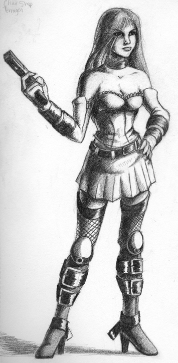
    Sorry for the poor quality, for some reason it became a little harder to see after I uploaded it.

    Anyway, I'll do this like paint-by-numbers, only it'll be critique-by-numbers.
    ^_^

    1)This whole area seems a little awkward. Her shoulder looks ok, but everything below that up until the elbow looks strangely situated, as well as a little too thin (especially compared the rest of her arm). Nice job on that hand though.

    2) this hand looked a little off--I know it's kind of hard to tell, but the thumb looks a little weird, I think it comes around the object too far. Also, since she's grabbing that handle so tightly, the rest of her fingers should be slightly angled--for instance, grab your remote, and look at how your fingers do. They don't point straight up and down when handling something like that.

    3) is that a shine on her butt? That doesn't quite make sense considering where your light source is, although it's a little dodgy in this picture.


    Oh, and her eyes seem to be looking in slightly different directions.

    In general though, I think you have a great start on this, I definitely like the look of it! :D It just need some fine-tuning.

    Good job! I always like looking at what you're working on!

    The_Indigo_Apocalypse on
  • Options
    RavenshadowRavenshadow Registered User regular
    edited December 2006
    thanks for the comments indigo. Yeah, that one was hard, the pose was awkward to draw, lots of twisting.

    trying speed painting... shits hard...
    shirt.jpg
    helmet.jpg
    helper.jpg
    midna.jpg
    mutant.jpg
    slow2.jpg
    speed.jpg

    bleah, gotta keep practicin'

    Ravenshadow on
  • Options
    RavenshadowRavenshadow Registered User regular
    edited December 2006
    more stuff. Still practicin'...
    goth_girl5.jpg

    and an attempted speed paint
    point_paint.jpg

    heh.... I wish my digital stuff was at the same level my pencils are... (not that my pencils are all that good :) )

    thoughts?

    Ravenshadow on
  • Options
    Vargas PrimeVargas Prime King of Nothing Just a ShowRegistered User regular
    edited December 2006
    Grr. Made a post and lost it mid-typing....

    Anyway, the pencil one is nice, but if you want some nitpicky critique, here goes...

    The head looks just a smidge big. Just a smidge. Her left foot should extend down further. The way her legs are positioned, her left one looks a little closer to us than the right one, and considering that the foot is coming directly at us, it should probably extend lower than the other foot, instead of even.

    The speedpaint is cool, but again, with her left foot positioned where it is, her left hip should be a lot lower than her right hip. As it is now, her left leg would have to be a few inches longer than her right to pull off that pose.

    Nice work, though, and I like the values on the pencil drawing.

    Vargas Prime on
  • Options
    RavenshadowRavenshadow Registered User regular
    edited December 2006
    thanks for stoppin' in.

    and I see what you mean about the legs in both pics (I knew it was there in the speed paint, but I missed it in the pencilled one). Thanks. I'll pay more attention to leg length on the next one. I have a problem getting feet to line up on the same plane.

    As for the head size. Yeah, I can see that now too. grrrrr. I thought I did pretty well on it. ... although, I guess its not too bad.

    That's the problem with practicing heads :) I get better at the features but miss how they fit into the entire body. I guess I need too move up to bust practice. :D

    Thanks again.

    Ravenshadow on
  • Options
    vrempirevrempire Registered User regular
    edited December 2006
    Wow Ravenshadow,
    you are really brave for trying different kind of method.
    I really like the women in the fire pic.
    Anyway, there is a lot more room for improvement.
    Good luck
    :)

    vrempire on
    vrembanner.gif
  • Options
    RavenshadowRavenshadow Registered User regular
    edited January 2007
    I know I posted these in the doodle thread, but I got Lexx'd :D

    I feel like I'm making progress (however slowly) but I could still use some advice on painting and lighting. I'm working in black and white mostly because I like it and I still feel weak in lighting and I feel that this way I can focus on my weaknesses without having to worry about hues, saturation, color mixing etc.

    Anyways... here's the latest.

    anatomy is a bit shifty on this one.
    work6.jpg

    work7.jpg

    Ravenshadow on
  • Options
    RavenshadowRavenshadow Registered User regular
    edited January 2007
    speed paint... 1.5 hours...
    didn't finish the background in the time I alloted myself.
    meh
    work8.jpg

    Ravenshadow on
  • Options
    rtsrts Registered User regular
    edited January 2007
    What kind of look are you going for? Specifically with the two images in the post before last.

    rts on
    skype: rtschutter
  • Options
    RavenshadowRavenshadow Registered User regular
    edited January 2007
    I'm not sure what you mean. I was trying just trying to paint some semi-realistic looking chicas.

    Ravenshadow on
  • Options
    rtsrts Registered User regular
    edited January 2007
    You are using fairly graphic indications for their features, which is why I ask. If you are going for photorealism I think you need to try to think about the shapes that make up the eye rather than think about drawing an eye. The features you have drawn are more symbolic than realistic I think.

    rts on
    skype: rtschutter
  • Options
    RavenshadowRavenshadow Registered User regular
    edited March 2007
    Hey guys.
    Works been keepin' me on a short leash so I don't get to post as much as I'ld like to. So here's a buttload of stuff. Would appreciate some feedback.

    Specially on the inkwashes. I can't find any info on how to do them, so I'm just kinda fucking around trying to figure it out. The only thing I've figured out so far is that I hate water color paper... sucks the ink all over the place. I've had the best luck with my sketch book pages.

    Also been workin with ballpoints lately. I kinda like 'em.


    more_faces.jpg
    ballpoint1.jpg
    ballpoint2.jpg
    ballpoint3.jpg
    ballpoint4.jpg
    ballpoint5.jpg
    ballpoint6.jpg
    ballpoint7.jpg

    and here are the inks
    inkwash1.jpg
    inkwash2.jpg
    inkwash3.jpg

    anyways, lemme know what ya think.

    Ravenshadow on
Sign In or Register to comment.