As was foretold, we've added advertisements to the forums! If you have questions, or if you encounter any bugs, please visit this thread: https://forums.penny-arcade.com/discussion/240191/forum-advertisement-faq-and-reports-thread/
Options

420 smoke [DOODLE] erryday

ProjeckProjeck Registered User regular
edited April 2009 in Artist's Corner
okay so link to NSFW stuff and all that sort of thing
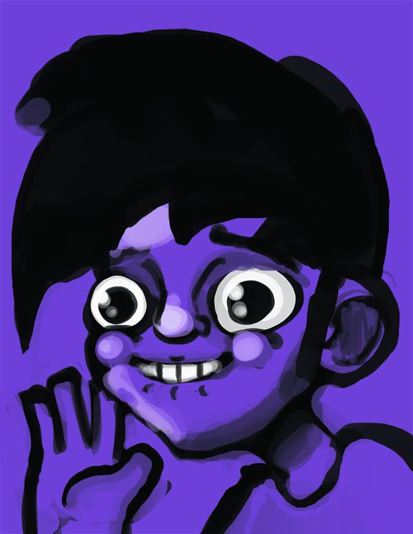
gabe2.jpg
now art times yes

Projeck on
«13456731

Posts

  • Options
    F87F87 So Say We All Registered User regular
    edited February 2009
    bol_wip.jpg

    Bong of Love WIP.

    F87 on
  • Options
    ProjeckProjeck Registered User regular
    edited February 2009
    how topical

    edit:
    reworked the face on that gabe there
    gabe3.jpg

    Projeck on
  • Options
    bombardierbombardier Moderator mod
    edited February 2009
    That hand is just not doing it.

    bombardier on
  • Options
    ProjeckProjeck Registered User regular
    edited February 2009
    doing what

    Projeck on
  • Options
    bombardierbombardier Moderator mod
    edited February 2009
    Looking good.

    It looks like an inflated surgeon's glove.

    bombardier on
  • Options
    ProjeckProjeck Registered User regular
    edited February 2009
    oh, okay

    ill work on that, thanks!

    Projeck on
  • Options
    GrifterGrifter BermudaModerator mod
    edited February 2009
    New logo for my site.

    blogicon2.png

    Grifter on
  • Options
    NotASenatorNotASenator Registered User regular
    edited February 2009
    Grifter wrote: »
    New logo for my site.

    blogicon2.png
    What does it say?

    NotASenator on
  • Options
    BetelgeuseBetelgeuse Registered User regular
    edited February 2009
    I think it says griftart, but that is only because I know what his site is called. It's pretty illegible!

    Betelgeuse on
  • Options
    LoomdunLoomdun Registered User regular
    edited February 2009
    It looks like G______ Home for losers

    Loomdun on
    splat
  • Options
    winter_combat_knightwinter_combat_knight Registered User regular
    edited February 2009
    some doodles from yesterday.

    Pic of Obama, and 2 of clint eastwood.

    2llect0.jpg

    An attempt at drawing George Castanza, and an attempt at drawing a chick, who truned out looking like a dude.

    2w3n909.jpg

    winter_combat_knight on
  • Options
    melting_dollmelting_doll Registered User regular
    edited February 2009
    This image might break your H-Scroll.
    tf2love.jpg

    Heavy's arm is too skinny and it's ticking me off!
    But yay, girlies? (:

    melting_doll on
  • Options
    BetelgeuseBetelgeuse Registered User regular
    edited February 2009
    Melting doll, you are too cute. And your art, too!

    Betelgeuse on
  • Options
    melting_dollmelting_doll Registered User regular
    edited February 2009
    Not so bad yourself, there, chief. (;


    Also, I almost forgot Mister Herman:
    peeweebasketball.jpg

    melting_doll on
  • Options
    RubberACRubberAC Sidney BC!Registered User regular
    edited February 2009
    I was just watching Pee Wee's big adventure hours ago

    RubberAC on
  • Options
    srsizzysrsizzy Registered User regular
    edited February 2009
    NotACrook wrote: »
    Grifter wrote: »
    New logo for my site.

    blogicon2.png
    What does it say?
    it says griftart, but I don't see how that thing passes for an i. I get what's going on though, what with the circles.

    srsizzy on
    BRO LET ME GET REAL WITH YOU AND SAY THAT MY FINGERS ARE PREPPED AND HOT LIKE THE SURFACE OF THE SUN TO BRING RADICAL BEATS SO SMOOTH THE SHIT WILL BE MEDICINAL-GRADE TRIPNASTY MAKING ALL BRAINWAVES ROLL ON THE SURFACE OF A BALLS-FEISTY NEURAL RAINBOW CRACKA-LACKIN' YOUR PERCEPTION OF THE HERE-NOW SPACE-TIME SITUATION THAT ALL OF LIFE BE JAMMED UP IN THROUGH THE UNIVERSAL FLOW BEATS
  • Options
    XALXAL Registered User regular
    edited February 2009
    Aimless face doodle.
    Trying to get used to the tablet...
    Whenever I draw people from the front, I never know what the **** I'm doing around the shoulders/arms. I just don't get/understand how it's supposed to look.
    doots.jpg

    I guess I should copy refs a lot because my brain can't figure it out on it's own.

    XAL on
  • Options
    winter_combat_knightwinter_combat_knight Registered User regular
    edited February 2009
    A couple self-portraits

    21a0jyf.jpg

    16kt75d.jpg

    winter_combat_knight on
  • Options
    Endless_SerpentsEndless_Serpents Registered User regular
    edited February 2009
    God damn, being a undercover agent is really taking it's toll on my doodle-times. However, look at this!

    FRL.png

    Endless_Serpents on
  • Options
    TheBogTheBog Registered User regular
    edited February 2009
    rom281.jpg
    rom282.jpg

    TheBog on
  • Options
    GrifterGrifter BermudaModerator mod
    edited February 2009
    srsizzy wrote: »
    NotACrook wrote: »
    Grifter wrote: »
    New logo for my site.

    blogicon2.png
    What does it say?
    it says griftart, but I don't see how that thing passes for an i. I get what's going on though, what with the circles.

    Yeah, I couldn't figure out a better way to do an I and stick with the whole circle thing. That was the best thing that I could come up with at the time.

    It was all a bit of an exercise in using Illustrator since I know very little about the program and I thought it would be a good idea to design my logo using vector graphics this time around.

    Grifter on
  • Options
    NeoRedXIIINeoRedXIII Registered User regular
    edited February 2009
    It looks like it might be a bit heavy on the left side due to the 'g' hanging off the 'home for the losers' and the bottomless 'rt.' My head wants to make it slanted. *shrug*

    NeoRedXIII on
  • Options
    NeoRedXIIINeoRedXIII Registered User regular
    edited February 2009
    I started playing around with it the way you were, especially since I'm probably in about the same position you are. I didn't take color choice into consideration, other than to distinguish each character from the next.

    Griftart.png

    My advice is to not limit yourself exclusively to the circle. You can still get the circles to come across as the dominant shape and basis for your characters. It doesn't necessarily have to be legible.

    NeoRedXIII on
  • Options
    lyriumlyrium Registered User regular
    edited February 2009
    I think that the 'i' would read more easily if you keep the dot and the body on the same half of a circle. This is pretty much what I'm trying to say:

    Untitled-1.jpg

    (I don't know how to do the transparent background thing)

    lyrium on
  • Options
    NeoRedXIIINeoRedXIII Registered User regular
    edited February 2009
    Yeah,

    Griftart2.png

    but I'm still working towards saying 'fuck legibility.'

    NeoRedXIII on
  • Options
    NotASenatorNotASenator Registered User regular
    edited February 2009
    NeoRedXIII wrote: »
    I started playing around with it the way you were, especially since I'm probably in about the same position you are. I didn't take color choice into consideration, other than to distinguish each character from the next.

    Griftart.png

    My advice is to not limit yourself exclusively to the circle. You can still get the circles to come across as the dominant shape and basis for your characters. It doesn't necessarily have to be legible.

    I read that as gooftaco

    NotASenator on
  • Options
    NeoRedXIIINeoRedXIII Registered User regular
    edited February 2009
    Grif should change to http://www.gooftaco.com now.

    NeoRedXIII on
  • Options
    PiousPious Registered User regular
    edited February 2009
    clairicesmall.jpg

    I wanna punch something.

    I'm done with it.

    Pious on
    Untitled_1_4.jpg
  • Options
    ProjeckProjeck Registered User regular
    edited February 2009
    her feet look weird

    Projeck on
  • Options
    NightDragonNightDragon 6th Grade Username Registered User regular
    edited February 2009
    Projeck wrote: »
    her feet look weird

    I think it's because they're too large, and don't look like they're being viewed from the top...

    NightDragon on
  • Options
    winter_combat_knightwinter_combat_knight Registered User regular
    edited February 2009
    Besides that she looks like she's doing Michael Jacksons anti gravity lean move, it looks pretty good. icon_up.gif

    winter_combat_knight on
  • Options
    ObilexObilex Registered User regular
    edited February 2009
    selfport2.jpg

    self portrait take 2

    Obilex on
  • Options
    Asamof the HorribleAsamof the Horrible Registered User regular
    edited February 2009
    2jb0c5y.jpg


    I did the captain falcon in the middle, just a goofy doodle

    Asamof the Horrible on
  • Options
    NightDragonNightDragon 6th Grade Username Registered User regular
    edited February 2009
    Angry.jpg

    NightDragon on
  • Options
    D-RobeD-Robe Registered User regular
    edited February 2009
    Too much caffeine.

    D-Robe on
    Cheese.
  • Options
    LoomdunLoomdun Registered User regular
    edited February 2009
    That is one angry looking pocahontas.

    Loomdun on
    splat
  • Options
    Toji SuzuharaToji Suzuhara Southern CaliforniaRegistered User regular
    edited February 2009
    Pious: The generic design stuff at her feet could help you sell the perspective more if it were following the plane that she's standing on. Also, the horizontal white lines on her legs are really flattening them out. If you want to convey that we're looking down her body, curve the lines with the forms.

    Obilex: It wouldn't kill you to add some more colors into that. The skin in particular could do with some hue variation.

    ND: The digitalness of the strokes and values makes me kind of uneasy because it can go downhill so fast, but since it's you, I have hope! The expression is cool. The shoulders just seem like placeholders, though.

    ---

    Doin' some superhero designing. I have a way to go, still.

    ss1.jpg

    ss2.jpg
    Yes, the crotch. I am aware. I'm still trying to figure out how much "football pants" is too much.

    Toji Suzuhara on
    AlphaFlag_200x40.jpg
  • Options
    XALXAL Registered User regular
    edited February 2009
    he's got a rap video girl booty in the last one

    XAL on
  • Options
    RobchamRobcham The Rabbit King of your pantsRegistered User regular
    edited February 2009
    hourly comics!
    07am.gif
    08am.gif
    09am.gif
    10am.gif
    11am.gif
    12am.gif
    07.gif
    02pm.gif
    03pm.gif
    04pm.gif
    05pm.gif
    06pm.gif

    Robcham on
  • Options
    GrifterGrifter BermudaModerator mod
    edited February 2009
    NeoRedXIII wrote: »
    Yeah,

    Griftart2.png

    but I'm still working towards saying 'fuck legibility.'

    Good job, guys. I think that's a lot better than what I was working with before. I'll take your suggestions and do some more work on it when I get home from work.

    Hmmm... gooftaco... :winky:

    Grifter on
This discussion has been closed.