As was foretold, we've added advertisements to the forums! If you have questions, or if you encounter any bugs, please visit this thread: https://forums.penny-arcade.com/discussion/240191/forum-advertisement-faq-and-reports-thread/
Options
Millislim's art's and things
millislim Black SheepSacramento, CARegistered User regular
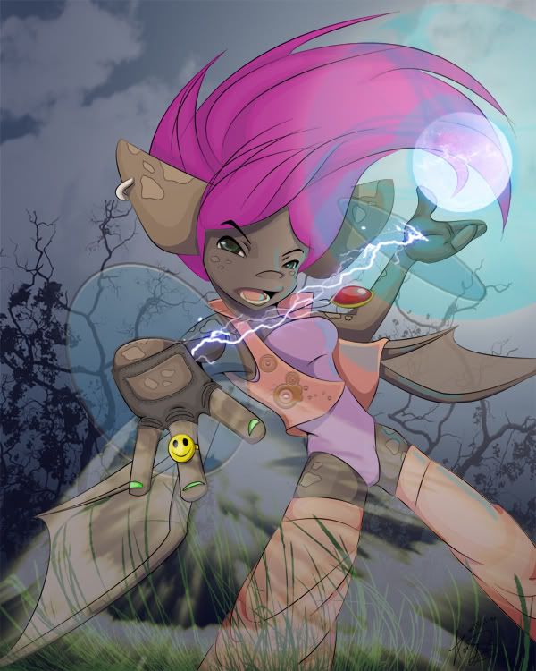
This was for a contest on a site requesting concept art for new web comic. Just thought I would share it because i'm very proud of it.
A little about it.
Done completely in photoshop, even the sketch which took 5 layers alone. Total time from start to finish about 20 hours, over 45 layers done in Adobe CS2 with a Havon Tablet 7"x 9". She's a bat whose main weapon are her gloves that can collect sound waves and throw them back. Her name is Echo.
[X] Pax tix
[X] Train tix
[_] Finish Vivi costume
[X] Anxiously wait
[X] Train tix
[_] Finish Vivi costume
[X] Anxiously wait
millislim on
0
Posts
the photograph background really isn't doing it for me
the character does not look like she's a part of the scene, she just looks haphazardly tossed in there.
same goes with the lightning, the orby glow and the wierd...what is that, cloud effect with a radial blur added to it?
none of these elements mesh with the style of the drawing, which i think is a strong style.
if you take the time to physically draw in the background elements, i think the image will be much stronger.
so, character: very nice
background and effect elements: not as good
i think you have some skill though, i'd like to see more from you.
With four paintbrush effects turned off: orb, background, lightning, grass
Just the lines if you were interested in that
[X] Train tix
[_] Finish Vivi costume
[X] Anxiously wait
but i am a minimalist of sorts
so maybe don't listen to me.
but i think you see what i mean when i turned those other layers off. It's hard to tell whats going on. She's just stading there...doin some sort of gangsta pose or something lol
[X] Train tix
[_] Finish Vivi costume
[X] Anxiously wait
welcome to the forums btw
i don't think i've seen you around
you've got a cool style, post some more stuff!
Kotaku advertised a Dalkstalkers fan art contest...so I tried my hand at a little known character called Queen Bee. Figured everyone else would be drawing Felicia or Morrigan so I thought I'd be different.
A drawing made for some furry by request
[X] Train tix
[_] Finish Vivi costume
[X] Anxiously wait
i think i have you on my friends list if you are.
same screen name as here. Small world if you've seen this already
[X] Train tix
[_] Finish Vivi costume
[X] Anxiously wait
hmm didn't have you on deviantart
added you though
[X] Train tix
[_] Finish Vivi costume
[X] Anxiously wait
i believe in you!
backgrounds are tough though
especially when they're not drawing in with the character
it's hard to put them together nicely as an afterthought
[X] Train tix
[_] Finish Vivi costume
[X] Anxiously wait