As was foretold, we've added advertisements to the forums! If you have questions, or if you encounter any bugs, please visit this thread: https://forums.penny-arcade.com/discussion/240191/forum-advertisement-faq-and-reports-thread/
Help me to comic (Kinda new styleish? Some more different inking?)
Death of Rats Registered User regular
Registered User regular
So I'm working on a comic to try to get my drawing/inking/layout skills back up to snuff... and the best way for me to do that is to know what all I need to work on. Here's a sample of my work so far...
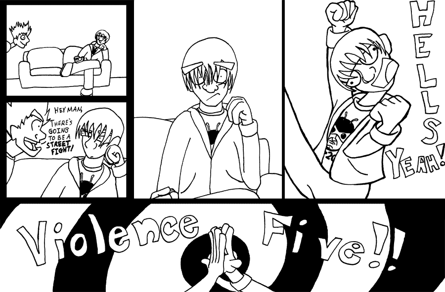
The main things I know are not very good are, well, the inking. For the life of me I just can't seem to understand line thickness and all that cool stuff. As well as the backgrounds... not nearly enough detail there. I'm semi-happy with the cartoony anatomy, but I'm sure with a little help I could improve that. Especially in the hands department (well, that's more practice than anything). So, well, rip it to shreds. Tell me what you think, and I'll try to improve it. Also, I have a second little strip in the works, so hopefully I'll be able to incorporate any criticism in that one.
Oh, and yes, that is suppose to be the 24 t-shirt. No, it's not very well modeled.
No I don't.
Death of Rats on
0
Posts
It's not hard to get some thickness in there. Things closer to camera are thicker while background stuff is thinner.
Watch out for pos/neg spacing because you have a lot of wasted space.
Also the cartoon anatomy you have employed is kinda bad, like the broken neck panel and weird fingers in the last panel. Maybe try a more simplistic style or somethin?
To its credit the comic does have a decent pace and each panel has a point. Having no useless fluff is always a good thing.
INSTAGRAM
Definitely agree there. The next comic is a little bit more varied in camera angles (I have it thumbed out), and the one after that will, just by the nature of the joke, have to be a lot more dynamic. Hopefully that will also help with the negative/possitive space.
While I know this is how it's suppose to work, I can never seem to actually get it to work right when I try it. I get confused. Is a nose suppose to be thicker than the ears? Than the outline of the head? When something's basically in the same camera plain should the lines really vary? Maybe it's just me confusing this with depth of field, but I really can't seem to figure it out. There's some fundamental things I'm not understanding about inking that's really holding me back here. One problem I have is anytime I buy microns they never seem to work. I bought a whole set of thicknesses a week ago, and only the .5 worked for more than a second.
Agreed. This one is kinda a lost cause on that front. The next one I'll try to look more closely from a design perspective at the whole layout. Related question, is the spoken dialogue in the second panel alright? I kinda had to squeeze it in there (for some reason I forgot to lay it out with enough space) and I'm not sure if it has enough room to not be distracting.
Yeah, the hands are definately sausage fingers. I'm going to try to get some hand/wrist practice in before starting work on the next comic. Not drawing anything for 3 some odd years has made my limited skill even worse. Especially on hands.
But besides the hands, what would you say are the worst parts of the anatomy? Is it the faces, the body, or just the thing as a whole? I really didn't want to start on this until I had a locked in style for the anatomy, but I realized I wouldn't be able to do that, and I'm still struggling with it. To be honest, the broken neck panel isn't what I had in mind for the style. Went a little too overboard with the "zanny" with that one.
Well thank you for that (actually thank you for all the criticism). Originally the first and second comic were going to be one strip, but I realized that 10 panels and 2 jokes = 2 comics and quickly reworked the layout to work for 2 comics. How are the girders in this one? Would it help with the negative/possitive space if I had more window panels, or even some overlay panels?
The anatomy just needs work in general, but you could get around that by either simplifying or trying something more abstract. Right now the characters are somewhere between realistic and zany and it feels like it should be more one or the other.
The panel with the dialog doesn't bother me because at least they're no wasted space. I'd rather see something crammed in than space with nothing, but that's just my preference. In a best case scenario there really shouldn't be either.
Understanding how to make line thickness will just come with practice. I can't really tell you what lines should be thicker, the ear or nose or mouth and what not. The parts that you deem more important should be more boldly rendered. Details that aren't as important can be thinner. You really just need to experiment to see what works for you. Lines should be thick and come to a thin point, but as they are now they just stop.
Good luck.
INSTAGRAM
old:
new:
Is anything better with the newer version? Or is it just degrees of sameness?
I laughed out loud when I realized the newer version was removing a t-shirt design. I think this post should be your new comic. Although there is something inherently funny with uppercutting the sky while simultaneously snapping ones own neck.
If you want to salvage the original: short term, you need to cut out the 3rd and 4th panels. Focus on what the actual joke is and capitalize on it. Adding in those two not only slows it down enough to remove the funny, but the poor draw skills really shine through, and you don't want that. Long term, you needs to learn drawin' skills. Either go the long tried and true route of draw from life/practice practice practice/study previous art, or if you wanna hop on the "bad art is funny" bandwagon, you have to still study why certain bad art is funny, and why others are terrible. I couldn't really describe it but, some people can definitely pull it off, and if you want that to be your thing, you need to figure out what they are doing.
Believe it or not I did "re-ink" that panel. And it did look quite different, until I shrunk it down to a web resolution. It's rather disheartening to see what I draw in pencil, which looks nice to my eyes, turn into this shit as soon as I start inking. So, well, I think I'll go back to the drawing board as it were with this one. See if I can get something workable out of it (yes, I know I'm being defensive. However, I do agree this comic doesn't look good) if I redo it completely. Either way it'll give me some more practice with the inking, and maybe I'll be able to fix the wasted space issue with a redraw.
First thing I did was go over the pencils with a .005, erased the pencils. Then I just tried to follow the advice from here. Closer things are thicker, farther away things are thinner. From what I see I have a hard time making things REALLY thick without thickening the things around them as well. I dunno. Anything you guys notice that might help me out here?
You've applied some variation in thickness, but in a haphazard and slapdash way. The thickest line I see is the diverging two lines of the legs meeting at the crotch. Is this what you deem as the most important subject of the image? I am troubled.
I did a quick draw over of the spots that stood out to me. I also did a quick ink over using what you did as a template.
First off, a few of the problems aren't inking based but structure/shape problems. Look at the legs meeting the crotch. This area just doesn't make sense. If Sonic's legs were connected to his body in this way he wouldn't be able to run, let alone pick up his unemployment check. When you draw legs and arms, think not only about how they bend and flex, but also how they connect to the body. The shoulder is also funky, but not in a Toe Jam and Earl kinda way. It just looks weird. Think about these areas when you're doing your pencils before you ink. When you pencil things out you can identify spots like these and fix them before you ink. If you were making a gravestone, you wouldn't continue to chip away at a misspelled name, would you? Of course not!
The goggles also don't look right. You really have to take into account the shape of the head when you are drawing something wrapping around the shape. At first I thought it was a fez because it doesn't look like he has something around his head. These areas are all small nitpicks in the scope of the image, but little things add up, and together can pull a great image down. The line on the shoes doesn't seem like at important line, but it really is. It defines the shape of the shoe. The lines you had were curved, but try to put more thought into things like that because the contour really sells the illusion of shape and form. Also the eyebrows had the same problem. They were curved, but they needed just a bit more form to look like they really belonged to be on the head. Little lines can make a big difference. The little line under the mouth and the reflection lines on the goggles make shapes seem more real. Sweet lord did I really type 2 paragraphs about the anatomy of a Sonic character?
So yeah enough about shapes and anatomy. Lets get back to line width since that's something I might actually be somewhat knowledgeable in. You've tried to change up the thickness here and there, but none of it is senseable. Look at the shoes. The one in front has almost the same thickness as the one in the back. This should not be! Whenever you see one object overlapping another, this is a sign that the thickness should be drastically different. You did the same thing with the tails, only this time you made the tail in the back even thicker. It's a little thing but it is an important thing.
Here's what I came up with...
Obviously every artist could ink this and come up with something different. Everyone is going to view parts as having a different importance, and thats what fun about inking. You get to decide what matters. Looking back on what I did, I probably could have put more emphasis on some parts, and less on others, like the chest hair. But even though I made those lines a bit too thick, I also simplified the spikey hairs of it from what you had. There were too many and it didn't need 10 spikes to get across that it's spikey. It's like the character from your web comics. You can have hair pointed downwards over his eyes without actually drawing like 20 hair spikes. It looks overly cluttered. Just simplifying a few things here and there will give everything a much cleaner, pleasant look.
Try experimenting more with varying amounts of thickness. Get crazy. Lines should start thin and get 10 times thicker. That is how you make lineart stand out. Obviously you don't always have to be that drastic but when you're just experimenting it's a great way to loosen up. Try to make objects that are in front or behind each other really stand out. Look at the width I used for the hand in the background as opposed to the one in front. You did make the ones in the back thinner than the ones in the front, but just not enough so that it really looks different. If you are going to make an effort to differentiate things, why not go all the way?
Some objects require the line to change up to make it seem like the object takes up 3D space. The goggles for instance are thick on the rim, until you follow it to the background where it thins out a bit. I could have emphasized it much more but you can still kinda see it. Things like the tail are behind the subject, so you know right away they should be pretty thin. They're crazy long though so you can make them thick again towards the top to make them seem like they're taking up actual space. They weren't reading as multiple tails in the original drawing to me, but just a small change and it becomes obvious.
Using a tablet made it much easier to do a quick rundown like this, and if I was using actual ink, the process would've taken a much more considerable amount of time. Even though it takes longer, you can still achieve good line variation with practice. With the tablet I would change the brush size bigger and hit areas I wanted to be thicker. When I use pens I just gradually feather them out until I'm happy with the thickness. Having some thicker pens on hand is always a good thing though. You shouldn't have to erase your pencil lines, if you use a blue pencil. I usually just pencil really light with a regular pencil though, and then adjust the brightness/contrast to make them disappear. I'm not sure what you mean by "having a hard time making things REALLY thick without thickening the things around them." Thickness doesn't always just come out of nowhere, it can be gradual too. But you can have something really thick while things around it are not, so I don't get what you mean.
Also try to put a shadow in because it helps ground the characters as opposed to having them floating in space. I should probably also tell you that light affects the lines as well in terms of thickness, but I'm nowhere near good enough with lightsource to talk about that. Hopefully my points came off as helpful, not long-winded and dickish.
INSTAGRAM
As far as the "hard time making things really thick without thickening the things around them", again, that's part of me not knowing what's I'm doing. I thicken something and then immediately I want to thicken pretty much the whole image, or at least what's around it. The whole thing is just counter intuitive for me at the moment, but I'm practicing, so hopefully I'll pick some of that up. Now that I have some pens that actually work (whenever I inked the comic I only had a .5 that worked), it might be a little easier to practice.
I'm surprised no one has said anything about how unsure my lines are. When I draw with a pencil my lines are usually very clean, and actually do have the varying thickness that you're talking about... but naturally, not through a large though process. Inking is just so damned time consuming and... irreversible that I can't make a quick flowing line. Everything is inch by inch. Again, will just take the confidence that comes with practice.
agreed.
Also, check out this Scot McCloud's stuff, he has a couple of books. Here is a link to a small tut he did:
http://vector.tutsplus.com/tutorials/comics/the-mechanics-of-comics/
Trying to simplify the faces a bit... not sure if I'm even hitting on anything right now.
Find your favorite cartoonist, and copy some of their pieces exactly.
This is dangerous advice because you could end up just becoming a clone, but it may help you figure somethings out.
Im assuming your favorite cartoonist is good.
I already do draw from life, this obviously isn't me doing that. If I wanted help with my lifedrawing I'd ask for it, I'm asking for help with this. The people on this board don't like my style, I'm trying to figure out what exactly they do like. Simplify it? I'm trying to do that without making it look like someone else's work.
Even right now what I'm doing is a mixture between Jim Mahfood's stuff on the clerks comic, some Johnen Vasquez, a bit of the clerks cartoon, and Machall. Well, at least that's what I'm thinking. Then again that's also a little bit of an insult to those people to say that.
I know my stuff isn't great, but is it really so bad that the only advice anyone besides EWadam will give is "learn 2 draw" or "learn 2 not bad art"? Everytime I end up posting something on here I get so damned frustrated and discouraged that I hang up my art stuff for months before wanting to work on anything again.
Not great, not horrible, mediocre. Could definitely be a lot better. And I'm working on that side of it while still working on this side of it. But this side is where I'm completely lost. Getting down a cartoony style (a really cartoony style, not a realistic one) is difficult, as I'm sure you all know. Drawing from life is also difficult, but in a different way. Design, abstract design, these things I definitely have problems with. Drawing, I know about, I'm mediocre at it, but I'm not completely incompetent.
I think these are displaying improvement on what you had originally. Keep going though, don't do just 3 thumbnails, do like a hundred. It will yield something good for results guaranteed.
INSTAGRAM
Also, your "goofy" head has styles from all over the place and they dont' blend well together. Focus on simplicity and refining your art so it looks cohesive. (also, draw from life
Scanning in pen work... with a slight touchup in photoshop.
Does it seem to anyone else like I've been making the features of the face so big that it makes the faces harder to read? I've been looking through the things I like to say I get inspiration from... and well, none of them enlarge the facial features as much as I do. I didn't use to do it that way either. Actually, I went back and looked at some of my older stuff where I was first using this "style", and to some extent the heads look much better. Some things were off about them, but I can definately see where not drawing like this for around 3 years has hurt me.
Actually, I think most of the stuff I've added to this style has hurt me a bit. The only thing that I really did to help was bulk up the characters some. I haven't really applied anything I've learned with lifedrawing or just general practice over the years into this style. Odd to realize that. Here's some examples of what I'm talking about:
First thing I ever drew with this style. Sometime late 2003. Not exactly what I ended up with, but I can see where I headed with it.
First thing I drew for a comic I was working on call "soda can army" in 2004. I think I had a better grasp of inking back then that I do now. This was done with a tech pen and not a micron or prismacolor pen. Maybe I should look into using one of those again. Either way, closer to what I ended up with now. The character at the desk is the same character in the comic I posted here.
First panel of the first comic I finished. Somewhere along the line I started to not use a ruler for straight lines and got really lazy. It's kinda crazy that the previous image looks better than this one. A lot more detail.
And pretty much the last image I drew for this style in 2005 after people here suggested I stop working on the comic and start working on lifedrawing. This is better than what I have now as far as the faces.
Really I have no clue what happened with this style I've been "developing" for the last "5 years". I tried to pick it back up, fix it up a bit, and run with it, but looking back the stuff I had before is better than the current comic. I've been working backwards this whole time.
I'm going to work on getting the designs of the characters more workable for the second one, but this is the final inking on the first one (I didn't go through the trouble of fixing the gutters digitally yet like I did when I first posted it).
So tell me what you think. Am I on the right track as far as the inking goes? I know it's a long process to actually get good at inking, but does it look like I'm heading in the right direction here?
Anyway, here's my go at coloring the first 3 panels. Probably won't go with this, more than likely I'll switch to flats. But I thought it looked interesting.
Everyone I've shown it too likes it so far, but, well, friends aren't usually the best candidates for constructive criticism, or criticism at all.
The clearest difference I can see is between the characters and the backgrounds, so thats good. A few of your lines curve out as they disappear like in the dudes sweatshirt so that's good too. The only problem is that for every couple things that look like your advancing, there's a couple things that seem completely nonsensical.
For example, the third panel. Follow your line around the dudes face down to his neck. All you did was thicken around the outline of everything. The dudes hood is clearly behind his neck, yet the neck gets a thin line and the hoody, which is the farthest away, gets the fat one! Outlining around everthing can work for somethings, but you shoudn't employ this style if your trying to get the hang of line width, it's a bad habit.
Also, second panel, the hair behind the guys head. It's super thick. Why? It's probably one of the thickest lines you've used yet it is a part of a shape that is of little importance. This is all pretty nitpicky stuff, but I'm just trying to get across that a few nitpicky things really add up, when you're trying to convince people that your comic is good. Some people wont care and some people wont notice, but some people will see a few things like that and steer clear. It's just up to you how much you care about that kinda stuff.
You've made some steps in the right direction, so cheers to that. You just need more, much more variation in your lines. It's boring when it is all the same width. I terrible at color stuff so I'll leave that subject to someone who doesn't suck.
INSTAGRAM
I'd suggest the drawing, and then when you get that functional, move up to inking from there, etc.. Right now you're drawing, designing the characters, inking, coloring, writing the comic, and laying out the comic.
and you're doing them all poorly. You can definitely improve, but not by continuing the same thing.
Well, certain body parts of the characters aren't the most important part of the piece, the whole character is. So, well, it's just a tad bit confusing to me. I totally agree with everything you've said, but it's stuff like that that confuses me. Unfortunately it takes someone actually pointing these things out to me for me to really see where I'm running into trouble.
Thickening your characters so they stand out against your background IS good, but if you are only applying the same thickness across the board, or outlining the edges of the characters, than it is less good. Look back at the Tails character to see what I mean, just make things interesting.
As far as what parts of the character are the most important, just try to consider what elements are closer to the viewer, or farther away, and thicken your lines accordingly. Look at the forth panel. The guys left arm is clearly in front of his body, yet it gets a thinner line than his midsection, which is behind. His fist has a nice fat line, but there is no build up from the arm, it's just BAM super thin to super thick. There is no subtlety in the lines, nothing gradual.
It's not a science and it doesn't all have to adhere strictly to these rules, but when you do, more often than not the comic will benefit from it.
As Manon pointed out it's going to be much harder to make advancements when your literally producing everything, as opposed to only worrying about inking.
From looking at the comic I think you would really benefit from conceptualizing a lot more before you start inking. Each panel could be used and laid out more effectively. If I see a comic where the words are squeezed into panels without enough room I automatically disregard that comic. Again, I'm a comic snob and may not be your audience but that is how my brain works. The hells yeah panel is just a comic killer. The pose is anatomically awkward and then you've got that text just crammed in there. No planning. If you don't have the time to lay out some pencil sketches ahead of time to make sure everything fits good, than I don't have time to waste reading it. I think a lot of people on these forums think the same way and if you put more care into everything overall, it will make a big difference.
Again, I think you really have to focus more on the conceptual side of things, and make sure your idea is effectively laid out before you even begin to think about coloring or inking or anything. Keep plugging away and I'm sure you'll make some progress.
INSTAGRAM
A few things people might or might not have said to you.
1) Do not get so upset about what people here say about your art. I got told my photography was boring in the photo thread, I think I've had like 2 pictures people have liked and maybe 3 people have even commented on. So don't stress out so much that you put everything away for months if they don't like it. If I did that I'd have to drop out of school. :-P
2) Listen to the criticism, and take the advice. You seem to be trying, that's good.
3) Don't worry that you are borrowing from other cartoonists that you like. Picasso says "Good artists copy. Great artists steal." And it is so true! No matter what you do you're going to be copying from somewhere...even by making the outline black, you're doing what someone before you did. You can't get away from it. If you like something someone else has done copy it for awhile, make it work with the way you work, eventually it will evolve and you will evolve your own style. That doesn't happen over night. Get good, then get original.
I'm not saying become a little copy monster, but even if you like Vasquez, I don't think you'd want to do 100% everything exactly like his so you're going to start going in your own directions. That's where practice and repetition comes in. Eventually you'll do something different, on accident or on purpose or because you're bored. But the thing is you'll look at this 'mistake' and you'll like it...and that means you have to almost start over...work out how to make that 'mistake' work for you.
4) What am I saying? Practice! With any art, whether it is drawing, painting, photography...whatever...you have to make the bad art to get to the good art. Maybe you have to make 20 bad drawings, maybe you have to make 20,000...but you can't avoid the bad and just get to the good. Might as well just accept it.
Also, and I know you're a good guy and all...your posts come across as kind of pissy, about how no one has commented, or hasn't said what you wanted. Yeah "lern 2 art" is not a good comment, but if you get nasty about it it'll discourage helpful people from responding too.
I dunno.
Not sure how it turned out. I kinda like the more angular character, but there's something off with the face that I really don't like too much. Also, while inking I tried to really pay attention to the whole "in front: thick, far away: thin" thing... but it generally made the whole thing look kinda unbalanced to me. As in, the right side is out of balance with the left side. But I'm sure someone here will be able to explain how I'm suppose to go about not have that happen.
Oh, and Thylacine, you're right... my posts do come off a bit pissy sometimes. I hate to say it, but posting stuff here I get a little on edge. Mainly because everytime I've started something since dropping out of school, I post it here and immediately get discouraged. It's my fault, but it still just puts me on edge. So don't think I don't appreciate even the unhelpful comments. I do. I just take them the wrong way most of the time.
INSTAGRAM
manovan suggested darwyn cooke and i will second that
darwyn uses simple, bold lines to get across the messages of weight and form:
look at green lantern on the very right side of the image. the lines of his neck, his chin, his pecs are all bold, thick lines as these are solid body parts, using solid, thick lines emphasizes that. now look at his fingers, hair, inner ear, and more of the details, thin, subtle lines. This combination of line widths leads to an aesthetically pleasing, solid feeling character drawing.
right now all you've done is thickened up a few lines, but your choice of lines to thicken shows no rhyme or reason.
for example
why did you choose to draw a huge thick line on the tuft of hair up front yet a tiny thin line on the back of his head?
something like hair is light, thin and usually fluffy, it would call for a thinner, more subtle line while the back of the head is thick and solid, calling for a thicker, fuller line.
There is a really thick line on the inside zipper part of the left side of his sweater, but a thin line on the right.
it looks almost like you were thickening lines that were supposed to pop out more at the viewer, almost like... trying to do foreshortening by thickening lines that are closer to the viewer
this would work with something like a building or landscape, but not for something like a person, whose bangs will never be more than a few inches away from the back of his head.
Varying line widths can also be used to draw attention to certain parts and sort of "guide" the eye around an image. Examples of this can be seen in stephen silver's work
Look at these wolves
thick lines are used sparingly but beautifully
the back and underbelly use thicker lines, drawing the eye along the contour of the animal. He uses a lot of varying line widths but every line has a purpose, and he knew that when he laid them down.
Inking can be tricky, it is most definitely it's own art form, which is why many comics are inked and pencilled by different artists. I recommend you study the ink work of artists you like and pinpoint why it looks good.
Best of luck
It's this kind of stuff that's confusing me. I really am trying like hell to experiment with this some. To get a feel for it before I move on to actually doing the comic. But I have no idea where I'm improving and where I'm not. One person says to use inking like foreshortening, to go crazy with it as far as the thick lines (which I can get behind... just like how a beginning illustrator is scared of shading dark blacks, a beginning inker would be scared of using too thick of lines), then someone tells me that this shows no rhyme or reason. It's all useful information, and I'm sure it will gel together with me eventually, but right now it just seems contradictory to eachother. It's probably that I went a little too overboard with it, and subtlety is something that I need to learn.
I think maybe I need to stop looking at Jim Mahfood's stuff and look at some of Jeff Smith's or Bruce Timm's stuff. I'm going to get this down. I've spent too many years being happy with stuff I draw only to destroy it when I go to ink. Darwyn also looks like an excelent choice to learn from.
I have picked up a few things so far that I didn't realize before. Now, when inking, I'm not trying to thicken the lines... I'm drawing the lines. Instead of just slowly making the lines thicker, I'm actually shaping them out and then filling them in. Not sure if that's the best way to go, but it does give me a little more control. And looking back at stuff I've done in the past, I really have been scared of going too thick. Also of breaking lines (something I realized while inking this. Several places where I should be breaking up lines to make the image easier to read. Especially with the way I draw the eyes over the hair).
As far as trying to learn from silver's work... that's a whole can of worms I don't even want to get into right now. I can't even imagine myself ever being able to design shapes (and lines) as well as he does. It's a whole subset of design that I've never been able to wrap my head around. Anytime I look at something that is designed in that style I get lost looking at it. But thanks Beavotron. I've always really liked your stuff (well, yours and adam's. You guys have design fucking down).
Are you still inking everything with a .005 pen? Because I think that's part of your problem. Granted, I don't know how big you are working here, but consider this: If you grab a larger pen size, anything from a 03 to an 05, you have a better degree of control over thick and thin lines.
Instead, it sounds and looks, like you are drawing a line, then another one parallel to the original and coloring in the gap in order to create your inked line work. Doing your whole piece this way is all wrong because it puts your brain in the wrong mindset.
Think of the Darwyn Cooke stuff up above: His brush work is focused entirely on the rhythm and flow of his characters. When you get so deep into drawing a line, and then another and then coloring in the gap and then moving on to the next line etc etc, you completely lose any sense of rhythm. Both your designs and your inking will suffer for this.
So I recommend taking a figurative step back, using a larger pen size and start making some large, confident strokes for your inking. This in and of itself will help you with line variation.
Keep in mind you can't just go at it like you would with a regular pen, you really have to think about the pressure and direction each line is going to take, and also whether or not a LINE is what you even need.
I know this sounds like pretentious Zen bullshit, but it adds instant line variation and a dynamic look...
here are two horrible examples!
see what range a brush pen will give even an individual stroke. I am not great with it, check out DMAC's Watchmuppets for a master at it.
Here is a funny looking hand:
same time spent on both, which one grabs your eye first?
Edit: Ack! those are huge! photobucket is being an ass and I can't edit them!
Oh Yea...I really like the latest improvements! leaps and bounds better than the first ones.
You missunderstood me. I wasn't using a .005 pen for everything. I was just going over it once with the .005, then thickening the lines with other thicknesses. However, you are right about the way I'm thickening my lines, at least on the latest posted piece. I was drawing two sets of lines, and then filling them in. I really don't know another way to get thick thick lines, because even a .08 is seen as too thin from what I've seen on this board. But for everything I do with inking from now on I'm going to try more and more different aproaches, and see what stuff sticks. For some reason I've had it in my head that practice with inking meant doing the same thing over and over again. I'm kinda realizing that it's more about trying new things while keeping the things that work so far.
it's cheap and fun, and you can do all kinds of stuff with it you have a hard time doing with a brush
I am confused about your inking process because this example shows penciled work that is functional and shows some promise, but the inked work looks like complete shit, like I wouldn't even think the same guy drew them.
I would like it if for your next stuff, you post the pencils and then the inks. You could also benefit off of practicing inking other peoples' pencils.
Note, if you do a google image search of "comic pencils" filtering for extra large and using the new color filter for white or gray, you'll find tons of stuff to download, print, and ink. If you have photoshop or something similar, it helps to print pencils at 50% opacity or lighter so that it's easier to scan when you ink.
Stop it. All of you.
No one stands like that. Just try it out yourself. Relax your shoulders, straighter you arms and twist your hand into a claw like mandible then point your palms towards the sky. See? See how unnatural that feels? Now why would you draw your characters that way?
I'm not specifically picking on you Death of Rats, as this seems to be a rookie mistake made by even the best (and mediocre, yet still popular) webcomic artists out there:
Even I made this mistake when I first started drawing cartoon characters. It seems very natural and pleasing to draw, but it is wrong. If I had to offer some real advice, I'd saw work on your hands as they are the easiest part to get lazy with when drawing multiple panels. Cutting off the panel at waist level is a good way to work around this if you insist on laziness, or even keeping the characters hands in their pockets. While also cliche, is still the better option. Good to see you are open to drawing varied poses though.
Also: Pointing. No one ever points at the person they are talking directly to.
Again, not specifically ripping on you.
i think that certain mainstream artists started doing it and the masses followed
but yeah you're right it's poop.