As was foretold, we've added advertisements to the forums! If you have questions, or if you encounter any bugs, please visit this thread: https://forums.penny-arcade.com/discussion/240191/forum-advertisement-faq-and-reports-thread/
Options
8 comic pages (looking for constructive criticism)
oysterboy Registered User regular
Hey everyone!
So here's the first 8 pages to a comic I've been working on. Before I add colour I want to perfect the dialogue and fix any mistakes with the art. So if anyone sees any glaring weak points please point em out to me! I'm posting these here cause I know you folk don't hold back. lol
Keep in mind I don't want to scrap the whole thing and redraw every page either, I just want to make these pages the best they can be before proceeding.
Any feedback at all is much appreciated and I'll be eternally grateful for anything") .
.
Thanks!
- Adam
So here's the first 8 pages to a comic I've been working on. Before I add colour I want to perfect the dialogue and fix any mistakes with the art. So if anyone sees any glaring weak points please point em out to me! I'm posting these here cause I know you folk don't hold back. lol
Keep in mind I don't want to scrap the whole thing and redraw every page either, I just want to make these pages the best they can be before proceeding.
Any feedback at all is much appreciated and I'll be eternally grateful for anything
Thanks!
- Adam
oysterboy on
0
Posts
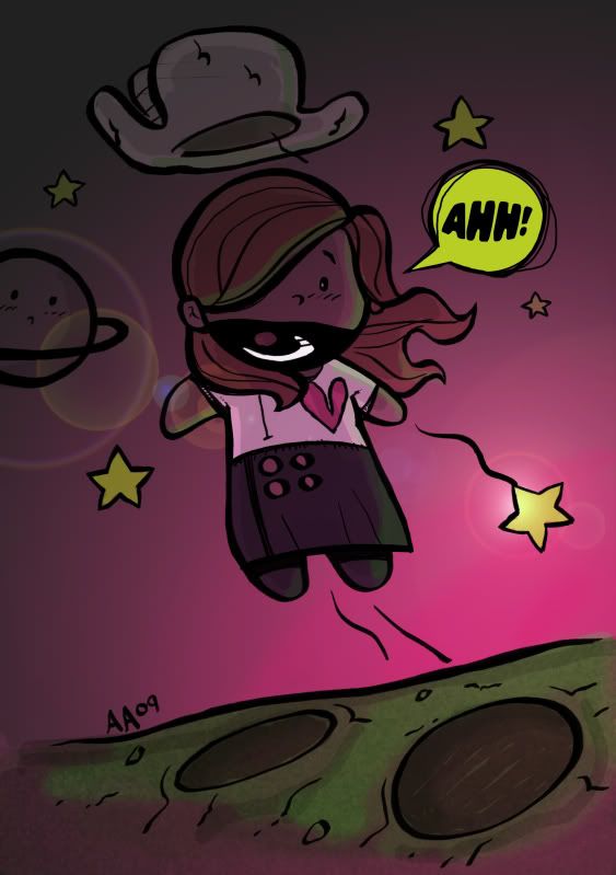
I think you have a really solid story here. The only place that it breaks down for me is on pg5 where she swings the flamingo in panel 2. The pose is great but seems more like someone about to stick a shovel in the Earth, rather than someone on the backs-swing of a lethal plastic bird attack. It's also unclear if she hit Mrs. Mellows in that panel or not. The only other thing I was not sure of was the change in her clothing on pg6. She's got the rat on her shoulder then, so maybe it's a visual metaphor, but it is a little odd.
Other than those two little things the visual storytelling is strong. I can follow the story without the words, so that means you done did it right.
www.atomic-robo.com
That looks like a different character entirely. I assume it's the ghostly white boy she mentions.
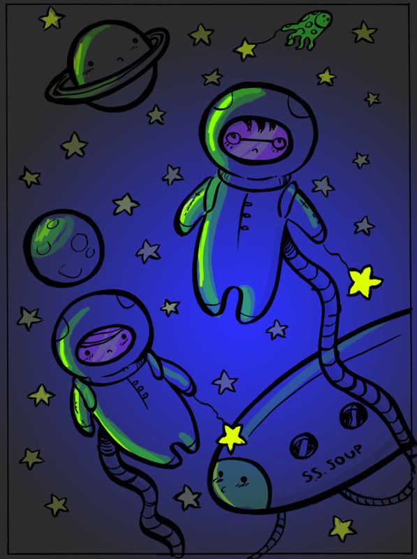
It looks awesome and if I'd have to find anything wrong with it it would probably be needless nitpicking. The only things do I notice is that with so much going on with the panels, especially the second and the last one, I get lost in the confusion a bit. And the fact that her arms are thicker than her waist kinda weirds me out. I understand the style choice but those are some butch biceps for a female cartoon character. Usually they're like brittle twigs.
I'm having trouble distinguishing panels where there is only a black bar and not a white gutter, especially with the heavy use of ink from panel to panel.
I've taken your feedback into consideration and did some revisions and will post to show you some more progress soon.. Thanks again!
Steam handle: Buckwolfe
I would also personally lose the slight transparency on the text boxes. When I first noticed it, I thought it was kind of cool, but when put against a complex background, it makes the text just the tiniest bit hard to read.
That's all I've got in the way of critiques. I really like it.
Thanks again you guys are awesome.
I'll be sure to mention where the finished pages can be seen when the time comes. I've made alot of improvements on the pages I posted in here. and I'm very happy with how the colours turned out.