As was foretold, we've added advertisements to the forums! If you have questions, or if you encounter any bugs, please visit this thread: https://forums.penny-arcade.com/discussion/240191/forum-advertisement-faq-and-reports-thread/
Options
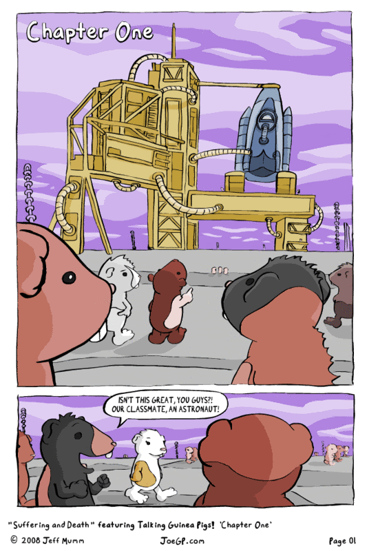
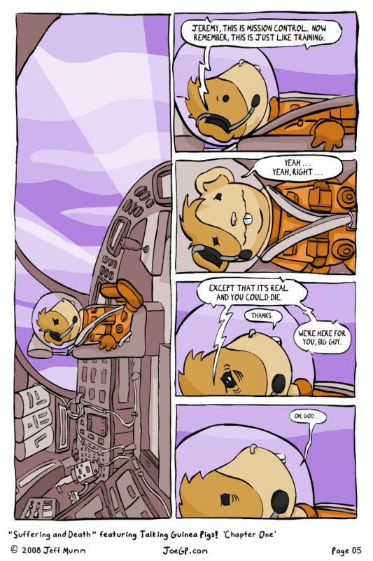
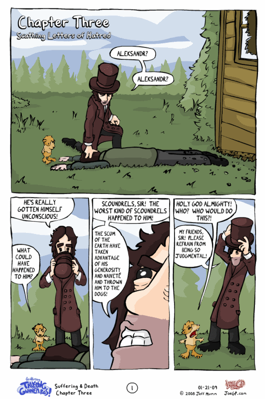
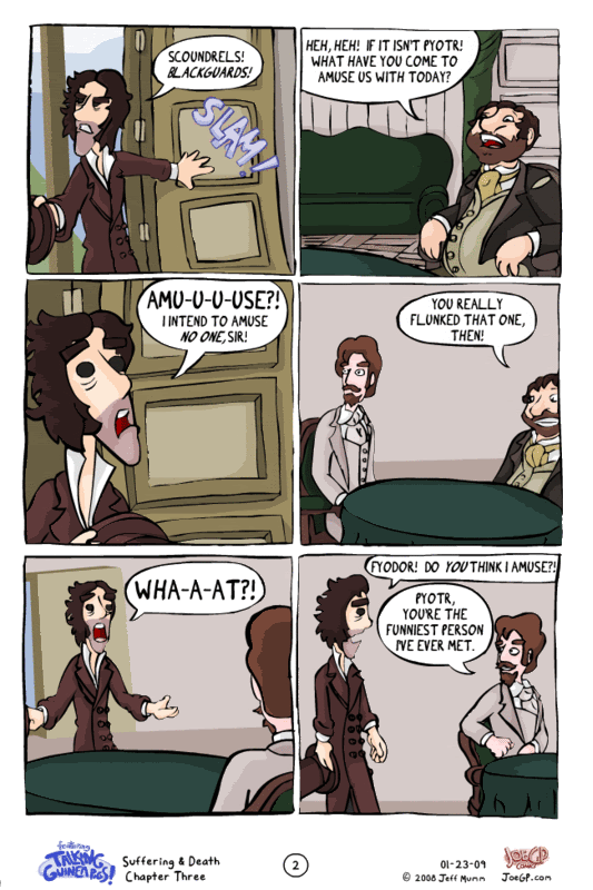
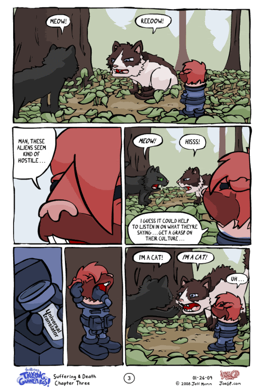
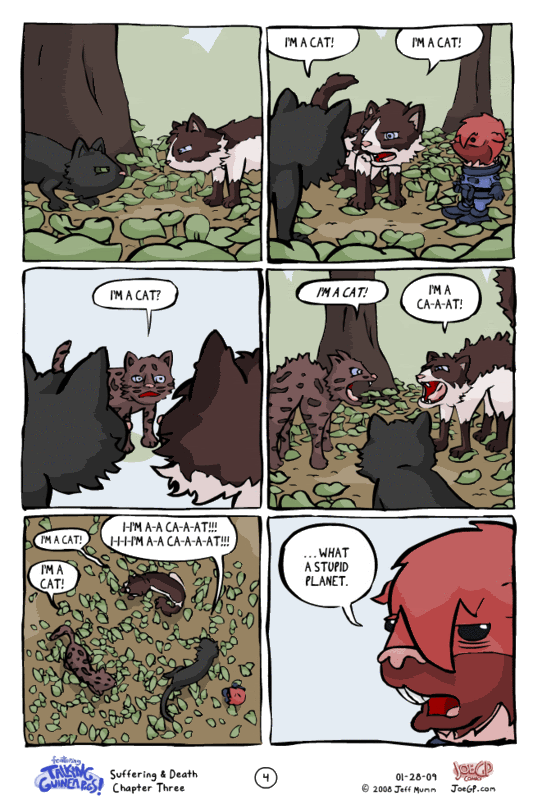
Guinea pigs from outer space
WaldFlieger Registered User regular
Registered User regular
Hello folks!
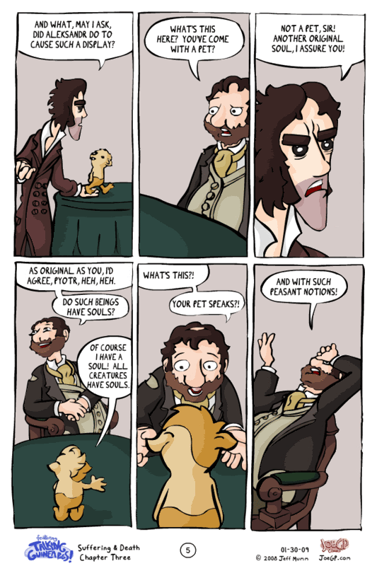
I write a comic featuring talking guinea pigs from a planet lightyears away from Earth. The current storyline, called "Suffering & Death," has them accidentally winding up in 19th century Russia via a wormhole combined with wacky hijinx.
I would love to hear some honest and critical feedback about said comic; called, strangely enough, "featuring Talking Guinea Pigs!" (exclamation point being part of the title)
As I'm already well into the third chapter, I'm just going to post the first five pages of the first chapter and the first five pages of the latest chapter. I think that should be a pretty decent example of the art and writing style.
The rest of the comic can be found at JoeGP.com if you are kind enough to read more.
Thanks!
WaldFlieger on
0
Posts
I'm particualrly fond of the "I'm a cat!" page.
[SIGPIC][/SIGPIC]
i like this comic
it has my stamp of comic approval
I tried to come up with a critique, but I've got nothing really.
I also laughed out loud at the "that would suck" Then the blank stare.
Good stuff man.
It kinda reminds me of a modern funny mouseguard.
But ... is there really nothing to critique? I almost feel like putting up more pages, maybe I just showed the good ones or something... One of my big fears with this storyline is whether I'm simply indulging myself by delving into 19th century Russian characters. I'm trying to keep things funny, and sometimes it's a challenge to walk that balance when I'm also sort of trying to keep an accurate (although extremely superficial) portrayal of my experience with Russian literature (well, Dostoevsky).
I posted a few of those pages with those characters, I could post more. Or am I just on the right track and should just not worry about it?
The way the platform deviates from the horizon makes it look a lot closer than it should, expecially since you have smaller guinea pigs in the background, but that doesn't help the scale. It breaks the illusion you'd have. Also desaturating it giving some atmospheric haze would add to the distance effect.
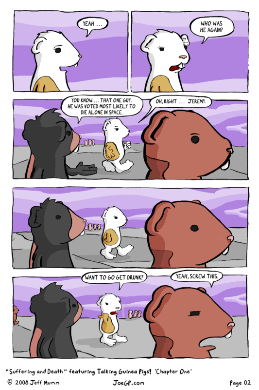
And the only other small thing I have to say right now is the profile shots of them talking took me a minute to realize that their mouths were open and that the lips weren't just lumps on their necks.
I'm a Cat!
I'm a cat!
oh god that was very funny.
How come Pyotr has reversed eyes
I'm a cat!
suck my diiiiick
I'M A CAT!
..I mean your writing and pacing is pretty damn good
Art wise Im not the biggest fan of the style. Your inking just feels a bit shaky without a whole lot of variation in line width. Id like to see some of the technical objects drawn with actual straight lines and not a sort've wobbly almost straight line.
I feel your characters could be given a bit more personality (guinea pigs) as in.. short one.. thin one fat one.. etc. You have that going a little bit, but it should really be pushed.
But I still really enjoyed reading it.
Thanks guys! I appreciate you taking the time to give me feedback.
I have a quick site-related question, if that's cool.
I'm redesigning my website to be more "comic-book" oriented because I feel like the way its organized now is more the standard for comic strips. Something along these lines I think would be cool. But I'm wondering how satisfying my comic is one page at a time. And then I began wondering about the possibilities of posting two pages once a week instead of one page twice a week. I'd either do this by uploading two separate files, or by making a wide image with two pages per update.
What would be more satisfying for you, as a webcomic reader? Would you rather have updates to check throughout the week, or would, in the case of my comic's content, it be more satisfying to only have one check per week but with two pages (probably more closely tied together)? It's a challenge to gauge this stuff without outside input.
Also, looking at Hamtaro is a good suggestion. Thanks!