As was foretold, we've added advertisements to the forums! If you have questions, or if you encounter any bugs, please visit this thread: https://forums.penny-arcade.com/discussion/240191/forum-advertisement-faq-and-reports-thread/
Options
LFJ pst
Prospicience The Raven KingDenvemoloradoRegistered User regular
The Raven KingDenvemoloradoRegistered User regular
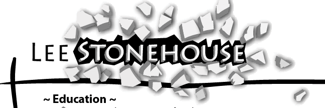
Alright so I've been working on my resume for a few days now. I'm looking for an advertising job (creative side) so I'm trying to do something creative with my name. Only thing is I've changed my mind, who knows how many times on the layout. So anyways this is what I've ended up with for today, I wish I had kept some of my old ideas, just got really frustrated with them for the most part.
Figured I'd ask for some crits on the design before I change my mind and start on another new idea.
It's going to be top left of the resume, and only on the cover page for companies that want one.
Figured I'd ask for some crits on the design before I change my mind and start on another new idea.
It's going to be top left of the resume, and only on the cover page for companies that want one.
Prospicience on
0
Posts
I think it would look better if you kept the shapes more simplified. Some of them have too many little jaggies in them.
Thanks! Yeah I guess I got a little carried away with the knife tool towards the end there. Thanks man, much appreciated.
My Portfolio Site
The shadow effect (which looks like the default photoshop layer > drop shadow filter) isn't positioned correctly for the lighting on the blocks to make sense, which will always happen when you try and use that filter in place of actually rendering shadow by hand.
I can see that you're trying to give the impression of STONEHOUSE breaking through the white of the paper, but it's failing because the entire thing looks flat - the debris are completely flat, and they look more like they're resting on the paper rather than being propelled away from it. The hole, meanwhile shows no depth, even though you can clearly see the thickness on the individual pieces of debris. Then finally the hole itself looks like more like it was cut out with a pair of scissors rather than being blasted away. If you're blasting apart a wall or a rock or anything, it cracks and crumbles away in a fairly distinct pattern - if something the width of STONEHOUSE was blasting through a wall it would break away more than just the area in its immediate outline.
Your choice of font is also working at cross purposes with the impression of strength and power that you're going for - it's too thin, and the rounded characters (the S and U) don't have parallel ending point for the beginning and end of their lines, putting them on a slant - this makes the font look more slender and handwritten, which not the effect you want at all. Same goes for the O. There's also some aliasing going on with the text, but I'm not sure if that's the way you saved the .jpeg or part of how photoshop is rendering it. The depth effect on STONEHOUSE could potentially work, but it's something that can very easily work against you if you don't know what you're doing.
I can't see all of them, but the lines that you're using (the two black lines that intersect in the lower left of your image) would probably be better replaced by simple, straight lines. You already have a lot of busy stuff going on here, and you'll have a greater impact from STONEHOUSE breaking through the page if the rest of the page isn't competing with the eye for attention.
So that should give you a couple things to work on, but I have to ask you if creative advertising is really your thing - even with a layman's knowledge of typography you should have seen some of the errors here, and that's a skill you're certainly going to need if you're doing any kind of advertising design.
It's important stuff like this: "Your choice of font is also working at cross purposes with the impression of strength and power that you're going for - it's too thin" that has been pushed to the back of my mind and I appreciate you reminding me. I guess in some ways it's a good thing my job didn't go through so I can reflect and get back in the groove of things. Thanks again, your crit has definitely been taken to heart.
My Portfolio Site
Yeah, I don't want to seem discouraging, but I have to agree with Rolo.
Is this your first time applying for an ad agency?
http://www.amazon.com/Non-Designers-Type-Book-2nd/dp/0321303369/ref=pd_bbs_sr_1/105-2252286-6025206?ie=UTF8&s=books&qid=1183871955&sr=1-1
I actually think my ideas have gotten progressively worse throughout the week as I think back.
Edit: thanks grifter I've been actually looking at ordering some books so this is perfect.
My Portfolio Site
One last thing, you should apply for the workshop (that's what we call it in Spanish, I have no idea if this is the correct English terminology). At the work shop you get to work with the other designers stuff, not only do you learn a lot by seeing how they tackle design issues, but it's also the area in the advertising agency that needs the most ppl. It's easier to get in through there than to apply as an art director.
I was actually planning on putting my resume and portfolio together while working there. Just doing it a little earlier now instead. The company actually had really big accounts too. Gotta move on I guess.
Edit: I'll also definitely check into the workshop thing. Sounds like something I could use for sure.
My Portfolio Site