As was foretold, we've added advertisements to the forums! If you have questions, or if you encounter any bugs, please visit this thread: https://forums.penny-arcade.com/discussion/240191/forum-advertisement-faq-and-reports-thread/
Options
Character Design (C&C Please)
scottmhallett Registered User regular
Registered User regular
Here's a character design I did recently. Any comments or criticisms would be appreciated.
[img][/img]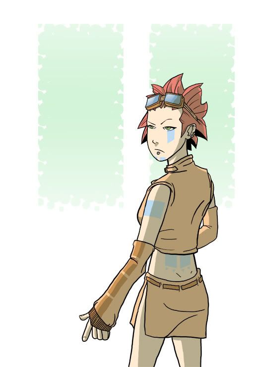
[img][/img]

scottmhallett on
0
Posts
When you start at the face it looks decent, then as you scan down it gets progressively worse.
her face slants out as it goes toward the chin. The facial features themselves are pretty decent.
The blue tattoo thingies don't really conform to her body. The ones that stand out most are under the eye and on the small of the back.
Also the folds in the clothing make almost no sense. I would recommend finding some pictures with similar clothing and looking at how it stretches and compresses.
Also for a character design why did you cut her off at the knees? Legs/boots, foot positioning can convey alot about your character. Don't skimp.
All in all, not a bad start though.
C&C:
For starters the character design is a tad generic. Also the overall composition of the piece is really lacking. For example, the odd choice of design in the background seems like filler, and not having any real purpose.
The anatomy, while not awful, is pretty off the mark. Being a noob at anatomy myself I cannot spell out all the problems for you, but I will take a stab at it. Head too big, arms too long, legs too short. It's hard to tell because you have her cropped off at the thighs, which is also a no-no.
The only other thing I would point out is that you are going to have to work on your clothing and how it drapes over your characters. Your clothing folds seem to be thrown around all willy nilly, and it doesn't look convincing.
I would suggest doing some anatomy practice, with lots of quick loose sketches untill you get a feel for solid body structure. I wouldn't go so far to bring a piece like this along when there are so many various problems. The time spent coloring this, which isn't half bad, could've been more constructivly spent on really practicing the human body before getting to this stage.
I hope this helped, cause I couldn't be any more civil. It is flame week, afterall.
INSTAGRAM
The legs, though cropped, look missproportioned. There is something wierd going on with the lower part of her body. Had he kept going, I'm pretty sure they would have looked very very odd.
Also, she has tiny-tiny hips.
The head is a little bit too big, and the nose and mouth are too low. The folds don't really seem to wrap around the figure and seem..
ah hell, I suck at words. I could do a draw over if you would like. HAve to be after figure, though.
The anatomy is off. i shouldn't even say that because everyone before me already mentioned it, but it bears repeating. I might disagree slightly with waka by saying that the head is somethign you COULD get away with if we could see the rest. Character designs don't have to be anatomically correct, but they need to be pleasing to the eye, which this one isn't yet. Mickey mouse was genious and he was 4 heads tall.
Hips are about as wide as from your fingertips to your elbow at the LEAST, even more in larger people.
With clothing, it's a lot like the English language: There's a lot of rules, but once you get past that it's very formulaic. In general, the tighter the clothing, the less wrinkles. The arm cloth is very loose looking and looks as if it needs
A) More wrinkles or
The Split Skirt thingy she's wearing would suggest varying degrees of tightness. It should be VERY form fitting towards the top (hips) and get gradually more loose at the end (knees).
Her jacket should be tighter toward the shoulderblades and looser towards the bottom. Unless of course there's some elastic piece or belt inside to suggest that it bunches at the bottom. If it is elastic (which seems more likely), it should bulge more above the elastic part.
so from top to bottom on the coat, it would be
-Tight
-
-slowly more loose
-
-
-
-most loose part (most wrinkles)
-
-Elastic band (tight)
what you have now suggests that the top 1/4 is tight but that the rest is almost equally loose.
Coloring: Too basic, I'd say. Try adding come color to the shadows. If the shadows are on a seperate layer, try adding some colors like blue or green (cool colors) to give it a more lifelike lighting appeal. This has to be REALLY subtle, like no more than 5% opacity on a strong blue.
What color is the light hitting her face? Is it a yellow/orange light? Is it an incandescant bluish light? Try to convey these things with VERY subtle color at first. Later you can always play with bolder colors and more dramatic lighting.
Just my two cents...
Its more like using a ruler to draw a straight line, or a compass for a circle.
Different line-thickness would add more value, too.
You could also use the tatoos to add more shape to her, if you bend them.
The rest is already said.
When it comes to straight lines and ovals, just don't use any helpers and it'll go into your flesh and bones. That saves a lot of time, doesn't it ^^?
- great animation focused website http://www.catsuka.com
Honestly, if your lines aren't "direct"/"confident" or if your figure is having anatomical/etc issues...using the super-correctness and sharpness of a ruler is going to really juxtapose the two in a drawing...same with using a compass. If i ever use a ruler, what I tend to do is draw the line really really lightly with the ruler, and then forgo the ruler when I'm doing the final line...that way, the uneven-ness of the subject mixes in better with the lines/circles I used devices to make.
Anyway!
I tend to draw out of my head too - I feel like using references is cheating...but I've been trying to get out of that mentality, because I realized I'm not going to improve if I have the same knowledge in my head - I'm going to improve if I'm looking at and *learning* how to draw from the real thing: a reference.
As far as your drawing goes, the first thing I really noticed was light source. The body looks like it's being let from the left, but the face looks like it's straight-on, and slightly above. The only mark you have there is under the nose. And the hair? Light sources everywhere. First thing I woud do would be to light your face like your character's, and...ref it.