As was foretold, we've added advertisements to the forums! If you have questions, or if you encounter any bugs, please visit this thread: https://forums.penny-arcade.com/discussion/240191/forum-advertisement-faq-and-reports-thread/
Options
Paintings
Shinpug Registered User regular
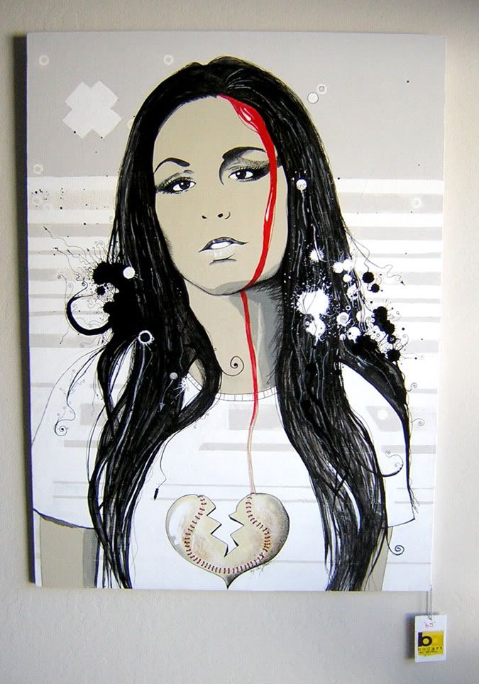
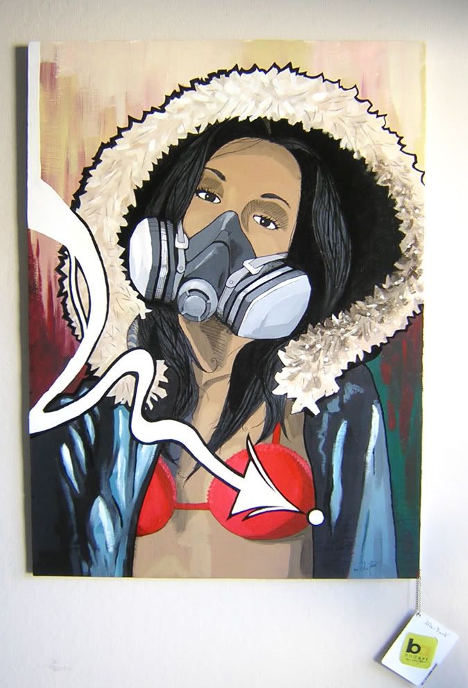
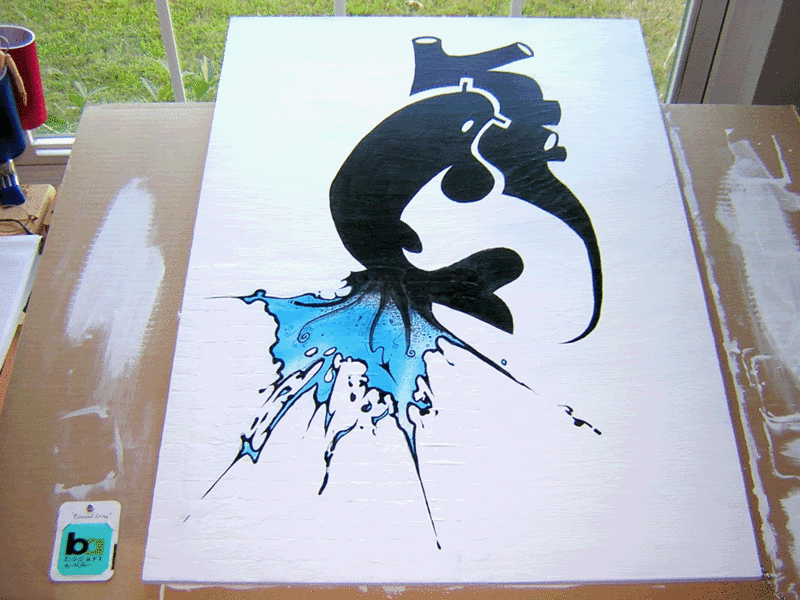
Whats crackin folks. Long time :shock: So im getting back into painting with my free time. Here are 3 recent ones I've done for a local fasion boutique. These were 24"x32" on board and acrylic, im getting back into oils tho, so ill post some stuff im currently working on.

Shinpug on
0
Posts
The first one more though. It just looks like there is a little to much face to the right of the red streak. Like if you cover up the streak with your finger, it looks like her face keeps going father than it should, if that makes any sense at all.
Second one is good too, but I'm not too keen on the arrow and the boobies. The red top is too perfectly round, kinda like eggs. The fabric that drapes over them on the left doesn't reflect that it is going over any form, it just goes straight down over the boobs. Wow, that made even less sense than my first crit...
Anyways are you going to see any dough for the sales of these? Nice pieces either way.
EDIT: Didn't see the third one. Harder to crit cause it is more abstract, but that is the one I would hang in my apartment.
INSTAGRAM
I wish I could have them.
You've got me in the mood to paint some more agian. Truly inspiring work you've got man. Keep up the excellamungo work up man. :^: :^:
Flickr | Facebook | Classifieds | GigPosters | Twitter | Blog
The one thing that even slightly looks off is the first painting's subject's right (left?) arm - the one on the left side of the painting.
It seems like it should be thicker - it almost looks like you whittled it down a bit to fit the whole arm on the canvas.
It's a minor point, but that's what we're here for.
But yeah man, the first one is crazy awesome.
Don't you think black strokes don't belong into women's faces ^^'? Shading with colour would work out better in my opinion.
- great animation focused website http://www.catsuka.com
thanks shin.
these are uber dope.
These are pretty damn slick.