As was foretold, we've added advertisements to the forums! If you have questions, or if you encounter any bugs, please visit this thread: https://forums.penny-arcade.com/discussion/240191/forum-advertisement-faq-and-reports-thread/
Options

Random 4 panel comic

SingasongSingasong Registered User regular
edited September 2008 in Artist's Corner
Hiya! I am new to the site (well, at least with making an account hehe) and was wondering if someone could offer some suggestions for my random 4 panel comic. Things like art style? Or writing? Or anything else that comes to mind?

Thanks a bunch! :D

edit: here is the updated one, the others didnt work out so well hehe

01intro.jpg

Singasong on

Posts

  • Options
    ProjeckProjeck Registered User regular
    edited September 2008
    this comic is so damn good

    do you have more

    Projeck on
  • Options
    MarshmallowMarshmallow Registered User regular
    edited September 2008
    My fancy has been tickled, unfortunately I'll have to leave the more serious art crits to the experienced folk of this board, but this looks good so far.

    Marshmallow on
  • Options
    SingasongSingasong Registered User regular
    edited September 2008
    hehe thanks :D nope, only those 3 so far... i was trying to set up for the main character (because she is a reverse sugar vampire were-mouse!) and then go into the normal fun things.

    Singasong on
  • Options
    ProjeckProjeck Registered User regular
    edited September 2008
    just kidding the writing is bland and generic and the art isnt much better, being 'random' isnt a replacement for any sort of quality

    throw away your how to draw to draw manga books and get back to the basics

    Projeck on
  • Options
    The Black HunterThe Black Hunter The key is a minimum of compromise, and a simple, unimpeachable reason to existRegistered User regular
    edited September 2008
    Projeck don't be a sarcastic little bitch


    The art itself is fairly well drawn for what it is, that being foggily coloured manga

    The writing, and general story set-up, is quite terrible. Unfortunately the little shitmonger up top is right, random, non-sensical "twists" and silly ideas don't make for a good comic.

    The positive side is that there are people who like this sort of thing, and if you kept going it likely would be read. Those people don't really hang around here though.

    The Black Hunter on
  • Options
    SingasongSingasong Registered User regular
    edited September 2008
    yea, the art isnt as good as i normally like... but i am trying to find something that i can draw in less time (my normal style takes a lotttt of time to do). I like the first one more than the sloppy speed shading / coloring of the 2nd and 3rd though *thinks*

    And... i dont have manga drawing books? I thought they were just things with really big eyes or something?

    Singasong on
  • Options
    ProjeckProjeck Registered User regular
    edited September 2008
    love you too sweetie

    Projeck on
  • Options
    ProjeckProjeck Registered User regular
    edited September 2008
    Basically you have a lot of improving to do before you are ready to do a webcomic, as it stands now your comic is terribly mediocre, and really isnt anything i couldnt find all over deviantart

    Projeck on
  • Options
    AgoodzAgoodz Registered User regular
    edited September 2008
    in before studiozel whiteknights

    Stuff is kind of blurry, I would suggest maybe cell shading to achieve a more comic feel as opposed to some kind of sketchbook, which is what it looks like atm. It should look more finished... if the values contrasted a bit more that would help as well.

    As for the writing,

    Agoodz on
  • Options
    The Black HunterThe Black Hunter The key is a minimum of compromise, and a simple, unimpeachable reason to existRegistered User regular
    edited September 2008
    Well now I'm just thankful no-one whipped their dick out in this here thread.


    I think the best thing you can do is just observe other comics and such, the webcomics thread in Wubble Woo is a good resource of both great and terrible, and you dont have to worry about being outsmarted by the guys in there either :P

    There is never a rush to start a webcomic
    If you think of an idea, then you have plenty of time from then on to dwell on it and refine it

    The Black Hunter on
  • Options
    SingasongSingasong Registered User regular
    edited September 2008
    Hmm im not so sure how to do cell shading (hehe). I think a cleaner style is a good idea though. maybe a softer greyscale? instead of color? *thinks* but grey would kind of make things seem too gloomy. hmm one minute ill see if it works

    Singasong on
  • Options
    SingasongSingasong Registered User regular
    edited September 2008
    Ok, here is the soft greyscale style. (first panel is with, 2nd without)

    intro1trial.jpg

    Hmm, i kinda like it ...doesnt make it as gloomy as i thought (and its easy to look at / pops the characters out more).

    Any opinions on it? :D Maybe if i cut out the way overboard sketchyness (in the 2nd and 3rd strip) and do the normal cleaner lines (not too too clean, thinking along the lines of whats in this example...so it still looks relaxed / sketchy... but not so messy it distracts).

    Hehe and then ...yea... gotta fix the writing. I think i went in the wrong direction with the mini-backstory thing and should just start playing with the main character (and slowly explain the sugar vampire weremouse thing). *thinks* OR! I could just make it a weremouse....but during the day... that would be a lot easier (And shorter!). Yea, i think i like that idea more heh.

    Singasong on
  • Options
    winter_combat_knightwinter_combat_knight Registered User regular
    edited September 2008
    I think your greyscale images are much better. If you're going to colour them, maybe try harder brushes.

    If you're doing these comics just out of fun, keep it up. Comics are fun to make. But if you're wanting to have a readership, it's going to be hard.

    winter_combat_knight on
  • Options
    Stupid Mr Whoopsie NameStupid Mr Whoopsie Name Registered User, ClubPA regular
    edited September 2008
    Singasong wrote: »
    yea, the art isnt as good as i normally like... but i am trying to find something that i can draw in less time (my normal style takes a lotttt of time to do).

    I would say keep doing it in your normal style, despite how long it takes. You keep up at it and you'll find that your speed will increase with experience. You'll never improve that aspect if you do the lesser style.

    And Projeck, by Thor's bootstraps I swear, I don't ever want to catch you acting like such a douche-faggot in the AC again.

    Stupid Mr Whoopsie Name on
  • Options
    The Black HunterThe Black Hunter The key is a minimum of compromise, and a simple, unimpeachable reason to existRegistered User regular
    edited September 2008
    "sugar vampire weremouse thing"

    I don't think this should be part of your comic. Perhaps just one

    A sugar vampire? what is that? it is complex and silly simply to be complex and silly, it can't go anywhere.

    You can write some great stories stemming from vampirism and lycanthropy in various animal forms, but mixing things just creates too many levels, making it difficult to concentrate on one thing.

    Perhaps a weremouse with a severe sweet tooth

    The Black Hunter on
  • Options
    SingasongSingasong Registered User regular
    edited September 2008
    Singasong wrote: »
    yea, the art isnt as good as i normally like... but i am trying to find something that i can draw in less time (my normal style takes a lotttt of time to do).

    I would say keep doing it in your normal style, despite how long it takes. You keep up at it and you'll find that your speed will increase with experience. You'll never improve that aspect if you do the lesser style.

    The problem with my normal style is i try to do lots of detail (well...try o.O) and spend hours and hours on shading and coloring. I still have lots of trouble with poses and proportions (been drawing for just over a year now hehe, i know i know, its no excuse... its just i have tonsss to learn)

    But thats the good thing! I figure no matter what i do, i will get better at something (like, i never actually tried to draw clothes that much before... well...other then skin-tight things). Thats why i thought playing with a webcomic would be fun :) i see lots of people who start off webcomics and get a LOT better as they go along (like the one that made penny arcade! i can already do better than the ones he drew at first :P)

    This is a really new idea (as in, this last week) so i really appreciate everyones comments! (no matter what they are!).
    A sugar vampire? what is that? it is complex and silly simply to be complex and silly, it can't go anywhere.

    You can write some great stories stemming from vampirism and lycanthropy in various animal forms, but mixing things just creates too many levels, making it difficult to concentrate on one thing.

    Perhaps a weremouse with a severe sweet tooth

    ya, i think your right (though, i really wanted to draw her as a mouse vampire-biting a ginger bread man on the neck :*( lol

    I didnt just make her a were-mouse at first because....well...then she would only turn into one at night! And that would be harder to use (and same with just a vampire) thats why i thought it would be a good idea to make her a reverse one ... but.... i think it just got wayyy too complicated. ((i really wanted her to turn into a panda at first, and name it "Panda-Monia" ... but... there is already a cartoon with that name i found out from googling!))

    Hmm... so... maybe a day-mouse? A reverse were-mouse? A.... umm... maybe just cursed (but thats kinda plain)? Oh! A 2nd generation were-mouse! That would explain why daylight does it! probably... heh, havent really heard of a 2nd generation were-monster before... so its open game to decide what happens! :P

    Singasong on
  • Options
    MykonosMykonos Registered User regular
    edited September 2008
    Theres a certain charm in the color pallete of the bottom two, but other than that I'm afraid the overall result is standard webcomic mediocrity - which is perfectly fine, providing you have the desire to grow and improve with both your art and your writing.

    Also, keep in mind that penny arcade came around the time when vg webcomics were practicely nonexistent, and although you may feel your art might better then theirs during their beginning, they had some sharp wit that carried them through there times of improvement.

    You gotta start somewhere, though, so keep practicing and study up on the basics and you'll do fine

    Mykonos on
    [SIGPIC][/SIGPIC]
    "I was born; six gun in my hand; behind the gun; I make my final stand"~Bad Company
  • Options
    SingasongSingasong Registered User regular
    edited September 2008
    Ok, here is the updated first one. I did the light / quick shading and dropped the entire "explain everything" thing. It still does some (because, well, gotta introduce things somehow!) but dont want to hit people over the head with it.

    This way i can just move right into playing with the characters instead of trying to explain a crazy backstory.

    *edit* its actually bigger than this...just photobucket shrinks it hehe. Its about the same size as the shaded thing i did right above, so there is more detail which seems to get lost.

    01intro.jpg

    Singasong on
  • Options
    The Black HunterThe Black Hunter The key is a minimum of compromise, and a simple, unimpeachable reason to existRegistered User regular
    edited September 2008
    That would work well if you removed the last panel and placed it after you introduced her "issues"

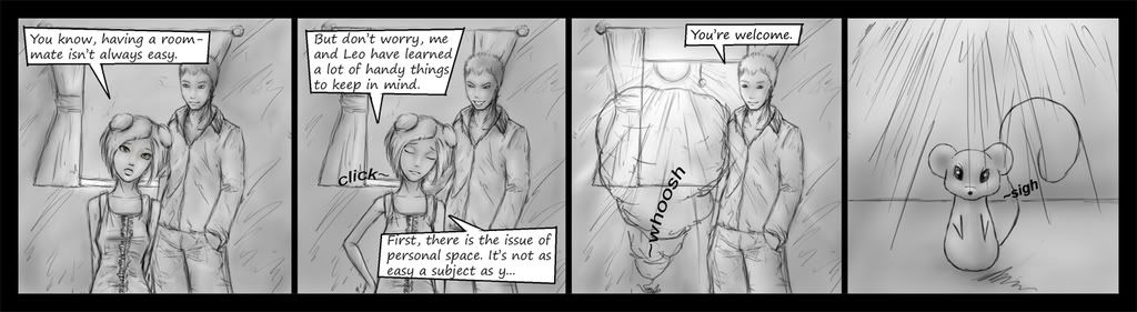
    Having the sighing mouse takes the humorous edge off the end of the comic

    There really is ALOT to consider when making a comic, much more than just figuring out a story and being able to draw well.

    The Black Hunter on
  • Options
    SingasongSingasong Registered User regular
    edited September 2008
    I was thinking i could introduce her mouse thing outside the comic. Maybe a really quick something on the first page introducing the general theme of the comic and a quick overview of the sittuation? Nothing like a huge backstory! just a cute picture of her on his head or something (or maybe even a 2 panel mini comic) to introduce them (so it wouldnt actually be a comic and people wouldnt be expecting to be...umm....entertained? lol).

    *thinks* hmmm, or.... *thinks* have this be the 2nd comic and make up something different for the real first one? :D

    Mouse thing is important! Because....Its cute and i like drawing them!

    Singasong on
  • Options
    FletcherFletcher Registered User regular
    edited September 2008
    I don't know if I'm alone in thinking this, but it seems to me that the grayscale doesn't really fit in with the speech bubbles as they are currently.

    They seem a little too "absolute" or something; its pretty hard to focus your attention on the art if all you can see is the BLACK WHITE BLACK of the outlines, bubbles and text.

    I'm not even sure that's it, but something looks odd about the speech bubbles anyway :|
    you don't need to write this so much :arrow: *thinks*

    Fletcher on
  • Options
    CrowlestonCrowleston Registered User regular
    edited September 2008
    You could expand the gutter around the words in your speech bubbles. As of now they are far too close and your bubbles feel very cramped and make reading uncomfortable.

    Also, you can tell that you're scared of hands, so I would practice some of those.

    Crowleston on
    useless but necessary objects of society.
  • Options
    SingasongSingasong Registered User regular
    edited September 2008
    Fletcher wrote: »
    I don't know if I'm alone in thinking this, but it seems to me that the grayscale doesn't really fit in with the speech bubbles as they are currently.

    They seem a little too "absolute" or something; its pretty hard to focus your attention on the art if all you can see is the BLACK WHITE BLACK of the outlines, bubbles and text.

    I'm not even sure that's it, but something looks odd about the speech bubbles anyway :|

    Hmm maybe if i made the lines darker? That might make the textboxes less distracting compared to the pictures?
    You could expand the gutter around the words in your speech bubbles.

    Whats the gutter? Make the text boxes bigger you mean? So the words dont come as close to the edge? (or is it the spacing between the letters? im not sure how to change that in photoshop heh)

    Singasong on
  • Options
    BelruelBelruel NARUTO FUCKS Registered User regular
    edited September 2008
    i m sorry, but the art on this looks hurried and sloppy, the coloring is moreso, and the story is simply awful.

    that type of concept of morphing animals is also overdone, but there must be an audience for it so i will not say to not do it at all.

    also, for your first comic, you have the same frame copy pasted repeatedly, that is not an auspicious start at all.

    i would recommend practicing drawing in general before going into a comic, and to take your time with it.

    Belruel on
    vmn6rftb232b.png
  • Options
    beavotronbeavotron Registered User regular
    edited September 2008
    heh kinda reminds me of twilight
    i seriously need to just stop reading these books, but i'm on the last one now thank god.

    beavotron on
  • Options
    BelruelBelruel NARUTO FUCKS Registered User regular
    edited September 2008
    i haven't touched any of the twilight books, are they any good? or just awful like i suspect?

    Belruel on
    vmn6rftb232b.png
  • Options
    FletcherFletcher Registered User regular
    edited September 2008
    If you want to read about a vampire called Edward's rippling back muscles and brooding temperment, they may be the books for you.

    Fletcher on
  • Options
    SingasongSingasong Registered User regular
    edited September 2008
    heres the 2nd one.

    i think your right about the first one, gonna drop the mouse at the end (i was just lazy and didnt want to redraw something heh! but i think i can use it for something else).

    anyhow, is the art style working better now? or still bleh? same with writing?

    thanks a bunch for the feedback, it helps a lot to figure out where i am going wrong :D

    002.jpg

    Singasong on
  • Options
    winter_combat_knightwinter_combat_knight Registered User regular
    edited September 2008
    Ah, very nice improvement with the art.

    winter_combat_knight on
  • Options
    CrowlestonCrowleston Registered User regular
    edited September 2008
    Yes, the space around the words, so they aren't so close to the edge. The uneven word boxes seem unnecessary and distracting.

    Crowleston on
    useless but necessary objects of society.
  • Options
    SingasongSingasong Registered User regular
    edited September 2008
    Hmm, ok, here is a different direction. I think i was trying too much too soon... so... i made the art less sketchy / more simple (while keeping the soft shading thing). Also dropped the big text thing and am going to try to do things through the pictures more (so less need for writing! yay).

    Heres the new style, any opinions on it? :D

    squeaksy1.jpg

    Singasong on
  • Options
    FletcherFletcher Registered User regular
    edited September 2008
    3rd panel doesn't really look like a vampire biting at the moment

    kind of looks like a really intense hug

    Fletcher on
  • Options
    SingasongSingasong Registered User regular
    edited September 2008
    hmm maybe bite marks would help.... thought if i had him breaking it would be kinda violent. (edit! oh! or a *chomp* or *bite* next to it...that would solve things!)

    Shes not a vampire anymore anyhow, just a mouse that really likes cookies :D ((i stink at drawing people))

    Singasong on
  • Options
    nakirushnakirush Registered User regular
    edited September 2008
    What about seeing the fangs going into the gingerbread man and gooey, caramelized sugar oozing from the bite...?

    nakirush on
  • Options
    The Black HunterThe Black Hunter The key is a minimum of compromise, and a simple, unimpeachable reason to existRegistered User regular
    edited September 2008
    haha

    okay those two are good

    The font seems a but jagged, and the anime inspired "~" doesn't sit with me, but then again little to do with anime does

    The Black Hunter on
Sign In or Register to comment.