As was foretold, we've added advertisements to the forums! If you have questions, or if you encounter any bugs, please visit this thread: https://forums.penny-arcade.com/discussion/240191/forum-advertisement-faq-and-reports-thread/
Options
Ill take a stab at this....
ignotuscaligo Registered User regular


soo yeah. mah stuffs.
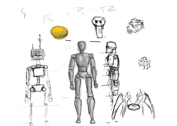
1) just some random sketches
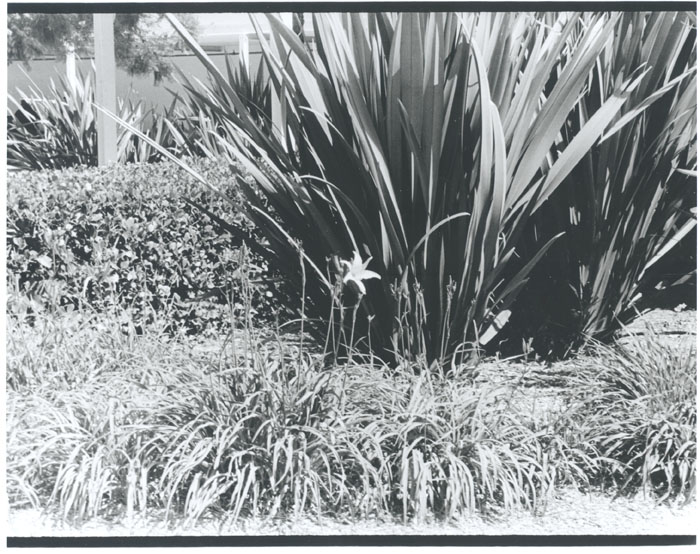
2) photo i took at school (not my best, but its something i have thats online)
3) a random tree i made with some yarn
4) A model i made and rendered in C4D
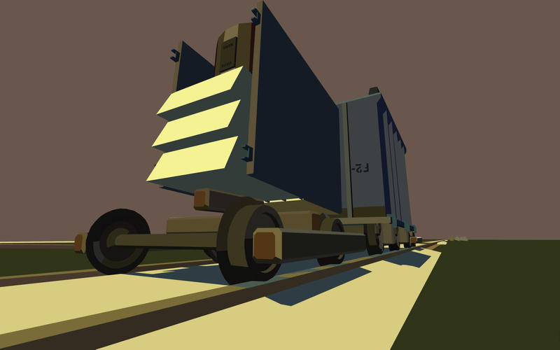
5) vectorization of a gmod contraption i made
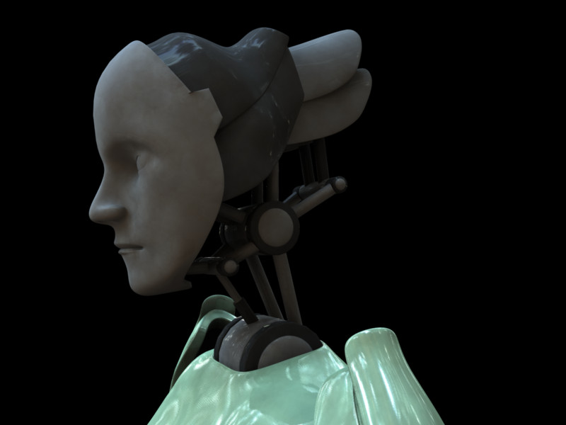
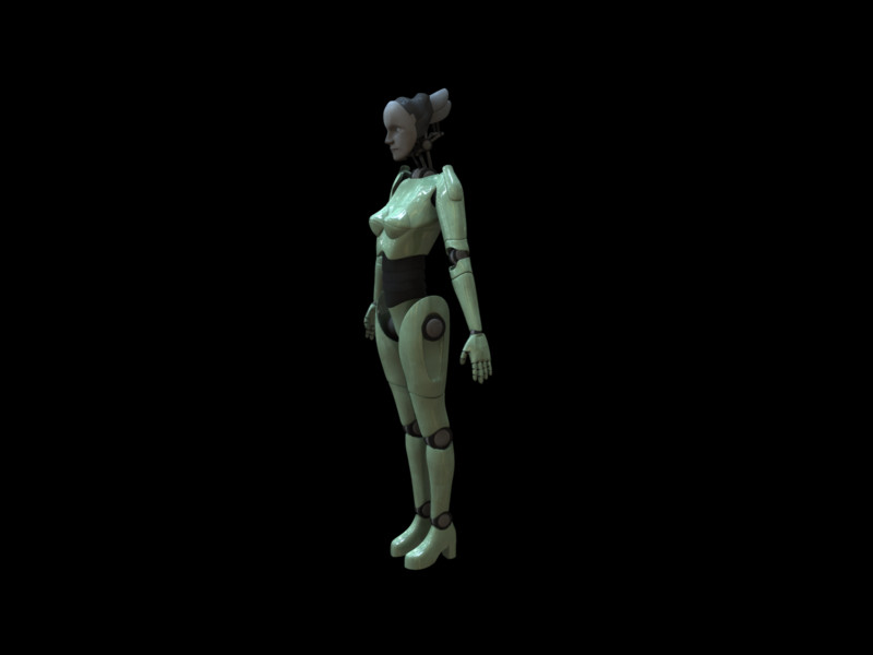
6) model of a female android, concept from tutorial, work done by me
7) same model from afar
i hope these arent too big....
Epic fails: 1
Epic wins: 0

Epic wins: 0
ignotuscaligo on
0
Posts
update: fixed
Epic wins: 0
The lines on the sketches seem too unsure, too unsteady in places where it oughtn't be; I'm looking specifically at the mannequin, and in the legs of the crab thing. The shading in the mannequin also looks a bit too soft, and lacking in tonal range, and though I can't say for sure what your reference (if you used one) looks like, the calves look too wide, at least in relation to the thighs.
I don't know if you lost the black levels in the development, the print (if there was one), or the digitization, but even if you were to correct the levels there, the tones don't really work; it looks washed out, possibly because of what seems like really harsh sunlight. The composition also doesn't work, because the focus (the ferns?) is too busy to hold my interest, and there's too little to bring it out from the rest of the picture (the noisy background/foreground don't help). On a technical level, it seems like it could stand to be a lot sharper, and as I mentioned before, the exposure settings could have used some tweaking to give the thing some better-defined midtones; right now, it's kind of just a mess of grey and white.
Sorry if it sounds a bit harsh; I'm sure it makes this next suggestion appealing, but if you have other photos, do what you can to get them on here. Or sketches. Or 3D work. Just more.
And, as crawdaddio points out in much more helpful detail, with a better exposure.
And good job with the female android, following tutorials can be long and tedious.
http://www.spellchrome.com/