As was foretold, we've added advertisements to the forums! If you have questions, or if you encounter any bugs, please visit this thread: https://forums.penny-arcade.com/discussion/240191/forum-advertisement-faq-and-reports-thread/
Options
Kronus vs. the Image Dump (Page 8)
Kronus Registered User regular
Registered User regular
Basically, I have recently discovered a strong interest in pursuing graphic design as a hobby/skill/career. It came about due to the work I do in a volunteer club at university, since we got it off the ground last year I have found myself as the sole person designing posters/graphics/website/etc. I have always had an interest in drawing but I completely lack the self-discipline to learn how to draw much more often than a handful of pieces throughout the year, which generally me a very long time to finish. However, I seem to have no problem spending hours on end working on posters or on our website, and I find it rather enjoyable. I think that having a goal or purpose for the work I put into a poster is what has kept my interest, as opposed to just grinding out pages upon pages of anatomy study (not to say that it isn't important, but rather I haven't found the motivation to do that on my own yet).
I have no formal art training of any kind, in fact I will be graduating next year with a physics undergrad but I don't intend to pursue that subject any further. I had never considered my interest in art anything more than a hobby until a friend of mine commissioned me to redesign a flyer for her company, at which point I realized I might be able to turn this into a marketable skill if I practiced and learned on my own. So hopefully you guys can help me get better at this and help me decide if this is something I want to do f'reals in the future. Plus having knowledgeable people to bounce ideas off of will be immensely helpful!
tl;dr: Help Kronus make pretty looking things!
To start off, I could use some C&C on the concert poster I've been working on recently:
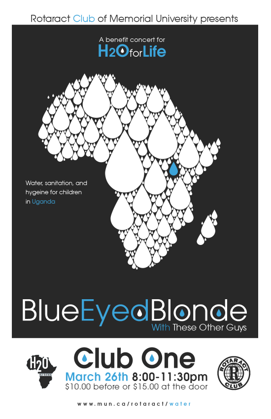
Note that I haven't been told the name of the opening band, so "These Other Guys" is just a placeholder. Information is fairly basic, it's a benefit concert for an organization that deals with water/sanitation in Africa, we are specifically raising money for a school in Uganda, so the theme here should obviously be water :P. I have been trying to get across as much information as possible without making just a wall of text. I'd like to add a small bit of distressing but I haven't been satisfied with it yet. I was toying with using a texture overlay on the dark background but I haven't found anything I thought would be appropriate.
I have no formal art training of any kind, in fact I will be graduating next year with a physics undergrad but I don't intend to pursue that subject any further. I had never considered my interest in art anything more than a hobby until a friend of mine commissioned me to redesign a flyer for her company, at which point I realized I might be able to turn this into a marketable skill if I practiced and learned on my own. So hopefully you guys can help me get better at this and help me decide if this is something I want to do f'reals in the future. Plus having knowledgeable people to bounce ideas off of will be immensely helpful!
tl;dr: Help Kronus make pretty looking things!
To start off, I could use some C&C on the concert poster I've been working on recently:
Note that I haven't been told the name of the opening band, so "These Other Guys" is just a placeholder. Information is fairly basic, it's a benefit concert for an organization that deals with water/sanitation in Africa, we are specifically raising money for a school in Uganda, so the theme here should obviously be water :P. I have been trying to get across as much information as possible without making just a wall of text. I'd like to add a small bit of distressing but I haven't been satisfied with it yet. I was toying with using a texture overlay on the dark background but I haven't found anything I thought would be appropriate.
Kronus on
0
Posts
I had the exact same take on it. The only thing I'd add is maybe remove the water drop from both the BEB AND CLUB ONE. Really great concept. Nicely done.
I like that the first one sort of looks oceany, but it might be a bit too much blue. On the other hand, I like the contrast of the second one.
Not-So-Ninja-Edit: Updated both of them slightly.
Completely agree.
To the OP: A great rule to follow with Graphic Design - don't just add something because you can; you're just adding clutter that detracts from your initial idea.
I could use some suggestions for background colours if you guys have any ideas, I don't think I chose a very interesting one for this test version.
The new blue is a nice compromise between the grey and the texture.
This is only an opinion. But yeah you would have to make sure all the font is readable.
and that the bands names are in original typeface.
I'm on the fence about Jeckal's rendition because I think it's important to have the headlining band pretty large and eye-catching but on the other hand I like the look of it being separated from the Africa logo.
I would suggest that maybe he could then shrink the arfica a bit more, raise up the blue bottom
and hence making more room for the bands names
Bigger != more legible.
Until then, here's something I did in January for an event that I think turned out ok. There's definitely a few things I would change looking back at it but I think it was a decent execution for having only a couple days notice:
EDIT: Thought I'd jump on the bandwagon. I came up with a few fun ideas but most of them had been done better by others.
It does convey the message pretty quickly, though.
For some reason I kept trying to turn it into a cracked record but I couldn't think of a context in which to use it. I came back to it a bunch for times with no results, I just think that cracked records look neat.
In other news, I have to do a flyer for a group that is holding a seniors symposium on a lot of different topics. Technology, Facebook, Email, Taxes, Healthy Living, Financial stuff, various kinds of frauds and safety, basically how to survive when you're old and don't know things. I'm having a hard time stepping outside of my comfort zones because I have absolutely no idea what seniors look for in a poster. I feel like every time I come up with something that starts to get interesting, I have to stop myself because it can't be complicated, the text has to be kinda large, etc. Am I underestimating the ability of seniors to appreciate posters these days?
I am basically the antithesis of the people whose attention I need to grab.
I've been throwing this idea around in my head for while, finally managed to sit myself down long enough to try it (ie I had the choice of doing this or studying).
EDIT: Just had an idea for TRofK in the same style, hopefully I have some time to do it tomorrow.
although i've always thought it was funny how covers of the two towers / the name almost always make people who have never read lotr before think of one of the towers as good and one as evil
shits all evil, man
Yeah I added that red splotch thing to try to connect that both towers are fuckin shit up as opposed to just Barad-dur. I couldn't really think of anything visually evil that happened in The Two Towers that I could add, but to be honest it's been a few years since I watched the movies.
Comon Gandalf. White wings and spirals = good. Black pointy shit = bad.
Please don't do this. The strength of this design lies in its simplicity. Same goes for any future designs with this motif. Right now you're channeling early Olly Moss -- try to keep it going.
I think in reality, people would figure out if it was a DVD or a book pretty quick.
Hah, I actually didn't read the books but I did my research before diving in