An update on recent technical problems and more from the admin: https://forums.penny-arcade.com/discussion/250292/on-technical-difficulties-mod-coverage-and-other-things/p1?new=1
Options
Inappropriate udders, page 5
tynic PICNIC BADASSRegistered User, ClubPA regular
PICNIC BADASSRegistered User, ClubPA regular
(Kochi made me do this)
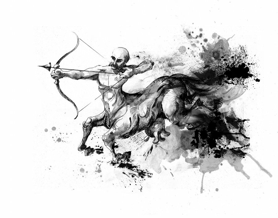
ok so I guess I should probably start putting things where knowledgeable people can see them, but i haven't made a thread here in about a bazillion years and I'm not really sure where to start. So I'm just going to dump old art in a kind of schizophrenically chronological order and then maybe things will become more coherent later.
I like working with ink
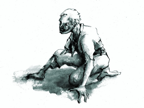
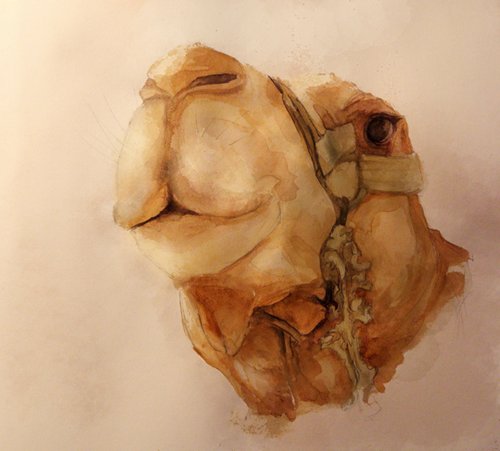
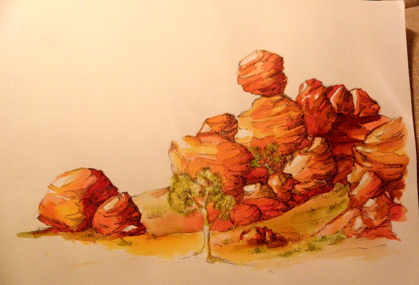
a while back I was doing a lot of watercolours; that was fun
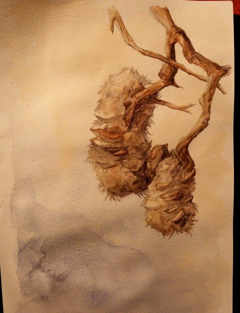
(photo ref)
and then more recently I started doing some work for this guy which meant a lot of digital painting (examples under spoiler)
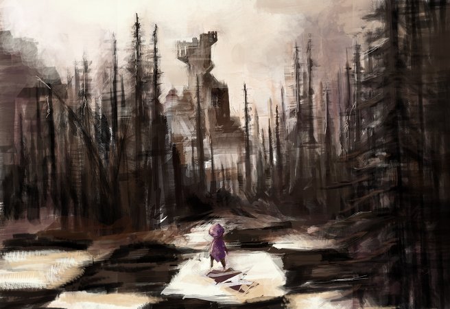
which is probably why I've been doing a lot more of that recently.
Wow, this is all over the shop. Anyway, I really need to get better fundamentals, especially figure studies, so I'll probably try to be doing more of that in the near future. Expect very dull pose sketches and things.
ok so I guess I should probably start putting things where knowledgeable people can see them, but i haven't made a thread here in about a bazillion years and I'm not really sure where to start. So I'm just going to dump old art in a kind of schizophrenically chronological order and then maybe things will become more coherent later.
I like working with ink
a while back I was doing a lot of watercolours; that was fun
(photo ref)
and then more recently I started doing some work for this guy which meant a lot of digital painting (examples under spoiler)
which is probably why I've been doing a lot more of that recently.
Wow, this is all over the shop. Anyway, I really need to get better fundamentals, especially figure studies, so I'll probably try to be doing more of that in the near future. Expect very dull pose sketches and things.
tynic on
+9
Posts
Bring on the dull pose sketches I say. You've got such a solid grasp on color theory/painting/watercolors, I look forward to seeing what getting better fundamentals will do for your work.
INSTAGRAM
Dude, you're kidding, right? Every time I see something of yours from, like, the last six months ago I basically crap myself out of jealousy.
anyway obviously I lied about doing more exercises and stuff. I'm working on some things I can't show just now, but here are some doodles and warmup sketches so this thread doesn't die.
loose reference from an old master sketch, I think?
50s-stuck
50s jon hamm, long story.
I like this, but theres no second bone in your upper arm.
I've always really enjoyed your work, particularly the whimsical and the traditional naturey stuff. You might want to try some giant brushes and really simplifying your shapes for your studies. I've had some luck with softer brushes.
yeah that's probably a good idea, re large brushes. I feel like I've lost track of building form lately, getting bogged down in detail. I need to step back.
i've been doing some stuff I guess but some of it turned out kind of crap and I don't really want to post it, I know what was wrong. But good learning experience.
anyway I promised myself that this year I was going to sit down and draw people. So, practising shapes and faces while watching french tv:
couple of figure drawings, I need to do more of these, get better. Maybe find a class here somehow.
back to digitalllll
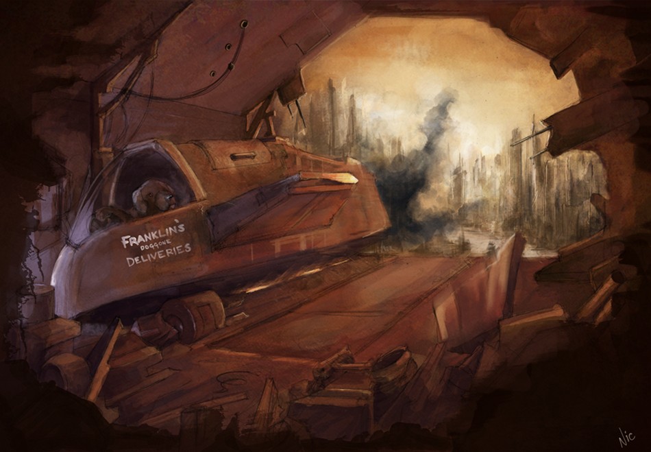
wallpaper for homestuck, not allowed to show the whole thing but here is an excerpt. It was actually a collab but I did the buildings and a lot of the final rendering on the angel.
quick charcoal from tonight. Started to add highlights digitally cause I couldn't find my white conte, but they looked like crap. Also I fucked up that ear placement pretty badly.
(didn't finish the last one).
Gonna try and make time for some non-digital stuff on the weekend. Also I just picked up a figure drawing book, so I will try to get some studies done.
thumbnailing ideas for a commission
start of something, maybe
You convey information so well with color.
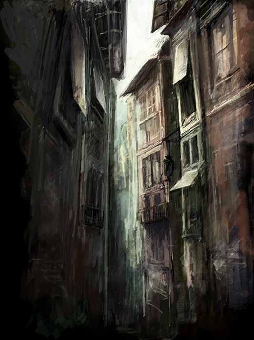
That alley painting in the OP reminds me of one of my favorite photos.
From a cursory glance at Ryder's teaching method, the thing that immediately bugs me is that he starts with the contour, which is such a backwards way to work.
What other figure books do you have? This one won't teach you how to draw but it will teach you anatomy, it's a really good resource.
I think I'm enjoying Ryder simply because it seems arse-backwards - it's really forcing me to change up the way I look at things. Hogarth never really clicked for me, for some reason, and I like reading Bridgeman but it's too easy for me to just copy drawings without breaking out of my comfort zone. I figure my anatomy is pretty sucky, so making me do something different can probably only be an improvement. But regardless of the efficacy of his methods when it comes to drawing dynamic figures, they're definitely pretty good for training your eye to observe angle and proportion, so it's certainly not a waste of time.
Thank you for taking the time to look and comment! And thanks for the link, too. Really appreciated.
ink ink god i love ink
more fanart, trying to practice fabric. Half-assed the background as an afterthought.
detail:
quick colours on a doodle which I think I might clean up and paint properly
I haven't posted in this thread for a bit because I've been too busy to do any proper studies
just had time for commissions and doodles basically but what the hey
Homestuck commission
edit: oh, I already posted that? Ok some other requested fanart. Not too happy with it. Light got muddy.
some stuff I think I already put in the doodle thread
I'm trying to loosen up my digital work in general, i was going way overboard with textures and junk. Yesterday I did some speedpaints using just a hard brush and greyscale, which I think was useful. Still need to work on figure drawing, my anatomy is still either shit or stiff.
hmmm ...
and a page for a comic I'm trying get off my butt and put together
Steam: FallenDestiny *** XBL: xDestinyx3
That last environment especially. Moar!
I have a commission or two to get out of the way, then I really want to buckle down on figure drawings for a while so if I don't post any of those in the next month feel free to yell at me.
why are you so good at those things?
So, massive digital painting dump incoming over the next couple of days, but first I thought I'd revive this thread with some doodles and a commission
... homestuck-related commission, rather specific request. Parts of this worked out well, other parts I'm really not happy with, but I can't justify spending more time on this without charging way more so it's going to have to stay.
I'm also having a lot of trouble calibrating between my work monitor and my home monitor; while I use my home computer to do prints and I know it's reasonably accurate, my work one has weird contrast and saturation issues. So then when I look at stuff at work I always think "yuck!" and desaturate/change the curves but then it's too dark and grey on my home monitor. And then on top of everything else, things always look different in the browser (what's that about). Basically this means I have no idea what other people are seeing, so, forgive any weird colour or contrast issues, they're probably due to me mucking around after the event.
details:
I feel like I have a crit for you, but I really cant pinpoint what I want to say. there are alot of things improving at once, and I think you have a lot of great qualities to your work, the textures and the organic forms are always really nice.
Some how, though, things seem to flatten out, either from odd, inconsistent lighting, or from a lack of volume in things like your clothing folds. Its never enough that it seems like you have no idea what your doing, but just enough that maybe a little more careful reference and study might bring you better results. For instance Looking at something like this http://smokinghippo.com/random_art/PAPosting/ss_3_sample.jpg where the shapes are all geometric and simple, Im still having trouble making out where exactly the light is coming from. Doing some quick studies of blocks and cylindrical forms in light sounds boring and not useful, but it could give you a refresh on form and light as it applies to things like buildings and arms. You have sort of a whispy nature, but solid geometry makes building everything a lot easier.
In the one I just posted up there I chose a difficult lighting scheme to start with, and then realised that a lot of the details would be hidden if I remained strictly true to it, so I basically cheated and hoped that 'reflected light' would cover my arse. Which it really didn't, and is one of the major reasons I'm not happy with the piece - while I think the underlying drawing isn't bad, at the end it just doesn't have that 'solid' feeling.
Probably some light studies would be really helpful. I think I might go look through Ikage's tumblr and do some learning.
Dont be afraid to just like, set up a still life if you have just a bit of room on your desk. I was doing it with my desk foo dogs earlier:
Basically just buy moving around my desk lamp I coung look at how the blue of my hard drive was either stongly reflected or waches over the form a bit, and the quick cell phone camera snaps gave me some reference for a bit of glare, if I wanted make that effect. Something blocky and distinctive like him gives some easy shapes to see in the light. I plan to buy a little set of building blocks for doing studies too.
oogh, ugh ja
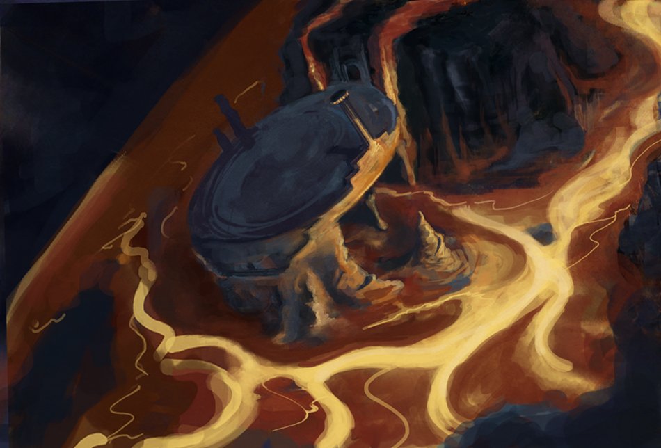
did a lot of things for the latest MSPA flash and album. So, commissioned work but with very loose parameters. Most of the flash stuff was a rush job and I want to go in and tweak bits before I post them, so it will be bits at a time.
Frog temple ruins:
the lighting here LOOKS nonsensical but actually it was designed around there being a bonfire in the depression at the centre-left.
Album artwork: Frostbite
Album artwork: Kingside Castle (more of a speedpaint)
Just, you know, thought you'd want to know.
edit: wow that is the WORST smiley
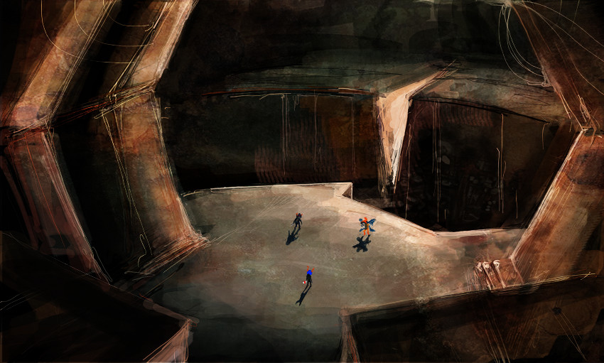
more homestuck dumping
I really like this one and am thinking of cleaning it up for a print maybe
I heard 'lighting' and automatically started on a paintover to try to help, but after a bit what became clear is that it wasn't the lighting treatment that was the issue (ie: the technical/technique bits), but where the light is in composition here. This is something that carries across into some of your other stuff as well, so I'm going to go ahead and use too many words talking about it. :P
My feeling is that the big dark figure in the background is the most important thing, followed by the girl- but since the biggest boldest patch of light is way over to the left with the doorway, the viewer's eye gets sort of shunted off that way instead- which draws attention to the party hat guy (Mark Twain? I haven't gotten to this point in Homestuck yet), but that feels like it should be more of a secondary detail than a primary one. Ideally, you should usually design your composition so the most important things are given the highest amount of contrast, so it probably would have made more sense to crop off the sides of the composition a bit and play up a rim-light around the dark figure, or find some other way to frame the scene.
Yeah, you might lose/play down some details, but it's always better to have a simple and effective composition, rather than a convoluted one with a lot of details. (A good reminder of this idea is comparing the incredibly bullshit overdetailed original Wheel of Time covers with the much better ebook covers. http://wot.wikia.com/wiki/Category:Cover_art)
I saw you were doing B+W thumbnails up there and that's a good place to sort this kinda stuff out, but for those I might suggest you leave out the grays and soft edges/blurs, and approach it a bit more like a Mike Mignola drawing- either just black or just white, working in big shapes and blocks; that way you don't lose sight of the fact the process is about looking for the idea that is the best graphic read, rather than just looking for ideas, period.
For example, the middle one on the first row, it's good because it's a figure silhouetted against a big bright light- it's a setup that automatically puts her in the position of highest contrast. But, then you've sort of started fiddling with her drawing and lightened her up, when she would in actual fact be in a lot more shadow, which winds up undercutting the initial idea. By committing to her as a big black compositional block, you're going to wind up with a stronger graphic read. If you need some light to work with in the final painting, you can kick in some subtle reflected light, but it's always better to start with the strong read and tone it back a bit, than start with a less committed read and try to force some strength back into it later.
If you take the next one over, it's a cool perspective and could be a cool composition- except the primary thing you're supposed to be looking at is the same value as the floor that serves as her background, so when you take away the lines, the figure disappears, and then your viewers are going to be drawn to the higher contrasting areas of the big white light ray and the big dark shadow block. If the figure were abstracted as a lighter shape on top of a darker shape, or a dark shape on top of a lighter shape, the viewer's attention would be drawn there instead.
Granted, these aren't the most subtle ways to approach to composition, but then, it's an area where subtlety doesn't get rewarded all that often. Composition is generally the art of "look over here, you idiots!", so if you make something that hits you like a pile of bricks from 50 feet away, you're on the right track.
Twitter
take a look
at the readout ...
... oh, 7 years. 7 years for my first Bacon crit.
:P
But seriously, I wouldn't argue with any of that at all, and really both your and Iruka's comments are exactly the kind of thing where I know, on some level, where I'm fucking up but I need someone else to step up and say it before I fix it. Thinking of light and composition in terms of contrast is something that I haven't really been doing, or haven't been doing enough of. Those thumbnails are obviously arse btw, but lately I've been doing more greyscale composition tests and pre-paints before starting a drawing lately and it does help.
With that commission, one of the ways I feel I went wrong - aside from the poor gaze leading, via the lighting, which you pointed out - was changing from a vertical to a square composition, which complicated the flow - cropping the sides would definitely improve the whole thing, and was actually something I was intending to do at one point, but the client liked it as-is. Basically if I did it over I would probably take a completely different approach, but that's the case with almost everything anyway.
anyway, muchas gracias!
Really? That can't be true, can it? I know I usually don't say much on your stuff because the looser ink kinda stuff that's kinda your thing is a bit out of my wheelhouse, but I find it hard to believe I've never said anything about your stuff ever.
Twitter
(Also it weirds me out a bit that my crits have become kind of a thing somehow, even in a joking lighthearted fashion. I mean, like...people know they can just ask me if they feel like they could use my opinion on something, right? (Also sorry, I really shouldn't derail your thread with my rambling. :P))
Twitter
I debated not saying anything because I know Bacon crits have become a 'thing' and I really was only joking, and didn't want to make you feel awkward. Then I said it anyway because I'm mean.
sketches, doodles, whatever
(i have no idea why this is sideways and I can't be bothered reuploading)
some paintings
still working on this one, need to fix up lots of it and just threw on a background. But it's only fanart so way down the priority list.
detail
assy speedpaint, already put it in the doodle thread
this year's christmas er, leap year's day? card. not very christmassy, i know. Long story.
detail
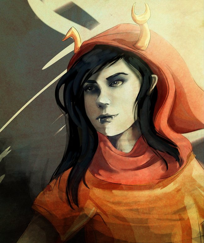
-A general boost to the saturation and contrast would probably help the whole thing 'pop' a bit more. You have a general tendency to stick with less saturated, middle values, and it would probably be good to try to push a bit more towards bolder color choices.
-The lighting on the hood/face could stand to be altered a bit to look more like solid planes- yes, the light source is to the left, but it's also a bit in front as well, so the highlights wouldn't be placed on the leftmost edge but a little bit more right, into the form.
-Also, you could probably stand to give the nose a cast shadow to solidify the form of the face a bit, and sell that light source.
-The hair is pretty matte at the moment, which makes it look as to not have a lot of volume to it- you might try something I picked up on James Gurney's blog, which is to treat the lighting of hair as you would a ribbon: http://gurneyjourney.blogspot.com/2008/04/hair-ribbon-secret.html . If you look at the pictures in this thread that were done off of photo ref, you can see you've already done this on those to a certain extent, just based on how hair looks; whereas in the paintings done from imagination, you starting getting finicky about individual strands of hair, and lose the overall sense of form.
Paintover:
Twitter