The new forums will be named Coin Return (based on the most recent vote)! You can check on the status and timeline of the transition to the new forums here.
The Guiding Principles and New Rules document is now in effect.
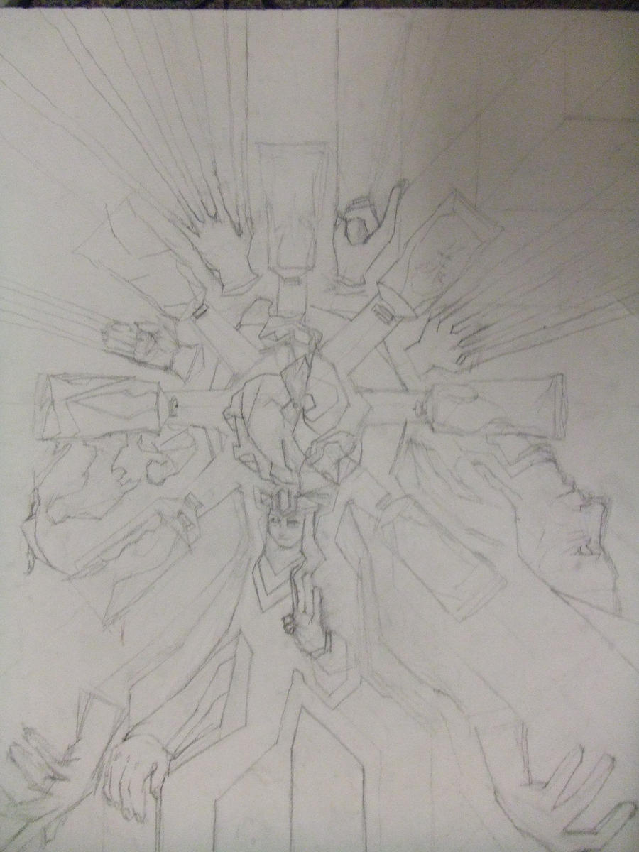
Long story short, I suck with color, but I love line. I ruined this poster idea I had by adding too much color. If anyone can see past the mind numbing red and muddy puddles, what direction should I go in from here?
sharpen your details. that's really the only direction to go in. I like the hand in the bottom right corner.
srsizzy on
BRO LET ME GET REAL WITH YOU AND SAY THAT MY FINGERS ARE PREPPED AND HOT LIKE THE SURFACE OF THE SUN TO BRING RADICAL BEATS SO SMOOTH THE SHIT WILL BE MEDICINAL-GRADE TRIPNASTY MAKING ALL BRAINWAVES ROLL ON THE SURFACE OF A BALLS-FEISTY NEURAL RAINBOW CRACKA-LACKIN' YOUR PERCEPTION OF THE HERE-NOW SPACE-TIME SITUATION THAT ALL OF LIFE BE JAMMED UP IN THROUGH THE UNIVERSAL FLOW BEATS
I was thinking of drawing over it to get my detail again then painting it all a flat color or dramatically changing the color. I'm not so concerned with what I should do with detail, I should say. I just hate the color! What don't people like about it? And yeah, it is done in paint.
hm...well...I don't mind the color, it's a little haphazard...it just isn't finished. there's no shading or detail. so it's hard to really say anything about it.
srsizzy on
BRO LET ME GET REAL WITH YOU AND SAY THAT MY FINGERS ARE PREPPED AND HOT LIKE THE SURFACE OF THE SUN TO BRING RADICAL BEATS SO SMOOTH THE SHIT WILL BE MEDICINAL-GRADE TRIPNASTY MAKING ALL BRAINWAVES ROLL ON THE SURFACE OF A BALLS-FEISTY NEURAL RAINBOW CRACKA-LACKIN' YOUR PERCEPTION OF THE HERE-NOW SPACE-TIME SITUATION THAT ALL OF LIFE BE JAMMED UP IN THROUGH THE UNIVERSAL FLOW BEATS
Looks to me like there are too many colors. There's no scheme or overall theme to the piece. It looks like you just used different colors to differentiate objects. Which is ok, but simplistic. Better to vary values, while having some kind of color scheme. Like complimentary, analogous, triadic(which you're probably closest to as of now), etc. You may want to define the forms a bit more, though I'm not sure if you were aiming to achieve a flat style. If that was the case, I'm going to say you succeeded.
And I would maybe add more detail as srsizzy said, but it all depends on what size you're working at. If it's small, like 8.5x11 or smaller, you're probably looking pretty good. And if bigger, I'd add more detail for sure.
...And I am being hulked enraged by multiple things right now and I will destroy you
0
RankenphilePassersby were amazedby the unusually large amounts of blood.Registered User, ModeratorMod Emeritus
edited October 2009
your subject is far more cool and desaturated then your background
the eye is drawn to warm and saturate tones
meaning we're focusing on the negative space far more than the subject
lead the eye to the most important points, then give it finer details there to keep it moving. Right now, you've got a strong composition ruined by poor color choice and no detail or delineation of forms
Posts
sharpen your details. that's really the only direction to go in. I like the hand in the bottom right corner.
And I would maybe add more detail as srsizzy said, but it all depends on what size you're working at. If it's small, like 8.5x11 or smaller, you're probably looking pretty good. And if bigger, I'd add more detail for sure.
the eye is drawn to warm and saturate tones
meaning we're focusing on the negative space far more than the subject
lead the eye to the most important points, then give it finer details there to keep it moving. Right now, you've got a strong composition ruined by poor color choice and no detail or delineation of forms
it needs a bit of sharpening and cleaning up, but it should turn out great