The new forums will be named Coin Return (based on the most recent vote)! You can check on the status and timeline of the transition to the new forums here.
The Guiding Principles and New Rules document is now in effect.

Logo

JRoseyJRosey Registered User regular
edited January 2007 in Artist's Corner
I hate posting a whole thread just for one little piece but I don't think it really belongs in the Doodle Thread.

Working on a logo for my photography site/business. You guys are the most aesthetically aware artists I've ever seen, so please take a moment to crit me. I'd really appreciate it.
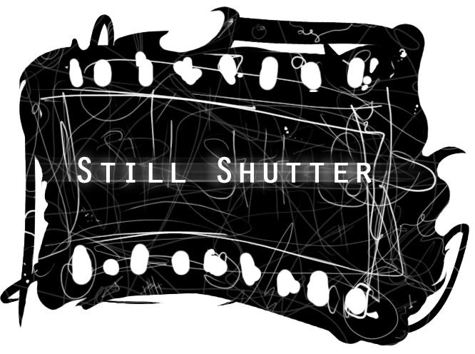
New-Logo.jpg

JRosey on

Posts

  • RusticCreatureRusticCreature Registered User regular
    edited January 2007
    It's too complicated, and it would scale down horribly. Try getting rid of some of those random lines, as they really add nothing to the piece.

    RusticCreature on
  • Sir PeechizworthSir Peechizworth Registered User regular
    edited January 2007
    it seems kinda messy. The filter over the text and the lines really don't mesh well.

    Sir Peechizworth on
    If it don't Blam, we don't want it.
  • MagicToasterMagicToaster JapanRegistered User regular
    edited January 2007
    That's way too complicated to be a logo. Also, the font is reeeeeeally small, from far away, you couldn't tell what it says.

    I'd advise against actually using this version.

    ULTRA KUDOS for using an element of fotography in the logo that actually ties the name and function of the store. Good logos are like that... just, less messy.

    MagicToaster on
  • PifmanPifman Registered User regular
    edited January 2007
    Well first off you've broken pretty much every rule of making a nice logo. Sure, rules are made to be broken - but only when the results are awesome. What you have there is more of "type treatment" with some sort of background... thing.

    If you'd really like a logo for your site/business, then you've got to simplify it a shit-ton. Then you need to ask yourself, can this logo work really big? Really small? On a shirt? On a fax? On a business card? Does it look professional or like somebody's high school project?

    The whole background thing doesn't make any sense other than maybe resembling film. In fact it doesn't really count as part of the "logo" unless you simplified it and brought the edges a lot closer to the type. The motion blur on Still Shutter isn't a good idea either. I guess this could be viewed as opinion, but there's a reason you've never ever seen a nice logo with some Photoshop blur filter mucking it up. Not only does it date it, but it sort of contradicts the word "still" no?

    OK I'm rambling, basically focus on the type. A good font, good kerning and possibly some sort of simple vector imagery/icon. Word up.

    Pifman on
    PA-Signature.gif
  • Kewop DecamKewop Decam Registered User regular
    edited January 2007
    Pifman wrote:
    Then you need to ask yourself, can this logo work really big? Really small? On a shirt? On a fax? On a business card? Does it look professional or like somebody's high school project?

    I tell my roommate this shit all the time and he continues to not listen pump out the worst looking logos ever for small clubs in our college.

    Listen to this guy, these rules aren't rules, they are MUST DOs.

    Kewop Decam on
    pasigfa7.jpg
  • JRoseyJRosey Registered User regular
    edited January 2007
    Thanks a million for the crits guys. Most of what you said were things I had considered but weren't sure of how much importance they held.

    Right now using your crits I've reached this;
    Clean-Logo.jpg
    But can still see that it needs to be simplified more, that I need to change the font. I guess what I'm afraid of is losing the artsy quality? This is company revolves around being edgier and more conceptual, and I'd like to portray that through the logo, if that's possible.

    I'm going to keep at it. Thanks again, and keep them coming!

    Edit: Took it down three more notches.

    Vector-Logo.jpg

    JRosey on
  • PifmanPifman Registered User regular
    edited January 2007
    So now it's too plain, but closer. Where as the first one in your last post is too busy/sloppy, the second one is very clean, but has no originality. I know you don't want to hear that! But I'm just trying to help haha.

    So basically give it some character. Maybe stack the words, maybe make the film smaller (and thus the holes too), maybe give the film a ribbon look (waving like a flag), maybe put the film tiny next to the word, maybe a lot of stuff. Point is try some different things, play with it and most importantly - give it character.

    This font is a lot better, and better laid out too.

    Pifman on
    PA-Signature.gif
  • Stupid Mr Whoopsie NameStupid Mr Whoopsie Name Registered User, ClubPA regular
    edited January 2007
    Good show Pifman, you pretty much covered the most important points already, but I will add that you want to make sure the logo pops!

    Give the consumer a reason to remember your product. At this point everyone knows what a lone pair of Golden Arches means, or the visage of Colonial Sanders, or even the red and blue, white striped sphere of the Pepsi cola company. Or perhaps most convincing is a white check marked called the "Swoosh".

    All of these images can be presented without their company names and everyone knows just exactly what they are, what they mean and who they belong to.

    Your goal with a logo is to want to produce this effect, known as "branding".

    Try to think of a design that will convey what you are all about without having your company name or phrase anywhere near it.

    Stupid Mr Whoopsie Name on
  • AumniAumni Registered User regular
    edited January 2007
    Good show Pifman, you pretty much covered the most important points already, but I will add that you want to make sure the logo pops!

    Give the consumer a reason to remember your product. At this point everyone knows what a lone pair of Golden Arches means, or the visage of Colonial Sanders, or even the red and blue, white striped sphere of the Pepsi cola company. Or perhaps most convincing is a white check marked called the "Swoosh".

    All of these images can be presented without their company names and everyone knows just exactly what they are, what they mean and who they belong to.

    Your goal with a logo is to want to produce this effect, known as "branding".

    Try to think of a design that will convey what you are all about without having your company name or phrase anywhere near it.

    Great advise, but logos can only become more abstract as your company becomes more popular. You want to think of something just as Mr. Elliotto said, something without your company name -- so that later down the line you can omit the name and your idea can become more abstract and still be well known. However it may be wiser to leave your name in the logo or under it or nearby for now until it becomes more well known.

    Aumni on
    http://steamcommunity.com/id/aumni/ Battlenet: Aumni#1978 GW2: Aumni.1425 PSN: Aumnius
  • wakkawawakkawa Registered User regular
    edited January 2007
    needs more thumbnails

    wakkawa on
  • MagicToasterMagicToaster JapanRegistered User regular
    edited January 2007
    Give the consumer a reason to remember your product.

    God, yes! Even if you're just starting out, creating placement is esential. There are lot's of ways you can attract and keep customers, but the name and the link it creates to the brain is escential!

    EDIT:

    Why don't you try experimenting with another element of photography to create the logo?

    MagicToaster on
  • Chop LogicChop Logic Registered User regular
    edited January 2007
    Yeah, maybe you should ditch the film idea for now and try some other things. I was thinking maybe a film reel, or an actual shutter or something maybe.

    Chop Logic on
  • JRoseyJRosey Registered User regular
    edited January 2007
    Thanks for the help everyone. Yeah since I posted this I realized just how much work goes into creating a logo, and am dedicating a large amount of time to configuring one. I'm playing with some new ideas and reworking old ones, and hopefully, with time and your advice, I'll come up with something rewarding. I'll update when I feel I've reached that point.

    Thanks again!

    JRosey on
  • misterpazuzumisterpazuzu Registered User regular
    edited January 2007
    I'm only going to comment on the original post as I think it's the piece in question. I think it looks fine. For corrections, the only thing that I would come up with would be a layering effect to distress the background further, thus enhancing the separation of the foreground (title) and the background piece... think Dave Mckean without properly aping Dave McKean ^__^.

    My two bits, take 'em for what they're worth.

    misterpazuzu on
    misterpazuzusig.jpg
  • ksblairksblair Registered User regular
    edited January 2007
    Clean-Logo.jpg

    This seems to be getting in the right direction, your focusing in on simpler points that make it interesting, but on your 3rd show, you are just going with the bare essentials.

    Dont necessarily lose the style, just not so many elements as the original.

    ksblair on
  • WastingPenguinsWastingPenguins Registered User regular
    edited January 2007
    Lose the vertical lines in the box around "Still Shutter". If it were just the two horizontal lines, it would look like a strip of film, but with the box, I almost forget what it's supposed to be.

    WastingPenguins on
  • JoeMushashiJoeMushashi Registered User regular
    edited January 2007
    the scribble reads 'changer' to me, don't know, I'd probably take it out

    or disguise the E and R more maybe

    JoeMushashi on
Sign In or Register to comment.