As was foretold, we've added advertisements to the forums! If you have questions, or if you encounter any bugs, please visit this thread: https://forums.penny-arcade.com/discussion/240191/forum-advertisement-faq-and-reports-thread/
Options
Bog dumps more
TheBog Registered User regular
Registered User regular
I REFUSE TO DIE!


I guess from now on I'm gonna dump everything I do into here. What do you people call these things?.. Dumps? OLOL
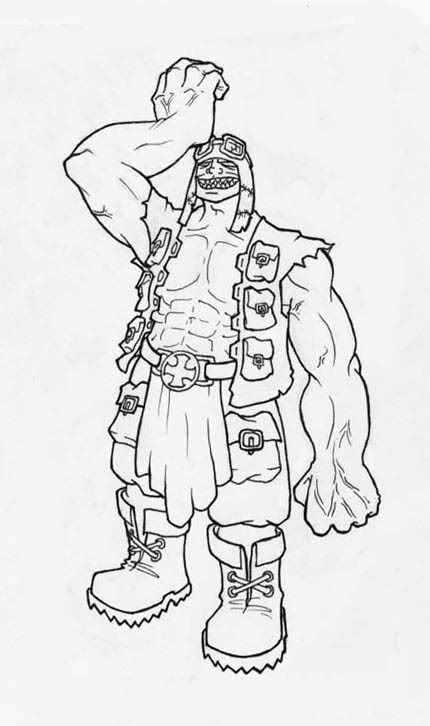
I found this doodle yesterday so I finished it and inked it.
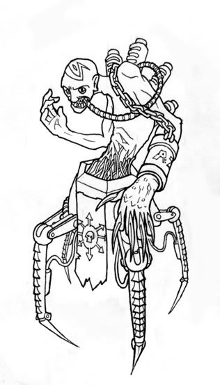
And here's some fat f*%k of a mutant I did yesterday in class.

Um.. I went and photocopied my 10x15 version and shrunk it down and then scanned that. Anyway, here you go. This is the new page 1 uncolored. I'd like to color it tonight.

So a little while ago I decided to do a comic. It was for this little independent group that prints short comics in their little compilations. They're good people. Anyway, I decided I'd do a comic for them, but when I was around page 6 or 7 I received an email with all the precise measurements and proportions and junk and my pages weren't proportional at all to what the final product should be. Aparently your standard 8.5x11 is fatter than a standard comic page. So now I started redrawing this badboy. Originally I wasn't going to show this to you guys until I got to around page 10 at least, but seeing as how now I'm redrawing it that'll be in FOREVER. Enjoy this old version in the meanwhile. I'm making the new one lots nicer. (more room to work on these huge comic page things... lol HEUG LEIK XBOXLOL)
Also I'm gonna post some crap that I haven't posted because I wanted to save it for a dump of sorts. I guess this would be it.
Any comments or crits are welcome, especially on the comic!


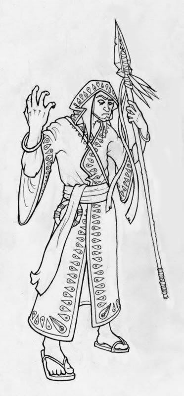
Oh, and I don't remember if I ever posted this guy. It's kind of old, but here you go anyway.

I guess from now on I'm gonna dump everything I do into here. What do you people call these things?.. Dumps? OLOL
I found this doodle yesterday so I finished it and inked it.
And here's some fat f*%k of a mutant I did yesterday in class.
Um.. I went and photocopied my 10x15 version and shrunk it down and then scanned that. Anyway, here you go. This is the new page 1 uncolored. I'd like to color it tonight.
So a little while ago I decided to do a comic. It was for this little independent group that prints short comics in their little compilations. They're good people. Anyway, I decided I'd do a comic for them, but when I was around page 6 or 7 I received an email with all the precise measurements and proportions and junk and my pages weren't proportional at all to what the final product should be. Aparently your standard 8.5x11 is fatter than a standard comic page. So now I started redrawing this badboy. Originally I wasn't going to show this to you guys until I got to around page 10 at least, but seeing as how now I'm redrawing it that'll be in FOREVER. Enjoy this old version in the meanwhile. I'm making the new one lots nicer. (more room to work on these huge comic page things... lol HEUG LEIK XBOXLOL)
Also I'm gonna post some crap that I haven't posted because I wanted to save it for a dump of sorts. I guess this would be it.
Any comments or crits are welcome, especially on the comic!
Oh, and I don't remember if I ever posted this guy. It's kind of old, but here you go anyway.
TheBog on
0
Posts
"You've lost. Get your carcass OFF this worthless Russian land."
Also I am amazed by your character designs. The first one is the one that grabbed my attention. They are really good, and you must have improved considerably lately because that is some high caliber stuff. Good anatomy and muscle structure!
INSTAGRAM
On that Eldar pic: he's not really holding the gun in his right hand, it looks like it's glued to it.
Generally, the linework is very good do, much to my taste. The only problem I see in the comic is that some of the faces look rather flat.
My digital art! http://forums.penny-arcade.com/showthread.php?t=8168
My pen and paper art! http://forums.penny-arcade.com/showthread.php?t=7462
Other than that I dont mind the flat colours/faces, too many comics nowadays are overcoloured/inked to death (have you seen Xmen these days? ugh), and the colours with simple 1-level shades are good the way they are.
My digital art! http://forums.penny-arcade.com/showthread.php?t=8168
My pen and paper art! http://forums.penny-arcade.com/showthread.php?t=7462
My digital art! http://forums.penny-arcade.com/showthread.php?t=8168
My pen and paper art! http://forums.penny-arcade.com/showthread.php?t=7462