The new forums will be named Coin Return (based on the most recent vote)! You can check on the status and timeline of the transition to the new forums here.
The Guiding Principles and New Rules document is now in effect.
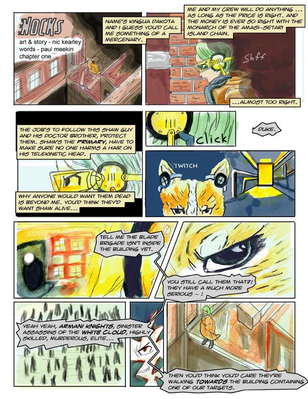
Nocks - Its a comic. I'm posting other arts now too.
Wise man once say: First page of web comic never good. Persist and do better on page 2.
That being said, I would like to hear some of your wisdoms about it.
I've read other threads, made bad attempts at them, and posted in a few.
I don't think it looks awful, at least by my own standards, but who am I to judge my own work?
Anyone who knows me on these forums knows that I will not only accept criticism, but usually act on it inside the given thread. I am prepared to hear anything ... I think.
The first thing that jumps out at me was that the layout is pretty stiff and could use some work. The word bubbles all look okay but the word boxes seem like they're placed oddly in a couple spots. It seems like the art within the panels are becoming second fiddle to the word boxes in a few spots.
Also it's kind of hard to tell what is happening in those last few panels, so you may want to try to work on your storyboarding some to more effectively convey what is happening. I guess it's mostly that 3rd to last panel that baffles me.
You've employed the use of some varying angles and perspectives. Unfortunately, the first and last panel are the same angle, and the next two are side angles, followed by some frontal angles. I would suggest just to keep experimenting with them, and to change it up to get some more interesting results.
That 5th panel sticks out as needing more attention to be effective. The background perspective is a little too ruler-perfect and dead on. Try to give your backgrounds a more loose and organic feel like you do your characters. Also the hard light of the door in the distance seems to have no affect on the character in the panel. The character himself is also a bit jarring because the it seems like I should be seeing him from a frontal/slightly side angle, instead of direct front.
The colors look nice and I dig the artwork as a whole so keep pumping out pages and I'll read em.
You know, guys, I think I'm going to do something smart and restart with the same dialog and basically same drawings and do less dialog and panels overall. I think its for the best, really. I mean its jammed up right now with content, it needs balance. Since only one person has commented on this so far I feel it only fair to post a new synopsis I came up with.
NOCKS
Shaw Nevada will soon be diagnosed with a disease he can't possibly control. Things go from bad to really bad when an unknown organization marks him and his only brother for death. With no plan, two new friends, and a strange world ahead of him; Shaw seeks to flee his once island city home for a new life.
There, that about sums up what I'm aiming for here. Interesting? Horribly boring drivel? Comment why don't cha! Working on a website for proper comic updates right now too.
Redid the first page in a smaller format with half the size. Still too much dialog? Somebody let me know these things, please. The coloring looks rushed, yes, I don't have a very good grasp on it. I'll also admit that I don't know my way around human anatomy the best either. I'm doing this comic so I get better at those things. Well, along with doing drawing from life of course.
Yay for being sick for two weeks! Really, it was a fun time had by all. Anyway I'm going to post this here and ask for crits on it. I know there are problems with it, I'm just not experienced enough in anatomy to spot them.
So this time, would someone, please comment on this drawing instead of having my topic parade itself into oblivion? I really want to get the problems worked out before I try coloring it. So, go crazy with it, I don't mind at all. I'm going to continue to post artwork in this thread and update it now that I'm not bedridden. :zzz:
the finger closest to us on his outstretched hand is the pinky, it should be way smaller with the ring finger visible from this viewpoint. head's too large and the profile you have drawn is a generic anime schema of a face.
A Christmas light bulb I tried to do recently. Is my style too impressionistic? Is that a word for it? Hah.
This is an old idea I never followed up on back when Bioshock 1 came out. Hellboy would be sent to Rapture to find Andrew Ryan for some reason or another, I had imagined Hellboy fighting a Big Daddy and some splicers, but never got around to drawing it for some reason. I figured it's relevant because Bioshock 2 just came out? I still like the concept. Or maybe you guys don't wanna see old stuff huh?
Recent attempt at drawing in a more cutesy style. Horribly flawed anatomies I'm sure.
the finger closest to us on his outstretched hand is the pinky, it should be way smaller with the ring finger visible from this viewpoint. head's too large and the profile you have drawn is a generic anime schema of a face.
See? I knew I'd make mistakes that were borderline generic. Thanks for pointing it out.
I do have a little trouble drawing straight lines sometimes. I've been using the pen tool in photoshop and it helps a lot.
I'd really like to not draw generic anime faces, but I don't really think I have a developed style to do otherwise? Is that a stupid excuse? Also from what I know - its always more important to get the underlying structure right before doing something fancy like coloring. Would adding more detail to the face help it any or is it just superfluous lines? --tried to fix what you mentioned.
All right! I knew it was horrible! What do you consider a good looking profile face Sir Manonvon?
EDIT: Good looking anime profile face I mean - is there such a thing that exists?
I'd like to critique your work but I'm a terrible judge of anime and manga. The only ones I ever read were Shirow's "Appleseed" and "Ghost In The Shell". And I even quit reading his stuff after he went photoshop crazy. The only thing I would suggest is getting a G-pen or Maru pen to help with your line width.
I think the light bulb is a good start. I would like to see more stuff like that, done in pencil.
Hey! It's been 6 days since you posted that comment! Time to post something or forever face the cold reality that is my laziness to draw actual from life things! I drew a monster truck my little brother owns. He actually asked me to draw it for him, which was adorable. So I'm like sure, I can draw cars. I gave him the finished sketch and he laughs a little. No comment just slight laughter. He's 13. I'll take that as a laugh of satisfaction, hahaa. Anyway making with the post.
EDIT Quickly - there is a tremendous amount wrong with it. I realize this. Perspective is flawed etc. You can go ahead and list what you think is wrong with it, I probably missed something.
EDIT again before anyone posts new comments - drew some bunnies yesterday at the mall pet shop.
Thought I'd offer some feedback on your truck. You've got a good sense of 3D volume, but your perspective construction is way off. Notice the construction lines and their directions, especially with the rear tire. Hope this helps a bit.
Posts
Also it's kind of hard to tell what is happening in those last few panels, so you may want to try to work on your storyboarding some to more effectively convey what is happening. I guess it's mostly that 3rd to last panel that baffles me.
You've employed the use of some varying angles and perspectives. Unfortunately, the first and last panel are the same angle, and the next two are side angles, followed by some frontal angles. I would suggest just to keep experimenting with them, and to change it up to get some more interesting results.
That 5th panel sticks out as needing more attention to be effective. The background perspective is a little too ruler-perfect and dead on. Try to give your backgrounds a more loose and organic feel like you do your characters. Also the hard light of the door in the distance seems to have no affect on the character in the panel. The character himself is also a bit jarring because the it seems like I should be seeing him from a frontal/slightly side angle, instead of direct front.
The colors look nice and I dig the artwork as a whole so keep pumping out pages and I'll read em.
INSTAGRAM
Page 2 will be posted some time this weekend when I get time for it.
Shaw Nevada will soon be diagnosed with a disease he can't possibly control. Things go from bad to really bad when an unknown organization marks him and his only brother for death. With no plan, two new friends, and a strange world ahead of him; Shaw seeks to flee his once island city home for a new life.
There, that about sums up what I'm aiming for here. Interesting? Horribly boring drivel? Comment why don't cha! Working on a website for proper comic updates right now too.
So this time, would someone, please comment on this drawing instead of having my topic parade itself into oblivion? I really want to get the problems worked out before I try coloring it. So, go crazy with it, I don't mind at all. I'm going to continue to post artwork in this thread and update it now that I'm not bedridden. :zzz:
This is an old idea I never followed up on back when Bioshock 1 came out. Hellboy would be sent to Rapture to find Andrew Ryan for some reason or another, I had imagined Hellboy fighting a Big Daddy and some splicers, but never got around to drawing it for some reason. I figured it's relevant because Bioshock 2 just came out? I still like the concept. Or maybe you guys don't wanna see old stuff huh?
Recent attempt at drawing in a more cutesy style. Horribly flawed anatomies I'm sure.
See? I knew I'd make mistakes that were borderline generic. Thanks for pointing it out.
the confidence isn't as strong in the cat though, your lines there are somewhat scratchy, making you look uncertain of their placement.
I'd really like to not draw generic anime faces, but I don't really think I have a developed style to do otherwise? Is that a stupid excuse? Also from what I know - its always more important to get the underlying structure right before doing something fancy like coloring. Would adding more detail to the face help it any or is it just superfluous lines? --tried to fix what you mentioned.
quite possibly the worst.
All right! I knew it was horrible! What do you consider a good looking profile face Sir Manonvon?
EDIT: Good looking anime profile face I mean - is there such a thing that exists?
Hey! It's been 6 days since you posted that comment! Time to post something or forever face the cold reality that is my laziness to draw actual from life things! I drew a monster truck my little brother owns. He actually asked me to draw it for him, which was adorable. So I'm like sure, I can draw cars. I gave him the finished sketch and he laughs a little. No comment just slight laughter. He's 13. I'll take that as a laugh of satisfaction, hahaa. Anyway making with the post.
EDIT Quickly - there is a tremendous amount wrong with it. I realize this. Perspective is flawed etc. You can go ahead and list what you think is wrong with it, I probably missed something.
EDIT again before anyone posts new comments - drew some bunnies yesterday at the mall pet shop.
New comics posted daily Monday-Friday
I'd agree, though, that the perspective is a little off, but otherwise great job.