The new forums will be named Coin Return (based on the most recent vote)! You can check on the status and timeline of the transition to the new forums here.
The Guiding Principles and New Rules document is now in effect.

Concept Art

GGlosserGGlosser Registered User regular
edited August 2010 in Artist's Corner
A few years back I was enrolled as a student at a state university. However, due to some unforeseeable complications I was forced to drop out after only a year. Rather than have everyone listen to my heart-wrenching tale I thought that I would see if I could get some constructive criticism or even some simple positive feedback. I never stopped drawing even after things got tough. However, having a taste of a studio environment, I know I'll never get the sort of unbiased commentary that I need from friends and family alone.

To start off, this is my idea for an online comic. I know that there are countless thousands of people out there doing webcomic strips online and such, but if it's any consolation this is not intended to be uploaded in a strip format. It's a Sci-fi fantasy setting that will be uploaded entire chapters at a time. I don't have any real goal in mind for the long term, I simply have a story to tell.

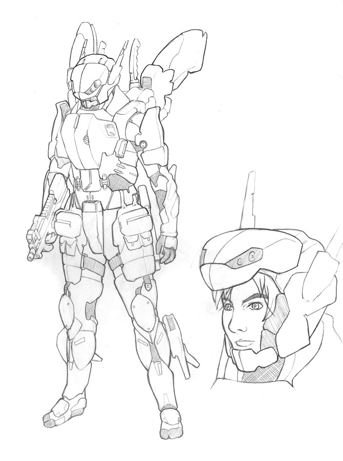
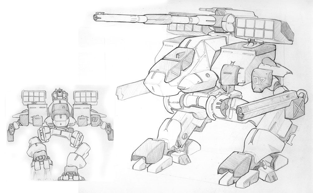
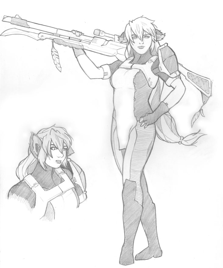
Here are a few examples of what I have been working on. This is all entirely concept.
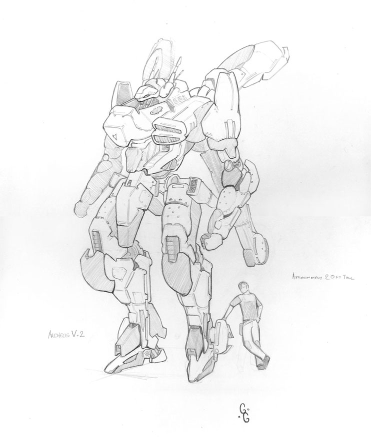
Archeus_Reduced_by_Kaiii.jpg

Kainen_TacArm_by_Kaiii.jpg

AR_01_Arbalest_by_Kaiii.jpg

Meira_Einherjar_Uniform_by_Kaiii.jpg

GGlosser on
«1

Posts

  • F87F87 So Say We All Registered User regular
    edited March 2010
    Pretty great stuff! I feel like your lines could use a tad more variation, especially in the facial features.

    I would like to see some colored, finished concepts.

    F87 on
  • 3dguy33dguy3 Registered User regular
    edited March 2010
    Great line quality and skill level!
    I'd say your comic will look fantastic!
    :)

    3dguy3 on
  • AumniAumni Registered User regular
    edited March 2010
    I'd read it.

    That's some fantastic clean work there!

    If I had any crits it would be that the female face seems to be off somehow...

    But yeah keep us updated man.

    Aumni on
    http://steamcommunity.com/id/aumni/ Battlenet: Aumni#1978 GW2: Aumni.1425 PSN: Aumnius
  • GGlosserGGlosser Registered User regular
    edited March 2010
    I can work on my line quality a bit for sure, but it has been hard for me to describe expression and facial features in such a small image. I did do a few expression studies though awhile back.

    Aiden_Study_by_Kaiii.jpg

    Aiden_Uniform_by_Kaiii.jpg

    As for color, I was planning on doing the comic in gray shades entirely. I can use traditional media to paint but when I try to do anything but logo and website design with illustrator and photoshop it just doesn't look right. I have almost no skill with painter programs.

    Thanks for the feedback.

    GGlosser on
  • TamTam Registered User regular
    edited March 2010
    I think you need some anatomy and proportion work. The placing of some facial features in 3/4 view are off, and some of the heads are too small. Other than that, fantastic work. I don't see any glaring flaws in the machines.

    Tam on
  • NappuccinoNappuccino Surveyor of Things and Stuff Registered User regular
    edited March 2010
    My only real problem with your designs is that it seems like you're letting your influences show too proudly- I'd like a bit more of an original take on these idea. That said, the quality of your art is fantastic and it is only let down a few times by, as tam pointed out, proportions and small nuances (like the eyes that of the girl that are just stuck on but not in the right locations/levels).

    However, I think the smaller problems should work themselves out once you actually begin work on the comic and you're drawing these characters a number of times from all different angles.

    Nappuccino on
    Like to write? Want to get e-published? Give us a look-see at http://wednesdaynightwrites.com/
    Rorus Raz wrote: »
    There's also the possibility you just can't really grow a bear like other guys.

    Not even BEAR vaginas can defeat me!
    cakemikz wrote: »
    And then I rub actual cake on myself.
    Loomdun wrote: »
    thats why you have chest helmets
  • IkageIkage Registered User regular
    edited March 2010
    Amazing machine work! I hope you stick around to post MOAR.

    Ikage on
    STRONGER THEN DIRT!! DIRT STRONG!
  • GGlosserGGlosser Registered User regular
    edited March 2010
    Yeah, I have noticed some problems with faces but they are getting better with practice. It's very hard to get good practice in without live models though, I miss my figure drawing class most of all.

    Here's a more recent shot, practicing some more unusual poses.

    Lost_in_Thought_by_Kaiii.jpg

    This one is a work in progress. Hope to have it done this weekend (work allowing).

    World_Ship_by_Kaiii.jpg

    This one is a little older but it show's a different angle on a face that was moderately successful I think

    Edana_Rakhe_by_Kaiii.jpg

    I can't really defend the originality of the machines. I've always loved the look of Battle tech and Mechwarrior and they had a huge influence on me. I'm hoping at the very least they won't look like copies of any particular design though.

    Thanks for the feed back everyone.

    GGlosser on
  • McGibsMcGibs TorontoRegistered User regular
    edited March 2010
    dog girl's foot is on backwards.

    McGibs on
    website_header.jpg
  • MetalbourneMetalbourne Inside a cluster b personalityRegistered User regular
    edited March 2010
    Your torsos look like they're a little on the short side.

    Otherwise I like the last picture because of the bigger variance in line weights

    Metalbourne on
  • GGlosserGGlosser Registered User regular
    edited March 2010
    McGibs wrote: »
    dog girl's foot is on backwards.

    Yikes, I can't believe I didn't notice that. Maybe I've been boozing it too hard lately....

    As for the torso, you might be right, I think what I had in mind was that she was bending forward a little and so that would shorten it up a bit, of course the placement of the arms does a little to obscure where the legs and the torso meet so that might have something to do with it too.

    Nothing badly enough wrong with this that I'd want to start over though I suppose. Except for having 2 left feet. She probably just had an awkward childhood.

    GGlosser on
  • surrealitychecksurrealitycheck lonely, but not unloved dreaming of faulty keys and latchesRegistered User regular
    edited March 2010
    The quality of the lines etc is brilliant.

    But those are really the most generic mechs I've seen >.<

    surrealitycheck on
    3fpohw4n01yj.png
  • GGlosserGGlosser Registered User regular
    edited March 2010
    So the concensus seems to be that the machines are not so great. Any ideas on what areas could be improved?

    Some insight would be great.

    GGlosser on
  • winter_combat_knightwinter_combat_knight Registered User regular
    edited March 2010
    freaking sweet line work! awesome mate
    THe only thing which bugs me (im sure has been mentioned above) is your heads are sometimes too small, and your torsos are too big. The girl in your first post, her torso (boobs to neck) are huge, yet her waist and head are quite small). Watch the proportions and your work will start kicking ass!

    robots are awesome too btw.

    i want to see coloured work!!!!!!! :)

    winter_combat_knight on
  • NappuccinoNappuccino Surveyor of Things and Stuff Registered User regular
    edited March 2010
    The problem with the mechs is that they look exactly like an algamation of Gundam's and Zone of the Enders and Mechwarrior (the last one, in particular, looks like the iconic ones from Mechwarrior )
    mech6.jpg

    Now, that isn't completely a bad thing- I mean, those series did what they did because those designs worked and were awesome. The problem is that everyone else and their grandmother's realized this.

    If I were you, I'd try to get away from the military shapes like Jets and Helicopters that are buried in the design and go for something out of this world- something that wouldn't be familiar at all to the reader yet hopefully recognizable as some kind of Military robot.

    Take, for instance the transport vehicles from Aliens- The don't look like anything we have at the moment, (aside from the tires) but they read, very obviously, as a heavy military "don't fuck with this thing." Now, I'm not saying this is exactly what you should do, but it is like what you should do. Figure out what your robot is supposed to be able to do, and then create something that should functionally be able to do that from the ground up.

    I hope this helps, or at least helps to get our points across.

    Nappuccino on
    Like to write? Want to get e-published? Give us a look-see at http://wednesdaynightwrites.com/
    Rorus Raz wrote: »
    There's also the possibility you just can't really grow a bear like other guys.

    Not even BEAR vaginas can defeat me!
    cakemikz wrote: »
    And then I rub actual cake on myself.
    Loomdun wrote: »
    thats why you have chest helmets
  • Shiekahn_boyShiekahn_boy Registered User regular
    edited March 2010
    I like to see your characters costumes have a little more... Flair? I enjoy the basic sort of outfit, the last one has a good touch to it, but the others need a little more detail. I think it's just because I'm comparing them to the great and sharp mechs you have going on. I haven't seen a lot of your work so it's a big contrast in your work.

    Also, if you were to improve on anatomy, it will make your machines look even better and your characters look excellent.

    Shiekahn_boy on
    "your a moron you know that wolves have packs wich they rely on nd they could ever here of lone wolves? you an idiot and your gay, wolves have packs and are smart with tactics" - Youtube Wolf Enthusiast.
    What the fuck are you people even arguing about? Shut up.
  • GGlosserGGlosser Registered User regular
    edited March 2010
    I seem to be hearing a lot of the same on basic anatomy, which is odd to me because while I do not get a chance to do live gesture anymore I nearly always draw from life. Stock photos or artistic nudes and that type of thing and in many cases someone said the head was proportionally too small, in fact it's probably too big.

    Women also tend to have shorter torso's than men, even if only slightly. Of course there are exceptions to the rule in all anatomy. Most people's hands come down about mid thigh, but people can have longer and shorter arms. I measure everything in head lengths as well and admit that my heads still tend to get a little too large, though mostly so I can show more detail.

    It's possible that some of the images (such as the two sitting poses) are showing odd enough angles that it is throwing off proportions.

    I think that my biggest failings that have been mentioned are my angled views of faces (3/4 view and everything in between) as has been mentioned. I tend to get the eye placement just wrong enough to make everything look just a little odd. It's something I'm working on, mostly because going from realism to cartoon has been a huge struggle for me.

    Speaking of realism, here's a self portrait I did at the beginning of my first year.

    Self_Portrait_Revised_by_Kaiii.jpg

    oh, and because it was mentioned in the last post. There is a reason everyone is wearing similar looking items of clothing (except the one in the racy looking jumpsuit). They are supposed to be wearing uniforms. Basically there is a "coat" that goes over the top of a skin tight suit so that they can go from "business casual" to cockpit ready in seconds. The idea of the overcoat was so they didn't have to look like they were prancing around in their underwear at all times.

    Here's a couple shots of people sporting the overcoat and skinsuit.

    Kainen_Dresari_Uniform_by_Kaiii.jpg

    Kerin_Ward_Skin_Suit_by_Kaiii.jpg

    GGlosser on
  • rtsrts Registered User regular
    edited March 2010
    Well, I am not as enthused as everybody else. But I feel like you have had enough people kissing your ass so far, so here comes one of the harshest critiques I have ever given:

    You may want to look to other cultural influences than Japan for your work. Because honestly, I don't think the furry version of Blue Gender is going to make an awesome comic. But maybe that's just me. I also think your work is way too anime heavy, it's not a good look. Japan is a weird place, and weird stuff comes out of it...but we tend to accept a lot of it because well...it's Japan. But at this point...I feel that stuff is so overused and done that it's hardly worth mentioning.

    I would just look somewhere else entirely.

    rts on
    skype: rtschutter
  • GodfatherGodfather Registered User regular
    edited March 2010
    The way you draw torsos kind of irks me. They're a bit too large in size comparison to the pelvis, so that the ribcage seems a bit top heavy, and the connection to the pelvic bone looks meaty, which is something you want to avoid when constructing women. I'm not talking superhero proportions (because that needs to fuck right off), but they should be a bit more toned if they're battling giant alien mechas or whatever else comes there way. Work on constructing the character's footing into the perspective, because right now a healthy chunk of these are off balance, like a stiff breeze could bowl them over.


    There's no doubt that your penciling techniques are superb. Clean linework, with confidence in value application. Just wonderful polish overall, and it seems you really enjoy getting to that process. Your best course of action would be to spend a few extra minutes properly setting up your figure before getting to the "good stuff", because it seems to be holding some of these from being real stand-out profile shots.

    Godfather on
  • GGlosserGGlosser Registered User regular
    edited March 2010
    cakemikz wrote: »
    Well, I am not as enthused as everybody else. But I feel like you have had enough people kissing your ass so far, so here comes one of the harshest critiques I have ever given:

    You may want to look to other cultural influences than Japan for your work. Because honestly, I don't think the furry version of Blue Gender is going to make an awesome comic. But maybe that's just me. I also think your work is way too anime heavy, it's not a good look. Japan is a weird place, and weird stuff comes out of it...but we tend to accept a lot of it because well...it's Japan. But at this point...I feel that stuff is so overused and done that it's hardly worth mentioning.

    I would just look somewhere else entirely.

    I don't consider this harsh at all. I understand full well the negative connotations of anime and manga. It's been done to death, you can see it's influence everywhere. Hell, you turn on cartoon network and what do you see? A bunch of American made kids shows with big eyes small mouths and loads of spiky hair.

    This might surprise you, but I really dislike anime and manga (for a multitude of reasons) and the focus of my last 3 years of independent study was actually realism. Realism does not translate well into comics however, I struggled for a long time with trying to turn realism into something comic book worthy and in the end it never worked. Perhaps a more skilled artist could do it, actually I know for a fact that they have, but I am almost entirely self taught and it just wasn't in me. So I simplified, I emulated western style comic book artists and ultimately, this is what I came up with.

    There are areas that are going to generate some bad rep, I can live with that. You can't win the hearts and minds of everyone as clearly I have failed already in just this thread alone. You've clearly already made up your mind based on my concept work and that's well within your rights. I won't fault someone for their opinion, but I will say that there is much more going on here than your summary suggests and I have to admit that "the furry version of Blue Gender(first, I don't really think ears and claws constitutes a 'furry' and second, I have no idea what Blue Gender is but I have a suspicion it's not what I'm going for)" is a little unfair.

    Even so, I appreciate your frankness and while it is hard to hear (and has been said before) it's both true and honest. It might even gradually cause me to lean back towards more realism in my final draft, but I'm working on a limited time frame now. In several months I will be leaving for the airforce and it was my hope to have at least one chapter done before I left for basic and tech school.

    I guess I'll see how modifications will fit into my time frame.

    GGlosser on
  • GGlosserGGlosser Registered User regular
    edited March 2010
    Godfather wrote: »
    The way you draw torsos kind of irks me. They're a bit too large in size comparison to the pelvis, so that the ribcage seems a bit top heavy, and the connection to the pelvic bone looks meaty, which is something you want to avoid when constructing women. I'm not talking superhero proportions (because that needs to fuck right off), but they should be a bit more toned if they're battling giant alien mechas or whatever else comes there way. Work on constructing the character's footing into the perspective, because right now a healthy chunk of these are off balance, like a stiff breeze could bowl them over.


    There's no doubt that your penciling techniques are superb. Clean linework, with confidence in value application. Just wonderful polish overall, and it seems you really enjoy getting to that process. Your best course of action would be to spend a few extra minutes properly setting up your figure before getting to the "good stuff", because it seems to be holding some of these from being real stand-out profile shots.

    Started writing my rebuttal to the comment before yours and didn't notice this one pop in!
    the connection to the pelvic bone looks meaty, which is something you want to avoid when constructing women

    This is true, I tend to find myself putting a little bit of myself in every character I draw and this is part of the result. From what I've been told, many artists do this (maybe a little narcissism?) but it seems to happen even in females. In truth it was even difficult for me to make women look feminine at all and I only just recently become comfortable with the female figure.

    One thing I wanted to avoid expressly though was the over exaggeration of anatomy present in a lot of comic books. These people are fit, but loads of over the top muscle and enormous breasts with tiny tiny waists always annoyed me. Even looking at my own drawings they still irk me a little and I will almost inevitably tone them down a bit more.

    As for the pelvic bone, I think I see what you mean and I'll try to tone it down in the future. Although it might just have something to do with the unique lines in the costumes in those particular areas. Either way I'll have to address it and thanks for pointing it out.

    GGlosser on
  • GodfatherGodfather Registered User regular
    edited March 2010
    Yes, it is true that artists tend to put a bit of themselves into their artwork. I tend to draw my characters on the leaner, more toned side of thing. I also draw huge, muscular dudes because it challenges me.


    Right now you're caught behind a wall, because you're right in your comfort zone at this point. You worked hard to get to where you're at, so now your challenge is to push yourself over that glass wall, because it will suppress your growth tremendously. Just doing the same thing over and over again might polish those elements to a mirror shine, but if you don't start tackling issues that are unknown to you, or aren't exactly your cup of tea, you'll be hurting yourself in the long run, and gain little to no progress as an artist.

    Godfather on
  • IkageIkage Registered User regular
    edited March 2010
    Sorry to come out of nowhere with this I was just yaaayyy someone likes Mecha as much as I do LETS TALK ABOUT HOW REVOLTECH FIGURES ARE AWESOME. Yaaaaay Mecha comics~ But I read a ridiculous amount of comics and I am a giant nerd. So let's talk about comics.
    This might surprise you, but I really dislike anime and manga (for a multitude of reasons) and the focus of my last 3 years of independent study was actually realism. Realism does not translate well into comics however, I struggled for a long time with trying to turn realism into something comic book worthy and in the end it never worked. Perhaps a more skilled artist could do it, actually I know for a fact that they have, but I am almost entirely self taught and it just wasn't in me. So I simplified, I emulated western style comic book artists and ultimately, this is what I came up with.

    You have to understand that a lot of Western comics are being influenced by the Japanese look. If you compare old school comics to American comics nowadays you'll see what I mean. But American art is a VERY varying style and really comes down to the Western artist your talking about. Because you could be going for Gez Fry look, a Cheeks look, Chris Stevens look, Mike Mignola look ( Hellboy), UDON look, a Duss or even Sean Gordon Murphy. And they are all legitimate western comic artists but they all vary drastically.

    I honestly think you are trying for the realism, but your going through the Japanese way of sniping/applying details to certain focal areas. I am not sure if that's the style you are trying to establish for your comic but let's talk about that.

    Because there are alot of artists that draw one way, but make another style for their comic a different way.
    She is another great example of one seriously business way then her comics being in a recognizable style so you KNOW who it is when you look at it.

    I would suggest exploring your work more and have fun making a brand style for your comic. In the comic industry as far as that goes, the more identifiable you are on your own the better, for your company and you. If you do good quality, people are going to remember what you've then they see your newest issue and go " OH MAN SO AND SO PUT OUT ANOTHER!? I LOVE THIS ARTIST". A lot of comic artists have made careers just off their styles, and love seeing other characters reinterpreted in their way. I would die to see a Mike Mignola Batman picture. But yes style is branding, it's how you can tell a Mulan movie shot from a Hercules movie one.

    But alot of people ( like myself) skip the foundations boat and make it all about style and when it comes to composition, color theory and all that jazz their work looks like a terrible mish mosh. You seemed to do the hard stuff first and really good at realism which is good, the more foundations you have, the more building blocks you have to build more solid varying work. But I would suggest to unstiffen your work a little bit and play around. But keep in mind: Style is a tool just like anything else, not a rule.

    Ikage on
    STRONGER THEN DIRT!! DIRT STRONG!
  • GGlosserGGlosser Registered User regular
    edited March 2010
    Ikage wrote: »
    Sorry to come out of nowhere with this I was just yaaayyy someone likes Mecha as much as I do LETS TALK ABOUT HOW REVOLTECH FIGURES ARE AWESOME. Yaaaaay Mecha comics~ But I read a ridiculous amount of comics and I am a giant nerd. So let's talk about comics.
    This might surprise you, but I really dislike anime and manga (for a multitude of reasons) and the focus of my last 3 years of independent study was actually realism. Realism does not translate well into comics however, I struggled for a long time with trying to turn realism into something comic book worthy and in the end it never worked. Perhaps a more skilled artist could do it, actually I know for a fact that they have, but I am almost entirely self taught and it just wasn't in me. So I simplified, I emulated western style comic book artists and ultimately, this is what I came up with.

    You have to understand that a lot of Western comics are being influenced by the Japanese look. If you compare old school comics to American comics nowadays you'll see what I mean. But American art is a VERY varying style and really comes down to the Western artist your talking about. Because you could be going for Gez Fry look, a Cheeks look, Chris Stevens look, Mike Mignola look ( Hellboy), UDON look, a Duss or even Sean Gordon Murphy. And they are all legitimate western comic artists but they all vary drastically.

    I honestly think you are trying for the realism, but your going through the Japanese way of sniping/applying details to certain focal areas. I am not sure if that's the style you are trying to establish for your comic but let's talk about that.

    Because there are alot of artists that draw one way, but make another style for their comic a different way.
    She is another great example of one seriously business way then her comics being in a recognizable style so you KNOW who it is when you look at it.

    I would suggest exploring your work more and have fun making a brand style for your comic. In the comic industry as far as that goes, the more identifiable you are on your own the better, for your company and you. If you do good quality, people are going to remember what you've then they see your newest issue and go " OH MAN SO AND SO PUT OUT ANOTHER!? I LOVE THIS ARTIST". A lot of comic artists have made careers just off their styles, and love seeing other characters reinterpreted in their way. I would die to see a Mike Mignola Batman picture. But yes style is branding, it's how you can tell a Mulan movie shot from a Hercules movie one.

    But alot of people ( like myself) skip the foundations boat and make it all about style and when it comes to composition, color theory and all that jazz their work looks like a terrible mish mosh. You seemed to do the hard stuff first and really good at realism which is good, the more foundations you have, the more building blocks you have to build more solid varying work. But I would suggest to unstiffen your work a little bit and play around. But keep in mind: Style is a tool just like anything else, not a rule.

    I actually meant to make the comparison to western style comics as well, but I left off at cartoon network because it seems in my mind to be the most notorious for it. I do appreciate the simplicity in the design of anime influenced work, but it almost always feels as though it's slightly "unfinished". Which is where I think most western style comics pick up the torch. More intense shading and more details (especially in the face) with a better range of expression. Another huge issue with Manga especially is the narrow range of value used both in the characters themselves and their environments.

    I think maybe that might end up being the difference between my work and some traditional manga. It's not much but it's something I can build on.

    Also, as far as getting out of my comfort zone, that's an easily fulfilled request because frankly, I don't have one. My style has changed so much through the years that you probably wouldn't even recognize it several months ago. I do however feel like I am on the right track in the long term but there is always going to be room for improvement. I'll never stop learning, which I think is evident since the whole college fiasco.

    Thanks for the comment, I think there's some good advice in there.

    GGlosser on
  • GGlosserGGlosser Registered User regular
    edited March 2010
    Nothing revolutionary this time. I thought I'd show one of my more unorthodox Battle-frame designs.

    Loki_Battle_frame_by_Kaiii.jpg

    A little less battle tech this time. I'm not 100% sold on the weapon, I think I lost it when I started trying to detail the cylinder in the middle. It's light enough that I can go back and fix it though.

    GGlosser on
  • MegaMan001MegaMan001 CRNA Rochester, MNRegistered User regular
    edited March 2010
    I'm not an artist, but I just wanted to say that this stuff - right down to your expressions and outfits - screams Zoids.

    I mean not as an influence, it looks like you're drawing Zoids - from that TV show.

    MegaMan001 on
    I am in the business of saving lives.
  • GGlosserGGlosser Registered User regular
    edited March 2010
    I'm not sure I'm seeing what you're seeing.

    The last update is pretty obviously based on an animal, similar to what the zoids series does, that's a fair assessment I suppose. I actually drew the figure of a fox and then did my best to cut down on the anthropomorphic features. Obvious things like the head and tail got cut out entirely, with the 'head' being turned into a dome with no neck. The legs were the most important feature, I wanted them to look just like the basis for my model because that is what is going to give the machine it's agility.

    My inspiration for the design was that the race of people that created it are something like... technologically advanced naturalists. All of their technology is going to be based on things that occur naturally because, to them improving on natures form seemed like the most methodical way to progress.

    As for everything else, I've never watched an episode of Zoids so I have no idea why anything else looks similar to it. I think my style could be likened to thousands of different comics and TV shows but I'm not exactly sure why this one in particular stuck out in your head.

    If other people feel the same way I might have to watch an episode or two and then make some major revisions.

    GGlosser on
  • NappuccinoNappuccino Surveyor of Things and Stuff Registered User regular
    edited March 2010
    I don't quite see the zoids comment either. Those designs were always more "this is an animal robot!" Where your design takes inspiration from nature and converts it to a robot form. Similar, but not at all the same thing.

    Now, I'm not a huge mech fan, but I personally think this design is a step in the right direction. I don't see your influences directly on the paper and it seems like a more original design. Keep it up :)

    Nappuccino on
    Like to write? Want to get e-published? Give us a look-see at http://wednesdaynightwrites.com/
    Rorus Raz wrote: »
    There's also the possibility you just can't really grow a bear like other guys.

    Not even BEAR vaginas can defeat me!
    cakemikz wrote: »
    And then I rub actual cake on myself.
    Loomdun wrote: »
    thats why you have chest helmets
  • GGlosserGGlosser Registered User regular
    edited April 2010
    My internet was down for a whole week and I have lots of new stuff, most of it is boring concept work that needed to be done but isn't particularly exciting but I did come up with something worth posting.

    Soft_Landing_by_Kaiii.jpg

    Testing some action oriented shots now. This one was pretty successful but it only shows the landing and not the actual jump. This one came out well enough that I might add in a back ground to it later as well, but I haven't decided what kind of background it needs. I'm open to suggestions.

    GGlosser on
  • winter_combat_knightwinter_combat_knight Registered User regular
    edited April 2010
    the composition loos off placing him on the far right of the page. that sword looks too small, almost like you ran out of room to draw it. Fix that arm and sword, and it will improve loads.
    Also, those things on his back are out of perspective. The furthest one should read as smaller than the one further to us.
    quick edit
    9hrnd4.jpg

    what do others think>?

    winter_combat_knight on
  • AumniAumni Registered User regular
    edited April 2010
    I agree about the large sword and focusing on the character a little more. For an action shot I don't see any motion and I think it's the smoke. If he's landing maybe have the smoke dispersing out in front of or around him, as it is now the smoke at his feet doesn't suggest him doing anything other than looking down from a cloud (since there is no background to get an idea of location).

    The other thing that's bugging me is his head, it seems too large or his body is too small.

    That said I think your lines are fantastic and I'm feverishly jealous.

    Aumni on
    http://steamcommunity.com/id/aumni/ Battlenet: Aumni#1978 GW2: Aumni.1425 PSN: Aumnius
  • GGlosserGGlosser Registered User regular
    edited April 2010
    The size of the sword is about right. It was supposed to be a very small weapon, short sword size. I also used a little bit of foreshortening on it for some added depth, although maybe the hand could stand to be a bit bigger.

    As for the booster, they are meant to rotate so maybe that's what I was thinking of when I did it. I do like your edit however, I might include it in the revision if I am able.

    Thanks for the feedback. I'll try to include some of those suggestions when I draw the background in.


    Edit: Oh, and I didn't run out of room, I cropped it that way on purpose because I thought it drew the eye in more and gave it a better sense of movement. I have at least another inch and a half to play with (I draw on 11X14 inch bristol board and have to scan my images in pieces and then put them together in photoshop, you'll notice sometimes I just throw them together quickly and you can see where the two pieces meet).

    GGlosser on
  • KendeathwalkerKendeathwalker Registered User regular
    edited April 2010
    WCK is right. The perspective is really really off. Ok so his booster is supposed to be able to rotate. Given that the boosters are lined up with his shoulders its not implying that they are rotated at all, it looks like each one is coming straight off the back of his shoulders. Therefore the tops of the boosters should relfect the angle of the shoulders/waist/hips/thighpad things. They dont, the angles are drastically different.

    Kendeathwalker on
  • AlyceInWonderlandAlyceInWonderland Registered User regular
    edited April 2010
    I didn't see this mentioned before, so I'm going to chime in and say that you're drawing the hands on your people WAY too small.

    Seriously. Bigger hands, not tiny midget hands.

    AlyceInWonderland on
  • GGlosserGGlosser Registered User regular
    edited April 2010
    I didn't see this mentioned before, so I'm going to chime in and say that you're drawing the hands on your people WAY too small.

    Seriously. Bigger hands, not tiny midget hands.

    Yeah, I made a brief mention of that and I've already made some adjustments. I won't be able to make every revision though because it's just a little too far along in most areas. I'll keep them in mind when I move on to other drawings though.

    Thanks for the feedback.

    GGlosser on
  • ZombiemamboZombiemambo Registered User regular
    edited April 2010
    the composition loos off placing him on the far right of the page. that sword looks too small, almost like you ran out of room to draw it. Fix that arm and sword, and it will improve loads.
    Also, those things on his back are out of perspective. The furthest one should read as smaller than the one further to us.
    quick edit
    9hrnd4.jpg

    what do others think>?

    Agreed on the perspective, but I think the composition at least has the right idea - putting him smackdab in the middle of the page is not good comp.

    Zombiemambo on
    JKKaAGp.png
  • FlayFlay Registered User regular
    edited April 2010
    Your character/mech designs are generally very good, and your lines are nice and confident, but I've noticed in a few (particularly that last one) that there isn't a great deal of contrast in the shading. You need some darker darks to give the drawing some more depth.

    Flay on
  • GGlosserGGlosser Registered User regular
    edited April 2010
    I've actually been hearing a lot about the depth of field. Some people really like the clean crisp look and others want to see more contrast. Here's a quick concept to see if I can break in somewhere in the middle. I'll keep working at it too.

    Kerin_Detail_by_Kaiii.jpg

    GGlosser on
  • winter_combat_knightwinter_combat_knight Registered User regular
    edited April 2010
    Forms really good, excellent lips, ears, face shape etc. But those eyes are out. Treat them like rounded spheres and draw the eye-lids over the top following the sphere shape. easier said than done i know. but keep at it!

    winter_combat_knight on
  • NappuccinoNappuccino Surveyor of Things and Stuff Registered User regular
    edited April 2010
    The eyes are an odd choice- everything else is so realistic looking and then you have some vaguely anime eyes- they don't seem to fit the style that everything else in your comic brings.

    Nappuccino on
    Like to write? Want to get e-published? Give us a look-see at http://wednesdaynightwrites.com/
    Rorus Raz wrote: »
    There's also the possibility you just can't really grow a bear like other guys.

    Not even BEAR vaginas can defeat me!
    cakemikz wrote: »
    And then I rub actual cake on myself.
    Loomdun wrote: »
    thats why you have chest helmets
Sign In or Register to comment.