The new forums will be named Coin Return (based on the most recent vote)! You can check on the status and timeline of the transition to the new forums here.
The Guiding Principles and New Rules document is now in effect.
Street Fighter 4 template art! (Criticism/suggestions wanted)
shadydentist Registered User regular
Well, I am not a artist. I don't have any actual art training, and my photoshop/GIMP skills are somewhat lacking. I've actually been asking for advice in the Street Fighter thread when it occurred to me that we have an art forum, so I might as well get criticism from more people.
Some background: This art is for an arcade stick. The circles on the template represent where the buttons/joystick are going to be jutting through the art. The arcade stick this is going on is a Mad Catz Marvel vs Capcom fightstick, with the art removed. I am going to re-use the original yellow joystick and buttons.
Well, here it is: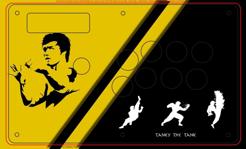
My concerns:
-might be a little bit too empty. Specifically, should I feel the need to add something to the upper-right corner?
-Are the drop shadows overdone?
Anyways, any criticism/suggestions are welcome.
Steam & GT

GT: Tanky the Tank
Black: 1377 6749 7425
GT: Tanky the Tank
Black: 1377 6749 7425
shadydentist on
0
Posts
Pretty cool concept though, you should def post some final pic when your done. Maaan I can't wait for SSF4...
INSTAGRAM
Edit: also the text "tanky the tank" is a bit boring. I know you said you lack art skills, but you can find cool fonts online, and then make a simple little background element or space it out in a way that helps the text seem more like a part of the above picture.
If the president had any real power, he'd be able to live wherever the fuck he wanted.
I also think you need to watch tangents and rethink your cropping. The element on the left would have much more impact if it was enlarged. Right now it's just barely bumping up against what look like holes for the stick/buttons.
The left and right elements lack unity. The left one is a photo with the levels adjusted and the right ones are basically sprite icons. You need to stick with one style. The drop shadows/photo/sprite thing is not working.
It looks like the left element has an eye patch.