As was foretold, we've added advertisements to the forums! If you have questions, or if you encounter any bugs, please visit this thread: https://forums.penny-arcade.com/discussion/240191/forum-advertisement-faq-and-reports-thread/
Options

1st web comic FFXIII

NakedZerglingNakedZergling A more apocalyptic post apocalypse Portland OregonRegistered User regular
edited April 2010 in Artist's Corner
So...i should fucking know better than to post this here, because its like asking to get raped. Please be gentle! this is literally my first ever attempt. I need to rethink panel sizes for h scroll, but what do you guys think?


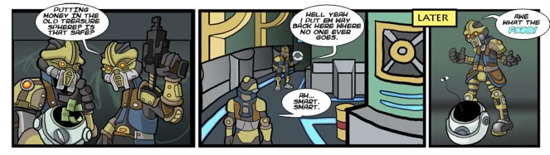
EXPLANATION OF FFXIII's TREASURE SPHERES


.....


......


.....


finalstrip1copy.jpg

NakedZergling on

Posts

  • Options
    MagicToasterMagicToaster JapanRegistered User regular
    edited April 2010
    I like it better without the last panel.

    MagicToaster on
  • Options
    NoodlesaladNoodlesalad Registered User regular
    edited April 2010
    Panel one seems much more finished than the other panels. I do like Panel one though

    Noodlesalad on
  • Options
    RentRent I'm always right Fuckin' deal with itRegistered User regular
    edited April 2010
    It seems really really similar thematically to that LoZ PA strip about the rupees

    Yeah but I like the first panel. It is good

    Rent on
  • Options
    earthwormadamearthwormadam ancient crust Registered User regular
    edited April 2010
    I didn't mind the last panel, but it always kinda irks me to see a censored fuck. Just write the fuck!

    I haven't played the new FF yet, so obviously I'm outta the loop, but it seems like the comic is suffering from a few small problems.

    1. Looks like you put all your effort into the characters, while the background suffers
    2. Icky gradients in some of the panels
    3. Questionable layout in certain panels, mostly the second one

    earthwormadam on
  • Options
    CristovalCristoval Registered User regular
    edited April 2010
    It's like you put all your effort into the first panel and then said "Fuck it", like the punchline was so funny that you were kind of in a rush to get there.

    That said, your style and color is nice to look at when the effort is there, and aside from the joke being kinda "meh" this didn't really offend me in any way.

    I'd suggest playing with the joke a bit more. As an audience we know that the money is going to get stolen, as is a rule across all video games that people hide their shit in the stupidest places. So our minds are already at the punchline by panel one. Maybe have the other robot/guard/monster thing berate the main dude for questioning his actions, or asking for alternatives. I'm sure there's some funniness to be had elsewhere on this topic.

    Cristoval on
  • Options
    CristovalCristoval Registered User regular
    edited April 2010
    Rent wrote: »
    It seems really really similar thematically to that LoZ PA strip about the rupees

    Yeah but I like the first panel. It is good


    I was just thinking about going out and finding this strip too.

    Cristoval on
  • Options
    MetalbourneMetalbourne Inside a cluster b personalityRegistered User regular
    edited April 2010
    This idea's been done a few times, actually. not only the PA strip, but someone else had a guy punching a hole in the wall to find a turkey inside. Then another guy did the same thing, but with a bag of taco bell.

    it's a very old joke and you have to do something to change it up

    Metalbourne on
  • Options
    FugitiveFugitive Registered User regular
    edited April 2010
    What are you planning to do with this? Because you've been around long enough that you should know all about 3 panel videogame comics, and how much we need them.

    The characters look pretty okay. You need to spend as much time on backgrounds though. They don't need to be lavish set-pieces necessarily, but you need to put in the same attention to lineweight and structure as you do with your characters. The second panel especially is just a mess, and it looks like you drew the other guy separate, re-sized, and dropped him in there.

    You censored the word fuck.

    Layout wise, you are working in a digital medium that is saturated with 3-panel comics. Not to get all Scott McCloud, but mix it up. You are being given an infinite canvas and using an index-card's worth of space.

    Content-wise, well, it's a 3 panel comic about videogames.

    Fugitive on
  • Options
    NakedZerglingNakedZergling A more apocalyptic post apocalypse Portland OregonRegistered User regular
    edited April 2010
    1) its for strengthgamer.com and they want it clean so that's why fuck is censored.
    2) I spent a lot of time on panel 1 and 3. # i did big, and looks better at the larger size.
    3) Panel 2 is too sloppy..guilty as charges. I can't/won't even try to argue that one.
    4) I wasn't trying to rip a joke from anywhere, but i'm curious to see which one you guys are referencing.

    For me it was a learning experiencing about actually DOING instead of BITCHING about other peoples stuff.
    I appreciate all your feedback guys. I'm thinking of scaning my new Kratos vs Dante comic and keeping it pen and ink instead of digital.

    NakedZergling on
  • Options
    CristovalCristoval Registered User regular
    edited April 2010
    We're not accusing you of ripping off the joke, it's just that this one in particular has already been done to death. If you are planning on keeping this comic about video games I would at least recommend familiarizing yourself with other ones out there (and not just PA, obviously) so you don't hit on the same tired material.

    Also yeah, make that shiz bigger. Unless those are the size reatrictions you were given by the website. And if they want to keep things clean then why bother throwing in a cuss word? You don't have to swear in order to appeal to your audiance.

    Cristoval on
  • Options
    JerichoTheKingJerichoTheKing Registered User regular
    edited April 2010
    Hahaha. So I'm not going to post my webcomic in here. My drawing ability will be the focus of your critique. The fact that the comic is /not/ about video games will be the one positive. Maybe I'll just hang out a while and once I'm somewhat liked, I'll see if anyone's interested.

    Dude, I see what everyone's saying about panel two, but seriously... if I could get panel one out of my pen, I'd be thrilled. I'm even worse at coloring than I am at drawing...

    Keep it up. You'll get there.

    JerichoTheKing on
  • Options
    JLM-AWPJLM-AWP Registered User regular
    edited April 2010
    4) I wasn't trying to rip a joke from anywhere, but i'm curious to see which one you guys are referencing.


    Exhibit A

    215213346_5iqJ3-L-2.jpg

    JLM-AWP on
  • Options
    JLM-AWPJLM-AWP Registered User regular
    edited April 2010
    Hahaha. So I'm not going to post my webcomic in here. My drawing ability will be the focus of your critique. The fact that the comic is /not/ about video games will be the one positive. Maybe I'll just hang out a while and once I'm somewhat liked, I'll see if anyone's interested.

    I think this is already a really bad approach. You being liked will have nothing to do with the critiques you get in this forum. Everyone here will rip you a new one, but the main goal is to help you improve, not make you feel like shit. If you're looking to skirt negative comments and honest critiques, then posting here at all is probably not in your best interest.

    JLM-AWP on
  • Options
    thejazzmanthejazzman Registered User regular
    edited April 2010
    The art is OK but the composition is too cluttered and it's not at all obvious what's going on visually.

    Try doing this every time you draw a comic. Take out all of the speech bubbles, show it to somebody, ask them if they understand what the comic is about, or just ask them to describe the story. If they don't know what the heck is going on, there is a problem.

    Also, the joke is very old and obvious, and unfortunately unlike the Penny Arcade version the lines aren't funny outside of the joke itself, so it falls pretty flat.

    So make another comic, and keep doing that until you're making good ones.

    thejazzman on
    [SIGPIC][/SIGPIC]
  • Options
    m.brooks42m.brooks42 Registered User regular
    have you considered vectoring instead of freehand? Your lines might come out smoother. I do think it's odd you pointed out my line quality when yours isn't all that great. Hope that's intentional, I guess. I also think it's strange that you asked the forum to "be gentle," but you clearly ignored my plea for "mercy." Hmm. Also, the middle frame's quality and detail is inconsistent with the other two frames. I get that there's a distance factor, but I think it would look better if at least the foreground objects really popped with the same sort of detail as the characters have in frame 1 and 3. Lastly, I don't think the joke is universally understandable. That's generally pretty important for strips. I do sort of like the colors you use, and it has a first impression of being a decent strip, so that's a plus in that it might encourage ppl to want to read it at a glance. Oh, the last "Fuck" is hard to read in that color, but at least the rest of the comic is relatively legible.

This discussion has been closed.